24K Gold Color Palette – HEX, RGB & Design Inspiration
Color Details
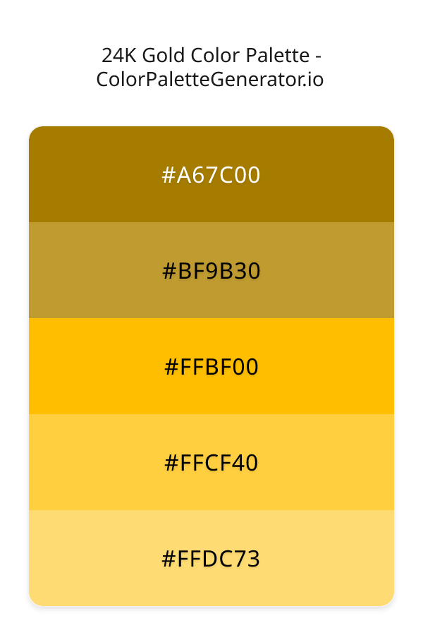
HEX: #A67C00
RGB: 166, 124, 0
HEX: #BF9B30
RGB: 191, 155, 48
HEX: #FFBF00
RGB: 255, 191, 0
HEX: #FFCF40
RGB: 255, 207, 64
HEX: #FFDC73
RGB: 255, 220, 115
Text on White/Black Backgrounds
Color Pair Combinations (10 total)
WCAG Contrast Standards:
- AAA (7:1): Enhanced contrast for maximum readability
- AA (4.5:1): Minimum for normal text (under 18pt)
- AA Large (3:1): Acceptable for large text (18pt+ or 14pt+ bold)
- Fail: Below WCAG standards, not recommended for text
Recommended Text Colors
Horizontal (Left to Right)
background: linear-gradient(to right, #A67C00 0%, #BF9B30 25%, #FFBF00 50%, #FFCF40 75%, #FFDC73 100%);Vertical (Top to Bottom)
background: linear-gradient(to bottom, #A67C00 0%, #BF9B30 25%, #FFBF00 50%, #FFCF40 75%, #FFDC73 100%);Diagonal (Top Left to Bottom Right)
background: linear-gradient(to bottom right, #A67C00 0%, #BF9B30 25%, #FFBF00 50%, #FFCF40 75%, #FFDC73 100%);Usage Tips:
- Copy the CSS code and paste directly into your stylesheets
- Linear gradients work great for backgrounds and hero sections
- Radial gradients are perfect for spotlights and focus effects
- Conic gradients create eye-catching loading spinners and progress indicators
- Smooth transitions ensure seamless color blending
Normal Vision
No color vision deficiency
Color Swatches
#A67C00
#BF9B30
#FFBF00
#FFCF40
#FFDC73
Full Palette View
How people with Normal Vision see it:
Overall Mood & Feel
Energetic, warm, and inviting
Emotional Impact
Stimulating and energetic, evoking feelings of excitement, warmth, and action. The balanced lightness creates versatility across different contexts
Psychological Effect
This 5-color palette creates a energetic, warm, and inviting. The combination works together to create memorable visual experiences that influence consumer perception, decision-making, and brand recall. The rich variety provides versatility while maintaining cohesive emotional messaging across touchpoints.
Brand Personality Traits
Perfect For These Industries
Target Audience
Young, trend-conscious consumers (18-35) who value creativity and self-expression
Individual Color Psychology
#A67C00
Luxurious and prestigious
Emotions Evoked
Personality Traits
Brand Traits
Ideal Industries
Marketing Use
Grabs attention quickly, stimulates mental activity, and generates optimism. Great for highlighting products and encouraging impulse decisions.
Cultural Meanings
Color Harmony Analysis
Palette Mood
Temperature
This palette combines balanced and light & airy moods with warm tones, making it versatile for various design applications.
Professional Implementation Guide
This monochromatic 24k gold palette features 5 carefully selected warm tones that create a energetic and passionate aesthetic. With low contrast levels and vibrant saturation, this palette is optimized for marketing materials and youth brands.
Web Design & Development
For web development, implement this palette with CSS variables for easy theme switching. Consider adding darker variants for better text readability.
- Apply the 60-30-10 rule for visual hierarchy
- Use accent colors for CTAs and hover states
- Maintain consistent color usage across all pages
- Test responsive behavior on multiple devices
Mobile App Interfaces
In mobile applications, these warm tones provide excellent battery efficiency on OLED screens. Use the subtle color variations to define clear touch targets.
- Design both light and dark mode variants
- Consider thumb-reach zones for color placement
- Test under direct sunlight and low light
- Use color to indicate interactive elements
Brand Identity Systems
Build a cohesive brand identity by designating specific colors for specific purposes. Establish your primary brand color from the most distinctive shade and create comprehensive brand guidelines specifying exact usage scenarios.
- Define primary, secondary, and accent colors
- Create usage rules for marketing materials
- Specify minimum sizes and clear space
- Document do's and don'ts for consistency
Frontend Development
Developers can integrate this palette efficiently using modern CSS techniques. Export as CSS variables for maximum flexibility, allowing theme switching and dynamic color updates without rewriting stylesheets.
- Use CSS custom properties for theming
- Implement semantic color naming conventions
- Create utility classes for rapid prototyping
- Consider CSS-in-JS for component-scoped colors
Print Design
For print materials, convert to CMYK using #A67C00 as the dominant color for headers and #FFDC73 for accents. These vibrant colors may appear slightly muted in print; request color proofs.
- Add to your design software color library
- Create swatches for quick color access
- Use CMYK values for print production
- Request color proofs before final print
Marketing Campaigns
Marketing materials benefit from consistent color usage that reinforces brand recognition. Apply this palette across email campaigns, landing pages, advertisements, and social media for maximum impact and memorability.
- Maintain color consistency across channels
- A/B test color variations for conversion
- Consider cultural color associations
- Align colors with campaign messaging
Strategic Color Distribution
Professional designers follow the 60-30-10 rule for balanced color distribution. Here's how to apply this principle with the 24K Gold:
Dominant Color
#A67C00Use #A67C00 as your primary color for backgrounds, main content areas. This yellow tone should occupy about 60% of your design space.
Secondary Color
#FFBF00Apply #FFBF00 as your secondary color for subtle backgrounds and card components. Allocate approximately 30% of your layout to this color.
Accent Color
#FFDC73Reserve #FFDC73 for accent elements like buttons, links, and important highlights. This yellow accent should be used sparingly (10% of design) to draw attention to key actions.
Professional Best Practices
✓ Smart Usage Tips
- •Add white or black text overlays to improve readability on colored backgrounds
- •Use desaturated versions (reduce saturation by 20-30%) for large background areas to prevent visual fatigue
- •Balance warm tones with neutral whites or grays to create visual breathing room
- •Test your palette across different devices and lighting conditions before finalizing
✗ Common Mistakes to Avoid
- •Don't use all colors equally—establish clear visual hierarchy through color weight
- •Avoid low-contrast text combinations that strain readability
- •Don't rely solely on color to convey meaning (use icons, text, and patterns too)
- •Avoid inconsistent color usage across different pages or screens
- •Don't assume screen colors match print output—always request physical proofs
Palette Overview & Statistics
5
Total Colors
2
Associated Tags
6
Categories
897
Community Likes
Color Analysis & Technical Guide
Detailed breakdown of each color's role, characteristics, and optimal applications. This monochromatic palette creates a energetic and passionate aesthetic perfect for marketing materials and youth brands.
Individual Color Breakdown
Each color in this warm palette has been analyzed for its properties and ideal usage scenarios. The low contrast and vibrant saturation ensure harmonious visual relationships.
#A67C00
YELLOW
#A67C00 serves as the primary/dominant color in this palette. This medium yellow (highly saturated) brings richness and prestige Use it for headers, navigation bars, and brand elements.
Dark toneH: 45°S: 100%L: 33%#BF9B30
YELLOW
#BF9B30 serves as the secondary/supporting color in this palette. This medium yellow (moderately saturated) brings richness and prestige Use it for cards, borders, section dividers, and supporting UI components.
Dark toneH: 45°S: 60%L: 47%#FFBF00
YELLOW
#FFBF00 serves as the secondary/supporting color in this palette. This medium yellow (highly saturated) brings richness and prestige Use it for cards, borders, section dividers, and supporting UI components.
Dark toneH: 45°S: 100%L: 50%#FFCF40
YELLOW
#FFCF40 serves as the secondary/supporting color in this palette. This medium yellow (highly saturated) brings optimism and cheerfulness Use it for cards, borders, section dividers, and supporting UI components.
Light toneH: 45°S: 100%L: 63%#FFDC73
YELLOW
#FFDC73 serves as the accent/highlight color in this palette. This light yellow (highly saturated) brings optimism and cheerfulness Use it for call-to-action buttons, links, important notifications, and interactive elements.
Light toneH: 45°S: 100%L: 73%
Palette Characteristics
This palette exhibits distinct characteristics that make it particularly suitable for specific design applications and industries.
Warm colors create energy, excitement, and approachability. Perfect for brands targeting emotional connection.
Low contrast creates subtle, sophisticated aesthetics but requires careful attention to text legibility.
Vibrant saturation creates bold, attention-grabbing designs perfect for youth brands and creative projects.
Balanced brightness provides flexibility for both light and dark design elements.
💡 Pro Tips for This Palette
- Perfect for: marketing materials, youth brands. The monochromatic color relationship creates natural visual flow.
- Mood & Psychology: This palette evokes a energetic and passionate feeling, making it ideal for brands seeking to convey those qualities.
- Accessibility: Test text combinations carefully with contrast checkers to ensure accessibility compliance.
- Extensions: Create tints (add white) and shades (add black) to expand this 5-color palette into a comprehensive design system.
- Cultural Context: Warm colors may have different meanings across cultures—verify associations with your target market.
Export Formats
Explore 24K Gold Palette
Evoke a sense of luxury and radiant energy with the "24K Gold" color palette, a meticulously curated collection designed to elevate your creative projects. This palette shimmers with the promise of opulence, capturing the warmth and boldness of real gold while radiating a modern and energetic vibe. It's a color scheme that speaks of success, quality, and a touch of daring creativity, instantly drawing the eye and making a lasting impression. This selection of warm tones offers a sophisticated blend, perfect for projects seeking a touch of brilliance and sophisticated charm.
At the heart of "24K Gold" lies a spectrum of sun-kissed shades. The journey begins with #A67C00, a rich, deep amber that anchors the palette with a grounding presence. It’s the foundation, providing depth and a sense of history. Moving towards the light, we encounter #BF9B30, a slightly brighter gold that introduces a touch of vibrancy, ideal for accents and highlights. As the palette unfolds, #FFBF00 emerges, the star of the show, a pure, dazzling gold that commands attention and exudes pure luxury. Continuing the ascent, #FFCF40 offers a softened glow, perfect for backgrounds and creating a balanced visual hierarchy. Finally, #FFDC73 shines with its lighter, airier quality, ready for subtle highlights and delicate applications.
The practical applications for this stunning palette are vast. Imagine the impact of “24K Gold” on a website design for a high-end brand, its sophisticated tones lending an air of exclusivity. This palette thrives in branding, from logos to marketing materials, especially for products or services aiming to convey quality, sophistication, and a sense of value. Think sleek mobile apps, eye-catching social media campaigns, and elegant print designs. From the richness of #A67C00 to the brightness of #FFBF00, the "24K Gold" palette is versatile enough to be tailored to various projects, from luxurious event invitations to sophisticated product packaging.
The psychology of “24K Gold” is compelling. The warm hues inherently evoke feelings of optimism, creativity, and wealth. Gold is associated with prestige, success, and prosperity, subtly influencing viewer perception and shaping behavior. It subtly conveys trust and quality, making it an excellent choice for brands aiming to build strong customer relationships. The palette's modern aesthetic further enhances this influence, creating an appealing and contemporary visual experience. It's a color scheme that speaks volumes without saying a word.
For the best results, consider pairing “24K Gold” with complementary colors like deep blues or grays to create striking visual contrasts. Consider #2C3E50 or #424949 for text and background to ground the golden hues. When designing, strive for balance. Use the bolder shades sparingly as accents, allowing the softer hues to shine in supporting roles. Experiment with gradients and textures to add depth and dimension. By following these best practices, you can unlock the full potential of "24K Gold," transforming your projects into works of art that are both captivating and impactful.
Palette Image
Below is the generated palette image showing all colors in a vertical layout. Perfect for sharing on social media or using as a reference.
Frequently Asked Questions
Everything you need to know about using and implementing the 24k gold palette effectively in your projects.