Ash Color Palette Color Palette – HEX, RGB & Design Inspiration
Color Details
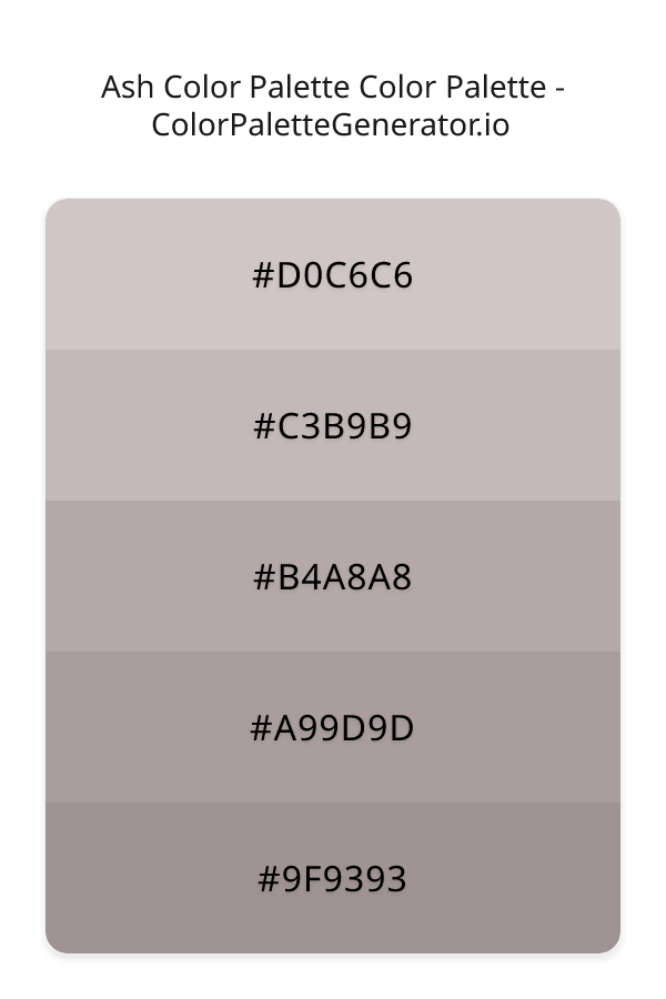
HEX: #D0C6C6
RGB: 208, 198, 198
HEX: #C3B9B9
RGB: 195, 185, 185
HEX: #B4A8A8
RGB: 180, 168, 168
HEX: #A99D9D
RGB: 169, 157, 157
HEX: #9F9393
RGB: 159, 147, 147
Text on White/Black Backgrounds
Color Pair Combinations (10 total)
WCAG Contrast Standards:
- AAA (7:1): Enhanced contrast for maximum readability
- AA (4.5:1): Minimum for normal text (under 18pt)
- AA Large (3:1): Acceptable for large text (18pt+ or 14pt+ bold)
- Fail: Below WCAG standards, not recommended for text
Recommended Text Colors
Horizontal (Left to Right)
background: linear-gradient(to right, #D0C6C6 0%, #C3B9B9 25%, #B4A8A8 50%, #A99D9D 75%, #9F9393 100%);Vertical (Top to Bottom)
background: linear-gradient(to bottom, #D0C6C6 0%, #C3B9B9 25%, #B4A8A8 50%, #A99D9D 75%, #9F9393 100%);Diagonal (Top Left to Bottom Right)
background: linear-gradient(to bottom right, #D0C6C6 0%, #C3B9B9 25%, #B4A8A8 50%, #A99D9D 75%, #9F9393 100%);Usage Tips:
- Copy the CSS code and paste directly into your stylesheets
- Linear gradients work great for backgrounds and hero sections
- Radial gradients are perfect for spotlights and focus effects
- Conic gradients create eye-catching loading spinners and progress indicators
- Smooth transitions ensure seamless color blending
Normal Vision
No color vision deficiency
Color Swatches
#D0C6C6
#C3B9B9
#B4A8A8
#A99D9D
#9F9393
Full Palette View
How people with Normal Vision see it:
Overall Mood & Feel
Energetic, warm, and inviting, with an airy and optimistic feel
Emotional Impact
Stimulating and energetic, evoking feelings of excitement, warmth, and action. The light tones create an uplifting, optimistic atmosphere perfect for approachable brands
Psychological Effect
This 5-color palette creates a energetic, warm, and inviting, with an airy and optimistic feel. The combination works together to create memorable visual experiences that influence consumer perception, decision-making, and brand recall. The rich variety provides versatility while maintaining cohesive emotional messaging across touchpoints.
Brand Personality Traits
Perfect For These Industries
Target Audience
Affluent consumers seeking premium, high-quality products and experiences. Appeals to those seeking approachable, positive, and optimistic brands
Individual Color Psychology
#D0C6C6
Warm and romantic
Emotions Evoked
Personality Traits
Brand Traits
Ideal Industries
Marketing Use
Creates urgency, stimulates appetite, increases heart rate, and grabs attention. Perfect for clearance sales, food brands, and call-to-action buttons.
Cultural Meanings
Color Harmony Analysis
Palette Mood
Temperature
This palette combines light & airy and balanced moods with warm tones, making it versatile for various design applications.
Professional Implementation Guide
This monochromatic ash color palette palette features 5 carefully selected warm tones that create a balanced and versatile aesthetic. With low contrast levels and muted saturation, this palette is optimized for .
Web Design & Development
For web development, implement this palette with CSS variables for easy theme switching. Consider adding darker variants for better text readability.
- Apply the 60-30-10 rule for visual hierarchy
- Use accent colors for CTAs and hover states
- Maintain consistent color usage across all pages
- Test responsive behavior on multiple devices
Mobile App Interfaces
In mobile applications, these warm tones provide excellent battery efficiency on OLED screens. Use the subtle color variations to define clear touch targets.
- Design both light and dark mode variants
- Consider thumb-reach zones for color placement
- Test under direct sunlight and low light
- Use color to indicate interactive elements
Brand Identity Systems
Build a cohesive brand identity by designating specific colors for specific purposes. Establish your primary brand color from the most distinctive shade and create comprehensive brand guidelines specifying exact usage scenarios.
- Define primary, secondary, and accent colors
- Create usage rules for marketing materials
- Specify minimum sizes and clear space
- Document do's and don'ts for consistency
Frontend Development
Developers can integrate this palette efficiently using modern CSS techniques. Export as CSS variables for maximum flexibility, allowing theme switching and dynamic color updates without rewriting stylesheets.
- Use CSS custom properties for theming
- Implement semantic color naming conventions
- Create utility classes for rapid prototyping
- Consider CSS-in-JS for component-scoped colors
Print Design
For print materials, convert to CMYK using #D0C6C6 as the dominant color for headers and #9F9393 for accents. These colors translate well to print with minimal adjustment.
- Add to your design software color library
- Create swatches for quick color access
- Use CMYK values for print production
- Request color proofs before final print
Marketing Campaigns
Marketing materials benefit from consistent color usage that reinforces brand recognition. Apply this palette across email campaigns, landing pages, advertisements, and social media for maximum impact and memorability.
- Maintain color consistency across channels
- A/B test color variations for conversion
- Consider cultural color associations
- Align colors with campaign messaging
Strategic Color Distribution
Professional designers follow the 60-30-10 rule for balanced color distribution. Here's how to apply this principle with the Ash Color Palette:
Dominant Color
#D0C6C6Use #D0C6C6 as your primary color for backgrounds, main content areas. This red tone should occupy about 60% of your design space.
Secondary Color
#B4A8A8Apply #B4A8A8 as your secondary color for subtle backgrounds and card components. Allocate approximately 30% of your layout to this color.
Accent Color
#9F9393Reserve #9F9393 for accent elements like buttons, links, and important highlights. This gray accent should be used sparingly (10% of design) to draw attention to key actions.
Professional Best Practices
✓ Smart Usage Tips
- •Add white or black text overlays to improve readability on colored backgrounds
- •Balance warm tones with neutral whites or grays to create visual breathing room
- •Test your palette across different devices and lighting conditions before finalizing
✗ Common Mistakes to Avoid
- •Don't use all colors equally—establish clear visual hierarchy through color weight
- •Avoid low-contrast text combinations that strain readability
- •Don't rely solely on color to convey meaning (use icons, text, and patterns too)
- •Avoid inconsistent color usage across different pages or screens
- •Don't assume screen colors match print output—always request physical proofs
Palette Overview & Statistics
5
Total Colors
2
Associated Tags
6
Categories
3857
Community Likes
Color Analysis & Technical Guide
Detailed breakdown of each color's role, characteristics, and optimal applications. This monochromatic palette creates a balanced and versatile aesthetic perfect for .
Individual Color Breakdown
Each color in this warm palette has been analyzed for its properties and ideal usage scenarios. The low contrast and muted saturation ensure harmonious visual relationships.
#D0C6C6
RED
#D0C6C6 serves as the primary/dominant color in this palette. This light red (muted) brings energy and warmth Use it for backgrounds, containers, and large surface areas.
Light toneH: 0°S: 10%L: 80%#C3B9B9
GRAY
#C3B9B9 serves as the secondary/supporting color in this palette. This light gray (muted) brings neutrality and balance Use it for cards, borders, section dividers, and supporting UI components.
Light toneH: 0°S: 8%L: 75%#B4A8A8
GRAY
#B4A8A8 serves as the secondary/supporting color in this palette. This medium gray (muted) brings neutrality and balance Use it for cards, borders, section dividers, and supporting UI components.
Light toneH: 0°S: 7%L: 68%#A99D9D
GRAY
#A99D9D serves as the secondary/supporting color in this palette. This medium gray (muted) brings neutrality and balance Use it for cards, borders, section dividers, and supporting UI components.
Light toneH: 0°S: 7%L: 64%#9F9393
GRAY
#9F9393 serves as the accent/highlight color in this palette. This medium gray (muted) brings neutrality and balance Use it for call-to-action buttons, links, important notifications, and interactive elements.
Light toneH: 0°S: 6%L: 60%
Palette Characteristics
This palette exhibits distinct characteristics that make it particularly suitable for specific design applications and industries.
Warm colors create energy, excitement, and approachability. Perfect for brands targeting emotional connection.
Low contrast creates subtle, sophisticated aesthetics but requires careful attention to text legibility.
Muted saturation offers sophistication and reduces visual fatigue, ideal for content-heavy applications.
Balanced brightness provides flexibility for both light and dark design elements.
💡 Pro Tips for This Palette
- Perfect for: . The monochromatic color relationship creates natural visual flow.
- Mood & Psychology: This palette evokes a balanced and versatile feeling, making it ideal for brands seeking to convey those qualities.
- Accessibility: Test text combinations carefully with contrast checkers to ensure accessibility compliance.
- Extensions: Create tints (add white) and shades (add black) to expand this 5-color palette into a comprehensive design system.
- Cultural Context: Warm colors may have different meanings across cultures—verify associations with your target market.
Export Formats
Explore Ash Color Palette Palette
The Ash Color Palette is a thoughtfully curated collection of hues that evoke a sense of serenity and balance, perfect for designs that require a soothing yet professional aesthetic. At its core, this palette is a masterful blend of warm, muted tones that converge to create a calming visual experience, making it an ideal choice for designers seeking to craft a peaceful and composed atmosphere. The palette's underlying theme of pink and coral hues, although subtle, adds a touch of warmth and approachability, setting it apart from more austere monochromatic schemes.
Delving deeper into the palette, we find that the lightest shade, D0C6C6, serves as a gentle foundation, providing a soft and airy quality that helps to establish a sense of calmness. As we progress through the palette, C3B9B9 emerges as a mid-tone, bringing a sense of stability and balance to the design, while B4A8A8 adds a touch of depth and nuance, subtly enriching the visual landscape. The two darker shades, A99D9D and 9F9393, work in tandem to create a sense of grounding and solidity, providing a satisfying contrast to the lighter tones and imbuing the design with a sense of professionalism and sophistication. Each shade, though distinct, blends seamlessly with its counterparts, yielding a cohesive and harmonious visual experience.
The Ash Color Palette is remarkably versatile, lending itself to a wide range of applications, from website design and app development to branding and marketing materials. Its calming and professional qualities make it an excellent choice for corporate environments, financial institutions, and healthcare organizations, where a sense of trust and stability is essential. Additionally, the palette's warm, muted tones can be used to create a soothing atmosphere in digital products, such as wellness apps, meditation platforms, or online educational resources, helping to foster a sense of relaxation and focus in users. Whether used as a primary color scheme or as an accent palette, the Ash Color Palette is sure to bring a sense of balance and harmony to any design.
The psychological impact of the Ash Color Palette is profound, as it has the power to influence viewer perception and behavior in meaningful ways. The warm, muted tones can help to reduce stress and anxiety, creating a sense of calmness and tranquility that can be particularly beneficial in designs aimed at healthcare, wellness, or financial services. Moreover, the palette's professional and corporate qualities can convey a sense of trust, stability, and expertise, making it an excellent choice for organizations seeking to establish a strong and credible brand identity. By leveraging the Ash Color Palette, designers can create a visual experience that not only engages and informs but also soothes and reassures, ultimately driving user loyalty and satisfaction.
To maximize the potential of the Ash Color Palette, designers can experiment with complementary colors, such as soft blues or pale greens, to create a sense of contrast and visual interest. When pairing the palette with other colors, it is essential to consider the 60-30-10 rule, where the dominant color, such as D0C6C6, occupies 60 percent of the design, the secondary color, like C3B9B9, occupies 30 percent, and the accent color, such as 9F9393, occupies 10 percent. By following this principle and using the Ash Color Palette thoughtfully, designers can craft a visually stunning and emotionally resonant design that leaves a lasting impression on users and sets their brand apart from the competition.
Palette Image
Below is the generated palette image showing all colors in a vertical layout. Perfect for sharing on social media or using as a reference.
Categories & Tags
Frequently Asked Questions
Everything you need to know about using and implementing the ash color palette palette effectively in your projects.