Black To Purple Color Palette – HEX, RGB & Design Inspiration
Color Details
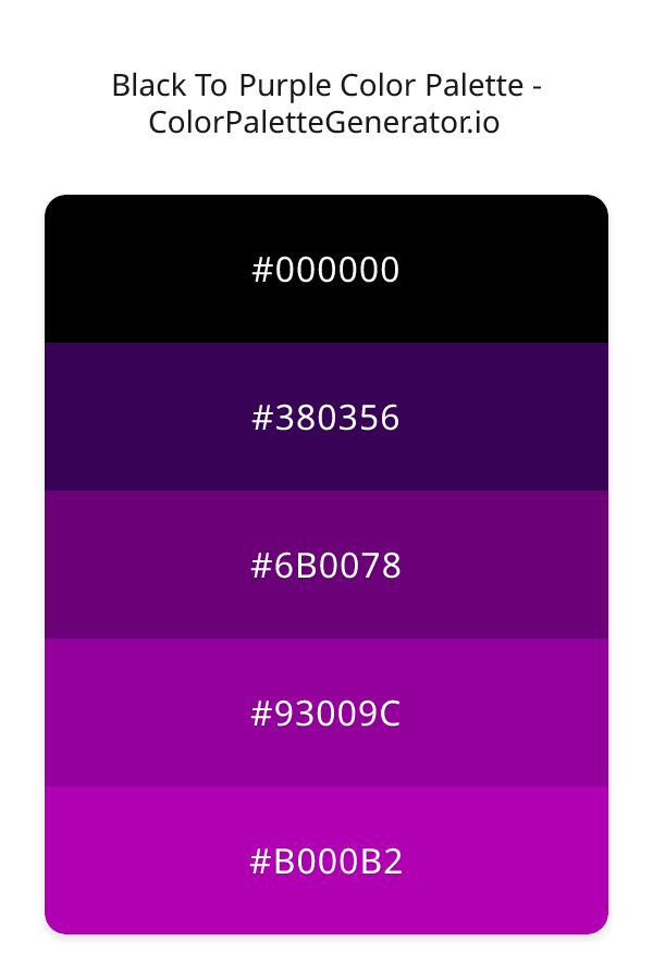
HEX: #000000
RGB: 0, 0, 0
HEX: #380356
RGB: 56, 3, 86
HEX: #6B0078
RGB: 107, 0, 120
HEX: #93009C
RGB: 147, 0, 156
HEX: #B000B2
RGB: 176, 0, 178
Text on White/Black Backgrounds
Color Pair Combinations (10 total)
WCAG Contrast Standards:
- AAA (7:1): Enhanced contrast for maximum readability
- AA (4.5:1): Minimum for normal text (under 18pt)
- AA Large (3:1): Acceptable for large text (18pt+ or 14pt+ bold)
- Fail: Below WCAG standards, not recommended for text
Recommended Text Colors
Horizontal (Left to Right)
background: linear-gradient(to right, #000000 0%, #380356 25%, #6B0078 50%, #93009C 75%, #B000B2 100%);Vertical (Top to Bottom)
background: linear-gradient(to bottom, #000000 0%, #380356 25%, #6B0078 50%, #93009C 75%, #B000B2 100%);Diagonal (Top Left to Bottom Right)
background: linear-gradient(to bottom right, #000000 0%, #380356 25%, #6B0078 50%, #93009C 75%, #B000B2 100%);Usage Tips:
- Copy the CSS code and paste directly into your stylesheets
- Linear gradients work great for backgrounds and hero sections
- Radial gradients are perfect for spotlights and focus effects
- Conic gradients create eye-catching loading spinners and progress indicators
- Smooth transitions ensure seamless color blending
Normal Vision
No color vision deficiency
Color Swatches
#000000
#380356
#6B0078
#93009C
#B000B2
Full Palette View
How people with Normal Vision see it:
Overall Mood & Feel
Energetic, warm, and inviting, with a sophisticated and dramatic atmosphere
Emotional Impact
Stimulating and energetic, evoking feelings of excitement, warmth, and action. The dark tones establish a premium, sophisticated feel ideal for luxury positioning
Psychological Effect
This 5-color palette creates a energetic, warm, and inviting, with a sophisticated and dramatic atmosphere. The combination works together to create memorable visual experiences that influence consumer perception, decision-making, and brand recall. The rich variety provides versatility while maintaining cohesive emotional messaging across touchpoints.
Brand Personality Traits
Perfect For These Industries
Target Audience
Active, outgoing individuals who respond to energy and enthusiasm
Individual Color Psychology
#000000
Sophisticated and powerful
Emotions Evoked
Personality Traits
Brand Traits
Ideal Industries
Marketing Use
Conveys luxury, power, and sophistication. Makes colors stand out when used as background. Popular in high-end fashion and technology. Can be overwhelming if overused.
Cultural Meanings
Color Harmony Analysis
Palette Mood
Temperature
This palette combines dark & bold and balanced moods with neutral and cool tones, making it versatile for various design applications.
Professional Implementation Guide
This complementary black to purple palette features 5 carefully selected cool tones that create a dramatic and sophisticated aesthetic. With medium contrast levels and vibrant saturation, this palette is optimized for .
Web Design & Development
For web development, implement this palette with CSS variables for easy theme switching. Consider adding darker variants for better text readability.
- Apply the 60-30-10 rule for visual hierarchy
- Use accent colors for CTAs and hover states
- Maintain consistent color usage across all pages
- Test responsive behavior on multiple devices
Mobile App Interfaces
In mobile applications, these cool tones provide excellent battery efficiency on OLED screens. Use the subtle color variations to define clear touch targets.
- Design both light and dark mode variants
- Consider thumb-reach zones for color placement
- Test under direct sunlight and low light
- Use color to indicate interactive elements
Brand Identity Systems
Build a cohesive brand identity by designating specific colors for specific purposes. Establish your primary brand color from the most distinctive shade and create comprehensive brand guidelines specifying exact usage scenarios.
- Define primary, secondary, and accent colors
- Create usage rules for marketing materials
- Specify minimum sizes and clear space
- Document do's and don'ts for consistency
Frontend Development
Developers can integrate this palette efficiently using modern CSS techniques. Export as CSS variables for maximum flexibility, allowing theme switching and dynamic color updates without rewriting stylesheets.
- Use CSS custom properties for theming
- Implement semantic color naming conventions
- Create utility classes for rapid prototyping
- Consider CSS-in-JS for component-scoped colors
Print Design
For print materials, convert to CMYK using #000000 as the dominant color for headers and #B000B2 for accents. These vibrant colors may appear slightly muted in print; request color proofs.
- Add to your design software color library
- Create swatches for quick color access
- Use CMYK values for print production
- Request color proofs before final print
Marketing Campaigns
Marketing materials benefit from consistent color usage that reinforces brand recognition. Apply this palette across email campaigns, landing pages, advertisements, and social media for maximum impact and memorability.
- Maintain color consistency across channels
- A/B test color variations for conversion
- Consider cultural color associations
- Align colors with campaign messaging
Strategic Color Distribution
Professional designers follow the 60-30-10 rule for balanced color distribution. Here's how to apply this principle with the Black To Purple:
Dominant Color
#000000Use #000000 as your primary color for headers, hero sections, and primary CTAs. This black tone should occupy about 60% of your design space.
Secondary Color
#6B0078Apply #6B0078 as your secondary color for subtle backgrounds and card components. Allocate approximately 30% of your layout to this color.
Accent Color
#B000B2Reserve #B000B2 for accent elements like buttons, links, and important highlights. This pink accent should be used sparingly (10% of design) to draw attention to key actions.
Professional Best Practices
✓ Smart Usage Tips
- •Use desaturated versions (reduce saturation by 20-30%) for large background areas to prevent visual fatigue
- •Add warm accent colors to create focal points and prevent designs from feeling too cold
- •Ensure sufficient lighting contrast for text elements—use light text on dark backgrounds
- •Test your palette across different devices and lighting conditions before finalizing
✗ Common Mistakes to Avoid
- •Don't use all colors equally—establish clear visual hierarchy through color weight
- •Avoid low-contrast text combinations that strain readability
- •Don't rely solely on color to convey meaning (use icons, text, and patterns too)
- •Avoid inconsistent color usage across different pages or screens
- •Don't assume screen colors match print output—always request physical proofs
Palette Overview & Statistics
5
Total Colors
3
Associated Tags
6
Categories
4402
Community Likes
Color Analysis & Technical Guide
Detailed breakdown of each color's role, characteristics, and optimal applications. This complementary palette creates a dramatic and sophisticated aesthetic perfect for .
Individual Color Breakdown
Each color in this cool palette has been analyzed for its properties and ideal usage scenarios. The medium contrast and vibrant saturation ensure harmonious visual relationships.
#000000
BLACK
#000000 serves as the primary/dominant color in this palette. This dark black (muted) brings elegance and authority Use it for headers, navigation bars, and brand elements.
Dark toneH: 0°S: 0%L: 0%#380356
PURPLE
#380356 serves as the secondary/supporting color in this palette. This dark purple (highly saturated) brings luxury and mystery Use it for cards, borders, section dividers, and supporting UI components.
Dark toneH: 278°S: 93%L: 17%#6B0078
PINK
#6B0078 serves as the secondary/supporting color in this palette. This dark pink (highly saturated) brings playfulness and compassion Use it for cards, borders, section dividers, and supporting UI components.
Dark toneH: 294°S: 100%L: 24%#93009C
PINK
#93009C serves as the secondary/supporting color in this palette. This medium pink (highly saturated) brings playfulness and compassion Use it for cards, borders, section dividers, and supporting UI components.
Dark toneH: 297°S: 100%L: 31%#B000B2
PINK
#B000B2 serves as the accent/highlight color in this palette. This medium pink (highly saturated) brings playfulness and compassion Use it for call-to-action buttons, links, important notifications, and interactive elements.
Dark toneH: 299°S: 100%L: 35%
Palette Characteristics
This palette exhibits distinct characteristics that make it particularly suitable for specific design applications and industries.
Cool tones convey professionalism, trust, and calmness. Ideal for corporate and tech applications.
Medium contrast provides visual interest while maintaining readability with proper text color choices.
Vibrant saturation creates bold, attention-grabbing designs perfect for youth brands and creative projects.
Dark tones create dramatic, sophisticated aesthetics and save battery on OLED displays.
💡 Pro Tips for This Palette
- Perfect for: . The complementary color relationship creates natural visual flow.
- Mood & Psychology: This palette evokes a dramatic and sophisticated feeling, making it ideal for brands seeking to convey those qualities.
- Accessibility: Test text combinations carefully with contrast checkers to ensure accessibility compliance.
- Extensions: Create tints (add white) and shades (add black) to expand this 5-color palette into a comprehensive design system.
- Cultural Context: Cool tones are generally perceived as professional worldwide but always research cultural color meanings.
Export Formats
Explore Black To Purple Palette
The Black To Purple color palette is a dramatic and captivating combination that evokes a sense of mystery and luxury, with a profound emotional impact on those who experience it. At its core, this palette is about the transformation from the deepest, darkest shadows to the richest, most vibrant hues of purple, a journey that unfolds with each successive shade. The palette begins with the absolute darkness of 000000, a void that sets the stage for the emergence of a profound, almost velvety purple, 380356, which introduces a sense of sophistication and elegance.
As the palette progresses, 6B0078 takes center stage, offering a slightly lighter and more saturated shade that leans towards the violet end of the spectrum, injecting a sense of vibrancy and energy into the design. This is followed by 93009C, a deep, rich purple that commands attention and inspires creativity, before culminating in B000B2, a bold and bright purple that radiates warmth and dynamism. Each of these colors plays a vital role in the overall aesthetic, with the coral undertones subtly woven throughout to add depth and complexity to the palette. The interplay between these shades creates a visual narrative that is both captivating and thought-provoking.
In practical terms, the Black To Purple palette is incredibly versatile, lending itself to a wide range of design applications, from websites and apps to branding and marketing campaigns. Its cool, dark, and vibrant qualities make it an ideal choice for designs that require a sense of drama and flair, such as entertainment, nightlife, or luxury lifestyle brands. The palette's energetic and bold characteristics also make it well-suited for designs that aim to engage and inspire, such as social media platforms, creative agencies, or innovative tech startups. Whether used as a primary color scheme or as an accent palette, Black To Purple is sure to add a level of sophistication and excitement to any design.
The psychological impact of the Black To Purple palette is equally noteworthy, as the colors within it have a profound influence on viewer perception and behavior. The darker shades, such as 000000 and 380356, can create a sense of mystery and intrigue, while the lighter shades, such as 6B0078 and B000B2, can stimulate creativity and enthusiasm. The palette's overall effect is one of energy and dynamism, making it an excellent choice for designs that aim to motivate and inspire. Furthermore, the coral undertones that run throughout the palette can add a sense of warmth and approachability, helping to balance out the cooler, darker shades and create a more nuanced emotional response.
For designers looking to make the most of the Black To Purple palette, it's worth considering complementary colors and pairing suggestions to enhance its impact. Neutral shades such as beige or gray can provide a useful counterpoint to the palette's bold, vibrant colors, while metallic accents like gold or silver can add an extra layer of luxury and sophistication. In terms of design best practices, it's essential to balance the palette's darker shades with lighter, more saturated colors to create visual harmony and avoid overwhelming the viewer. By doing so, designers can unlock the full potential of the Black To Purple palette and create designs that are both visually stunning and emotionally resonant.
Palette Image
Below is the generated palette image showing all colors in a vertical layout. Perfect for sharing on social media or using as a reference.
Frequently Asked Questions
Everything you need to know about using and implementing the black to purple palette effectively in your projects.