Blue To Green Gradient Color Palette – HEX, RGB & Design Inspiration
Color Details
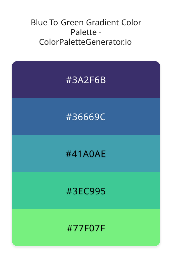
HEX: #3A2F6B
RGB: 58, 47, 107
HEX: #36669C
RGB: 54, 102, 156
HEX: #41A0AE
RGB: 65, 160, 174
HEX: #3EC995
RGB: 62, 201, 149
HEX: #77F07F
RGB: 119, 240, 127
Text on White/Black Backgrounds
Color Pair Combinations (10 total)
WCAG Contrast Standards:
- AAA (7:1): Enhanced contrast for maximum readability
- AA (4.5:1): Minimum for normal text (under 18pt)
- AA Large (3:1): Acceptable for large text (18pt+ or 14pt+ bold)
- Fail: Below WCAG standards, not recommended for text
Recommended Text Colors
Horizontal (Left to Right)
background: linear-gradient(to right, #3A2F6B 0%, #36669C 25%, #41A0AE 50%, #3EC995 75%, #77F07F 100%);Vertical (Top to Bottom)
background: linear-gradient(to bottom, #3A2F6B 0%, #36669C 25%, #41A0AE 50%, #3EC995 75%, #77F07F 100%);Diagonal (Top Left to Bottom Right)
background: linear-gradient(to bottom right, #3A2F6B 0%, #36669C 25%, #41A0AE 50%, #3EC995 75%, #77F07F 100%);Usage Tips:
- Copy the CSS code and paste directly into your stylesheets
- Linear gradients work great for backgrounds and hero sections
- Radial gradients are perfect for spotlights and focus effects
- Conic gradients create eye-catching loading spinners and progress indicators
- Smooth transitions ensure seamless color blending
Normal Vision
No color vision deficiency
Color Swatches
#3A2F6B
#36669C
#41A0AE
#3EC995
#77F07F
Full Palette View
How people with Normal Vision see it:
Overall Mood & Feel
Calm, professional, and trustworthy
Emotional Impact
Calming and contemplative, promoting feelings of trust, stability, and peace. The balanced lightness creates versatility across different contexts
Psychological Effect
This 5-color palette creates a calm, professional, and trustworthy. The combination works together to create memorable visual experiences that influence consumer perception, decision-making, and brand recall. The rich variety provides versatility while maintaining cohesive emotional messaging across touchpoints.
Brand Personality Traits
Perfect For These Industries
Target Audience
Business professionals and decision-makers seeking reliability and competence
Individual Color Psychology
#3A2F6B
Professional and authoritative
Emotions Evoked
Personality Traits
Brand Traits
Ideal Industries
Marketing Use
Most popular color globally. Builds trust and reduces stress. Ideal for corporate brands, financial services, and healthcare. Can suppress appetite.
Cultural Meanings
Color Harmony Analysis
Palette Mood
Temperature
This palette combines balanced moods with cool and neutral tones, making it versatile for various design applications.
Professional Implementation Guide
This triadic blue to green gradient palette features 5 carefully selected cool tones that create a balanced and versatile aesthetic. With high contrast levels and moderate saturation, this palette is optimized for web interfaces and mobile apps.
Web Design & Development
For web development, implement this palette with CSS variables for easy theme switching. The high contrast makes it ideal for accessible interfaces meeting WCAG AA standards.
- Apply the 60-30-10 rule for visual hierarchy
- Use accent colors for CTAs and hover states
- Maintain consistent color usage across all pages
- Test responsive behavior on multiple devices
Mobile App Interfaces
In mobile applications, these cool tones provide excellent battery efficiency on OLED screens. Use the strong color contrast to define clear touch targets.
- Design both light and dark mode variants
- Consider thumb-reach zones for color placement
- Test under direct sunlight and low light
- Use color to indicate interactive elements
Brand Identity Systems
Build a cohesive brand identity by designating specific colors for specific purposes. Establish your primary brand color from the most distinctive shade and create comprehensive brand guidelines specifying exact usage scenarios.
- Define primary, secondary, and accent colors
- Create usage rules for marketing materials
- Specify minimum sizes and clear space
- Document do's and don'ts for consistency
Frontend Development
Developers can integrate this palette efficiently using modern CSS techniques. Export as CSS variables for maximum flexibility, allowing theme switching and dynamic color updates without rewriting stylesheets.
- Use CSS custom properties for theming
- Implement semantic color naming conventions
- Create utility classes for rapid prototyping
- Consider CSS-in-JS for component-scoped colors
Print Design
For print materials, convert to CMYK using #3A2F6B as the dominant color for headers and #77F07F for accents. These colors translate well to print with minimal adjustment.
- Add to your design software color library
- Create swatches for quick color access
- Use CMYK values for print production
- Request color proofs before final print
Marketing Campaigns
Marketing materials benefit from consistent color usage that reinforces brand recognition. Apply this palette across email campaigns, landing pages, advertisements, and social media for maximum impact and memorability.
- Maintain color consistency across channels
- A/B test color variations for conversion
- Consider cultural color associations
- Align colors with campaign messaging
Strategic Color Distribution
Professional designers follow the 60-30-10 rule for balanced color distribution. Here's how to apply this principle with the Blue To Green Gradient:
Dominant Color
#3A2F6BUse #3A2F6B as your primary color for backgrounds, main content areas. This blue tone should occupy about 60% of your design space.
Secondary Color
#41A0AEApply #41A0AE as your secondary color for supporting elements and section dividers. Allocate approximately 30% of your layout to this color.
Accent Color
#77F07FReserve #77F07F for accent elements like buttons, links, and important highlights. This green accent should be used sparingly (10% of design) to draw attention to key actions.
Professional Best Practices
✓ Smart Usage Tips
- •Add warm accent colors to create focal points and prevent designs from feeling too cold
- •Test your palette across different devices and lighting conditions before finalizing
✗ Common Mistakes to Avoid
- •Don't use all colors equally—establish clear visual hierarchy through color weight
- •Avoid low-contrast text combinations that strain readability
- •Don't rely solely on color to convey meaning (use icons, text, and patterns too)
- •Avoid inconsistent color usage across different pages or screens
- •Don't assume screen colors match print output—always request physical proofs
Palette Overview & Statistics
5
Total Colors
5
Associated Tags
2
Categories
371
Community Likes
Color Analysis & Technical Guide
Detailed breakdown of each color's role, characteristics, and optimal applications. This triadic palette creates a balanced and versatile aesthetic perfect for web interfaces and mobile apps.
Individual Color Breakdown
Each color in this cool palette has been analyzed for its properties and ideal usage scenarios. The high contrast and moderate saturation ensure excellent readability and accessibility.
#3A2F6B
BLUE
#3A2F6B serves as the primary/dominant color in this palette. This medium blue (moderately saturated) brings professionalism and depth Use it for headers, navigation bars, and brand elements.
Dark toneH: 251°S: 39%L: 30%#36669C
BLUE
#36669C serves as the secondary/supporting color in this palette. This medium blue (moderately saturated) brings professionalism and depth Use it for cards, borders, section dividers, and supporting UI components.
Dark toneH: 212°S: 49%L: 41%#41A0AE
CYAN
#41A0AE serves as the secondary/supporting color in this palette. This medium cyan (moderately saturated) brings clarity and innovation Use it for cards, borders, section dividers, and supporting UI components.
Dark toneH: 188°S: 46%L: 47%#3EC995
GREEN
#3EC995 serves as the secondary/supporting color in this palette. This medium green (moderately saturated) brings freshness and growth Use it for cards, borders, section dividers, and supporting UI components.
Light toneH: 158°S: 56%L: 52%#77F07F
GREEN
#77F07F serves as the accent/highlight color in this palette. This medium green (highly saturated) brings freshness and growth Use it for call-to-action buttons, links, important notifications, and interactive elements.
Light toneH: 124°S: 80%L: 70%
Palette Characteristics
This palette exhibits distinct characteristics that make it particularly suitable for specific design applications and industries.
Cool tones convey professionalism, trust, and calmness. Ideal for corporate and tech applications.
High contrast ensures excellent readability and meets WCAG accessibility standards for most text combinations.
Moderate saturation balances visual interest with professional restraint.
Balanced brightness provides flexibility for both light and dark design elements.
💡 Pro Tips for This Palette
- Perfect for: web interfaces, mobile apps. The triadic color relationship creates natural visual flow.
- Mood & Psychology: This palette evokes a balanced and versatile feeling, making it ideal for brands seeking to convey those qualities.
- Accessibility: Excellent contrast makes this palette naturally accessible. Most color combinations will meet WCAG AA standards.
- Extensions: Create tints (add white) and shades (add black) to expand this 5-color palette into a comprehensive design system.
- Cultural Context: Cool tones are generally perceived as professional worldwide but always research cultural color meanings.
Export Formats
Explore Blue To Green Gradient Palette
The Blue To Green Gradient color palette is a mesmerizing blend of cool, calming hues that evoke a sense of serenity and growth, inviting the viewer to embark on a journey of discovery and exploration. This harmonious palette weaves together a range of blues and greens, from the deep, rich tones of 3A2F6B, a mysterious indigo shade that sets the foundation for the palette, to the vibrant, energetic notes of 77F07F, a lively green that adds a burst of freshness and vitality to the overall scheme. As the eye travels through the palette, it is drawn to the soothing, gentle quality of 36669C, a soft blue that adds a sense of balance and stability, while 41A0AE and 3EC995 introduce tantalizing hints of turquoise and teal, their aquatic undertones conjuring up images of crystal-clear waters and lush, tropical landscapes.
As we delve deeper into the palette, it becomes clear that each color plays a unique role in creating a sense of continuity and flow, with 3A2F6B providing a dramatic, intense backdrop that grounds the palette, while 36669C and 41A0AE work together to create a sense of depth and dimensionality, their subtle nuances of blue and green drawing the viewer in and inviting them to explore. Meanwhile, 3EC995 and 77F07F bring a sense of lightness and airiness to the palette, their bright, zesty tones infusing the overall scheme with a sense of energy and dynamism. Whether used in isolation or in combination, each of these colors possesses a distinct character and personality, making them ideal for a wide range of design applications, from the creation of captivating digital experiences to the development of innovative branding and marketing campaigns.
Designers and developers will find the Blue To Green Gradient palette to be a versatile and inspiring tool, suitable for use in a variety of contexts, including websites, apps, and branding materials. The palette's modern, balanced aesthetic makes it particularly well-suited to the creation of sleek, contemporary digital interfaces, where its soothing colors can help to reduce visual noise and create a sense of calm, focused engagement. Additionally, the palette's natural, organic tones make it an excellent choice for environmental, outdoor, or wellness-related projects, where its connection to the natural world can help to evoke feelings of harmony and balance. By incorporating the Blue To Green Gradient palette into their design work, creatives can add depth, nuance, and emotional resonance to their projects, inviting viewers to connect with their message on a deeper, more intuitive level.
The colors in the Blue To Green Gradient palette also have a profound impact on viewer perception and behavior, with each hue exerting a unique influence on the emotions and psyche. The blues and greens in the palette are often associated with feelings of trust, loyalty, and growth, while the turquoise and teal tones introduce a sense of creativity, playfulness, and adventure. As a result, the palette is likely to resonate with viewers who value innovation, sustainability, and personal development, making it an excellent choice for projects that aim to inspire, educate, or motivate. By leveraging the psychological power of color, designers can use the Blue To Green Gradient palette to create experiences that are not only visually stunning but also emotionally engaging and memorable.
To get the most out of the Blue To Green Gradient palette, designers can experiment with pairing its colors with complementary hues, such as warm neutrals or deep, rich browns, to create striking contrasts and add depth to their designs. They can also try layering the colors to create intricate, textured effects, or using them in gradients and transitions to add a sense of movement and energy to their work. By combining the palette's colors in innovative and imaginative ways, creatives can unlock new possibilities for visual expression and storytelling, pushing the boundaries of what is possible in the realm of digital design and beyond. Whether used in a subtle, nuanced manner or in a bold, attention-grabbing way, the Blue To Green Gradient palette is a powerful tool that can help designers to craft experiences that are both beautiful and meaningful, leaving a lasting impression on all who encounter them.
Palette Image
Below is the generated palette image showing all colors in a vertical layout. Perfect for sharing on social media or using as a reference.
Categories & Tags
Frequently Asked Questions
Everything you need to know about using and implementing the blue to green gradient palette effectively in your projects.