Bluey Heeler Color Palette – HEX, RGB & Design Inspiration
Color Details
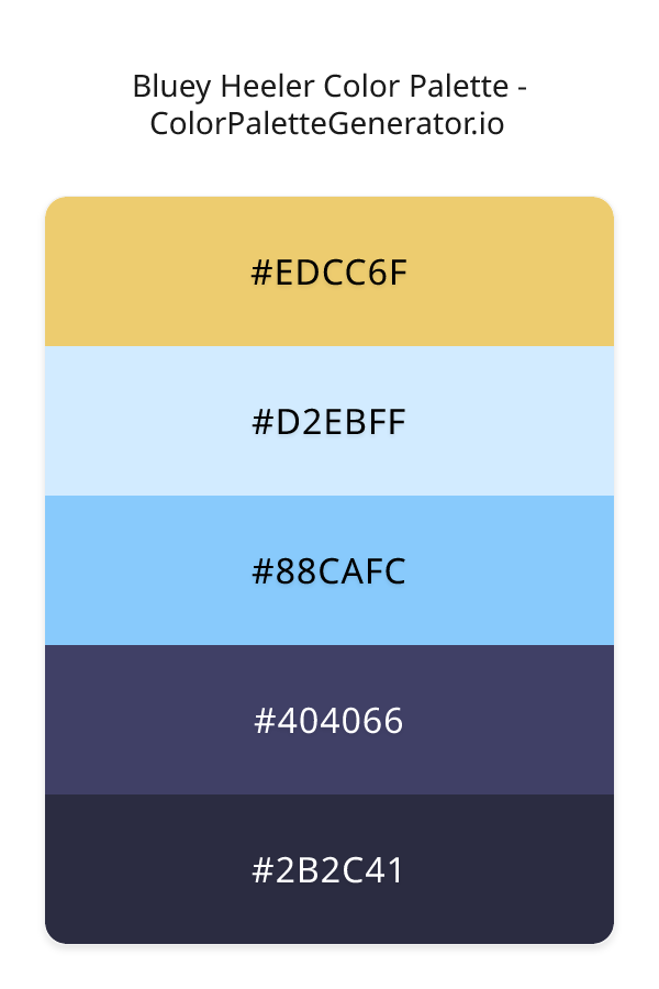
HEX: #EDCC6F
RGB: 237, 204, 111
HEX: #D2EBFF
RGB: 210, 235, 255
HEX: #88CAFC
RGB: 136, 202, 252
HEX: #404066
RGB: 64, 64, 102
HEX: #2B2C41
RGB: 43, 44, 65
Text on White/Black Backgrounds
Color Pair Combinations (10 total)
WCAG Contrast Standards:
- AAA (7:1): Enhanced contrast for maximum readability
- AA (4.5:1): Minimum for normal text (under 18pt)
- AA Large (3:1): Acceptable for large text (18pt+ or 14pt+ bold)
- Fail: Below WCAG standards, not recommended for text
Recommended Text Colors
Horizontal (Left to Right)
background: linear-gradient(to right, #EDCC6F 0%, #D2EBFF 25%, #88CAFC 50%, #404066 75%, #2B2C41 100%);Vertical (Top to Bottom)
background: linear-gradient(to bottom, #EDCC6F 0%, #D2EBFF 25%, #88CAFC 50%, #404066 75%, #2B2C41 100%);Diagonal (Top Left to Bottom Right)
background: linear-gradient(to bottom right, #EDCC6F 0%, #D2EBFF 25%, #88CAFC 50%, #404066 75%, #2B2C41 100%);Usage Tips:
- Copy the CSS code and paste directly into your stylesheets
- Linear gradients work great for backgrounds and hero sections
- Radial gradients are perfect for spotlights and focus effects
- Conic gradients create eye-catching loading spinners and progress indicators
- Smooth transitions ensure seamless color blending
Normal Vision
No color vision deficiency
Color Swatches
#EDCC6F
#D2EBFF
#88CAFC
#404066
#2B2C41
Full Palette View
How people with Normal Vision see it:
Overall Mood & Feel
Calm, professional, and trustworthy
Emotional Impact
Calming and contemplative, promoting feelings of trust, stability, and peace. The balanced lightness creates versatility across different contexts
Psychological Effect
This 5-color palette creates a calm, professional, and trustworthy. The combination works together to create memorable visual experiences that influence consumer perception, decision-making, and brand recall. The rich variety provides versatility while maintaining cohesive emotional messaging across touchpoints.
Brand Personality Traits
Perfect For These Industries
Target Audience
Business professionals and decision-makers seeking reliability and competence
Individual Color Psychology
#EDCC6F
Cheerful and inviting
Emotions Evoked
Personality Traits
Brand Traits
Ideal Industries
Marketing Use
Stimulates activity and socialization, creates a sense of fun and affordability. Excellent for CTAs, impulse purchases, and youth marketing.
Cultural Meanings
Color Harmony Analysis
Palette Mood
Temperature
This palette combines light & airy and balanced and dark & bold moods with warm and cool tones, making it versatile for various design applications.
Professional Implementation Guide
This complementary bluey heeler palette features 5 carefully selected cool tones that create a balanced and versatile aesthetic. With high contrast levels and vibrant saturation, this palette is optimized for web interfaces and mobile apps.
Web Design & Development
For web development, implement this palette with CSS variables for easy theme switching. The high contrast makes it ideal for accessible interfaces meeting WCAG AA standards.
- Apply the 60-30-10 rule for visual hierarchy
- Use accent colors for CTAs and hover states
- Maintain consistent color usage across all pages
- Test responsive behavior on multiple devices
Mobile App Interfaces
In mobile applications, these cool tones provide excellent battery efficiency on OLED screens. Use the strong color contrast to define clear touch targets.
- Design both light and dark mode variants
- Consider thumb-reach zones for color placement
- Test under direct sunlight and low light
- Use color to indicate interactive elements
Brand Identity Systems
Build a cohesive brand identity by designating specific colors for specific purposes. Establish your primary brand color from the most distinctive shade and create comprehensive brand guidelines specifying exact usage scenarios.
- Define primary, secondary, and accent colors
- Create usage rules for marketing materials
- Specify minimum sizes and clear space
- Document do's and don'ts for consistency
Frontend Development
Developers can integrate this palette efficiently using modern CSS techniques. Export as CSS variables for maximum flexibility, allowing theme switching and dynamic color updates without rewriting stylesheets.
- Use CSS custom properties for theming
- Implement semantic color naming conventions
- Create utility classes for rapid prototyping
- Consider CSS-in-JS for component-scoped colors
Print Design
For print materials, convert to CMYK using #EDCC6F as the dominant color for headers and #2B2C41 for accents. These vibrant colors may appear slightly muted in print; request color proofs.
- Add to your design software color library
- Create swatches for quick color access
- Use CMYK values for print production
- Request color proofs before final print
Marketing Campaigns
Marketing materials benefit from consistent color usage that reinforces brand recognition. Apply this palette across email campaigns, landing pages, advertisements, and social media for maximum impact and memorability.
- Maintain color consistency across channels
- A/B test color variations for conversion
- Consider cultural color associations
- Align colors with campaign messaging
Strategic Color Distribution
Professional designers follow the 60-30-10 rule for balanced color distribution. Here's how to apply this principle with the Bluey Heeler:
Dominant Color
#EDCC6FUse #EDCC6F as your primary color for backgrounds, main content areas. This orange tone should occupy about 60% of your design space.
Secondary Color
#88CAFCApply #88CAFC as your secondary color for supporting elements and section dividers. Allocate approximately 30% of your layout to this color.
Accent Color
#2B2C41Reserve #2B2C41 for accent elements like buttons, links, and important highlights. This blue accent should be used sparingly (10% of design) to draw attention to key actions.
Professional Best Practices
✓ Smart Usage Tips
- •Use desaturated versions (reduce saturation by 20-30%) for large background areas to prevent visual fatigue
- •Add warm accent colors to create focal points and prevent designs from feeling too cold
- •Test your palette across different devices and lighting conditions before finalizing
✗ Common Mistakes to Avoid
- •Don't use all colors equally—establish clear visual hierarchy through color weight
- •Avoid low-contrast text combinations that strain readability
- •Don't rely solely on color to convey meaning (use icons, text, and patterns too)
- •Avoid inconsistent color usage across different pages or screens
- •Don't assume screen colors match print output—always request physical proofs
Palette Overview & Statistics
5
Total Colors
4
Associated Tags
5
Categories
4454
Community Likes
Color Analysis & Technical Guide
Detailed breakdown of each color's role, characteristics, and optimal applications. This complementary palette creates a balanced and versatile aesthetic perfect for web interfaces and mobile apps.
Individual Color Breakdown
Each color in this cool palette has been analyzed for its properties and ideal usage scenarios. The high contrast and vibrant saturation ensure excellent readability and accessibility.
#EDCC6F
ORANGE
#EDCC6F serves as the primary/dominant color in this palette. This medium orange (highly saturated) brings creativity and enthusiasm Use it for headers, navigation bars, and brand elements.
Light toneH: 44°S: 78%L: 68%#D2EBFF
BLUE
#D2EBFF serves as the secondary/supporting color in this palette. This light blue (highly saturated) brings trust and tranquility Use it for cards, borders, section dividers, and supporting UI components.
Light toneH: 207°S: 100%L: 91%#88CAFC
BLUE
#88CAFC serves as the secondary/supporting color in this palette. This light blue (highly saturated) brings trust and tranquility Use it for cards, borders, section dividers, and supporting UI components.
Light toneH: 206°S: 95%L: 76%#404066
BLUE
#404066 serves as the secondary/supporting color in this palette. This medium blue (muted) brings professionalism and depth Use it for cards, borders, section dividers, and supporting UI components.
Dark toneH: 240°S: 23%L: 33%#2B2C41
BLUE
#2B2C41 serves as the accent/highlight color in this palette. This dark blue (muted) brings professionalism and depth Use it for call-to-action buttons, links, important notifications, and interactive elements.
Dark toneH: 237°S: 20%L: 21%
Palette Characteristics
This palette exhibits distinct characteristics that make it particularly suitable for specific design applications and industries.
Cool tones convey professionalism, trust, and calmness. Ideal for corporate and tech applications.
High contrast ensures excellent readability and meets WCAG accessibility standards for most text combinations.
Vibrant saturation creates bold, attention-grabbing designs perfect for youth brands and creative projects.
Balanced brightness provides flexibility for both light and dark design elements.
💡 Pro Tips for This Palette
- Perfect for: web interfaces, mobile apps. The complementary color relationship creates natural visual flow.
- Mood & Psychology: This palette evokes a balanced and versatile feeling, making it ideal for brands seeking to convey those qualities.
- Accessibility: Excellent contrast makes this palette naturally accessible. Most color combinations will meet WCAG AA standards.
- Extensions: Create tints (add white) and shades (add black) to expand this 5-color palette into a comprehensive design system.
- Cultural Context: Cool tones are generally perceived as professional worldwide but always research cultural color meanings.
Export Formats
Explore Bluey Heeler Palette
The Bluey Heeler color palette is a captivating combination of hues that evoke a sense of freedom and playfulness, reminiscent of a clear sky on a sunny day. This palette has the power to transport viewers to a world of endless possibilities, where creativity knows no bounds and imagination runs wild. At its core, the Bluey Heeler palette is a masterful blend of cool, bold, and modern elements, with a dash of whimsy that sets it apart from more subdued color schemes. The palette's foundation is built around a series of blue shades, including the soft, serene tone of D2EBFF, which provides a sense of calmness and serenity.
As we delve deeper into the palette, we find a range of colors that work together in perfect harmony. The warm, golden tone of EDCC6F adds a touch of vibrancy and energy, while the deeper, richer shade of 404066 provides a sense of balance and stability. The 88CAFC shade, with its gentle, sky-inspired hue, serves as a perfect bridge between the lighter and darker colors, creating a sense of continuity and flow. Meanwhile, the darkest shade, 2B2C41, adds depth and sophistication, grounding the palette and preventing it from feeling too airy or ephemeral. Each of these colors plays a vital role in the overall aesthetic of the Bluey Heeler palette, and together they create a visual language that is both modern and timeless.
The Bluey Heeler palette is incredibly versatile, making it an excellent choice for a wide range of design applications, from websites and apps to branding and marketing materials. Its bold, playful quality makes it particularly well-suited for projects that require a sense of fun and creativity, such as entertainment or lifestyle brands. At the same time, its cool, modern elements ensure that it remains sophisticated and professional, making it an excellent choice for corporate or tech-related projects. Whether you're designing a website, creating a logo, or developing a marketing campaign, the Bluey Heeler palette has the power to elevate your design and capture the attention of your target audience.
The colors in the Bluey Heeler palette also have a profound impact on viewer perception and behavior. The blue shades, particularly the lighter tones such as D2EBFF and 88CAFC, have a calming effect, while the deeper, richer shades like 404066 and 2B2C41 can create a sense of trust and authority. The warm, golden tone of EDCC6F, on the other hand, can evoke feelings of excitement and enthusiasm, making it an excellent choice for calls-to-action or promotional materials. By carefully balancing these colors, designers can create a visual narrative that engages and motivates their audience, driving conversions and building brand loyalty.
To get the most out of the Bluey Heeler palette, designers should consider pairing it with complementary colors that enhance its natural beauty. For example, the orange tone of EDCC6F can be paired with a deep, burnt orange shade to create a stunning contrast, while the blue shades can be combined with a crisp, white tone to create a clean and modern look. When working with the Bluey Heeler palette, it's also essential to consider the 60-30-10 rule, where the dominant color occupies 60 percent of the design, the secondary color occupies 30 percent, and the accent color occupies 10 percent. By following this guideline and experimenting with different color combinations, designers can unlock the full potential of the Bluey Heeler palette and create designs that are both visually stunning and emotionally resonant.
Palette Image
Below is the generated palette image showing all colors in a vertical layout. Perfect for sharing on social media or using as a reference.
Frequently Asked Questions
Everything you need to know about using and implementing the bluey heeler palette effectively in your projects.