Bright Colours Color Palette – HEX, RGB & Design Inspiration
Color Details
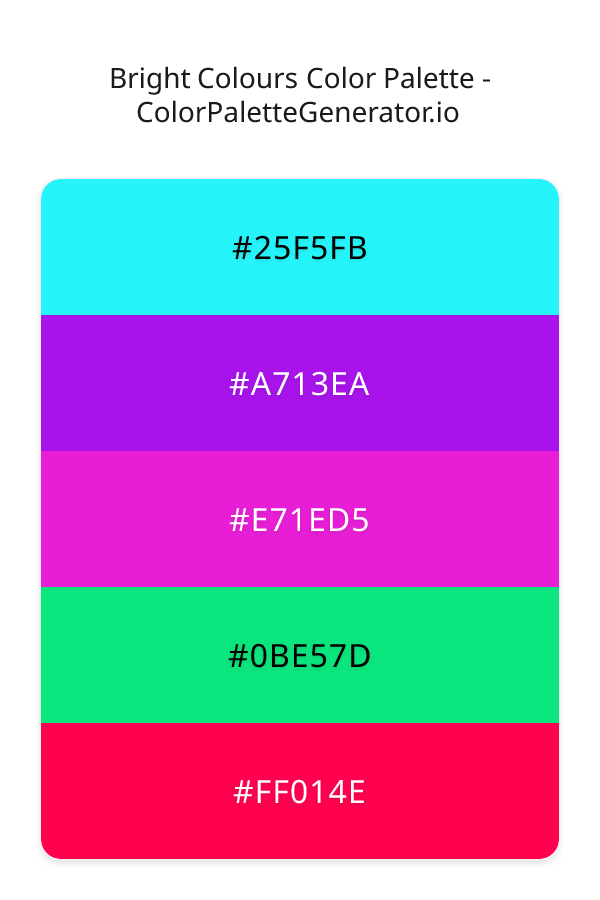
HEX: #25F5FB
RGB: 37, 245, 251
HEX: #A713EA
RGB: 167, 19, 234
HEX: #E71ED5
RGB: 231, 30, 213
HEX: #0BE57D
RGB: 11, 229, 125
HEX: #FF014E
RGB: 255, 1, 78
Text on White/Black Backgrounds
Color Pair Combinations (10 total)
WCAG Contrast Standards:
- AAA (7:1): Enhanced contrast for maximum readability
- AA (4.5:1): Minimum for normal text (under 18pt)
- AA Large (3:1): Acceptable for large text (18pt+ or 14pt+ bold)
- Fail: Below WCAG standards, not recommended for text
Recommended Text Colors
Horizontal (Left to Right)
background: linear-gradient(to right, #25F5FB 0%, #A713EA 25%, #E71ED5 50%, #0BE57D 75%, #FF014E 100%);Vertical (Top to Bottom)
background: linear-gradient(to bottom, #25F5FB 0%, #A713EA 25%, #E71ED5 50%, #0BE57D 75%, #FF014E 100%);Diagonal (Top Left to Bottom Right)
background: linear-gradient(to bottom right, #25F5FB 0%, #A713EA 25%, #E71ED5 50%, #0BE57D 75%, #FF014E 100%);Usage Tips:
- Copy the CSS code and paste directly into your stylesheets
- Linear gradients work great for backgrounds and hero sections
- Radial gradients are perfect for spotlights and focus effects
- Conic gradients create eye-catching loading spinners and progress indicators
- Smooth transitions ensure seamless color blending
Normal Vision
No color vision deficiency
Color Swatches
#25F5FB
#A713EA
#E71ED5
#0BE57D
#FF014E
Full Palette View
How people with Normal Vision see it:
Overall Mood & Feel
Balanced and versatile
Emotional Impact
Calming and contemplative, promoting feelings of trust, stability, and peace. The balanced lightness creates versatility across different contexts
Psychological Effect
This 5-color palette creates a balanced and versatile. The combination works together to create memorable visual experiences that influence consumer perception, decision-making, and brand recall. The rich variety provides versatility while maintaining cohesive emotional messaging across touchpoints.
Brand Personality Traits
Perfect For These Industries
Target Audience
Thoughtful consumers who value stability, trust, and quality
Individual Color Psychology
#25F5FB
Clear and refreshing
Emotions Evoked
Personality Traits
Brand Traits
Ideal Industries
Marketing Use
Evokes feelings of cleanliness and clarity. Popular in tech and healthcare for its association with precision and hygiene.
Cultural Meanings
Color Harmony Analysis
Palette Mood
Temperature
This palette combines balanced moods with cool and warm and neutral tones, making it versatile for various design applications.
Professional Implementation Guide
This complementary bright colours palette features 5 carefully selected balanced tones that create a balanced and versatile aesthetic. With low contrast levels and vibrant saturation, this palette is optimized for .
Web Design & Development
For web development, implement this palette with CSS variables for easy theme switching. Consider adding darker variants for better text readability.
- Apply the 60-30-10 rule for visual hierarchy
- Use accent colors for CTAs and hover states
- Maintain consistent color usage across all pages
- Test responsive behavior on multiple devices
Mobile App Interfaces
In mobile applications, these balanced tones provide excellent battery efficiency on OLED screens. Use the subtle color variations to define clear touch targets.
- Design both light and dark mode variants
- Consider thumb-reach zones for color placement
- Test under direct sunlight and low light
- Use color to indicate interactive elements
Brand Identity Systems
Build a cohesive brand identity by designating specific colors for specific purposes. Establish your primary brand color from the most distinctive shade and create comprehensive brand guidelines specifying exact usage scenarios.
- Define primary, secondary, and accent colors
- Create usage rules for marketing materials
- Specify minimum sizes and clear space
- Document do's and don'ts for consistency
Frontend Development
Developers can integrate this palette efficiently using modern CSS techniques. Export as CSS variables for maximum flexibility, allowing theme switching and dynamic color updates without rewriting stylesheets.
- Use CSS custom properties for theming
- Implement semantic color naming conventions
- Create utility classes for rapid prototyping
- Consider CSS-in-JS for component-scoped colors
Print Design
For print materials, convert to CMYK using #25F5FB as the dominant color for headers and #FF014E for accents. These vibrant colors may appear slightly muted in print; request color proofs.
- Add to your design software color library
- Create swatches for quick color access
- Use CMYK values for print production
- Request color proofs before final print
Marketing Campaigns
Marketing materials benefit from consistent color usage that reinforces brand recognition. Apply this palette across email campaigns, landing pages, advertisements, and social media for maximum impact and memorability.
- Maintain color consistency across channels
- A/B test color variations for conversion
- Consider cultural color associations
- Align colors with campaign messaging
Strategic Color Distribution
Professional designers follow the 60-30-10 rule for balanced color distribution. Here's how to apply this principle with the Bright Colours:
Dominant Color
#25F5FBUse #25F5FB as your primary color for backgrounds, main content areas. This cyan tone should occupy about 60% of your design space.
Secondary Color
#E71ED5Apply #E71ED5 as your secondary color for subtle backgrounds and card components. Allocate approximately 30% of your layout to this color.
Accent Color
#FF014EReserve #FF014E for accent elements like buttons, links, and important highlights. This pink accent should be used sparingly (10% of design) to draw attention to key actions.
Professional Best Practices
✓ Smart Usage Tips
- •Add white or black text overlays to improve readability on colored backgrounds
- •Use desaturated versions (reduce saturation by 20-30%) for large background areas to prevent visual fatigue
- •Test your palette across different devices and lighting conditions before finalizing
✗ Common Mistakes to Avoid
- •Don't use all colors equally—establish clear visual hierarchy through color weight
- •Avoid low-contrast text combinations that strain readability
- •Don't rely solely on color to convey meaning (use icons, text, and patterns too)
- •Avoid inconsistent color usage across different pages or screens
- •Don't assume screen colors match print output—always request physical proofs
Palette Overview & Statistics
5
Total Colors
5
Associated Tags
5
Categories
2028
Community Likes
Color Analysis & Technical Guide
Detailed breakdown of each color's role, characteristics, and optimal applications. This complementary palette creates a balanced and versatile aesthetic perfect for .
Individual Color Breakdown
Each color in this balanced palette has been analyzed for its properties and ideal usage scenarios. The low contrast and vibrant saturation ensure harmonious visual relationships.
#25F5FB
CYAN
#25F5FB serves as the primary/dominant color in this palette. This medium cyan (highly saturated) brings clarity and innovation Use it for headers, navigation bars, and brand elements.
Light toneH: 182°S: 96%L: 56%#A713EA
PURPLE
#A713EA serves as the secondary/supporting color in this palette. This medium purple (highly saturated) brings luxury and mystery Use it for cards, borders, section dividers, and supporting UI components.
Dark toneH: 281°S: 85%L: 50%#E71ED5
PINK
#E71ED5 serves as the secondary/supporting color in this palette. This medium pink (highly saturated) brings playfulness and compassion Use it for cards, borders, section dividers, and supporting UI components.
Light toneH: 305°S: 81%L: 51%#0BE57D
GREEN
#0BE57D serves as the secondary/supporting color in this palette. This medium green (highly saturated) brings stability and prosperity Use it for cards, borders, section dividers, and supporting UI components.
Dark toneH: 151°S: 91%L: 47%#FF014E
PINK
#FF014E serves as the accent/highlight color in this palette. This medium pink (highly saturated) brings playfulness and compassion Use it for call-to-action buttons, links, important notifications, and interactive elements.
Dark toneH: 342°S: 100%L: 50%
Palette Characteristics
This palette exhibits distinct characteristics that make it particularly suitable for specific design applications and industries.
Balanced temperature offers versatility across various design contexts and industries.
Low contrast creates subtle, sophisticated aesthetics but requires careful attention to text legibility.
Vibrant saturation creates bold, attention-grabbing designs perfect for youth brands and creative projects.
Balanced brightness provides flexibility for both light and dark design elements.
💡 Pro Tips for This Palette
- Perfect for: . The complementary color relationship creates natural visual flow.
- Mood & Psychology: This palette evokes a balanced and versatile feeling, making it ideal for brands seeking to convey those qualities.
- Accessibility: Test text combinations carefully with contrast checkers to ensure accessibility compliance.
- Extensions: Create tints (add white) and shades (add black) to expand this 5-color palette into a comprehensive design system.
- Cultural Context: Cool tones are generally perceived as professional worldwide but always research cultural color meanings.
Export Formats
Explore Bright Colours Palette
The Bright Colours palette is a dynamic and captivating collection of hues that is sure to evoke feelings of excitement and energy in all who experience it. This vibrant and bold colour scheme is perfect for designers looking to add a touch of modern flair to their work, and its feminine undertones make it an excellent choice for projects targeting a female audience. At the heart of this palette is a carefully curated selection of colours, each with its own unique personality and characteristics, from the soft, serene quality of cyan, as seen in the gentle glow of the 25F5FB shade, to the bold, attention-grabbing quality of the A713EA violet tone.
As we delve deeper into the Bright Colours palette, it becomes clear that each individual colour plays a vital role in the overall aesthetic. The 25F5FB shade, with its calming, aquatic undertones, provides a sense of balance and stability, while the A713EA tone, with its rich, velvety texture, adds a sense of luxury and sophistication. The E71ED5 magenta shade brings a touch of whimsy and playfulness to the palette, while the 0BE57D teal tone adds a sense of freshness and vitality. Meanwhile, the FF014E red shade provides a bold, eye-catching accent that draws the viewer's attention and adds a sense of urgency to the design. By combining these colours in a thoughtful and intentional way, designers can create a visual identity that is both modern and feminine, with a unique energy all its own.
The Bright Colours palette is incredibly versatile, and can be applied to a wide range of design projects, from websites and apps to branding and marketing materials. Its vibrant, energetic quality makes it an excellent choice for projects that require a sense of excitement and enthusiasm, such as a new product launch or a social media campaign. The palette's modern, feminine aesthetic also makes it a great fit for projects targeting a young, female audience, such as a fashion or beauty brand. Whether used in a bold, attention-grabbing way or in a more subtle, nuanced manner, the Bright Colours palette is sure to add a touch of personality and flair to any design project.
The colours in the Bright Colours palette also have a profound impact on the viewer's perception and behaviour, with each individual hue influencing the emotional and psychological response to the design. The cyan and teal tones, for example, are known to have a calming effect on the viewer, while the violet and magenta shades can add a sense of creativity and inspiration. The red shade, meanwhile, can stimulate the viewer's sense of excitement and energy, and can be used to draw attention to specific elements of the design. By carefully considering the psychological impact of each colour, designers can use the Bright Colours palette to create a visual identity that not only looks great, but also elicits a specific emotional response from the viewer.
For designers looking to get the most out of the Bright Colours palette, there are a few key tips and tricks to keep in mind. To add depth and contrast to the design, consider pairing the Bright Colours palette with a selection of complementary colours, such as neutral shades or earthy tones. The 25F5FB cyan shade, for example, pairs beautifully with a deep, rich brown, while the A713EA violet tone looks stunning when paired with a bright, sunny yellow. When combining the colours in the palette, be sure to balance bold, eye-catching shades like the FF014E red tone with more subdued, neutral hues, in order to create a sense of visual harmony and balance. By following these tips and tricks, designers can unlock the full potential of the Bright Colours palette, and create a visual identity that is both beautiful and effective.
Palette Image
Below is the generated palette image showing all colors in a vertical layout. Perfect for sharing on social media or using as a reference.
Frequently Asked Questions
Everything you need to know about using and implementing the bright colours palette effectively in your projects.