Bright Summer Color Palette – HEX, RGB & Design Inspiration
Color Details
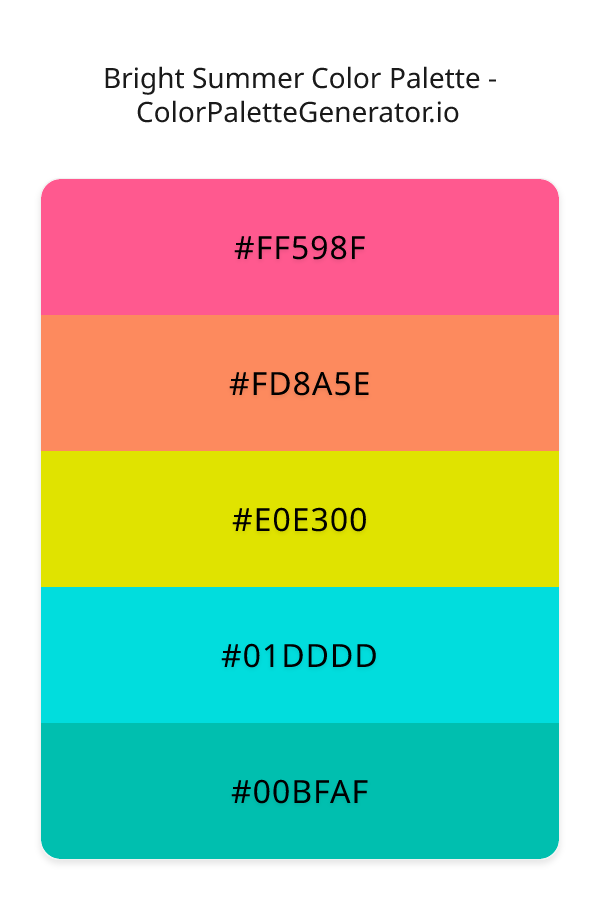
HEX: #FF598F
RGB: 255, 89, 143
HEX: #FD8A5E
RGB: 253, 138, 94
HEX: #E0E300
RGB: 224, 227, 0
HEX: #01DDDD
RGB: 1, 221, 221
HEX: #00BFAF
RGB: 0, 191, 175
Text on White/Black Backgrounds
Color Pair Combinations (10 total)
WCAG Contrast Standards:
- AAA (7:1): Enhanced contrast for maximum readability
- AA (4.5:1): Minimum for normal text (under 18pt)
- AA Large (3:1): Acceptable for large text (18pt+ or 14pt+ bold)
- Fail: Below WCAG standards, not recommended for text
Recommended Text Colors
Horizontal (Left to Right)
background: linear-gradient(to right, #FF598F 0%, #FD8A5E 25%, #E0E300 50%, #01DDDD 75%, #00BFAF 100%);Vertical (Top to Bottom)
background: linear-gradient(to bottom, #FF598F 0%, #FD8A5E 25%, #E0E300 50%, #01DDDD 75%, #00BFAF 100%);Diagonal (Top Left to Bottom Right)
background: linear-gradient(to bottom right, #FF598F 0%, #FD8A5E 25%, #E0E300 50%, #01DDDD 75%, #00BFAF 100%);Usage Tips:
- Copy the CSS code and paste directly into your stylesheets
- Linear gradients work great for backgrounds and hero sections
- Radial gradients are perfect for spotlights and focus effects
- Conic gradients create eye-catching loading spinners and progress indicators
- Smooth transitions ensure seamless color blending
Normal Vision
No color vision deficiency
Color Swatches
#FF598F
#FD8A5E
#E0E300
#01DDDD
#00BFAF
Full Palette View
How people with Normal Vision see it:
Overall Mood & Feel
Energetic, warm, and inviting
Emotional Impact
Stimulating and energetic, evoking feelings of excitement, warmth, and action. The balanced lightness creates versatility across different contexts
Psychological Effect
This 5-color palette creates a energetic, warm, and inviting. The combination works together to create memorable visual experiences that influence consumer perception, decision-making, and brand recall. The rich variety provides versatility while maintaining cohesive emotional messaging across touchpoints.
Brand Personality Traits
Perfect For These Industries
Target Audience
Active, outgoing individuals who respond to energy and enthusiasm
Individual Color Psychology
#FF598F
Playful and energetic
Emotions Evoked
Personality Traits
Brand Traits
Ideal Industries
Marketing Use
Appeals to feminine markets, evokes compassion and care. Used in healthcare and beauty. Hot pink captures attention and conveys energy and fun.
Cultural Meanings
Color Harmony Analysis
Palette Mood
Temperature
This palette combines balanced and light & airy moods with warm and neutral tones, making it versatile for various design applications.
Professional Implementation Guide
This complementary bright summer palette features 5 carefully selected warm tones that create a energetic and passionate aesthetic. With low contrast levels and vibrant saturation, this palette is optimized for marketing materials and youth brands.
Web Design & Development
For web development, implement this palette with CSS variables for easy theme switching. Consider adding darker variants for better text readability.
- Apply the 60-30-10 rule for visual hierarchy
- Use accent colors for CTAs and hover states
- Maintain consistent color usage across all pages
- Test responsive behavior on multiple devices
Mobile App Interfaces
In mobile applications, these warm tones provide excellent battery efficiency on OLED screens. Use the subtle color variations to define clear touch targets.
- Design both light and dark mode variants
- Consider thumb-reach zones for color placement
- Test under direct sunlight and low light
- Use color to indicate interactive elements
Brand Identity Systems
Build a cohesive brand identity by designating specific colors for specific purposes. Establish your primary brand color from the most distinctive shade and create comprehensive brand guidelines specifying exact usage scenarios.
- Define primary, secondary, and accent colors
- Create usage rules for marketing materials
- Specify minimum sizes and clear space
- Document do's and don'ts for consistency
Frontend Development
Developers can integrate this palette efficiently using modern CSS techniques. Export as CSS variables for maximum flexibility, allowing theme switching and dynamic color updates without rewriting stylesheets.
- Use CSS custom properties for theming
- Implement semantic color naming conventions
- Create utility classes for rapid prototyping
- Consider CSS-in-JS for component-scoped colors
Print Design
For print materials, convert to CMYK using #FF598F as the dominant color for headers and #00BFAF for accents. These vibrant colors may appear slightly muted in print; request color proofs.
- Add to your design software color library
- Create swatches for quick color access
- Use CMYK values for print production
- Request color proofs before final print
Marketing Campaigns
Marketing materials benefit from consistent color usage that reinforces brand recognition. Apply this palette across email campaigns, landing pages, advertisements, and social media for maximum impact and memorability.
- Maintain color consistency across channels
- A/B test color variations for conversion
- Consider cultural color associations
- Align colors with campaign messaging
Strategic Color Distribution
Professional designers follow the 60-30-10 rule for balanced color distribution. Here's how to apply this principle with the Bright Summer:
Dominant Color
#FF598FUse #FF598F as your primary color for backgrounds, main content areas. This pink tone should occupy about 60% of your design space.
Secondary Color
#E0E300Apply #E0E300 as your secondary color for subtle backgrounds and card components. Allocate approximately 30% of your layout to this color.
Accent Color
#00BFAFReserve #00BFAF for accent elements like buttons, links, and important highlights. This cyan accent should be used sparingly (10% of design) to draw attention to key actions.
Professional Best Practices
✓ Smart Usage Tips
- •Add white or black text overlays to improve readability on colored backgrounds
- •Use desaturated versions (reduce saturation by 20-30%) for large background areas to prevent visual fatigue
- •Balance warm tones with neutral whites or grays to create visual breathing room
- •Test your palette across different devices and lighting conditions before finalizing
✗ Common Mistakes to Avoid
- •Don't use all colors equally—establish clear visual hierarchy through color weight
- •Avoid low-contrast text combinations that strain readability
- •Don't rely solely on color to convey meaning (use icons, text, and patterns too)
- •Avoid inconsistent color usage across different pages or screens
- •Don't assume screen colors match print output—always request physical proofs
Palette Overview & Statistics
5
Total Colors
3
Associated Tags
4
Categories
4385
Community Likes
Color Analysis & Technical Guide
Detailed breakdown of each color's role, characteristics, and optimal applications. This complementary palette creates a energetic and passionate aesthetic perfect for marketing materials and youth brands.
Individual Color Breakdown
Each color in this warm palette has been analyzed for its properties and ideal usage scenarios. The low contrast and vibrant saturation ensure harmonious visual relationships.
#FF598F
PINK
#FF598F serves as the primary/dominant color in this palette. This medium pink (highly saturated) brings playfulness and compassion Use it for headers, navigation bars, and brand elements.
Light toneH: 340°S: 100%L: 67%#FD8A5E
ORANGE
#FD8A5E serves as the secondary/supporting color in this palette. This medium orange (highly saturated) brings creativity and enthusiasm Use it for cards, borders, section dividers, and supporting UI components.
Light toneH: 17°S: 98%L: 68%#E0E300
YELLOW
#E0E300 serves as the secondary/supporting color in this palette. This medium yellow (highly saturated) brings richness and prestige Use it for cards, borders, section dividers, and supporting UI components.
Dark toneH: 61°S: 100%L: 45%#01DDDD
CYAN
#01DDDD serves as the secondary/supporting color in this palette. This medium cyan (highly saturated) brings clarity and innovation Use it for cards, borders, section dividers, and supporting UI components.
Dark toneH: 180°S: 99%L: 44%#00BFAF
CYAN
#00BFAF serves as the accent/highlight color in this palette. This medium cyan (highly saturated) brings clarity and innovation Use it for call-to-action buttons, links, important notifications, and interactive elements.
Dark toneH: 175°S: 100%L: 37%
Palette Characteristics
This palette exhibits distinct characteristics that make it particularly suitable for specific design applications and industries.
Warm colors create energy, excitement, and approachability. Perfect for brands targeting emotional connection.
Low contrast creates subtle, sophisticated aesthetics but requires careful attention to text legibility.
Vibrant saturation creates bold, attention-grabbing designs perfect for youth brands and creative projects.
Balanced brightness provides flexibility for both light and dark design elements.
💡 Pro Tips for This Palette
- Perfect for: marketing materials, youth brands. The complementary color relationship creates natural visual flow.
- Mood & Psychology: This palette evokes a energetic and passionate feeling, making it ideal for brands seeking to convey those qualities.
- Accessibility: Test text combinations carefully with contrast checkers to ensure accessibility compliance.
- Extensions: Create tints (add white) and shades (add black) to expand this 5-color palette into a comprehensive design system.
- Cultural Context: Warm colors may have different meanings across cultures—verify associations with your target market.
Export Formats
Explore Bright Summer Palette
The Bright Summer color palette is an electrifying combination of vibrant hues that evoke the carefree spirit of a sun-kissed season, transporting viewers to a world of warmth and energy. This palette is an expert blend of contrasting colors, carefully crafted to create a visually stunning experience that is both bold and captivating. At its core, the Bright Summer palette is designed to evoke feelings of excitement, optimism, and joy, making it an ideal choice for designers seeking to inject a sense of dynamism into their projects.
Delving deeper into the palette, the first color, a gorgeous shade of pinkish red, fd8a5e, sets the tone for a lively and playful atmosphere, while the adjacent color, ff598f, adds a touch of sophistication and elegance to the mix. The introduction of e0e300, a radiant golden hue, brings a sense of luxury and warmth, perfectly balancing the cooler tones of the palette. The teal-inspired colors, 01dddd and 00bfaf, serve as a refreshing contrast, injecting a sense of calmness and serenity into the design. Each color plays a vital role in the overall harmony of the palette, working together in perfect unison to create a truly mesmerizing visual experience.
The Bright Summer palette is incredibly versatile, lending itself to a wide range of design applications, from websites and mobile apps to branding and marketing campaigns. Its modern and energetic vibe makes it an excellent choice for startups and forward-thinking companies looking to make a bold statement. Designers can use this palette to create eye-catching interfaces, logos, and graphics that are sure to capture the viewer's attention and leave a lasting impression. Whether used in its entirety or as a starting point for further experimentation, the Bright Summer palette is a valuable asset for any designer seeking to add a touch of vibrancy and excitement to their work.
The psychology behind the Bright Summer palette is equally fascinating, as each color has a profound impact on the viewer's perception and behavior. The combination of red and pinkish hues stimulates the viewer's emotions, evoking feelings of passion and energy, while the golden tone adds a sense of prestige and sophistication. The teal-inspired colors, on the other hand, promote a sense of calmness and trust, creating a sense of balance and harmony. By leveraging the psychological effects of these colors, designers can create a truly immersive experience that resonates with their target audience and leaves a lasting impression.
To get the most out of the Bright Summer palette, designers should consider pairing these colors with complementary hues to create striking contrasts and visual interest. For example, the pinkish red, fd8a5e, can be paired with a deep blue or purple to create a stunning visual effect. Additionally, designers should be mindful of the 60-30-10 rule, where the dominant color, in this case, the golden hue, e0e300, should occupy about 60 percent of the design, while the secondary color, 01dddd, should occupy about 30 percent, and the accent color, ff598f, should occupy the remaining 10 percent. By following these design best practices and experimenting with different combinations, designers can unlock the full potential of the Bright Summer palette and create truly breathtaking designs that captivate and inspire their audience.
Palette Image
Below is the generated palette image showing all colors in a vertical layout. Perfect for sharing on social media or using as a reference.
Frequently Asked Questions
Everything you need to know about using and implementing the bright summer palette effectively in your projects.