Brown And Black Color Palette – HEX, RGB & Design Inspiration
Color Details
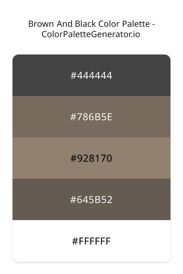
HEX: #444444
RGB: 68, 68, 68
HEX: #786B5E
RGB: 120, 107, 94
HEX: #928170
RGB: 146, 129, 112
HEX: #645B52
RGB: 100, 91, 82
HEX: #FFFFFF
RGB: 255, 255, 255
Text on White/Black Backgrounds
Color Pair Combinations (10 total)
WCAG Contrast Standards:
- AAA (7:1): Enhanced contrast for maximum readability
- AA (4.5:1): Minimum for normal text (under 18pt)
- AA Large (3:1): Acceptable for large text (18pt+ or 14pt+ bold)
- Fail: Below WCAG standards, not recommended for text
Recommended Text Colors
Horizontal (Left to Right)
background: linear-gradient(to right, #444444 0%, #786B5E 25%, #928170 50%, #645B52 75%, #FFFFFF 100%);Vertical (Top to Bottom)
background: linear-gradient(to bottom, #444444 0%, #786B5E 25%, #928170 50%, #645B52 75%, #FFFFFF 100%);Diagonal (Top Left to Bottom Right)
background: linear-gradient(to bottom right, #444444 0%, #786B5E 25%, #928170 50%, #645B52 75%, #FFFFFF 100%);Usage Tips:
- Copy the CSS code and paste directly into your stylesheets
- Linear gradients work great for backgrounds and hero sections
- Radial gradients are perfect for spotlights and focus effects
- Conic gradients create eye-catching loading spinners and progress indicators
- Smooth transitions ensure seamless color blending
Normal Vision
No color vision deficiency
Color Swatches
#444444
#786B5E
#928170
#645B52
#FFFFFF
Full Palette View
How people with Normal Vision see it:
Overall Mood & Feel
Energetic, warm, and inviting
Emotional Impact
Stimulating and energetic, evoking feelings of excitement, warmth, and action. The balanced lightness creates versatility across different contexts
Psychological Effect
This 5-color palette creates a energetic, warm, and inviting. It stimulates activity and engagement, increasing heart rate and mental alertness. The combination works together to create memorable visual experiences that influence consumer perception, decision-making, and brand recall. The rich variety provides versatility while maintaining cohesive emotional messaging across touchpoints.
Brand Personality Traits
Perfect For These Industries
Target Audience
Young, trend-conscious consumers (18-35) who value creativity and self-expression
Individual Color Psychology
#444444
Modern and professional
Emotions Evoked
Personality Traits
Brand Traits
Ideal Industries
Marketing Use
Provides balance and neutrality. Doesn't compete for attention. Professional and timeless. Can appear dull if not balanced with other colors.
Cultural Meanings
Color Harmony Analysis
Palette Mood
Temperature
This palette combines balanced and light & airy moods with neutral and warm tones, making it versatile for various design applications.
Professional Implementation Guide
This analogous brown and black palette features 5 carefully selected warm tones that create a balanced and versatile aesthetic. With high contrast levels and muted saturation, this palette is optimized for web interfaces and mobile apps.
Web Design & Development
For web development, implement this palette with CSS variables for easy theme switching. The high contrast makes it ideal for accessible interfaces meeting WCAG AA standards.
- Apply the 60-30-10 rule for visual hierarchy
- Use accent colors for CTAs and hover states
- Maintain consistent color usage across all pages
- Test responsive behavior on multiple devices
Mobile App Interfaces
In mobile applications, these warm tones provide excellent battery efficiency on OLED screens. Use the strong color contrast to define clear touch targets.
- Design both light and dark mode variants
- Consider thumb-reach zones for color placement
- Test under direct sunlight and low light
- Use color to indicate interactive elements
Brand Identity Systems
Build a cohesive brand identity by designating specific colors for specific purposes. Establish your primary brand color from the most distinctive shade and create comprehensive brand guidelines specifying exact usage scenarios.
- Define primary, secondary, and accent colors
- Create usage rules for marketing materials
- Specify minimum sizes and clear space
- Document do's and don'ts for consistency
Frontend Development
Developers can integrate this palette efficiently using modern CSS techniques. Export as CSS variables for maximum flexibility, allowing theme switching and dynamic color updates without rewriting stylesheets.
- Use CSS custom properties for theming
- Implement semantic color naming conventions
- Create utility classes for rapid prototyping
- Consider CSS-in-JS for component-scoped colors
Print Design
For print materials, convert to CMYK using #444444 as the dominant color for headers and #FFFFFF for accents. These colors translate well to print with minimal adjustment.
- Add to your design software color library
- Create swatches for quick color access
- Use CMYK values for print production
- Request color proofs before final print
Marketing Campaigns
Marketing materials benefit from consistent color usage that reinforces brand recognition. Apply this palette across email campaigns, landing pages, advertisements, and social media for maximum impact and memorability.
- Maintain color consistency across channels
- A/B test color variations for conversion
- Consider cultural color associations
- Align colors with campaign messaging
Strategic Color Distribution
Professional designers follow the 60-30-10 rule for balanced color distribution. Here's how to apply this principle with the Brown And Black:
Dominant Color
#444444Use #444444 as your primary color for backgrounds, main content areas. This gray tone should occupy about 60% of your design space.
Secondary Color
#928170Apply #928170 as your secondary color for supporting elements and section dividers. Allocate approximately 30% of your layout to this color.
Accent Color
#FFFFFFReserve #FFFFFF for accent elements like buttons, links, and important highlights. This white accent should be used sparingly (10% of design) to draw attention to key actions.
Professional Best Practices
✓ Smart Usage Tips
- •Balance warm tones with neutral whites or grays to create visual breathing room
- •Test your palette across different devices and lighting conditions before finalizing
✗ Common Mistakes to Avoid
- •Don't use all colors equally—establish clear visual hierarchy through color weight
- •Avoid low-contrast text combinations that strain readability
- •Don't rely solely on color to convey meaning (use icons, text, and patterns too)
- •Avoid inconsistent color usage across different pages or screens
- •Don't assume screen colors match print output—always request physical proofs
Palette Overview & Statistics
5
Total Colors
2
Associated Tags
6
Categories
1506
Community Likes
Color Analysis & Technical Guide
Detailed breakdown of each color's role, characteristics, and optimal applications. This analogous palette creates a balanced and versatile aesthetic perfect for web interfaces and mobile apps.
Individual Color Breakdown
Each color in this warm palette has been analyzed for its properties and ideal usage scenarios. The high contrast and muted saturation ensure excellent readability and accessibility.
#444444
GRAY
#444444 serves as the primary/dominant color in this palette. This dark gray (muted) brings neutrality and balance Use it for headers, navigation bars, and brand elements.
Dark toneH: 0°S: 0%L: 27%#786B5E
ORANGE
#786B5E serves as the secondary/supporting color in this palette. This medium orange (muted) brings creativity and enthusiasm Use it for cards, borders, section dividers, and supporting UI components.
Dark toneH: 30°S: 12%L: 42%#928170
ORANGE
#928170 serves as the secondary/supporting color in this palette. This medium orange (muted) brings creativity and enthusiasm Use it for cards, borders, section dividers, and supporting UI components.
Light toneH: 30°S: 13%L: 51%#645B52
ORANGE
#645B52 serves as the secondary/supporting color in this palette. This medium orange (muted) brings creativity and enthusiasm Use it for cards, borders, section dividers, and supporting UI components.
Dark toneH: 30°S: 10%L: 36%#FFFFFF
WHITE
#FFFFFF serves as the accent/highlight color in this palette. This light white (muted) brings cleanliness and simplicity Use it for call-to-action buttons, links, important notifications, and interactive elements.
Light toneH: 0°S: 0%L: 100%
Palette Characteristics
This palette exhibits distinct characteristics that make it particularly suitable for specific design applications and industries.
Warm colors create energy, excitement, and approachability. Perfect for brands targeting emotional connection.
High contrast ensures excellent readability and meets WCAG accessibility standards for most text combinations.
Muted saturation offers sophistication and reduces visual fatigue, ideal for content-heavy applications.
Balanced brightness provides flexibility for both light and dark design elements.
💡 Pro Tips for This Palette
- Perfect for: web interfaces, mobile apps. The analogous color relationship creates natural visual flow.
- Mood & Psychology: This palette evokes a balanced and versatile feeling, making it ideal for brands seeking to convey those qualities.
- Accessibility: Excellent contrast makes this palette naturally accessible. Most color combinations will meet WCAG AA standards.
- Extensions: Create tints (add white) and shades (add black) to expand this 5-color palette into a comprehensive design system.
- Cultural Context: Warm colors may have different meanings across cultures—verify associations with your target market.
Export Formats
Explore Brown And Black Palette
The Brown And Black color palette is a masterful blend of earthy tones that evoke a sense of warmth and coziness, while also exuding a sense of boldness and sophistication. At its core, this palette is all about creating a sense of balance and harmony, with a range of shades that work together in perfect unison to create a truly immersive visual experience. The palette's emotional impact is undeniable, with a deep sense of comfort and tranquility that draws the viewer in and refuses to let go. With its muted, monochromatic tones, this palette is perfect for designers looking to create a sense of calm and serenity, while also injecting a sense of excitement and energy into their designs.
As we delve deeper into the palette, we find a range of stunning shades that each bring their own unique character to the table. The 444444 shade is a deep, rich gray that provides a sense of stability and grounding, while the 786B5E shade adds a touch of warmth and earthiness to the mix. The 928170 shade is a beautiful, muted brown that brings a sense of depth and complexity to the palette, while the 645B52 shade is a slightly darker, cooler brown that adds a sense of balance and harmony. And then, of course, there is the FFFFFF shade, a crisp, clean white that adds a touch of contrast and visual interest to the design. Each of these shades works together in perfect harmony to create a truly stunning visual experience that is both calming and bold at the same time.
In terms of practical applications, the Brown And Black color palette is incredibly versatile and can be used in a wide range of design contexts. For example, it would be perfect for creating a warm and inviting website or app, particularly in the lifestyle or wellness space. It would also be great for branding and marketing materials, such as business cards, brochures, or social media graphics, where a sense of earthiness and approachability is key. And with its bold, muted tones, this palette would also be ideal for creating eye-catching packaging or advertising materials that really stand out from the crowd. Whether you're a designer, developer, or creative professional, this palette is sure to inspire and delight, with its unique blend of warm, earthy tones and bold, contrasting shades.
From a psychological perspective, the colors in the Brown And Black palette have a profound impact on the viewer's perception and behavior. The warm, earthy tones of the 786B5E and 928170 shades, for example, are known to evoke feelings of comfort and relaxation, while the deeper, cooler tones of the 645B52 shade can create a sense of balance and stability. The 444444 shade, meanwhile, is often associated with feelings of sophistication and elegance, while the FFFFFF shade adds a touch of clarity and precision to the design. And although pink and coral are not explicitly included in the palette, they can be used as accent colors to add a touch of playfulness and energy to the design. By carefully selecting and combining these colors, designers can create a truly immersive and engaging visual experience that resonates with their target audience on a deep and emotional level.
For designers looking to get the most out of the Brown And Black color palette, there are a few pro tips to keep in mind. First, consider pairing the palette with complementary colors like pink or coral to add a touch of contrast and visual interest to the design. You could also try experimenting with different shades and tints of the core colors, such as the 786B5E or 928170 shades, to create a unique and customized look that is all your own. And when it comes to design best practices, be sure to use the palette in a way that creates a sense of balance and harmony, with plenty of negative space and visual breathing room to let the colors really shine. By following these tips and embracing the unique character of the Brown And Black color palette, designers can create stunning, effective designs that truly capture the essence of this beautiful and inspiring color scheme.
Palette Image
Below is the generated palette image showing all colors in a vertical layout. Perfect for sharing on social media or using as a reference.
Categories & Tags
Frequently Asked Questions
Everything you need to know about using and implementing the brown and black palette effectively in your projects.