Calming Colors Color Palette – HEX, RGB & Design Inspiration
Color Details
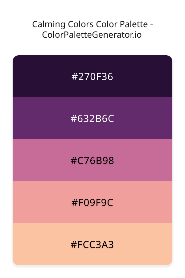
HEX: #270F36
RGB: 39, 15, 54
HEX: #632B6C
RGB: 99, 43, 108
HEX: #C76B98
RGB: 199, 107, 152
HEX: #F09F9C
RGB: 240, 159, 156
HEX: #FCC3A3
RGB: 252, 195, 163
Text on White/Black Backgrounds
Color Pair Combinations (10 total)
WCAG Contrast Standards:
- AAA (7:1): Enhanced contrast for maximum readability
- AA (4.5:1): Minimum for normal text (under 18pt)
- AA Large (3:1): Acceptable for large text (18pt+ or 14pt+ bold)
- Fail: Below WCAG standards, not recommended for text
Recommended Text Colors
Horizontal (Left to Right)
background: linear-gradient(to right, #270F36 0%, #632B6C 25%, #C76B98 50%, #F09F9C 75%, #FCC3A3 100%);Vertical (Top to Bottom)
background: linear-gradient(to bottom, #270F36 0%, #632B6C 25%, #C76B98 50%, #F09F9C 75%, #FCC3A3 100%);Diagonal (Top Left to Bottom Right)
background: linear-gradient(to bottom right, #270F36 0%, #632B6C 25%, #C76B98 50%, #F09F9C 75%, #FCC3A3 100%);Usage Tips:
- Copy the CSS code and paste directly into your stylesheets
- Linear gradients work great for backgrounds and hero sections
- Radial gradients are perfect for spotlights and focus effects
- Conic gradients create eye-catching loading spinners and progress indicators
- Smooth transitions ensure seamless color blending
Normal Vision
No color vision deficiency
Color Swatches
#270F36
#632B6C
#C76B98
#F09F9C
#FCC3A3
Full Palette View
How people with Normal Vision see it:
Overall Mood & Feel
Energetic, warm, and inviting
Emotional Impact
Stimulating and energetic, evoking feelings of excitement, warmth, and action. The balanced lightness creates versatility across different contexts
Psychological Effect
This 5-color palette creates a energetic, warm, and inviting. The combination works together to create memorable visual experiences that influence consumer perception, decision-making, and brand recall. The rich variety provides versatility while maintaining cohesive emotional messaging across touchpoints.
Brand Personality Traits
Perfect For These Industries
Target Audience
Active, outgoing individuals who respond to energy and enthusiasm
Individual Color Psychology
#270F36
Creative and mysterious
Emotions Evoked
Personality Traits
Brand Traits
Ideal Industries
Marketing Use
Evokes sophistication and luxury. Appeals to creative audiences. Used by premium brands to suggest quality and exclusivity. Rare in nature makes it feel special.
Cultural Meanings
Color Harmony Analysis
Palette Mood
Temperature
This palette combines dark & bold and balanced and light & airy moods with cool and warm tones, making it versatile for various design applications.
Professional Implementation Guide
This complementary calming colors palette features 5 carefully selected warm tones that create a energetic and passionate aesthetic. With high contrast levels and vibrant saturation, this palette is optimized for web interfaces and mobile apps.
Web Design & Development
For web development, implement this palette with CSS variables for easy theme switching. The high contrast makes it ideal for accessible interfaces meeting WCAG AA standards.
- Apply the 60-30-10 rule for visual hierarchy
- Use accent colors for CTAs and hover states
- Maintain consistent color usage across all pages
- Test responsive behavior on multiple devices
Mobile App Interfaces
In mobile applications, these warm tones provide excellent battery efficiency on OLED screens. Use the strong color contrast to define clear touch targets.
- Design both light and dark mode variants
- Consider thumb-reach zones for color placement
- Test under direct sunlight and low light
- Use color to indicate interactive elements
Brand Identity Systems
Build a cohesive brand identity by designating specific colors for specific purposes. Establish your primary brand color from the most distinctive shade and create comprehensive brand guidelines specifying exact usage scenarios.
- Define primary, secondary, and accent colors
- Create usage rules for marketing materials
- Specify minimum sizes and clear space
- Document do's and don'ts for consistency
Frontend Development
Developers can integrate this palette efficiently using modern CSS techniques. Export as CSS variables for maximum flexibility, allowing theme switching and dynamic color updates without rewriting stylesheets.
- Use CSS custom properties for theming
- Implement semantic color naming conventions
- Create utility classes for rapid prototyping
- Consider CSS-in-JS for component-scoped colors
Print Design
For print materials, convert to CMYK using #270F36 as the dominant color for headers and #FCC3A3 for accents. These vibrant colors may appear slightly muted in print; request color proofs.
- Add to your design software color library
- Create swatches for quick color access
- Use CMYK values for print production
- Request color proofs before final print
Marketing Campaigns
Marketing materials benefit from consistent color usage that reinforces brand recognition. Apply this palette across email campaigns, landing pages, advertisements, and social media for maximum impact and memorability.
- Maintain color consistency across channels
- A/B test color variations for conversion
- Consider cultural color associations
- Align colors with campaign messaging
Strategic Color Distribution
Professional designers follow the 60-30-10 rule for balanced color distribution. Here's how to apply this principle with the Calming Colors:
Dominant Color
#270F36Use #270F36 as your primary color for backgrounds, main content areas. This purple tone should occupy about 60% of your design space.
Secondary Color
#C76B98Apply #C76B98 as your secondary color for supporting elements and section dividers. Allocate approximately 30% of your layout to this color.
Accent Color
#FCC3A3Reserve #FCC3A3 for accent elements like buttons, links, and important highlights. This orange accent should be used sparingly (10% of design) to draw attention to key actions.
Professional Best Practices
✓ Smart Usage Tips
- •Use desaturated versions (reduce saturation by 20-30%) for large background areas to prevent visual fatigue
- •Balance warm tones with neutral whites or grays to create visual breathing room
- •Test your palette across different devices and lighting conditions before finalizing
✗ Common Mistakes to Avoid
- •Don't use all colors equally—establish clear visual hierarchy through color weight
- •Avoid low-contrast text combinations that strain readability
- •Don't rely solely on color to convey meaning (use icons, text, and patterns too)
- •Avoid inconsistent color usage across different pages or screens
- •Don't assume screen colors match print output—always request physical proofs
Palette Overview & Statistics
5
Total Colors
4
Associated Tags
5
Categories
3585
Community Likes
Color Analysis & Technical Guide
Detailed breakdown of each color's role, characteristics, and optimal applications. This complementary palette creates a energetic and passionate aesthetic perfect for web interfaces and mobile apps.
Individual Color Breakdown
Each color in this warm palette has been analyzed for its properties and ideal usage scenarios. The high contrast and vibrant saturation ensure excellent readability and accessibility.
#270F36
PURPLE
#270F36 serves as the primary/dominant color in this palette. This dark purple (moderately saturated) brings luxury and mystery Use it for headers, navigation bars, and brand elements.
Dark toneH: 277°S: 57%L: 14%#632B6C
PINK
#632B6C serves as the secondary/supporting color in this palette. This medium pink (moderately saturated) brings playfulness and compassion Use it for cards, borders, section dividers, and supporting UI components.
Dark toneH: 292°S: 43%L: 30%#C76B98
PINK
#C76B98 serves as the secondary/supporting color in this palette. This medium pink (moderately saturated) brings playfulness and compassion Use it for cards, borders, section dividers, and supporting UI components.
Light toneH: 331°S: 45%L: 60%#F09F9C
RED
#F09F9C serves as the secondary/supporting color in this palette. This light red (highly saturated) brings energy and warmth Use it for cards, borders, section dividers, and supporting UI components.
Light toneH: 2°S: 74%L: 78%#FCC3A3
ORANGE
#FCC3A3 serves as the accent/highlight color in this palette. This light orange (highly saturated) brings creativity and enthusiasm Use it for call-to-action buttons, links, important notifications, and interactive elements.
Light toneH: 22°S: 94%L: 81%
Palette Characteristics
This palette exhibits distinct characteristics that make it particularly suitable for specific design applications and industries.
Warm colors create energy, excitement, and approachability. Perfect for brands targeting emotional connection.
High contrast ensures excellent readability and meets WCAG accessibility standards for most text combinations.
Vibrant saturation creates bold, attention-grabbing designs perfect for youth brands and creative projects.
Balanced brightness provides flexibility for both light and dark design elements.
💡 Pro Tips for This Palette
- Perfect for: web interfaces, mobile apps, marketing materials, youth brands. The complementary color relationship creates natural visual flow.
- Mood & Psychology: This palette evokes a energetic and passionate feeling, making it ideal for brands seeking to convey those qualities.
- Accessibility: Excellent contrast makes this palette naturally accessible. Most color combinations will meet WCAG AA standards.
- Extensions: Create tints (add white) and shades (add black) to expand this 5-color palette into a comprehensive design system.
- Cultural Context: Warm colors may have different meanings across cultures—verify associations with your target market.
Export Formats
Explore Calming Colors Palette
The Calming Colors palette is a masterful blend of hues that evoke a sense of serenity and tranquility, while also exuding a bold and playful personality, making it an ideal choice for designers seeking to create a visually striking and emotionally resonant experience. At its core, this palette is about balance and harmony, bringing together a range of colors that work in perfect concert to create a sense of equilibrium and calm. The palette's deepest, richest shade, 270F36, is a dark, velvety indigo that provides a dramatic backdrop for the other colors to shine, its mysterious and alluring quality drawing the viewer in and setting the tone for the rest of the palette.
As we delve deeper into the palette, we find 632B6C, a sumptuous, plum-like purple that adds a sense of luxury and sophistication, its slightly blue undertones giving it a sense of coolness and restraint, while 270F36 provides a sense of depth and complexity. This is followed by C76B98, a soft, blush-like coral that injects a touch of warmth and femininity into the palette, its gentle, soothing quality making it perfect for designs that require a sense of approachability and friendliness. The palette's two lightest shades, F09F9C and FCC3A3, are a vibrant, juicy coral and a soft, creamy peach, respectively, and they work together to create a sense of energy and playfulness, their bright, cheerful quality making them perfect for designs that require a sense of fun and spontaneity.
The Calming Colors palette is incredibly versatile, making it suitable for a wide range of design applications, from websites and apps to branding and marketing materials. Its bold, modern aesthetic makes it perfect for designs that require a sense of edginess and sophistication, while its feminine, elegant qualities make it ideal for designs that require a sense of refinement and poise. Whether you're creating a website for a fashion brand, a mobile app for a wellness company, or a marketing campaign for a luxury product, this palette has the range and flexibility to meet your needs, and its unique blend of red, indigo, purple, and coral hues makes it perfect for designs that require a sense of warmth, energy, and creativity.
The colors in the Calming Colors palette have a profound impact on viewer perception and behavior, with each shade working to evoke a specific emotional response. The dark indigo of 270F36 creates a sense of trust and stability, while the plum-like purple of 632B6C adds a sense of creativity and wisdom. The soft coral of C76B98 injects a sense of playfulness and approachability, while the vibrant coral of F09F9C and the creamy peach of FCC3A3 work together to create a sense of energy and excitement. By using these colors in your design, you can create a powerful emotional connection with your audience, and guide them towards a specific action or outcome, whether that's making a purchase, signing up for a service, or simply engaging with your brand.
To get the most out of the Calming Colors palette, it's essential to consider the principles of color harmony and contrast, and to think carefully about how each shade will work together to create a cohesive visual identity. One approach is to use the palette's deepest, richest shades as a background, and then overlay the lighter, brighter shades on top, creating a sense of depth and visual interest. You can also experiment with pairing the palette's colors with complementary shades, such as a bright, zesty yellow or a deep, rich green, to create a sense of tension and contrast. By following these principles, and using the Calming Colors palette in a thoughtful and intentional way, you can create designs that are not only visually stunning, but also emotionally resonant and highly effective.
Palette Image
Below is the generated palette image showing all colors in a vertical layout. Perfect for sharing on social media or using as a reference.
Categories & Tags
Frequently Asked Questions
Everything you need to know about using and implementing the calming colors palette effectively in your projects.