Cobalt Blue Palette I Color Palette – HEX, RGB & Design Inspiration
Color Details
HEX: #6690CC
RGB: 102, 144, 204
HEX: #4C7EC4
RGB: 76, 126, 196
HEX: #326BBB
RGB: 50, 107, 187
HEX: #1959B3
RGB: 25, 89, 179
HEX: #0047AB
RGB: 0, 71, 171
Text on White/Black Backgrounds
Color Pair Combinations (10 total)
WCAG Contrast Standards:
- AAA (7:1): Enhanced contrast for maximum readability
- AA (4.5:1): Minimum for normal text (under 18pt)
- AA Large (3:1): Acceptable for large text (18pt+ or 14pt+ bold)
- Fail: Below WCAG standards, not recommended for text
Recommended Text Colors
Horizontal (Left to Right)
background: linear-gradient(to right, #6690CC 0%, #4C7EC4 25%, #326BBB 50%, #1959B3 75%, #0047AB 100%);Vertical (Top to Bottom)
background: linear-gradient(to bottom, #6690CC 0%, #4C7EC4 25%, #326BBB 50%, #1959B3 75%, #0047AB 100%);Diagonal (Top Left to Bottom Right)
background: linear-gradient(to bottom right, #6690CC 0%, #4C7EC4 25%, #326BBB 50%, #1959B3 75%, #0047AB 100%);Usage Tips:
- Copy the CSS code and paste directly into your stylesheets
- Linear gradients work great for backgrounds and hero sections
- Radial gradients are perfect for spotlights and focus effects
- Conic gradients create eye-catching loading spinners and progress indicators
- Smooth transitions ensure seamless color blending
Normal Vision
No color vision deficiency
Color Swatches
#6690CC
#4C7EC4
#326BBB
#1959B3
#0047AB
Full Palette View
How people with Normal Vision see it:
Overall Mood & Feel
Calm, professional, and trustworthy
Emotional Impact
Calming and contemplative, promoting feelings of trust, stability, and peace. The balanced lightness creates versatility across different contexts
Psychological Effect
This 5-color palette creates a calm, professional, and trustworthy. The combination works together to create memorable visual experiences that influence consumer perception, decision-making, and brand recall. The rich variety provides versatility while maintaining cohesive emotional messaging across touchpoints.
Brand Personality Traits
Perfect For These Industries
Target Audience
Business professionals and decision-makers seeking reliability and competence
Individual Color Psychology
#6690CC
Trustworthy and stable
Emotions Evoked
Personality Traits
Brand Traits
Ideal Industries
Marketing Use
Most popular color globally. Builds trust and reduces stress. Ideal for corporate brands, financial services, and healthcare. Can suppress appetite.
Cultural Meanings
Color Harmony Analysis
Palette Mood
Temperature
This palette combines balanced moods with cool tones, making it versatile for various design applications.
Professional Implementation Guide
This monochromatic cobalt blue palette i palette features 5 carefully selected cool tones that create a balanced and versatile aesthetic. With low contrast levels and vibrant saturation, this palette is optimized for .
Web Design & Development
For web development, implement this palette with CSS variables for easy theme switching. Consider adding darker variants for better text readability.
- Apply the 60-30-10 rule for visual hierarchy
- Use accent colors for CTAs and hover states
- Maintain consistent color usage across all pages
- Test responsive behavior on multiple devices
Mobile App Interfaces
In mobile applications, these cool tones provide excellent battery efficiency on OLED screens. Use the subtle color variations to define clear touch targets.
- Design both light and dark mode variants
- Consider thumb-reach zones for color placement
- Test under direct sunlight and low light
- Use color to indicate interactive elements
Brand Identity Systems
Build a cohesive brand identity by designating specific colors for specific purposes. Establish your primary brand color from the most distinctive shade and create comprehensive brand guidelines specifying exact usage scenarios.
- Define primary, secondary, and accent colors
- Create usage rules for marketing materials
- Specify minimum sizes and clear space
- Document do's and don'ts for consistency
Frontend Development
Developers can integrate this palette efficiently using modern CSS techniques. Export as CSS variables for maximum flexibility, allowing theme switching and dynamic color updates without rewriting stylesheets.
- Use CSS custom properties for theming
- Implement semantic color naming conventions
- Create utility classes for rapid prototyping
- Consider CSS-in-JS for component-scoped colors
Print Design
For print materials, convert to CMYK using #6690CC as the dominant color for headers and #0047AB for accents. These vibrant colors may appear slightly muted in print; request color proofs.
- Add to your design software color library
- Create swatches for quick color access
- Use CMYK values for print production
- Request color proofs before final print
Marketing Campaigns
Marketing materials benefit from consistent color usage that reinforces brand recognition. Apply this palette across email campaigns, landing pages, advertisements, and social media for maximum impact and memorability.
- Maintain color consistency across channels
- A/B test color variations for conversion
- Consider cultural color associations
- Align colors with campaign messaging
Strategic Color Distribution
Professional designers follow the 60-30-10 rule for balanced color distribution. Here's how to apply this principle with the Cobalt Blue Palette I:
Dominant Color
#6690CCUse #6690CC as your primary color for backgrounds, main content areas. This blue tone should occupy about 60% of your design space.
Secondary Color
#326BBBApply #326BBB as your secondary color for subtle backgrounds and card components. Allocate approximately 30% of your layout to this color.
Accent Color
#0047ABReserve #0047AB for accent elements like buttons, links, and important highlights. This blue accent should be used sparingly (10% of design) to draw attention to key actions.
Professional Best Practices
✓ Smart Usage Tips
- •Add white or black text overlays to improve readability on colored backgrounds
- •Use desaturated versions (reduce saturation by 20-30%) for large background areas to prevent visual fatigue
- •Add warm accent colors to create focal points and prevent designs from feeling too cold
- •Test your palette across different devices and lighting conditions before finalizing
✗ Common Mistakes to Avoid
- •Don't use all colors equally—establish clear visual hierarchy through color weight
- •Avoid low-contrast text combinations that strain readability
- •Don't rely solely on color to convey meaning (use icons, text, and patterns too)
- •Avoid inconsistent color usage across different pages or screens
- •Don't assume screen colors match print output—always request physical proofs
Palette Overview & Statistics
5
Total Colors
1
Associated Tags
6
Categories
1463
Community Likes
Color Analysis & Technical Guide
Detailed breakdown of each color's role, characteristics, and optimal applications. This monochromatic palette creates a balanced and versatile aesthetic perfect for .
Individual Color Breakdown
Each color in this cool palette has been analyzed for its properties and ideal usage scenarios. The low contrast and vibrant saturation ensure harmonious visual relationships.
#6690CC
BLUE
#6690CC serves as the primary/dominant color in this palette. This medium blue (moderately saturated) brings trust and tranquility Use it for headers, navigation bars, and brand elements.
Light toneH: 215°S: 50%L: 60%#4C7EC4
BLUE
#4C7EC4 serves as the secondary/supporting color in this palette. This medium blue (moderately saturated) brings trust and tranquility Use it for cards, borders, section dividers, and supporting UI components.
Light toneH: 215°S: 50%L: 53%#326BBB
BLUE
#326BBB serves as the secondary/supporting color in this palette. This medium blue (moderately saturated) brings professionalism and depth Use it for cards, borders, section dividers, and supporting UI components.
Dark toneH: 215°S: 58%L: 46%#1959B3
BLUE
#1959B3 serves as the secondary/supporting color in this palette. This medium blue (highly saturated) brings professionalism and depth Use it for cards, borders, section dividers, and supporting UI components.
Dark toneH: 215°S: 75%L: 40%#0047AB
BLUE
#0047AB serves as the accent/highlight color in this palette. This medium blue (highly saturated) brings professionalism and depth Use it for call-to-action buttons, links, important notifications, and interactive elements.
Dark toneH: 215°S: 100%L: 34%
Palette Characteristics
This palette exhibits distinct characteristics that make it particularly suitable for specific design applications and industries.
Cool tones convey professionalism, trust, and calmness. Ideal for corporate and tech applications.
Low contrast creates subtle, sophisticated aesthetics but requires careful attention to text legibility.
Vibrant saturation creates bold, attention-grabbing designs perfect for youth brands and creative projects.
Balanced brightness provides flexibility for both light and dark design elements.
💡 Pro Tips for This Palette
- Perfect for: . The monochromatic color relationship creates natural visual flow.
- Mood & Psychology: This palette evokes a balanced and versatile feeling, making it ideal for brands seeking to convey those qualities.
- Accessibility: Test text combinations carefully with contrast checkers to ensure accessibility compliance.
- Extensions: Create tints (add white) and shades (add black) to expand this 5-color palette into a comprehensive design system.
- Cultural Context: Cool tones are generally perceived as professional worldwide but always research cultural color meanings.
Export Formats
Explore Cobalt Blue Palette I Palette
The Cobalt Blue Palette I is a mesmerizing collection of hues that evokes a sense of serenity and professionalism, perfect for designers seeking to create a cohesive visual identity for their clients. At the heart of this palette lies a range of blues, from the soft, gentle tone of 6690CC, which sets the tone for a soothing and calming atmosphere, to the deeper, richer shades that add depth and complexity to the overall design. This carefully crafted palette is designed to create a sense of balance and harmony, making it an ideal choice for a wide range of applications, from corporate branding to tech startups.
As we delve deeper into the palette, we find that each shade plays a unique role in creating a cohesive visual narrative. The 6690CC serves as a versatile background color, providing a subtle base that allows other design elements to take center stage. In contrast, the 4C7EC4 adds a touch of sophistication and elegance, with its slightly darker and more muted tone, making it perfect for accents and highlights. The 326BBB introduces a sense of warmth and nuance, while the 1959B3 and 0047AB provide a dramatic and intense contrast, drawing the viewer's attention to key design elements. By combining these shades in a thoughtful and intentional way, designers can create a rich and engaging visual experience that resonates with their audience.
The Cobalt Blue Palette I is incredibly versatile, lending itself to a wide range of applications, from website design and mobile apps to branding and marketing materials. Its cool, calming tones make it an ideal choice for corporate and tech industries, where a professional and sophisticated image is essential. Designers can use this palette to create a consistent visual identity across all touchpoints, from business cards and letterheads to social media and advertising campaigns. By using the 6690CC as a primary color, and accenting with the deeper blues, such as 1959B3 and 0047AB, designers can create a cohesive and recognizable brand that stands out in a crowded market.
The psychology behind the Cobalt Blue Palette I is rooted in the emotional and psychological impact of the color blue, which is often associated with trust, loyalty, and wisdom. By using this palette, designers can create a sense of confidence and stability, which is essential for building trust with their audience. The cool, calming tones can also help to reduce stress and anxiety, creating a sense of serenity and calm. Furthermore, the palette's professional and sophisticated tone can help to convey a sense of expertise and authority, making it an ideal choice for industries where credibility and trust are paramount.
To get the most out of the Cobalt Blue Palette I, designers can experiment with complementary colors, such as oranges and yellows, to create a striking contrast and add visual interest to their designs. Pairing the 6690CC with a warm beige or neutral tone can also help to create a sense of balance and harmony, while accenting with the deeper blues, such as 0047AB, can add a touch of drama and sophistication. By following design best practices, such as using a clear hierarchy of colors and typography, and carefully considering the palette's emotional and psychological impact, designers can unlock the full potential of the Cobalt Blue Palette I and create designs that truly resonate with their audience.
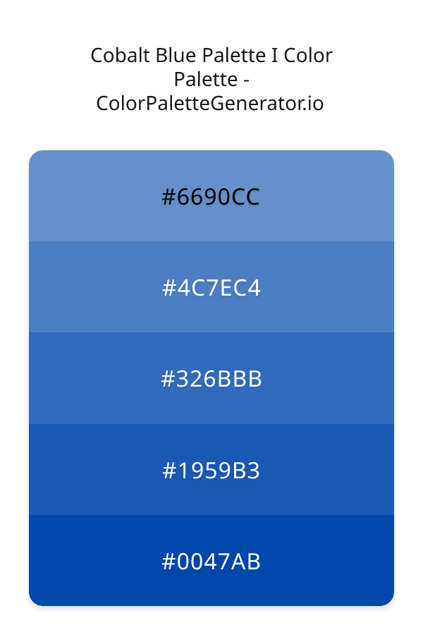
Palette Image
Below is the generated palette image showing all colors in a vertical layout. Perfect for sharing on social media or using as a reference.
Categories & Tags
Tags
Frequently Asked Questions
Everything you need to know about using and implementing the cobalt blue palette i palette effectively in your projects.