Cool Grey Lite Color Palette – HEX, RGB & Design Inspiration
Color Details
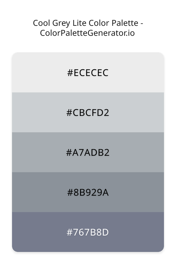
HEX: #ECECEC
RGB: 236, 236, 236
HEX: #CBCFD2
RGB: 203, 207, 210
HEX: #A7ADB2
RGB: 167, 173, 178
HEX: #8B929A
RGB: 139, 146, 154
HEX: #767B8D
RGB: 118, 123, 141
Text on White/Black Backgrounds
Color Pair Combinations (10 total)
WCAG Contrast Standards:
- AAA (7:1): Enhanced contrast for maximum readability
- AA (4.5:1): Minimum for normal text (under 18pt)
- AA Large (3:1): Acceptable for large text (18pt+ or 14pt+ bold)
- Fail: Below WCAG standards, not recommended for text
Recommended Text Colors
Horizontal (Left to Right)
background: linear-gradient(to right, #ECECEC 0%, #CBCFD2 25%, #A7ADB2 50%, #8B929A 75%, #767B8D 100%);Vertical (Top to Bottom)
background: linear-gradient(to bottom, #ECECEC 0%, #CBCFD2 25%, #A7ADB2 50%, #8B929A 75%, #767B8D 100%);Diagonal (Top Left to Bottom Right)
background: linear-gradient(to bottom right, #ECECEC 0%, #CBCFD2 25%, #A7ADB2 50%, #8B929A 75%, #767B8D 100%);Usage Tips:
- Copy the CSS code and paste directly into your stylesheets
- Linear gradients work great for backgrounds and hero sections
- Radial gradients are perfect for spotlights and focus effects
- Conic gradients create eye-catching loading spinners and progress indicators
- Smooth transitions ensure seamless color blending
Normal Vision
No color vision deficiency
Color Swatches
#ECECEC
#CBCFD2
#A7ADB2
#8B929A
#767B8D
Full Palette View
How people with Normal Vision see it:
Overall Mood & Feel
Calm, professional, and trustworthy, with an airy and optimistic feel
Emotional Impact
Calming and contemplative, promoting feelings of trust, stability, and peace. The light tones create an uplifting, optimistic atmosphere perfect for approachable brands
Psychological Effect
This 5-color palette creates a calm, professional, and trustworthy, with an airy and optimistic feel. The combination works together to create memorable visual experiences that influence consumer perception, decision-making, and brand recall. The rich variety provides versatility while maintaining cohesive emotional messaging across touchpoints.
Brand Personality Traits
Perfect For These Industries
Target Audience
Affluent consumers seeking premium, high-quality products and experiences. Appeals to those seeking approachable, positive, and optimistic brands
Individual Color Psychology
#ECECEC
Clean and minimal
Emotions Evoked
Personality Traits
Brand Traits
Ideal Industries
Marketing Use
Creates sense of space and simplicity. Used in minimalist designs, medical fields, and luxury brands. Provides contrast and breathing room.
Cultural Meanings
Color Harmony Analysis
Palette Mood
Temperature
This palette combines light & airy and balanced moods with neutral and cool tones, making it versatile for various design applications.
Professional Implementation Guide
This complementary cool grey lite palette features 5 carefully selected cool tones that create a calm and professional aesthetic. With medium contrast levels and muted saturation, this palette is optimized for corporate branding and business websites.
Web Design & Development
For web development, implement this palette with CSS variables for easy theme switching. Consider adding darker variants for better text readability.
- Apply the 60-30-10 rule for visual hierarchy
- Use accent colors for CTAs and hover states
- Maintain consistent color usage across all pages
- Test responsive behavior on multiple devices
Mobile App Interfaces
In mobile applications, these cool tones provide excellent battery efficiency on OLED screens. Use the subtle color variations to define clear touch targets.
- Design both light and dark mode variants
- Consider thumb-reach zones for color placement
- Test under direct sunlight and low light
- Use color to indicate interactive elements
Brand Identity Systems
Build a cohesive brand identity by designating specific colors for specific purposes. Establish your primary brand color from the most distinctive shade and create comprehensive brand guidelines specifying exact usage scenarios.
- Define primary, secondary, and accent colors
- Create usage rules for marketing materials
- Specify minimum sizes and clear space
- Document do's and don'ts for consistency
Frontend Development
Developers can integrate this palette efficiently using modern CSS techniques. Export as CSS variables for maximum flexibility, allowing theme switching and dynamic color updates without rewriting stylesheets.
- Use CSS custom properties for theming
- Implement semantic color naming conventions
- Create utility classes for rapid prototyping
- Consider CSS-in-JS for component-scoped colors
Print Design
For print materials, convert to CMYK using #ECECEC as the dominant color for headers and #767B8D for accents. These colors translate well to print with minimal adjustment.
- Add to your design software color library
- Create swatches for quick color access
- Use CMYK values for print production
- Request color proofs before final print
Marketing Campaigns
Marketing materials benefit from consistent color usage that reinforces brand recognition. Apply this palette across email campaigns, landing pages, advertisements, and social media for maximum impact and memorability.
- Maintain color consistency across channels
- A/B test color variations for conversion
- Consider cultural color associations
- Align colors with campaign messaging
Strategic Color Distribution
Professional designers follow the 60-30-10 rule for balanced color distribution. Here's how to apply this principle with the Cool Grey Lite:
Dominant Color
#ECECECUse #ECECEC as your primary color for backgrounds, main content areas. This white tone should occupy about 60% of your design space.
Secondary Color
#A7ADB2Apply #A7ADB2 as your secondary color for subtle backgrounds and card components. Allocate approximately 30% of your layout to this color.
Accent Color
#767B8DReserve #767B8D for accent elements like buttons, links, and important highlights. This gray accent should be used sparingly (10% of design) to draw attention to key actions.
Professional Best Practices
✓ Smart Usage Tips
- •Add warm accent colors to create focal points and prevent designs from feeling too cold
- •Test your palette across different devices and lighting conditions before finalizing
✗ Common Mistakes to Avoid
- •Don't use all colors equally—establish clear visual hierarchy through color weight
- •Avoid low-contrast text combinations that strain readability
- •Don't rely solely on color to convey meaning (use icons, text, and patterns too)
- •Avoid inconsistent color usage across different pages or screens
- •Don't assume screen colors match print output—always request physical proofs
Palette Overview & Statistics
5
Total Colors
3
Associated Tags
6
Categories
397
Community Likes
Color Analysis & Technical Guide
Detailed breakdown of each color's role, characteristics, and optimal applications. This complementary palette creates a calm and professional aesthetic perfect for corporate branding and business websites.
Individual Color Breakdown
Each color in this cool palette has been analyzed for its properties and ideal usage scenarios. The medium contrast and muted saturation ensure harmonious visual relationships.
#ECECEC
WHITE
#ECECEC serves as the primary/dominant color in this palette. This light white (muted) brings cleanliness and simplicity Use it for backgrounds, containers, and large surface areas.
Light toneH: 0°S: 0%L: 93%#CBCFD2
WHITE
#CBCFD2 serves as the secondary/supporting color in this palette. This light white (muted) brings cleanliness and simplicity Use it for cards, borders, section dividers, and supporting UI components.
Light toneH: 206°S: 7%L: 81%#A7ADB2
GRAY
#A7ADB2 serves as the secondary/supporting color in this palette. This medium gray (muted) brings neutrality and balance Use it for cards, borders, section dividers, and supporting UI components.
Light toneH: 207°S: 7%L: 68%#8B929A
GRAY
#8B929A serves as the secondary/supporting color in this palette. This medium gray (muted) brings neutrality and balance Use it for cards, borders, section dividers, and supporting UI components.
Light toneH: 212°S: 7%L: 57%#767B8D
GRAY
#767B8D serves as the accent/highlight color in this palette. This medium gray (muted) brings neutrality and balance Use it for call-to-action buttons, links, important notifications, and interactive elements.
Light toneH: 227°S: 9%L: 51%
Palette Characteristics
This palette exhibits distinct characteristics that make it particularly suitable for specific design applications and industries.
Cool tones convey professionalism, trust, and calmness. Ideal for corporate and tech applications.
Medium contrast provides visual interest while maintaining readability with proper text color choices.
Muted saturation offers sophistication and reduces visual fatigue, ideal for content-heavy applications.
Balanced brightness provides flexibility for both light and dark design elements.
💡 Pro Tips for This Palette
- Perfect for: corporate branding, business websites. The complementary color relationship creates natural visual flow.
- Mood & Psychology: This palette evokes a calm and professional feeling, making it ideal for brands seeking to convey those qualities.
- Accessibility: Test text combinations carefully with contrast checkers to ensure accessibility compliance.
- Extensions: Create tints (add white) and shades (add black) to expand this 5-color palette into a comprehensive design system.
- Cultural Context: Cool tones are generally perceived as professional worldwide but always research cultural color meanings.
Export Formats
Explore Cool Grey Lite Palette
The Cool Grey Lite color palette embodies a sense of serenity and balance, evoking feelings of calmness and clarity. This soothing palette is comprised of a range of gentle greys, from the lightest shade of ECECEC, which serves as a clean and neutral background, to the deeper, richer tones of 8B929A and 767B8D, which add depth and nuance to the overall aesthetic. The palette is rounded out by the soft, muted tones of CBCFD2 and A7ADB2, which bring a sense of subtlety and understatement to the table.
Each color in the Cool Grey Lite palette plays a distinct role in creating a harmonious and visually appealing whole. The lightest shade, ECECEC, provides a clean and neutral foundation, while CBCFD2 adds a touch of softness and subtlety, recalling the gentle hue of a light blue sky on a summer day. A7ADB2 brings a sense of calmness and serenity, its muted tone evoking the feeling of a still pond or a quiet morning mist. The deeper shades, 8B929A and 767B8D, add a sense of gravity and sophistication, their rich, muted tones suggesting a sense of professionalism and corporate elegance. While the palette does not explicitly feature pink, light blue, or blue, it subtly nods to these colors through its muted, calming tones.
The Cool Grey Lite palette is highly versatile and can be applied in a wide range of design contexts, from websites and apps to branding and marketing materials. Its calming, professional aesthetic makes it an ideal choice for corporate or financial institutions, where a sense of trust and stability is paramount. It is also well-suited to healthcare or wellness applications, where a soothing and calming atmosphere is essential. In addition, the palette's muted, understated tones make it an excellent choice for designers who want to create a clean and uncluttered visual environment, allowing their content to take center stage.
The colors in the Cool Grey Lite palette have a profound impact on viewer perception and behavior, influencing our emotions and attitudes in subtle but powerful ways. The muted, calming tones of the palette can help to reduce stress and anxiety, creating a sense of relaxation and calmness. At the same time, the deeper, richer shades add a sense of sophistication and professionalism, suggesting a sense of expertise and authority. By leveraging these colors, designers can create a visual environment that is both soothing and engaging, drawing the viewer in and holding their attention.
To get the most out of the Cool Grey Lite palette, designers should consider pairing it with complementary colors that enhance its calming, professional aesthetic. For example, adding a touch of warm beige or pale yellow can help to create a sense of balance and harmony, while a deep, rich blue can add a sense of drama and contrast. It is also important to consider the specific design context and application, using the palette's lighter shades for backgrounds and textures, and reserving the deeper shades for accents and highlights. By following these best practices and using the Cool Grey Lite palette in a thoughtful and intentional way, designers can create a visual environment that is both beautiful and effective, engaging and inspiring their audience.
Palette Image
Below is the generated palette image showing all colors in a vertical layout. Perfect for sharing on social media or using as a reference.
Categories & Tags
Frequently Asked Questions
Everything you need to know about using and implementing the cool grey lite palette effectively in your projects.