Dusk Color Palette – HEX, RGB & Design Inspiration
Color Details
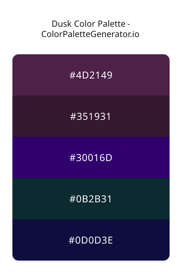
HEX: #4D2149
RGB: 77, 33, 73
HEX: #351931
RGB: 53, 25, 49
HEX: #30016D
RGB: 48, 1, 109
HEX: #0B2B31
RGB: 11, 43, 49
HEX: #0D0D3E
RGB: 13, 13, 62
Text on White/Black Backgrounds
Color Pair Combinations (10 total)
WCAG Contrast Standards:
- AAA (7:1): Enhanced contrast for maximum readability
- AA (4.5:1): Minimum for normal text (under 18pt)
- AA Large (3:1): Acceptable for large text (18pt+ or 14pt+ bold)
- Fail: Below WCAG standards, not recommended for text
Recommended Text Colors
Horizontal (Left to Right)
background: linear-gradient(to right, #4D2149 0%, #351931 25%, #30016D 50%, #0B2B31 75%, #0D0D3E 100%);Vertical (Top to Bottom)
background: linear-gradient(to bottom, #4D2149 0%, #351931 25%, #30016D 50%, #0B2B31 75%, #0D0D3E 100%);Diagonal (Top Left to Bottom Right)
background: linear-gradient(to bottom right, #4D2149 0%, #351931 25%, #30016D 50%, #0B2B31 75%, #0D0D3E 100%);Usage Tips:
- Copy the CSS code and paste directly into your stylesheets
- Linear gradients work great for backgrounds and hero sections
- Radial gradients are perfect for spotlights and focus effects
- Conic gradients create eye-catching loading spinners and progress indicators
- Smooth transitions ensure seamless color blending
Normal Vision
No color vision deficiency
Color Swatches
#4D2149
#351931
#30016D
#0B2B31
#0D0D3E
Full Palette View
How people with Normal Vision see it:
Overall Mood & Feel
Calm, professional, and trustworthy, with a sophisticated and dramatic atmosphere
Emotional Impact
Calming and contemplative, promoting feelings of trust, stability, and peace. The dark tones establish a premium, sophisticated feel ideal for luxury positioning
Psychological Effect
This 5-color palette creates a calm, professional, and trustworthy, with a sophisticated and dramatic atmosphere. The combination works together to create memorable visual experiences that influence consumer perception, decision-making, and brand recall. The rich variety provides versatility while maintaining cohesive emotional messaging across touchpoints.
Brand Personality Traits
Perfect For These Industries
Target Audience
Thoughtful consumers who value stability, trust, and quality
Individual Color Psychology
#4D2149
Warm and caring
Emotions Evoked
Personality Traits
Brand Traits
Ideal Industries
Marketing Use
Appeals to feminine markets, evokes compassion and care. Used in healthcare and beauty. Hot pink captures attention and conveys energy and fun.
Cultural Meanings
Color Harmony Analysis
Palette Mood
Temperature
This palette combines balanced and dark & bold moods with warm and cool tones, making it versatile for various design applications.
Professional Implementation Guide
This triadic dusk palette features 5 carefully selected cool tones that create a dramatic and sophisticated aesthetic. With low contrast levels and vibrant saturation, this palette is optimized for .
Web Design & Development
For web development, implement this palette with CSS variables for easy theme switching. Consider adding darker variants for better text readability.
- Apply the 60-30-10 rule for visual hierarchy
- Use accent colors for CTAs and hover states
- Maintain consistent color usage across all pages
- Test responsive behavior on multiple devices
Mobile App Interfaces
In mobile applications, these cool tones provide excellent battery efficiency on OLED screens. Use the subtle color variations to define clear touch targets.
- Design both light and dark mode variants
- Consider thumb-reach zones for color placement
- Test under direct sunlight and low light
- Use color to indicate interactive elements
Brand Identity Systems
Build a cohesive brand identity by designating specific colors for specific purposes. Establish your primary brand color from the most distinctive shade and create comprehensive brand guidelines specifying exact usage scenarios.
- Define primary, secondary, and accent colors
- Create usage rules for marketing materials
- Specify minimum sizes and clear space
- Document do's and don'ts for consistency
Frontend Development
Developers can integrate this palette efficiently using modern CSS techniques. Export as CSS variables for maximum flexibility, allowing theme switching and dynamic color updates without rewriting stylesheets.
- Use CSS custom properties for theming
- Implement semantic color naming conventions
- Create utility classes for rapid prototyping
- Consider CSS-in-JS for component-scoped colors
Print Design
For print materials, convert to CMYK using #4D2149 as the dominant color for headers and #0D0D3E for accents. These vibrant colors may appear slightly muted in print; request color proofs.
- Add to your design software color library
- Create swatches for quick color access
- Use CMYK values for print production
- Request color proofs before final print
Marketing Campaigns
Marketing materials benefit from consistent color usage that reinforces brand recognition. Apply this palette across email campaigns, landing pages, advertisements, and social media for maximum impact and memorability.
- Maintain color consistency across channels
- A/B test color variations for conversion
- Consider cultural color associations
- Align colors with campaign messaging
Strategic Color Distribution
Professional designers follow the 60-30-10 rule for balanced color distribution. Here's how to apply this principle with the Dusk:
Dominant Color
#4D2149Use #4D2149 as your primary color for headers, hero sections, and primary CTAs. This pink tone should occupy about 60% of your design space.
Secondary Color
#30016DApply #30016D as your secondary color for subtle backgrounds and card components. Allocate approximately 30% of your layout to this color.
Accent Color
#0D0D3EReserve #0D0D3E for accent elements like buttons, links, and important highlights. This blue accent should be used sparingly (10% of design) to draw attention to key actions.
Professional Best Practices
✓ Smart Usage Tips
- •Add white or black text overlays to improve readability on colored backgrounds
- •Use desaturated versions (reduce saturation by 20-30%) for large background areas to prevent visual fatigue
- •Add warm accent colors to create focal points and prevent designs from feeling too cold
- •Ensure sufficient lighting contrast for text elements—use light text on dark backgrounds
- •Test your palette across different devices and lighting conditions before finalizing
✗ Common Mistakes to Avoid
- •Don't use all colors equally—establish clear visual hierarchy through color weight
- •Avoid low-contrast text combinations that strain readability
- •Don't rely solely on color to convey meaning (use icons, text, and patterns too)
- •Avoid inconsistent color usage across different pages or screens
- •Don't assume screen colors match print output—always request physical proofs
Palette Overview & Statistics
5
Total Colors
4
Associated Tags
5
Categories
433
Community Likes
Color Analysis & Technical Guide
Detailed breakdown of each color's role, characteristics, and optimal applications. This triadic palette creates a dramatic and sophisticated aesthetic perfect for .
Individual Color Breakdown
Each color in this cool palette has been analyzed for its properties and ideal usage scenarios. The low contrast and vibrant saturation ensure harmonious visual relationships.
#4D2149
PINK
#4D2149 serves as the primary/dominant color in this palette. This dark pink (moderately saturated) brings playfulness and compassion Use it for headers, navigation bars, and brand elements.
Dark toneH: 305°S: 40%L: 22%#351931
PINK
#351931 serves as the secondary/supporting color in this palette. This dark pink (moderately saturated) brings playfulness and compassion Use it for cards, borders, section dividers, and supporting UI components.
Dark toneH: 309°S: 36%L: 15%#30016D
PURPLE
#30016D serves as the secondary/supporting color in this palette. This dark purple (highly saturated) brings luxury and mystery Use it for cards, borders, section dividers, and supporting UI components.
Dark toneH: 266°S: 98%L: 22%#0B2B31
CYAN
#0B2B31 serves as the secondary/supporting color in this palette. This dark cyan (highly saturated) brings clarity and innovation Use it for cards, borders, section dividers, and supporting UI components.
Dark toneH: 189°S: 63%L: 12%#0D0D3E
BLUE
#0D0D3E serves as the accent/highlight color in this palette. This dark blue (highly saturated) brings professionalism and depth Use it for call-to-action buttons, links, important notifications, and interactive elements.
Dark toneH: 240°S: 65%L: 15%
Palette Characteristics
This palette exhibits distinct characteristics that make it particularly suitable for specific design applications and industries.
Cool tones convey professionalism, trust, and calmness. Ideal for corporate and tech applications.
Low contrast creates subtle, sophisticated aesthetics but requires careful attention to text legibility.
Vibrant saturation creates bold, attention-grabbing designs perfect for youth brands and creative projects.
Dark tones create dramatic, sophisticated aesthetics and save battery on OLED displays.
💡 Pro Tips for This Palette
- Perfect for: . The triadic color relationship creates natural visual flow.
- Mood & Psychology: This palette evokes a dramatic and sophisticated feeling, making it ideal for brands seeking to convey those qualities.
- Accessibility: Test text combinations carefully with contrast checkers to ensure accessibility compliance.
- Extensions: Create tints (add white) and shades (add black) to expand this 5-color palette into a comprehensive design system.
- Cultural Context: Cool tones are generally perceived as professional worldwide but always research cultural color meanings.
Export Formats
Explore Dusk Palette
The Dusk color palette is a captivating and emotive collection of hues that evoke the mystery and allure of a twilight evening. As the sun dips below the horizon, the sky transforms into a deep, rich tapestry of colors, and this palette perfectly captures that essence. With its blend of dark, jewel-toned shades, Dusk is sure to add a touch of sophistication and elegance to any design project. The palette's dominant colors, such as 4D2149, a deep plum shade, and 351931, a rich, dark navy, set the tone for a dramatic and alluring visual experience.
Delving deeper into the palette, we find that each color plays a unique role in creating the overall aesthetic. The 30016D shade, a vibrant, dark purple, adds a pop of color and energy to the palette, while 0B2B31, a deep, muted teal, provides a sense of balance and calm. Meanwhile, 0D0D3E, a dark, cool blue, serves as a versatile background color that ties the entire palette together. As these colors work in harmony, they create a sense of depth and dimensionality, drawing the viewer in and inviting them to explore the design. Whether used in a website, app, or branding project, the Dusk palette is sure to make a lasting impression on its audience.
The Dusk color palette is particularly well-suited for designs that require a sense of luxury, sophistication, and modernity. It would be an excellent choice for a high-end fashion brand, a luxury travel website, or a sleek, modern mobile app. The palette's dark, jewel-toned shades would also be perfect for creating a dramatic and immersive user experience in a gaming or entertainment context. Additionally, the palette's feminine and elegant undertones make it an excellent choice for designs that cater to a female audience, such as a lifestyle blog, a beauty brand, or a women's fashion magazine. In terms of marketing and branding, the Dusk palette would be ideal for creating a sense of mystery and allure, perfect for promoting a new product launch or a special event.
The colors in the Dusk palette have a profound impact on the viewer's perception and behavior. The dark, rich shades can evoke feelings of luxury, creativity, and sophistication, while the pops of purple and teal can add a sense of energy and playfulness. The palette's overall effect is one of calmness and serenity, making it perfect for designs that require a sense of balance and tranquility. The colors can also influence the viewer's emotions, with the plum and purple shades evoking feelings of creativity and wisdom, and the navy and blue shades promoting a sense of trust and loyalty. By leveraging these psychological effects, designers can create a visual experience that resonates with their audience on a deep and emotional level.
To get the most out of the Dusk color palette, designers can experiment with complementary colors and pairing suggestions to create a unique and captivating visual experience. For example, pairing 4D2149 with a light, creamy white can create a stunning contrast that highlights the richness and depth of the plum shade. Alternatively, combining 30016D with a deep, muted green can add a sense of balance and harmony to the design. When working with the Dusk palette, it's also important to consider the principles of color theory and design best practices, such as using the 60-30-10 rule to balance the colors and create a sense of visual flow. By following these tips and guidelines, designers can unlock the full potential of the Dusk color palette and create designs that are truly breathtaking and unforgettable.
Palette Image
Below is the generated palette image showing all colors in a vertical layout. Perfect for sharing on social media or using as a reference.
Frequently Asked Questions
Everything you need to know about using and implementing the dusk palette effectively in your projects.