Eye Colors Color Palette – HEX, RGB & Design Inspiration
Color Details
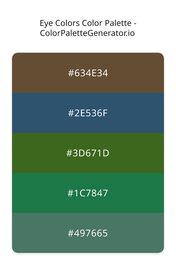
HEX: #634E34
RGB: 99, 78, 52
HEX: #2E536F
RGB: 46, 83, 111
HEX: #3D671D
RGB: 61, 103, 29
HEX: #1C7847
RGB: 28, 120, 71
HEX: #497665
RGB: 73, 118, 101
Text on White/Black Backgrounds
Color Pair Combinations (10 total)
WCAG Contrast Standards:
- AAA (7:1): Enhanced contrast for maximum readability
- AA (4.5:1): Minimum for normal text (under 18pt)
- AA Large (3:1): Acceptable for large text (18pt+ or 14pt+ bold)
- Fail: Below WCAG standards, not recommended for text
Recommended Text Colors
Horizontal (Left to Right)
background: linear-gradient(to right, #634E34 0%, #2E536F 25%, #3D671D 50%, #1C7847 75%, #497665 100%);Vertical (Top to Bottom)
background: linear-gradient(to bottom, #634E34 0%, #2E536F 25%, #3D671D 50%, #1C7847 75%, #497665 100%);Diagonal (Top Left to Bottom Right)
background: linear-gradient(to bottom right, #634E34 0%, #2E536F 25%, #3D671D 50%, #1C7847 75%, #497665 100%);Usage Tips:
- Copy the CSS code and paste directly into your stylesheets
- Linear gradients work great for backgrounds and hero sections
- Radial gradients are perfect for spotlights and focus effects
- Conic gradients create eye-catching loading spinners and progress indicators
- Smooth transitions ensure seamless color blending
Normal Vision
No color vision deficiency
Color Swatches
#634E34
#2E536F
#3D671D
#1C7847
#497665
Full Palette View
How people with Normal Vision see it:
Overall Mood & Feel
Balanced and versatile, with a sophisticated and dramatic atmosphere
Emotional Impact
Calming and contemplative, promoting feelings of trust, stability, and peace. The dark tones establish a premium, sophisticated feel ideal for luxury positioning
Psychological Effect
This 5-color palette creates a balanced and versatile, with a sophisticated and dramatic atmosphere. It reduces stress and promotes relaxation, lowering heart rate and encouraging contemplation. The combination works together to create memorable visual experiences that influence consumer perception, decision-making, and brand recall. The rich variety provides versatility while maintaining cohesive emotional messaging across touchpoints.
Brand Personality Traits
Perfect For These Industries
Target Audience
Business professionals and decision-makers seeking reliability and competence
Individual Color Psychology
#634E34
Cheerful and inviting
Emotions Evoked
Personality Traits
Brand Traits
Ideal Industries
Marketing Use
Stimulates activity and socialization, creates a sense of fun and affordability. Excellent for CTAs, impulse purchases, and youth marketing.
Cultural Meanings
Color Harmony Analysis
Palette Mood
Temperature
This palette combines balanced moods with warm and cool and neutral tones, making it versatile for various design applications.
Professional Implementation Guide
This complementary eye colors palette features 5 carefully selected balanced tones that create a balanced and versatile aesthetic. With low contrast levels and moderate saturation, this palette is optimized for .
Web Design & Development
For web development, implement this palette with CSS variables for easy theme switching. Consider adding darker variants for better text readability.
- Apply the 60-30-10 rule for visual hierarchy
- Use accent colors for CTAs and hover states
- Maintain consistent color usage across all pages
- Test responsive behavior on multiple devices
Mobile App Interfaces
In mobile applications, these balanced tones provide excellent battery efficiency on OLED screens. Use the subtle color variations to define clear touch targets.
- Design both light and dark mode variants
- Consider thumb-reach zones for color placement
- Test under direct sunlight and low light
- Use color to indicate interactive elements
Brand Identity Systems
Build a cohesive brand identity by designating specific colors for specific purposes. Establish your primary brand color from the most distinctive shade and create comprehensive brand guidelines specifying exact usage scenarios.
- Define primary, secondary, and accent colors
- Create usage rules for marketing materials
- Specify minimum sizes and clear space
- Document do's and don'ts for consistency
Frontend Development
Developers can integrate this palette efficiently using modern CSS techniques. Export as CSS variables for maximum flexibility, allowing theme switching and dynamic color updates without rewriting stylesheets.
- Use CSS custom properties for theming
- Implement semantic color naming conventions
- Create utility classes for rapid prototyping
- Consider CSS-in-JS for component-scoped colors
Print Design
For print materials, convert to CMYK using #634E34 as the dominant color for headers and #497665 for accents. These colors translate well to print with minimal adjustment.
- Add to your design software color library
- Create swatches for quick color access
- Use CMYK values for print production
- Request color proofs before final print
Marketing Campaigns
Marketing materials benefit from consistent color usage that reinforces brand recognition. Apply this palette across email campaigns, landing pages, advertisements, and social media for maximum impact and memorability.
- Maintain color consistency across channels
- A/B test color variations for conversion
- Consider cultural color associations
- Align colors with campaign messaging
Strategic Color Distribution
Professional designers follow the 60-30-10 rule for balanced color distribution. Here's how to apply this principle with the Eye Colors:
Dominant Color
#634E34Use #634E34 as your primary color for backgrounds, main content areas. This orange tone should occupy about 60% of your design space.
Secondary Color
#3D671DApply #3D671D as your secondary color for subtle backgrounds and card components. Allocate approximately 30% of your layout to this color.
Accent Color
#497665Reserve #497665 for accent elements like buttons, links, and important highlights. This green accent should be used sparingly (10% of design) to draw attention to key actions.
Professional Best Practices
✓ Smart Usage Tips
- •Add white or black text overlays to improve readability on colored backgrounds
- •Test your palette across different devices and lighting conditions before finalizing
✗ Common Mistakes to Avoid
- •Don't use all colors equally—establish clear visual hierarchy through color weight
- •Avoid low-contrast text combinations that strain readability
- •Don't rely solely on color to convey meaning (use icons, text, and patterns too)
- •Avoid inconsistent color usage across different pages or screens
- •Don't assume screen colors match print output—always request physical proofs
Palette Overview & Statistics
5
Total Colors
5
Associated Tags
3
Categories
1675
Community Likes
Color Analysis & Technical Guide
Detailed breakdown of each color's role, characteristics, and optimal applications. This complementary palette creates a balanced and versatile aesthetic perfect for .
Individual Color Breakdown
Each color in this balanced palette has been analyzed for its properties and ideal usage scenarios. The low contrast and moderate saturation ensure harmonious visual relationships.
#634E34
ORANGE
#634E34 serves as the primary/dominant color in this palette. This medium orange (moderately saturated) brings creativity and enthusiasm Use it for headers, navigation bars, and brand elements.
Dark toneH: 33°S: 31%L: 30%#2E536F
BLUE
#2E536F serves as the secondary/supporting color in this palette. This medium blue (moderately saturated) brings professionalism and depth Use it for cards, borders, section dividers, and supporting UI components.
Dark toneH: 206°S: 41%L: 31%#3D671D
GREEN
#3D671D serves as the secondary/supporting color in this palette. This dark green (moderately saturated) brings stability and prosperity Use it for cards, borders, section dividers, and supporting UI components.
Dark toneH: 94°S: 56%L: 26%#1C7847
GREEN
#1C7847 serves as the secondary/supporting color in this palette. This dark green (highly saturated) brings stability and prosperity Use it for cards, borders, section dividers, and supporting UI components.
Dark toneH: 148°S: 62%L: 29%#497665
GREEN
#497665 serves as the accent/highlight color in this palette. This medium green (muted) brings stability and prosperity Use it for call-to-action buttons, links, important notifications, and interactive elements.
Dark toneH: 157°S: 24%L: 37%
Palette Characteristics
This palette exhibits distinct characteristics that make it particularly suitable for specific design applications and industries.
Balanced temperature offers versatility across various design contexts and industries.
Low contrast creates subtle, sophisticated aesthetics but requires careful attention to text legibility.
Moderate saturation balances visual interest with professional restraint.
Balanced brightness provides flexibility for both light and dark design elements.
💡 Pro Tips for This Palette
- Perfect for: . The complementary color relationship creates natural visual flow.
- Mood & Psychology: This palette evokes a balanced and versatile feeling, making it ideal for brands seeking to convey those qualities.
- Accessibility: Test text combinations carefully with contrast checkers to ensure accessibility compliance.
- Extensions: Create tints (add white) and shades (add black) to expand this 5-color palette into a comprehensive design system.
- Cultural Context: Cool tones are generally perceived as professional worldwide but always research cultural color meanings.
Export Formats
Explore Eye Colors Palette
The Eye Colors palette is a masterful blend of earthy tones and soothing hues that evokes a sense of timeless sophistication and refinement, perfect for designs that require a sense of balance and poise. This carefully crafted palette features a range of colors, including the warm, rich brown tone of 634E34, which sets the foundation for a sense of comfort and familiarity. As the eye moves through the palette, it is drawn to the deep, cool blue of 2E536F, a shade that adds a sense of calmness and serenity to the overall effect. The palette is rounded out by the addition of 3D671D, a muted greenish brown that brings a sense of organic warmth, 1C7847, a soft sage green that adds a touch of freshness, and 497665, a weathered teal that adds a sense of depth and history.
Each color in the Eye Colors palette has been carefully selected to play a specific role in the overall aesthetic, with 634E34 providing a sense of grounding and stability, while 2E536F adds a sense of drama and contrast. The 3D671D shade helps to tie the palette together, bridging the gap between the warmer and cooler tones, and 1C7847 adds a touch of subtlety and nuance. Meanwhile, 497665 serves as a kind of anchor, drawing the eye and holding it in place. As a whole, the palette is characterized by a sense of vintage elegance, with a balanced and refined quality that is perfect for designs that require a sense of sophistication and poise.
The Eye Colors palette is versatile and can be applied in a variety of contexts, from website design and app development to branding and marketing materials. It is particularly well-suited to designs that require a sense of balance and harmony, such as luxury goods, high-end fashion, and premium lifestyle brands. The palette's earthy tones and soothing hues also make it a good fit for designs related to health and wellness, outdoor activities, and environmental causes. Whether used in a digital or print context, the Eye Colors palette is sure to add a sense of depth and sophistication to any design, and its balanced and refined quality makes it an excellent choice for designs that require a sense of timeless elegance.
The colors in the Eye Colors palette have a profound impact on the viewer's perception and behavior, with the warm, earthy tones evoking feelings of comfort and relaxation, while the cooler hues add a sense of calmness and serenity. The palette's use of muted, muted shades also helps to create a sense of subtlety and nuance, drawing the viewer in and encouraging them to engage more deeply with the design. As a result, the Eye Colors palette is particularly well-suited to designs that require a sense of emotional resonance, such as branding and marketing campaigns, where the goal is to create a lasting impression and build a strong connection with the viewer.
For designers looking to get the most out of the Eye Colors palette, there are a number of pro tips and best practices to keep in mind. One approach is to use the palette's complementary colors to create a sense of contrast and visual interest, such as pairing 634E34 with a deep, rich red, or using 2E536F alongside a bright, sunny yellow. Another approach is to experiment with different pairing combinations, such as combining 3D671D with 1C7847 to create a sense of harmony and balance, or using 497665 alongside 634E34 to add a sense of depth and history. By following these tips and best practices, designers can unlock the full potential of the Eye Colors palette and create designs that are truly unforgettable.
Palette Image
Below is the generated palette image showing all colors in a vertical layout. Perfect for sharing on social media or using as a reference.
Frequently Asked Questions
Everything you need to know about using and implementing the eye colors palette effectively in your projects.