Gr Color Palette – HEX, RGB & Design Inspiration
Color Details
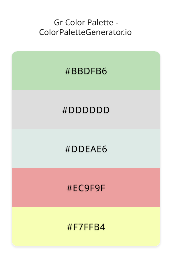
HEX: #BBDFB6
RGB: 187, 223, 182
HEX: #DDDDDD
RGB: 221, 221, 221
HEX: #DDEAE6
RGB: 221, 234, 230
HEX: #EC9F9F
RGB: 236, 159, 159
HEX: #F7FFB4
RGB: 247, 255, 180
Text on White/Black Backgrounds
Color Pair Combinations (10 total)
WCAG Contrast Standards:
- AAA (7:1): Enhanced contrast for maximum readability
- AA (4.5:1): Minimum for normal text (under 18pt)
- AA Large (3:1): Acceptable for large text (18pt+ or 14pt+ bold)
- Fail: Below WCAG standards, not recommended for text
Recommended Text Colors
Horizontal (Left to Right)
background: linear-gradient(to right, #BBDFB6 0%, #DDDDDD 25%, #DDEAE6 50%, #EC9F9F 75%, #F7FFB4 100%);Vertical (Top to Bottom)
background: linear-gradient(to bottom, #BBDFB6 0%, #DDDDDD 25%, #DDEAE6 50%, #EC9F9F 75%, #F7FFB4 100%);Diagonal (Top Left to Bottom Right)
background: linear-gradient(to bottom right, #BBDFB6 0%, #DDDDDD 25%, #DDEAE6 50%, #EC9F9F 75%, #F7FFB4 100%);Usage Tips:
- Copy the CSS code and paste directly into your stylesheets
- Linear gradients work great for backgrounds and hero sections
- Radial gradients are perfect for spotlights and focus effects
- Conic gradients create eye-catching loading spinners and progress indicators
- Smooth transitions ensure seamless color blending
Normal Vision
No color vision deficiency
Color Swatches
#BBDFB6
#DDDDDD
#DDEAE6
#EC9F9F
#F7FFB4
Full Palette View
How people with Normal Vision see it:
Overall Mood & Feel
Energetic, warm, and inviting, with an airy and optimistic feel
Emotional Impact
Stimulating and energetic, evoking feelings of excitement, warmth, and action. The light tones create an uplifting, optimistic atmosphere perfect for approachable brands
Psychological Effect
This 5-color palette creates a energetic, warm, and inviting, with an airy and optimistic feel. The combination works together to create memorable visual experiences that influence consumer perception, decision-making, and brand recall. The rich variety provides versatility while maintaining cohesive emotional messaging across touchpoints.
Brand Personality Traits
Perfect For These Industries
Target Audience
Business professionals and decision-makers seeking reliability and competence. Appeals to those seeking approachable, positive, and optimistic brands
Individual Color Psychology
#BBDFB6
Calming and balanced
Emotions Evoked
Personality Traits
Brand Traits
Ideal Industries
Marketing Use
Suggests environmental friendliness and health. Easiest color for eyes to process. Perfect for wellness brands and eco-friendly products.
Cultural Meanings
Color Harmony Analysis
Palette Mood
Temperature
This palette combines light & airy and balanced moods with neutral and warm tones, making it versatile for various design applications.
Professional Implementation Guide
This complementary gr palette features 5 carefully selected warm tones that create a light and airy aesthetic. With low contrast levels and moderate saturation, this palette is optimized for minimalist designs and health & wellness.
Web Design & Development
For web development, implement this palette with CSS variables for easy theme switching. Consider adding darker variants for better text readability.
- Apply the 60-30-10 rule for visual hierarchy
- Use accent colors for CTAs and hover states
- Maintain consistent color usage across all pages
- Test responsive behavior on multiple devices
Mobile App Interfaces
In mobile applications, these warm tones provide excellent readability in bright conditions. Use the subtle color variations to define clear touch targets.
- Design both light and dark mode variants
- Consider thumb-reach zones for color placement
- Test under direct sunlight and low light
- Use color to indicate interactive elements
Brand Identity Systems
Build a cohesive brand identity by designating specific colors for specific purposes. Establish your primary brand color from the most distinctive shade and create comprehensive brand guidelines specifying exact usage scenarios.
- Define primary, secondary, and accent colors
- Create usage rules for marketing materials
- Specify minimum sizes and clear space
- Document do's and don'ts for consistency
Frontend Development
Developers can integrate this palette efficiently using modern CSS techniques. Export as CSS variables for maximum flexibility, allowing theme switching and dynamic color updates without rewriting stylesheets.
- Use CSS custom properties for theming
- Implement semantic color naming conventions
- Create utility classes for rapid prototyping
- Consider CSS-in-JS for component-scoped colors
Print Design
For print materials, convert to CMYK using #BBDFB6 as the dominant color for headers and #F7FFB4 for accents. These colors translate well to print with minimal adjustment.
- Add to your design software color library
- Create swatches for quick color access
- Use CMYK values for print production
- Request color proofs before final print
Marketing Campaigns
Marketing materials benefit from consistent color usage that reinforces brand recognition. Apply this palette across email campaigns, landing pages, advertisements, and social media for maximum impact and memorability.
- Maintain color consistency across channels
- A/B test color variations for conversion
- Consider cultural color associations
- Align colors with campaign messaging
Strategic Color Distribution
Professional designers follow the 60-30-10 rule for balanced color distribution. Here's how to apply this principle with the Gr:
Dominant Color
#BBDFB6Use #BBDFB6 as your primary color for backgrounds, main content areas. This green tone should occupy about 60% of your design space.
Secondary Color
#DDEAE6Apply #DDEAE6 as your secondary color for subtle backgrounds and card components. Allocate approximately 30% of your layout to this color.
Accent Color
#F7FFB4Reserve #F7FFB4 for accent elements like buttons, links, and important highlights. This yellow accent should be used sparingly (10% of design) to draw attention to key actions.
Professional Best Practices
✓ Smart Usage Tips
- •Add white or black text overlays to improve readability on colored backgrounds
- •Balance warm tones with neutral whites or grays to create visual breathing room
- •Test your palette across different devices and lighting conditions before finalizing
✗ Common Mistakes to Avoid
- •Don't use all colors equally—establish clear visual hierarchy through color weight
- •Avoid low-contrast text combinations that strain readability
- •Don't rely solely on color to convey meaning (use icons, text, and patterns too)
- •Avoid inconsistent color usage across different pages or screens
- •Don't assume screen colors match print output—always request physical proofs
Palette Overview & Statistics
5
Total Colors
5
Associated Tags
4
Categories
3682
Community Likes
Color Analysis & Technical Guide
Detailed breakdown of each color's role, characteristics, and optimal applications. This complementary palette creates a light and airy aesthetic perfect for minimalist designs and health & wellness.
Individual Color Breakdown
Each color in this warm palette has been analyzed for its properties and ideal usage scenarios. The low contrast and moderate saturation ensure harmonious visual relationships.
#BBDFB6
GREEN
#BBDFB6 serves as the primary/dominant color in this palette. This light green (moderately saturated) brings freshness and growth Use it for backgrounds, containers, and large surface areas.
Light toneH: 113°S: 39%L: 79%#DDDDDD
WHITE
#DDDDDD serves as the secondary/supporting color in this palette. This light white (muted) brings cleanliness and simplicity Use it for cards, borders, section dividers, and supporting UI components.
Light toneH: 0°S: 0%L: 87%#DDEAE6
CYAN
#DDEAE6 serves as the secondary/supporting color in this palette. This light cyan (muted) brings clarity and innovation Use it for cards, borders, section dividers, and supporting UI components.
Light toneH: 162°S: 24%L: 89%#EC9F9F
RED
#EC9F9F serves as the secondary/supporting color in this palette. This light red (highly saturated) brings energy and warmth Use it for cards, borders, section dividers, and supporting UI components.
Light toneH: 0°S: 67%L: 77%#F7FFB4
YELLOW
#F7FFB4 serves as the accent/highlight color in this palette. This light yellow (highly saturated) brings optimism and cheerfulness Use it for call-to-action buttons, links, important notifications, and interactive elements.
Light toneH: 66°S: 100%L: 85%
Palette Characteristics
This palette exhibits distinct characteristics that make it particularly suitable for specific design applications and industries.
Warm colors create energy, excitement, and approachability. Perfect for brands targeting emotional connection.
Low contrast creates subtle, sophisticated aesthetics but requires careful attention to text legibility.
Moderate saturation balances visual interest with professional restraint.
Light palette creates airy, open designs with excellent readability for dark text overlays.
💡 Pro Tips for This Palette
- Perfect for: minimalist designs, health & wellness. The complementary color relationship creates natural visual flow.
- Mood & Psychology: This palette evokes a light and airy feeling, making it ideal for brands seeking to convey those qualities.
- Accessibility: Test text combinations carefully with contrast checkers to ensure accessibility compliance.
- Extensions: Create tints (add white) and shades (add black) to expand this 5-color palette into a comprehensive design system.
- Cultural Context: Warm colors may have different meanings across cultures—verify associations with your target market.
Export Formats
Explore Gr Palette
The Gr color palette is a masterful blend of soothing hues that evoke a sense of serenity and balance, perfect for designers seeking to create a calming and uplifting visual experience. At its core, this palette is all about subtle nuances and gentle contrasts, with a range of shades that work in harmony to create a sense of lightness and airiness. From the soft, muted tones of DDDDDD, a versatile gray shade that provides a clean and neutral background, to the delicate, pastel-inspired DDEAE6, a pale, sage-like hue that adds a touch of sophistication and elegance, each color in the Gr palette has been carefully selected to work together in perfect harmony.
As we delve deeper into the individual colors that make up the Gr palette, we find a range of unique and captivating shades, each with its own distinct character and role to play. The gentle, yellow-tinged F7FFB4, for example, adds a touch of warmth and optimism, while the soft, pinkish EC9F9F brings a sense of playfulness and creativity. Meanwhile, the muted, gray-green BBDFB6 provides a sense of balance and stability, grounding the palette and preventing it from feeling too sweet or overpowering. By combining these colors in different ways, designers can create a wide range of effects, from soft and subtle to bold and eye-catching, making the Gr palette a versatile and valuable tool for any design project.
In terms of practical applications, the Gr color palette is ideal for use in a wide range of design contexts, from websites and apps to branding and marketing materials. Its light, pastel-inspired shades make it particularly well-suited for use in spring-themed designs, or in any project where a sense of freshness and renewal is desired. The palette's balanced, harmonious quality also makes it a great choice for designs that require a sense of calmness and serenity, such as wellness or healthcare-related projects. Whether used in its entirety or in combination with other colors, the Gr palette is sure to add a touch of elegance and sophistication to any design, and its versatility makes it a valuable addition to any designer's toolkit.
The colors in the Gr palette also have a profound impact on viewer perception and behavior, influencing our emotions and moods in subtle but powerful ways. The soft, soothing shades of gray and green, for example, can help to reduce stress and anxiety, while the warmer, more vibrant shades of yellow and pink can stimulate creativity and enthusiasm. By carefully selecting and combining these colors, designers can create a visual experience that is not only aesthetically pleasing, but also emotionally resonant and engaging. Whether used to create a sense of calmness and relaxation, or to stimulate energy and excitement, the Gr color palette is a powerful tool for any designer seeking to create a lasting impression on their audience.
For designers looking to get the most out of the Gr color palette, there are a few key tips and tricks to keep in mind. One of the most effective ways to use this palette is to combine its softer, more muted shades with bold, contrasting colors, creating a sense of visual interest and tension. The F7FFB4 yellow shade, for example, pairs beautifully with deep, rich blues or purples, while the EC9F9F pink shade looks stunning when combined with bold, bright whites or creams. By experimenting with different combinations and pairings, designers can unlock the full potential of the Gr color palette, and create designs that are truly unique and captivating. Additionally, considering the hex codes of the colors, such as BBDFB6 and DDEAE6, can help designers to create a cohesive visual identity, and to ensure that their designs are consistent and effective across different platforms and media.
Palette Image
Below is the generated palette image showing all colors in a vertical layout. Perfect for sharing on social media or using as a reference.
Categories & Tags
Frequently Asked Questions
Everything you need to know about using and implementing the gr palette effectively in your projects.