Green Palette Color Palette – HEX, RGB & Design Inspiration
Color Details
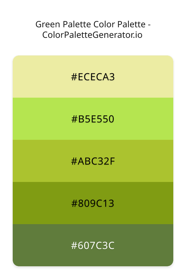
HEX: #ECECA3
RGB: 236, 236, 163
HEX: #B5E550
RGB: 181, 229, 80
HEX: #ABC32F
RGB: 171, 195, 47
HEX: #809C13
RGB: 128, 156, 19
HEX: #607C3C
RGB: 96, 124, 60
Text on White/Black Backgrounds
Color Pair Combinations (10 total)
WCAG Contrast Standards:
- AAA (7:1): Enhanced contrast for maximum readability
- AA (4.5:1): Minimum for normal text (under 18pt)
- AA Large (3:1): Acceptable for large text (18pt+ or 14pt+ bold)
- Fail: Below WCAG standards, not recommended for text
Recommended Text Colors
Horizontal (Left to Right)
background: linear-gradient(to right, #ECECA3 0%, #B5E550 25%, #ABC32F 50%, #809C13 75%, #607C3C 100%);Vertical (Top to Bottom)
background: linear-gradient(to bottom, #ECECA3 0%, #B5E550 25%, #ABC32F 50%, #809C13 75%, #607C3C 100%);Diagonal (Top Left to Bottom Right)
background: linear-gradient(to bottom right, #ECECA3 0%, #B5E550 25%, #ABC32F 50%, #809C13 75%, #607C3C 100%);Usage Tips:
- Copy the CSS code and paste directly into your stylesheets
- Linear gradients work great for backgrounds and hero sections
- Radial gradients are perfect for spotlights and focus effects
- Conic gradients create eye-catching loading spinners and progress indicators
- Smooth transitions ensure seamless color blending
Normal Vision
No color vision deficiency
Color Swatches
#ECECA3
#B5E550
#ABC32F
#809C13
#607C3C
Full Palette View
How people with Normal Vision see it:
Overall Mood & Feel
Energetic, warm, and inviting
Emotional Impact
Stimulating and energetic, evoking feelings of excitement, warmth, and action. The balanced lightness creates versatility across different contexts
Psychological Effect
This 5-color palette creates a energetic, warm, and inviting. It reduces stress and promotes relaxation, lowering heart rate and encouraging contemplation. The combination works together to create memorable visual experiences that influence consumer perception, decision-making, and brand recall. The rich variety provides versatility while maintaining cohesive emotional messaging across touchpoints.
Brand Personality Traits
Perfect For These Industries
Target Audience
Business professionals and decision-makers seeking reliability and competence
Individual Color Psychology
#ECECA3
Bright and cheerful
Emotions Evoked
Personality Traits
Brand Traits
Ideal Industries
Marketing Use
Grabs attention quickly, stimulates mental activity, and generates optimism. Great for highlighting products and encouraging impulse decisions.
Cultural Meanings
Color Harmony Analysis
Palette Mood
Temperature
This palette combines light & airy and balanced moods with neutral tones, making it versatile for various design applications.
Professional Implementation Guide
This monochromatic green palette palette features 5 carefully selected balanced tones that create a balanced and versatile aesthetic. With medium contrast levels and vibrant saturation, this palette is optimized for .
Web Design & Development
For web development, implement this palette with CSS variables for easy theme switching. Consider adding darker variants for better text readability.
- Apply the 60-30-10 rule for visual hierarchy
- Use accent colors for CTAs and hover states
- Maintain consistent color usage across all pages
- Test responsive behavior on multiple devices
Mobile App Interfaces
In mobile applications, these balanced tones provide excellent battery efficiency on OLED screens. Use the subtle color variations to define clear touch targets.
- Design both light and dark mode variants
- Consider thumb-reach zones for color placement
- Test under direct sunlight and low light
- Use color to indicate interactive elements
Brand Identity Systems
Build a cohesive brand identity by designating specific colors for specific purposes. Establish your primary brand color from the most distinctive shade and create comprehensive brand guidelines specifying exact usage scenarios.
- Define primary, secondary, and accent colors
- Create usage rules for marketing materials
- Specify minimum sizes and clear space
- Document do's and don'ts for consistency
Frontend Development
Developers can integrate this palette efficiently using modern CSS techniques. Export as CSS variables for maximum flexibility, allowing theme switching and dynamic color updates without rewriting stylesheets.
- Use CSS custom properties for theming
- Implement semantic color naming conventions
- Create utility classes for rapid prototyping
- Consider CSS-in-JS for component-scoped colors
Print Design
For print materials, convert to CMYK using #ECECA3 as the dominant color for headers and #607C3C for accents. These vibrant colors may appear slightly muted in print; request color proofs.
- Add to your design software color library
- Create swatches for quick color access
- Use CMYK values for print production
- Request color proofs before final print
Marketing Campaigns
Marketing materials benefit from consistent color usage that reinforces brand recognition. Apply this palette across email campaigns, landing pages, advertisements, and social media for maximum impact and memorability.
- Maintain color consistency across channels
- A/B test color variations for conversion
- Consider cultural color associations
- Align colors with campaign messaging
Strategic Color Distribution
Professional designers follow the 60-30-10 rule for balanced color distribution. Here's how to apply this principle with the Green Palette:
Dominant Color
#ECECA3Use #ECECA3 as your primary color for backgrounds, main content areas. This yellow tone should occupy about 60% of your design space.
Secondary Color
#ABC32FApply #ABC32F as your secondary color for subtle backgrounds and card components. Allocate approximately 30% of your layout to this color.
Accent Color
#607C3CReserve #607C3C for accent elements like buttons, links, and important highlights. This green accent should be used sparingly (10% of design) to draw attention to key actions.
Professional Best Practices
✓ Smart Usage Tips
- •Use desaturated versions (reduce saturation by 20-30%) for large background areas to prevent visual fatigue
- •Test your palette across different devices and lighting conditions before finalizing
✗ Common Mistakes to Avoid
- •Don't use all colors equally—establish clear visual hierarchy through color weight
- •Avoid low-contrast text combinations that strain readability
- •Don't rely solely on color to convey meaning (use icons, text, and patterns too)
- •Avoid inconsistent color usage across different pages or screens
- •Don't assume screen colors match print output—always request physical proofs
Palette Overview & Statistics
5
Total Colors
3
Associated Tags
4
Categories
550
Community Likes
Color Analysis & Technical Guide
Detailed breakdown of each color's role, characteristics, and optimal applications. This monochromatic palette creates a balanced and versatile aesthetic perfect for .
Individual Color Breakdown
Each color in this balanced palette has been analyzed for its properties and ideal usage scenarios. The medium contrast and vibrant saturation ensure harmonious visual relationships.
#ECECA3
YELLOW
#ECECA3 serves as the primary/dominant color in this palette. This light yellow (highly saturated) brings optimism and cheerfulness Use it for backgrounds, containers, and large surface areas.
Light toneH: 60°S: 66%L: 78%#B5E550
GREEN
#B5E550 serves as the secondary/supporting color in this palette. This medium green (highly saturated) brings freshness and growth Use it for cards, borders, section dividers, and supporting UI components.
Light toneH: 79°S: 74%L: 61%#ABC32F
GREEN
#ABC32F serves as the secondary/supporting color in this palette. This medium green (highly saturated) brings stability and prosperity Use it for cards, borders, section dividers, and supporting UI components.
Dark toneH: 70°S: 61%L: 47%#809C13
GREEN
#809C13 serves as the secondary/supporting color in this palette. This medium green (highly saturated) brings stability and prosperity Use it for cards, borders, section dividers, and supporting UI components.
Dark toneH: 72°S: 78%L: 34%#607C3C
GREEN
#607C3C serves as the accent/highlight color in this palette. This medium green (moderately saturated) brings stability and prosperity Use it for call-to-action buttons, links, important notifications, and interactive elements.
Dark toneH: 86°S: 35%L: 36%
Palette Characteristics
This palette exhibits distinct characteristics that make it particularly suitable for specific design applications and industries.
Balanced temperature offers versatility across various design contexts and industries.
Medium contrast provides visual interest while maintaining readability with proper text color choices.
Vibrant saturation creates bold, attention-grabbing designs perfect for youth brands and creative projects.
Balanced brightness provides flexibility for both light and dark design elements.
💡 Pro Tips for This Palette
- Perfect for: . The monochromatic color relationship creates natural visual flow.
- Mood & Psychology: This palette evokes a balanced and versatile feeling, making it ideal for brands seeking to convey those qualities.
- Accessibility: Test text combinations carefully with contrast checkers to ensure accessibility compliance.
- Extensions: Create tints (add white) and shades (add black) to expand this 5-color palette into a comprehensive design system.
- Cultural Context: Cool tones are generally perceived as professional worldwide but always research cultural color meanings.
Export Formats
Explore Green Palette Palette
The Green Palette is a masterful blend of earthy tones and vibrant hues, evoking feelings of serenity and growth while also exuding a sense of modernity and playfulness. At its core, this palette is designed to evoke an emotional response, transporting viewers to a world of lush landscapes and endless possibilities. With a range of shades that transition seamlessly from soft and muted to bold and bright, the Green Palette is an ideal choice for designers seeking to create a visual identity that is both elegant and captivating.
Delving deeper into the palette, we find a rich tapestry of colors that work in harmony to create a unique visual experience. The lightest shade, ECECA3, serves as a subtle background tone, providing a neutral foundation for the other colors to shine. In contrast, B5E550 is a vibrant and energetic hue that demands attention, its bright, lime-inspired tone injecting a sense of excitement and playfulness into the design. The mid-tone, ABC32F, offers a beautiful balance between the two, its olive undertones adding a sense of depth and sophistication. The darker shades, 809C13 and 607C3C, provide a sense of grounding and stability, their gray and olive tones working in tandem to create a sense of balance and harmony.
In practical terms, the Green Palette is an incredibly versatile design tool, lending itself to a wide range of applications, from website design and app development to branding and marketing campaigns. Its modern and elegant aesthetic makes it an ideal choice for luxury brands and high-end products, while its playful and vibrant tone is perfectly suited to more casual and creative endeavors. Whether used in its entirety or as a starting point for further experimentation, the Green Palette is sure to add a touch of sophistication and style to any design project.
The psychology behind the Green Palette is equally fascinating, as each color works to influence viewer perception and behavior in subtle yet powerful ways. The softer shades, such as ECECA3 and 607C3C, have a calming effect, promoting feelings of relaxation and tranquility, while the brighter tones, like B5E550 and ABC32F, stimulate the senses, encouraging engagement and interaction. By carefully balancing these contrasting elements, designers can create a visual experience that is both soothing and energizing, drawing viewers in and holding their attention.
For designers seeking to get the most out of the Green Palette, there are a number of pro tips and pairing suggestions to keep in mind. To add an extra layer of depth and contrast, consider introducing complementary colors, such as rich blues or deep plums, to create a sense of visual tension and balance. When pairing the Green Palette with other design elements, such as typography and imagery, it's essential to strike a balance between harmony and contrast, allowing each component to shine while also working together to create a cohesive visual whole. By following these design best practices and experimenting with the Green Palette's unique range of colors, designers can unlock a world of creative possibilities and produce truly stunning results.
Palette Image
Below is the generated palette image showing all colors in a vertical layout. Perfect for sharing on social media or using as a reference.
Categories & Tags
Frequently Asked Questions
Everything you need to know about using and implementing the green palette palette effectively in your projects.