Grimace Color Palette – HEX, RGB & Design Inspiration
Color Details
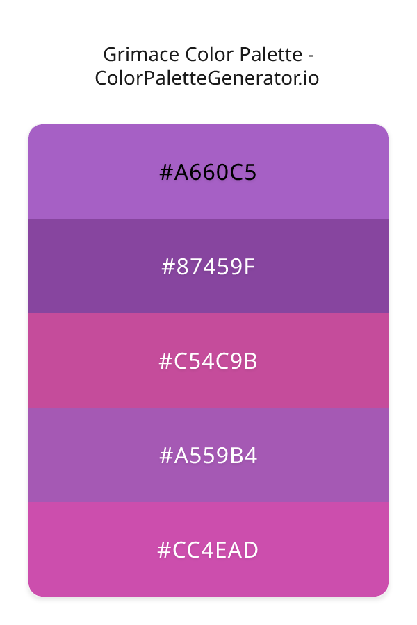
HEX: #A660C5
RGB: 166, 96, 197
HEX: #87459F
RGB: 135, 69, 159
HEX: #C54C9B
RGB: 197, 76, 155
HEX: #A559B4
RGB: 165, 89, 180
HEX: #CC4EAD
RGB: 204, 78, 173
Text on White/Black Backgrounds
Color Pair Combinations (10 total)
WCAG Contrast Standards:
- AAA (7:1): Enhanced contrast for maximum readability
- AA (4.5:1): Minimum for normal text (under 18pt)
- AA Large (3:1): Acceptable for large text (18pt+ or 14pt+ bold)
- Fail: Below WCAG standards, not recommended for text
Recommended Text Colors
Horizontal (Left to Right)
background: linear-gradient(to right, #A660C5 0%, #87459F 25%, #C54C9B 50%, #A559B4 75%, #CC4EAD 100%);Vertical (Top to Bottom)
background: linear-gradient(to bottom, #A660C5 0%, #87459F 25%, #C54C9B 50%, #A559B4 75%, #CC4EAD 100%);Diagonal (Top Left to Bottom Right)
background: linear-gradient(to bottom right, #A660C5 0%, #87459F 25%, #C54C9B 50%, #A559B4 75%, #CC4EAD 100%);Usage Tips:
- Copy the CSS code and paste directly into your stylesheets
- Linear gradients work great for backgrounds and hero sections
- Radial gradients are perfect for spotlights and focus effects
- Conic gradients create eye-catching loading spinners and progress indicators
- Smooth transitions ensure seamless color blending
Normal Vision
No color vision deficiency
Color Swatches
#A660C5
#87459F
#C54C9B
#A559B4
#CC4EAD
Full Palette View
How people with Normal Vision see it:
Overall Mood & Feel
Energetic, warm, and inviting
Emotional Impact
Stimulating and energetic, evoking feelings of excitement, warmth, and action. The balanced lightness creates versatility across different contexts
Psychological Effect
This 5-color palette creates a energetic, warm, and inviting. The combination works together to create memorable visual experiences that influence consumer perception, decision-making, and brand recall. The rich variety provides versatility while maintaining cohesive emotional messaging across touchpoints.
Brand Personality Traits
Perfect For These Industries
Target Audience
Active, outgoing individuals who respond to energy and enthusiasm
Individual Color Psychology
#A660C5
Creative and mysterious
Emotions Evoked
Personality Traits
Brand Traits
Ideal Industries
Marketing Use
Evokes sophistication and luxury. Appeals to creative audiences. Used by premium brands to suggest quality and exclusivity. Rare in nature makes it feel special.
Cultural Meanings
Color Harmony Analysis
Palette Mood
Temperature
This palette combines balanced moods with cool and warm tones, making it versatile for various design applications.
Professional Implementation Guide
This analogous grimace palette features 5 carefully selected cool tones that create a balanced and versatile aesthetic. With low contrast levels and moderate saturation, this palette is optimized for .
Web Design & Development
For web development, implement this palette with CSS variables for easy theme switching. Consider adding darker variants for better text readability.
- Apply the 60-30-10 rule for visual hierarchy
- Use accent colors for CTAs and hover states
- Maintain consistent color usage across all pages
- Test responsive behavior on multiple devices
Mobile App Interfaces
In mobile applications, these cool tones provide excellent battery efficiency on OLED screens. Use the subtle color variations to define clear touch targets.
- Design both light and dark mode variants
- Consider thumb-reach zones for color placement
- Test under direct sunlight and low light
- Use color to indicate interactive elements
Brand Identity Systems
Build a cohesive brand identity by designating specific colors for specific purposes. Establish your primary brand color from the most distinctive shade and create comprehensive brand guidelines specifying exact usage scenarios.
- Define primary, secondary, and accent colors
- Create usage rules for marketing materials
- Specify minimum sizes and clear space
- Document do's and don'ts for consistency
Frontend Development
Developers can integrate this palette efficiently using modern CSS techniques. Export as CSS variables for maximum flexibility, allowing theme switching and dynamic color updates without rewriting stylesheets.
- Use CSS custom properties for theming
- Implement semantic color naming conventions
- Create utility classes for rapid prototyping
- Consider CSS-in-JS for component-scoped colors
Print Design
For print materials, convert to CMYK using #A660C5 as the dominant color for headers and #CC4EAD for accents. These colors translate well to print with minimal adjustment.
- Add to your design software color library
- Create swatches for quick color access
- Use CMYK values for print production
- Request color proofs before final print
Marketing Campaigns
Marketing materials benefit from consistent color usage that reinforces brand recognition. Apply this palette across email campaigns, landing pages, advertisements, and social media for maximum impact and memorability.
- Maintain color consistency across channels
- A/B test color variations for conversion
- Consider cultural color associations
- Align colors with campaign messaging
Strategic Color Distribution
Professional designers follow the 60-30-10 rule for balanced color distribution. Here's how to apply this principle with the Grimace:
Dominant Color
#A660C5Use #A660C5 as your primary color for backgrounds, main content areas. This purple tone should occupy about 60% of your design space.
Secondary Color
#C54C9BApply #C54C9B as your secondary color for subtle backgrounds and card components. Allocate approximately 30% of your layout to this color.
Accent Color
#CC4EADReserve #CC4EAD for accent elements like buttons, links, and important highlights. This pink accent should be used sparingly (10% of design) to draw attention to key actions.
Professional Best Practices
✓ Smart Usage Tips
- •Add white or black text overlays to improve readability on colored backgrounds
- •Add warm accent colors to create focal points and prevent designs from feeling too cold
- •Test your palette across different devices and lighting conditions before finalizing
✗ Common Mistakes to Avoid
- •Don't use all colors equally—establish clear visual hierarchy through color weight
- •Avoid low-contrast text combinations that strain readability
- •Don't rely solely on color to convey meaning (use icons, text, and patterns too)
- •Avoid inconsistent color usage across different pages or screens
- •Don't assume screen colors match print output—always request physical proofs
Palette Overview & Statistics
5
Total Colors
3
Associated Tags
4
Categories
4346
Community Likes
Color Analysis & Technical Guide
Detailed breakdown of each color's role, characteristics, and optimal applications. This analogous palette creates a balanced and versatile aesthetic perfect for .
Individual Color Breakdown
Each color in this cool palette has been analyzed for its properties and ideal usage scenarios. The low contrast and moderate saturation ensure harmonious visual relationships.
#A660C5
PURPLE
#A660C5 serves as the primary/dominant color in this palette. This medium purple (moderately saturated) brings creative and luxurious Use it for headers, navigation bars, and brand elements.
Light toneH: 282°S: 47%L: 57%#87459F
PURPLE
#87459F serves as the secondary/supporting color in this palette. This medium purple (moderately saturated) brings luxury and mystery Use it for cards, borders, section dividers, and supporting UI components.
Dark toneH: 284°S: 39%L: 45%#C54C9B
PINK
#C54C9B serves as the secondary/supporting color in this palette. This medium pink (moderately saturated) brings playfulness and compassion Use it for cards, borders, section dividers, and supporting UI components.
Light toneH: 321°S: 51%L: 54%#A559B4
PINK
#A559B4 serves as the secondary/supporting color in this palette. This medium pink (moderately saturated) brings playfulness and compassion Use it for cards, borders, section dividers, and supporting UI components.
Light toneH: 290°S: 38%L: 53%#CC4EAD
PINK
#CC4EAD serves as the accent/highlight color in this palette. This medium pink (moderately saturated) brings playfulness and compassion Use it for call-to-action buttons, links, important notifications, and interactive elements.
Light toneH: 315°S: 55%L: 55%
Palette Characteristics
This palette exhibits distinct characteristics that make it particularly suitable for specific design applications and industries.
Cool tones convey professionalism, trust, and calmness. Ideal for corporate and tech applications.
Low contrast creates subtle, sophisticated aesthetics but requires careful attention to text legibility.
Moderate saturation balances visual interest with professional restraint.
Balanced brightness provides flexibility for both light and dark design elements.
💡 Pro Tips for This Palette
- Perfect for: . The analogous color relationship creates natural visual flow.
- Mood & Psychology: This palette evokes a balanced and versatile feeling, making it ideal for brands seeking to convey those qualities.
- Accessibility: Test text combinations carefully with contrast checkers to ensure accessibility compliance.
- Extensions: Create tints (add white) and shades (add black) to expand this 5-color palette into a comprehensive design system.
- Cultural Context: Cool tones are generally perceived as professional worldwide but always research cultural color meanings.
Export Formats
Explore Grimace Palette
The Grimace color palette is a masterful blend of rich, jewel-toned hues that evoke a sense of luxury and sophistication, making it perfect for designers seeking to add a touch of elegance to their projects. At its core, this monochromatic palette is characterized by a range of indigo, gray, and plum shades that work in harmony to create a balanced and modern aesthetic. The palette's emotional impact is one of refinement and poise, making it an excellent choice for feminine designs that require a sense of glamour and finesse.
Delving deeper into the palette, we find that the A660C5 shade serves as a beautiful anchor, providing a deep, rich purple tone that sets the tone for the rest of the colors. In contrast, the 87459F shade offers a slightly darker, more muted alternative, bringing a sense of depth and complexity to the palette. The C54C9B shade, with its slightly pink undertones, adds a touch of warmth and vibrancy, while the A559B4 shade provides a smooth, velvety texture that ties the entire palette together. Finally, the CC4EAD shade rounds out the palette with a bright, poppy purple that adds a sense of energy and playfulness.
In terms of practical applications, the Grimace color palette is incredibly versatile, lending itself to a wide range of design projects, from websites and apps to branding and marketing materials. Its modern, feminine aesthetic makes it particularly well-suited to designs targeting a female audience, such as fashion or beauty websites, while its balanced, monochromatic structure ensures that it can be easily adapted to a variety of different contexts. Whether you're designing a sleek, modern website or developing a bold, eye-catching marketing campaign, the Grimace color palette is sure to provide the perfect foundation for your project.
From a psychological perspective, the colors in the Grimace palette are known to have a profound impact on viewer perception and behavior. The indigo and gray tones, for example, are often associated with feelings of trust, loyalty, and wisdom, while the plum shades are known to evoke emotions of creativity, luxury, and sophistication. By combining these colors in a single palette, designers can create a visual identity that is both emotionally resonant and intellectually engaging, drawing viewers in and inspiring them to take action. As a result, the Grimace color palette is an excellent choice for designers seeking to create a lasting impression on their audience.
For designers looking to get the most out of the Grimace color palette, there are a few key tips and tricks to keep in mind. When pairing these colors with complementary hues, it's often helpful to stick with neutral shades like white, black, or gray, which can help to create a sense of balance and contrast. Additionally, designers may want to experiment with different pairing suggestions, such as combining the A660C5 shade with a deep, rich gold, or the C54C9B shade with a bright, poppy pink. By following these best practices and staying true to the palette's core aesthetic, designers can unlock the full potential of the Grimace color palette and create designs that are both beautiful and effective.
Palette Image
Below is the generated palette image showing all colors in a vertical layout. Perfect for sharing on social media or using as a reference.
Categories & Tags
Frequently Asked Questions
Everything you need to know about using and implementing the grimace palette effectively in your projects.