Grunge Color Palette – HEX, RGB & Design Inspiration
Color Details
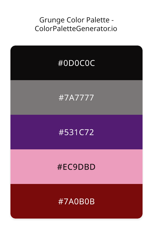
HEX: #0D0C0C
RGB: 13, 12, 12
HEX: #7A7777
RGB: 122, 119, 119
HEX: #531C72
RGB: 83, 28, 114
HEX: #EC9DBD
RGB: 236, 157, 189
HEX: #7A0B0B
RGB: 122, 11, 11
Text on White/Black Backgrounds
Color Pair Combinations (10 total)
WCAG Contrast Standards:
- AAA (7:1): Enhanced contrast for maximum readability
- AA (4.5:1): Minimum for normal text (under 18pt)
- AA Large (3:1): Acceptable for large text (18pt+ or 14pt+ bold)
- Fail: Below WCAG standards, not recommended for text
Recommended Text Colors
Horizontal (Left to Right)
background: linear-gradient(to right, #0D0C0C 0%, #7A7777 25%, #531C72 50%, #EC9DBD 75%, #7A0B0B 100%);Vertical (Top to Bottom)
background: linear-gradient(to bottom, #0D0C0C 0%, #7A7777 25%, #531C72 50%, #EC9DBD 75%, #7A0B0B 100%);Diagonal (Top Left to Bottom Right)
background: linear-gradient(to bottom right, #0D0C0C 0%, #7A7777 25%, #531C72 50%, #EC9DBD 75%, #7A0B0B 100%);Usage Tips:
- Copy the CSS code and paste directly into your stylesheets
- Linear gradients work great for backgrounds and hero sections
- Radial gradients are perfect for spotlights and focus effects
- Conic gradients create eye-catching loading spinners and progress indicators
- Smooth transitions ensure seamless color blending
Normal Vision
No color vision deficiency
Color Swatches
#0D0C0C
#7A7777
#531C72
#EC9DBD
#7A0B0B
Full Palette View
How people with Normal Vision see it:
Overall Mood & Feel
Energetic, warm, and inviting
Emotional Impact
Stimulating and energetic, evoking feelings of excitement, warmth, and action. The balanced lightness creates versatility across different contexts
Psychological Effect
This 5-color palette creates a energetic, warm, and inviting. The combination works together to create memorable visual experiences that influence consumer perception, decision-making, and brand recall. The rich variety provides versatility while maintaining cohesive emotional messaging across touchpoints.
Brand Personality Traits
Perfect For These Industries
Target Audience
Affluent consumers seeking premium, high-quality products and experiences
Individual Color Psychology
#0D0C0C
Sophisticated and powerful
Emotions Evoked
Personality Traits
Brand Traits
Ideal Industries
Marketing Use
Conveys luxury, power, and sophistication. Makes colors stand out when used as background. Popular in high-end fashion and technology. Can be overwhelming if overused.
Cultural Meanings
Color Harmony Analysis
Palette Mood
Temperature
This palette combines dark & bold and balanced moods with warm and cool tones, making it versatile for various design applications.
Professional Implementation Guide
This complementary grunge palette features 5 carefully selected warm tones that create a balanced and versatile aesthetic. With low contrast levels and moderate saturation, this palette is optimized for .
Web Design & Development
For web development, implement this palette with CSS variables for easy theme switching. Consider adding darker variants for better text readability.
- Apply the 60-30-10 rule for visual hierarchy
- Use accent colors for CTAs and hover states
- Maintain consistent color usage across all pages
- Test responsive behavior on multiple devices
Mobile App Interfaces
In mobile applications, these warm tones provide excellent battery efficiency on OLED screens. Use the subtle color variations to define clear touch targets.
- Design both light and dark mode variants
- Consider thumb-reach zones for color placement
- Test under direct sunlight and low light
- Use color to indicate interactive elements
Brand Identity Systems
Build a cohesive brand identity by designating specific colors for specific purposes. Establish your primary brand color from the most distinctive shade and create comprehensive brand guidelines specifying exact usage scenarios.
- Define primary, secondary, and accent colors
- Create usage rules for marketing materials
- Specify minimum sizes and clear space
- Document do's and don'ts for consistency
Frontend Development
Developers can integrate this palette efficiently using modern CSS techniques. Export as CSS variables for maximum flexibility, allowing theme switching and dynamic color updates without rewriting stylesheets.
- Use CSS custom properties for theming
- Implement semantic color naming conventions
- Create utility classes for rapid prototyping
- Consider CSS-in-JS for component-scoped colors
Print Design
For print materials, convert to CMYK using #0D0C0C as the dominant color for headers and #7A0B0B for accents. These colors translate well to print with minimal adjustment.
- Add to your design software color library
- Create swatches for quick color access
- Use CMYK values for print production
- Request color proofs before final print
Marketing Campaigns
Marketing materials benefit from consistent color usage that reinforces brand recognition. Apply this palette across email campaigns, landing pages, advertisements, and social media for maximum impact and memorability.
- Maintain color consistency across channels
- A/B test color variations for conversion
- Consider cultural color associations
- Align colors with campaign messaging
Strategic Color Distribution
Professional designers follow the 60-30-10 rule for balanced color distribution. Here's how to apply this principle with the Grunge:
Dominant Color
#0D0C0CUse #0D0C0C as your primary color for backgrounds, main content areas. This black tone should occupy about 60% of your design space.
Secondary Color
#531C72Apply #531C72 as your secondary color for subtle backgrounds and card components. Allocate approximately 30% of your layout to this color.
Accent Color
#7A0B0BReserve #7A0B0B for accent elements like buttons, links, and important highlights. This red accent should be used sparingly (10% of design) to draw attention to key actions.
Professional Best Practices
✓ Smart Usage Tips
- •Add white or black text overlays to improve readability on colored backgrounds
- •Balance warm tones with neutral whites or grays to create visual breathing room
- •Test your palette across different devices and lighting conditions before finalizing
✗ Common Mistakes to Avoid
- •Don't use all colors equally—establish clear visual hierarchy through color weight
- •Avoid low-contrast text combinations that strain readability
- •Don't rely solely on color to convey meaning (use icons, text, and patterns too)
- •Avoid inconsistent color usage across different pages or screens
- •Don't assume screen colors match print output—always request physical proofs
Palette Overview & Statistics
5
Total Colors
4
Associated Tags
5
Categories
4140
Community Likes
Color Analysis & Technical Guide
Detailed breakdown of each color's role, characteristics, and optimal applications. This complementary palette creates a balanced and versatile aesthetic perfect for .
Individual Color Breakdown
Each color in this warm palette has been analyzed for its properties and ideal usage scenarios. The low contrast and moderate saturation ensure harmonious visual relationships.
#0D0C0C
BLACK
#0D0C0C serves as the primary/dominant color in this palette. This dark black (muted) brings elegance and authority Use it for headers, navigation bars, and brand elements.
Dark toneH: 0°S: 4%L: 5%#7A7777
GRAY
#7A7777 serves as the secondary/supporting color in this palette. This medium gray (muted) brings neutrality and balance Use it for cards, borders, section dividers, and supporting UI components.
Dark toneH: 0°S: 1%L: 47%#531C72
PURPLE
#531C72 serves as the secondary/supporting color in this palette. This dark purple (highly saturated) brings luxury and mystery Use it for cards, borders, section dividers, and supporting UI components.
Dark toneH: 278°S: 61%L: 28%#EC9DBD
PINK
#EC9DBD serves as the secondary/supporting color in this palette. This light pink (highly saturated) brings playfulness and compassion Use it for cards, borders, section dividers, and supporting UI components.
Light toneH: 336°S: 68%L: 77%#7A0B0B
RED
#7A0B0B serves as the accent/highlight color in this palette. This dark red (highly saturated) brings power and sophistication Use it for call-to-action buttons, links, important notifications, and interactive elements.
Dark toneH: 0°S: 83%L: 26%
Palette Characteristics
This palette exhibits distinct characteristics that make it particularly suitable for specific design applications and industries.
Warm colors create energy, excitement, and approachability. Perfect for brands targeting emotional connection.
Low contrast creates subtle, sophisticated aesthetics but requires careful attention to text legibility.
Moderate saturation balances visual interest with professional restraint.
Balanced brightness provides flexibility for both light and dark design elements.
💡 Pro Tips for This Palette
- Perfect for: . The complementary color relationship creates natural visual flow.
- Mood & Psychology: This palette evokes a balanced and versatile feeling, making it ideal for brands seeking to convey those qualities.
- Accessibility: Test text combinations carefully with contrast checkers to ensure accessibility compliance.
- Extensions: Create tints (add white) and shades (add black) to expand this 5-color palette into a comprehensive design system.
- Cultural Context: Warm colors may have different meanings across cultures—verify associations with your target market.
Export Formats
Explore Grunge Palette
The Grunge color palette is a masterful blend of rich, evocative hues that evoke the raw energy of a bygone era, while still feeling remarkably contemporary and sophisticated. At its core, this palette is about embracing imperfection and authenticity, with a dash of luxury and refinement. As the colors meld together, they create a sense of depth and visual interest that draws the viewer in, inviting them to explore and experience the world in a new way. The palette's emotional impact is undeniable, conjuring up feelings of creativity, rebellion, and a touch of nostalgia.
Delving deeper into the individual colors that make up the Grunge palette, we find a fascinating array of shades that work together in perfect harmony. The darkest, coolest tone, 0D0C0C, provides a dramatic backdrop for the other colors to shine, its deep, mysterious quality adding a sense of gravity and importance to the overall design. In contrast, 7A7777 brings a sense of balance and stability, its muted, grayish-brown hue helping to ground the palette and prevent it from feeling too overwhelming or chaotic. The 531C72, with its rich, plum-like undertones, adds a pop of vibrancy and sophistication, drawing the eye and captivating the imagination. Meanwhile, EC9DBD, a warm, coral-inspired shade, injects a sense of playfulness and energy into the mix, while 7A0B0B, a deep, crimson-red, adds a sense of passion and intensity.
In terms of practical applications, the Grunge palette is incredibly versatile, lending itself to a wide range of design contexts, from websites and apps to branding and marketing materials. Its unique blend of warm, vintage, and bold elements makes it an excellent choice for designs that need to convey a sense of creativity, rebelliousness, or nonconformity, such as music or art-related projects. At the same time, its balanced, elegant qualities ensure that it can also work beautifully in more refined or sophisticated contexts, like luxury goods or high-end fashion. Whether used in its entirety or in partial combinations, the Grunge palette is sure to add a touch of excitement and visual interest to any design.
The psychology behind the Grunge palette is equally fascinating, as each color plays a subtle yet powerful role in shaping the viewer's perception and behavior. The darker, cooler tones, such as 0D0C0C and 7A7777, tend to create a sense of calmness and serenity, while the bolder, more vibrant shades, like 531C72 and EC9DBD, stimulate the senses and encourage engagement. The 7A0B0B, with its deep, crimson undertones, can even evoke feelings of excitement or passion, making it an excellent choice for calls-to-action or other interactive elements. By carefully balancing these different psychological effects, designers can use the Grunge palette to create a rich, immersive experience that draws the viewer in and refuses to let go.
For designers looking to get the most out of the Grunge palette, there are several pro tips and pairing suggestions worth exploring. One approach is to use the 531C72 as a primary color, with 7A7777 and 0D0C0C providing secondary support and depth. Alternatively, the EC9DBD can be used as a accent color, adding a pop of warmth and energy to an otherwise cool or muted design. In terms of complementary colors, shades like olive green or turquoise can create a stunning contrast with the Grunge palette, while more subtle pairings, such as beige or taupe, can help to balance out its bolder elements. By experimenting with these different combinations and techniques, designers can unlock the full potential of the Grunge palette and create designs that are truly unforgettable.
Palette Image
Below is the generated palette image showing all colors in a vertical layout. Perfect for sharing on social media or using as a reference.
Frequently Asked Questions
Everything you need to know about using and implementing the grunge palette effectively in your projects.