Kuromi Color Palette – HEX, RGB & Design Inspiration
Color Details
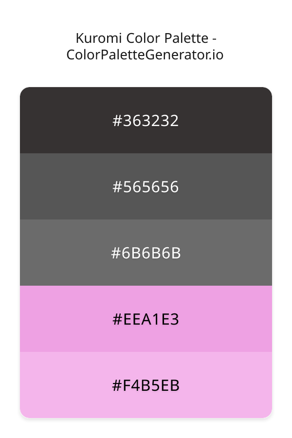
HEX: #363232
RGB: 54, 50, 50
HEX: #565656
RGB: 86, 86, 86
HEX: #6B6B6B
RGB: 107, 107, 107
HEX: #EEA1E3
RGB: 238, 161, 227
HEX: #F4B5EB
RGB: 244, 181, 235
Text on White/Black Backgrounds
Color Pair Combinations (10 total)
WCAG Contrast Standards:
- AAA (7:1): Enhanced contrast for maximum readability
- AA (4.5:1): Minimum for normal text (under 18pt)
- AA Large (3:1): Acceptable for large text (18pt+ or 14pt+ bold)
- Fail: Below WCAG standards, not recommended for text
Recommended Text Colors
Horizontal (Left to Right)
background: linear-gradient(to right, #363232 0%, #565656 25%, #6B6B6B 50%, #EEA1E3 75%, #F4B5EB 100%);Vertical (Top to Bottom)
background: linear-gradient(to bottom, #363232 0%, #565656 25%, #6B6B6B 50%, #EEA1E3 75%, #F4B5EB 100%);Diagonal (Top Left to Bottom Right)
background: linear-gradient(to bottom right, #363232 0%, #565656 25%, #6B6B6B 50%, #EEA1E3 75%, #F4B5EB 100%);Usage Tips:
- Copy the CSS code and paste directly into your stylesheets
- Linear gradients work great for backgrounds and hero sections
- Radial gradients are perfect for spotlights and focus effects
- Conic gradients create eye-catching loading spinners and progress indicators
- Smooth transitions ensure seamless color blending
Normal Vision
No color vision deficiency
Color Swatches
#363232
#565656
#6B6B6B
#EEA1E3
#F4B5EB
Full Palette View
How people with Normal Vision see it:
Overall Mood & Feel
Energetic, warm, and inviting
Emotional Impact
Stimulating and energetic, evoking feelings of excitement, warmth, and action. The balanced lightness creates versatility across different contexts
Psychological Effect
This 5-color palette creates a energetic, warm, and inviting. The combination works together to create memorable visual experiences that influence consumer perception, decision-making, and brand recall. The rich variety provides versatility while maintaining cohesive emotional messaging across touchpoints.
Brand Personality Traits
Perfect For These Industries
Target Audience
Affluent consumers seeking premium, high-quality products and experiences
Individual Color Psychology
#363232
Modern and professional
Emotions Evoked
Personality Traits
Brand Traits
Ideal Industries
Marketing Use
Provides balance and neutrality. Doesn't compete for attention. Professional and timeless. Can appear dull if not balanced with other colors.
Cultural Meanings
Color Harmony Analysis
Palette Mood
Temperature
This palette combines balanced and light & airy moods with warm and neutral tones, making it versatile for various design applications.
Professional Implementation Guide
This complementary kuromi palette features 5 carefully selected warm tones that create a balanced and versatile aesthetic. With high contrast levels and muted saturation, this palette is optimized for web interfaces and mobile apps.
Web Design & Development
For web development, implement this palette with CSS variables for easy theme switching. The high contrast makes it ideal for accessible interfaces meeting WCAG AA standards.
- Apply the 60-30-10 rule for visual hierarchy
- Use accent colors for CTAs and hover states
- Maintain consistent color usage across all pages
- Test responsive behavior on multiple devices
Mobile App Interfaces
In mobile applications, these warm tones provide excellent battery efficiency on OLED screens. Use the strong color contrast to define clear touch targets.
- Design both light and dark mode variants
- Consider thumb-reach zones for color placement
- Test under direct sunlight and low light
- Use color to indicate interactive elements
Brand Identity Systems
Build a cohesive brand identity by designating specific colors for specific purposes. Establish your primary brand color from the most distinctive shade and create comprehensive brand guidelines specifying exact usage scenarios.
- Define primary, secondary, and accent colors
- Create usage rules for marketing materials
- Specify minimum sizes and clear space
- Document do's and don'ts for consistency
Frontend Development
Developers can integrate this palette efficiently using modern CSS techniques. Export as CSS variables for maximum flexibility, allowing theme switching and dynamic color updates without rewriting stylesheets.
- Use CSS custom properties for theming
- Implement semantic color naming conventions
- Create utility classes for rapid prototyping
- Consider CSS-in-JS for component-scoped colors
Print Design
For print materials, convert to CMYK using #363232 as the dominant color for headers and #F4B5EB for accents. These colors translate well to print with minimal adjustment.
- Add to your design software color library
- Create swatches for quick color access
- Use CMYK values for print production
- Request color proofs before final print
Marketing Campaigns
Marketing materials benefit from consistent color usage that reinforces brand recognition. Apply this palette across email campaigns, landing pages, advertisements, and social media for maximum impact and memorability.
- Maintain color consistency across channels
- A/B test color variations for conversion
- Consider cultural color associations
- Align colors with campaign messaging
Strategic Color Distribution
Professional designers follow the 60-30-10 rule for balanced color distribution. Here's how to apply this principle with the Kuromi:
Dominant Color
#363232Use #363232 as your primary color for backgrounds, main content areas. This gray tone should occupy about 60% of your design space.
Secondary Color
#6B6B6BApply #6B6B6B as your secondary color for supporting elements and section dividers. Allocate approximately 30% of your layout to this color.
Accent Color
#F4B5EBReserve #F4B5EB for accent elements like buttons, links, and important highlights. This pink accent should be used sparingly (10% of design) to draw attention to key actions.
Professional Best Practices
✓ Smart Usage Tips
- •Balance warm tones with neutral whites or grays to create visual breathing room
- •Test your palette across different devices and lighting conditions before finalizing
✗ Common Mistakes to Avoid
- •Don't use all colors equally—establish clear visual hierarchy through color weight
- •Avoid low-contrast text combinations that strain readability
- •Don't rely solely on color to convey meaning (use icons, text, and patterns too)
- •Avoid inconsistent color usage across different pages or screens
- •Don't assume screen colors match print output—always request physical proofs
Palette Overview & Statistics
5
Total Colors
2
Associated Tags
6
Categories
686
Community Likes
Color Analysis & Technical Guide
Detailed breakdown of each color's role, characteristics, and optimal applications. This complementary palette creates a balanced and versatile aesthetic perfect for web interfaces and mobile apps.
Individual Color Breakdown
Each color in this warm palette has been analyzed for its properties and ideal usage scenarios. The high contrast and muted saturation ensure excellent readability and accessibility.
#363232
GRAY
#363232 serves as the primary/dominant color in this palette. This dark gray (muted) brings neutrality and balance Use it for headers, navigation bars, and brand elements.
Dark toneH: 0°S: 4%L: 20%#565656
GRAY
#565656 serves as the secondary/supporting color in this palette. This medium gray (muted) brings neutrality and balance Use it for cards, borders, section dividers, and supporting UI components.
Dark toneH: 0°S: 0%L: 34%#6B6B6B
GRAY
#6B6B6B serves as the secondary/supporting color in this palette. This medium gray (muted) brings neutrality and balance Use it for cards, borders, section dividers, and supporting UI components.
Dark toneH: 0°S: 0%L: 42%#EEA1E3
PINK
#EEA1E3 serves as the secondary/supporting color in this palette. This light pink (highly saturated) brings playfulness and compassion Use it for cards, borders, section dividers, and supporting UI components.
Light toneH: 309°S: 69%L: 78%#F4B5EB
PINK
#F4B5EB serves as the accent/highlight color in this palette. This light pink (highly saturated) brings playfulness and compassion Use it for call-to-action buttons, links, important notifications, and interactive elements.
Light toneH: 309°S: 74%L: 83%
Palette Characteristics
This palette exhibits distinct characteristics that make it particularly suitable for specific design applications and industries.
Warm colors create energy, excitement, and approachability. Perfect for brands targeting emotional connection.
High contrast ensures excellent readability and meets WCAG accessibility standards for most text combinations.
Muted saturation offers sophistication and reduces visual fatigue, ideal for content-heavy applications.
Balanced brightness provides flexibility for both light and dark design elements.
💡 Pro Tips for This Palette
- Perfect for: web interfaces, mobile apps. The complementary color relationship creates natural visual flow.
- Mood & Psychology: This palette evokes a balanced and versatile feeling, making it ideal for brands seeking to convey those qualities.
- Accessibility: Excellent contrast makes this palette naturally accessible. Most color combinations will meet WCAG AA standards.
- Extensions: Create tints (add white) and shades (add black) to expand this 5-color palette into a comprehensive design system.
- Cultural Context: Warm colors may have different meanings across cultures—verify associations with your target market.
Export Formats
Explore Kuromi Palette
The Kuromi color palette is a masterful blend of sophistication and playfulness, evoking a sense of refined elegance and bold creativity. At its core, this palette is a nuanced exploration of magenta and coral hues, tempered by deep, rich grays that add a sense of professionalism and balance. As a whole, the Kuromi palette exudes a sense of confident femininity, making it an ideal choice for brands and designers looking to convey a sense of warmth and approachability.
Delving deeper into the individual colors that comprise the Kuromi palette, we find a range of subtle yet distinct shades that work together in harmony. The darkest shade, a deep, cool gray with the hex code 363232, provides a sense of stability and grounding, serving as a versatile background or accent color. The mid-tones, including 565656 and 6B6B6B, offer a gradual progression of light to dark, creating a sense of depth and visual interest. The two lighter, bolder shades, EEA1E3 and F4B5EB, introduce a pop of vibrant color, with the former exhibiting a slightly more saturated, magenta quality and the latter leaning towards a softer, coral-inspired hue. These colors can be used to draw attention, create visual hierarchy, and inject a sense of energy and playfulness into a design.
The Kuromi palette is highly versatile and can be applied in a wide range of design contexts, from websites and apps to branding, marketing materials, and corporate communications. Its unique blend of warm, bold, and professional elements makes it an excellent choice for tech companies looking to convey a sense of innovation and creativity, as well as for feminine-focused brands seeking to express a sense of confidence and sophistication. In terms of specific design applications, the Kuromi palette could be used to create striking website hero images, bold app icons, or eye-catching social media graphics, all of which would benefit from the palette's inherent sense of energy and visual appeal.
The colors in the Kuromi palette also have a profound impact on viewer perception and behavior, with the deep grays and rich magentas working together to create a sense of luxury, creativity, and approachability. The bold, vibrant shades can stimulate emotions, inspire engagement, and encourage interaction, making them ideal for call-to-actions, promotions, and other design elements that require a high level of visual attention. Furthermore, the palette's feminine undertones can help to create a sense of empathy and connection with a target audience, making it an excellent choice for brands seeking to build strong, meaningful relationships with their customers.
To get the most out of the Kuromi palette, designers and developers can experiment with complementary colors, pairing the bold magentas and corals with deep blues or rich greens to create a sense of contrast and visual tension. When pairing the colors in the palette, it's essential to balance the bold, vibrant shades with the more subdued grays, using the latter to create a sense of calm and stability. By following these design best practices and embracing the unique characteristics of the Kuromi palette, creative professionals can unlock a wide range of design possibilities, from sleek and modern tech interfaces to elegant, sophisticated branding and marketing materials.
Palette Image
Below is the generated palette image showing all colors in a vertical layout. Perfect for sharing on social media or using as a reference.
Frequently Asked Questions
Everything you need to know about using and implementing the kuromi palette effectively in your projects.