Light Green To Dark Green Color Palette – HEX, RGB & Design Inspiration
Color Details
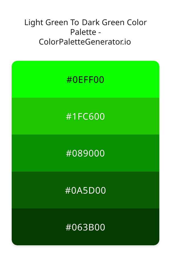
HEX: #0EFF00
RGB: 14, 255, 0
HEX: #1FC600
RGB: 31, 198, 0
HEX: #089000
RGB: 8, 144, 0
HEX: #0A5D00
RGB: 10, 93, 0
HEX: #063B00
RGB: 6, 59, 0
Text on White/Black Backgrounds
Color Pair Combinations (10 total)
WCAG Contrast Standards:
- AAA (7:1): Enhanced contrast for maximum readability
- AA (4.5:1): Minimum for normal text (under 18pt)
- AA Large (3:1): Acceptable for large text (18pt+ or 14pt+ bold)
- Fail: Below WCAG standards, not recommended for text
Recommended Text Colors
Horizontal (Left to Right)
background: linear-gradient(to right, #0EFF00 0%, #1FC600 25%, #089000 50%, #0A5D00 75%, #063B00 100%);Vertical (Top to Bottom)
background: linear-gradient(to bottom, #0EFF00 0%, #1FC600 25%, #089000 50%, #0A5D00 75%, #063B00 100%);Diagonal (Top Left to Bottom Right)
background: linear-gradient(to bottom right, #0EFF00 0%, #1FC600 25%, #089000 50%, #0A5D00 75%, #063B00 100%);Usage Tips:
- Copy the CSS code and paste directly into your stylesheets
- Linear gradients work great for backgrounds and hero sections
- Radial gradients are perfect for spotlights and focus effects
- Conic gradients create eye-catching loading spinners and progress indicators
- Smooth transitions ensure seamless color blending
Normal Vision
No color vision deficiency
Color Swatches
#0EFF00
#1FC600
#089000
#0A5D00
#063B00
Full Palette View
How people with Normal Vision see it:
Overall Mood & Feel
Balanced and versatile, with a sophisticated and dramatic atmosphere
Emotional Impact
Calming and contemplative, promoting feelings of trust, stability, and peace. The dark tones establish a premium, sophisticated feel ideal for luxury positioning
Psychological Effect
This 5-color palette creates a balanced and versatile, with a sophisticated and dramatic atmosphere. It reduces stress and promotes relaxation, lowering heart rate and encouraging contemplation. The combination works together to create memorable visual experiences that influence consumer perception, decision-making, and brand recall. The rich variety provides versatility while maintaining cohesive emotional messaging across touchpoints.
Brand Personality Traits
Perfect For These Industries
Target Audience
Business professionals and decision-makers seeking reliability and competence
Individual Color Psychology
#0EFF00
Fresh and vibrant
Emotions Evoked
Personality Traits
Brand Traits
Ideal Industries
Marketing Use
Suggests environmental friendliness and health. Easiest color for eyes to process. Perfect for wellness brands and eco-friendly products.
Cultural Meanings
Color Harmony Analysis
Palette Mood
Temperature
This palette combines balanced and dark & bold moods with neutral tones, making it versatile for various design applications.
Professional Implementation Guide
This monochromatic light green to dark green palette features 5 carefully selected balanced tones that create a dramatic and sophisticated aesthetic. With high contrast levels and vibrant saturation, this palette is optimized for web interfaces and mobile apps.
Web Design & Development
For web development, implement this palette with CSS variables for easy theme switching. The high contrast makes it ideal for accessible interfaces meeting WCAG AA standards.
- Apply the 60-30-10 rule for visual hierarchy
- Use accent colors for CTAs and hover states
- Maintain consistent color usage across all pages
- Test responsive behavior on multiple devices
Mobile App Interfaces
In mobile applications, these balanced tones provide excellent battery efficiency on OLED screens. Use the strong color contrast to define clear touch targets.
- Design both light and dark mode variants
- Consider thumb-reach zones for color placement
- Test under direct sunlight and low light
- Use color to indicate interactive elements
Brand Identity Systems
Build a cohesive brand identity by designating specific colors for specific purposes. Establish your primary brand color from the most distinctive shade and create comprehensive brand guidelines specifying exact usage scenarios.
- Define primary, secondary, and accent colors
- Create usage rules for marketing materials
- Specify minimum sizes and clear space
- Document do's and don'ts for consistency
Frontend Development
Developers can integrate this palette efficiently using modern CSS techniques. Export as CSS variables for maximum flexibility, allowing theme switching and dynamic color updates without rewriting stylesheets.
- Use CSS custom properties for theming
- Implement semantic color naming conventions
- Create utility classes for rapid prototyping
- Consider CSS-in-JS for component-scoped colors
Print Design
For print materials, convert to CMYK using #0EFF00 as the dominant color for headers and #063B00 for accents. These vibrant colors may appear slightly muted in print; request color proofs.
- Add to your design software color library
- Create swatches for quick color access
- Use CMYK values for print production
- Request color proofs before final print
Marketing Campaigns
Marketing materials benefit from consistent color usage that reinforces brand recognition. Apply this palette across email campaigns, landing pages, advertisements, and social media for maximum impact and memorability.
- Maintain color consistency across channels
- A/B test color variations for conversion
- Consider cultural color associations
- Align colors with campaign messaging
Strategic Color Distribution
Professional designers follow the 60-30-10 rule for balanced color distribution. Here's how to apply this principle with the Light Green To Dark Green:
Dominant Color
#0EFF00Use #0EFF00 as your primary color for headers, hero sections, and primary CTAs. This green tone should occupy about 60% of your design space.
Secondary Color
#089000Apply #089000 as your secondary color for supporting elements and section dividers. Allocate approximately 30% of your layout to this color.
Accent Color
#063B00Reserve #063B00 for accent elements like buttons, links, and important highlights. This green accent should be used sparingly (10% of design) to draw attention to key actions.
Professional Best Practices
✓ Smart Usage Tips
- •Use desaturated versions (reduce saturation by 20-30%) for large background areas to prevent visual fatigue
- •Ensure sufficient lighting contrast for text elements—use light text on dark backgrounds
- •Test your palette across different devices and lighting conditions before finalizing
✗ Common Mistakes to Avoid
- •Don't use all colors equally—establish clear visual hierarchy through color weight
- •Avoid low-contrast text combinations that strain readability
- •Don't rely solely on color to convey meaning (use icons, text, and patterns too)
- •Avoid inconsistent color usage across different pages or screens
- •Don't assume screen colors match print output—always request physical proofs
Palette Overview & Statistics
5
Total Colors
1
Associated Tags
6
Categories
4101
Community Likes
Color Analysis & Technical Guide
Detailed breakdown of each color's role, characteristics, and optimal applications. This monochromatic palette creates a dramatic and sophisticated aesthetic perfect for web interfaces and mobile apps.
Individual Color Breakdown
Each color in this balanced palette has been analyzed for its properties and ideal usage scenarios. The high contrast and vibrant saturation ensure excellent readability and accessibility.
#0EFF00
GREEN
#0EFF00 serves as the primary/dominant color in this palette. This medium green (highly saturated) brings stability and prosperity Use it for headers, navigation bars, and brand elements.
Dark toneH: 117°S: 100%L: 50%#1FC600
GREEN
#1FC600 serves as the secondary/supporting color in this palette. This medium green (highly saturated) brings stability and prosperity Use it for cards, borders, section dividers, and supporting UI components.
Dark toneH: 111°S: 100%L: 39%#089000
GREEN
#089000 serves as the secondary/supporting color in this palette. This dark green (highly saturated) brings stability and prosperity Use it for cards, borders, section dividers, and supporting UI components.
Dark toneH: 117°S: 100%L: 28%#0A5D00
GREEN
#0A5D00 serves as the secondary/supporting color in this palette. This dark green (highly saturated) brings stability and prosperity Use it for cards, borders, section dividers, and supporting UI components.
Dark toneH: 114°S: 100%L: 18%#063B00
GREEN
#063B00 serves as the accent/highlight color in this palette. This dark green (highly saturated) brings stability and prosperity Use it for call-to-action buttons, links, important notifications, and interactive elements.
Dark toneH: 114°S: 100%L: 12%
Palette Characteristics
This palette exhibits distinct characteristics that make it particularly suitable for specific design applications and industries.
Balanced temperature offers versatility across various design contexts and industries.
High contrast ensures excellent readability and meets WCAG accessibility standards for most text combinations.
Vibrant saturation creates bold, attention-grabbing designs perfect for youth brands and creative projects.
Dark tones create dramatic, sophisticated aesthetics and save battery on OLED displays.
💡 Pro Tips for This Palette
- Perfect for: web interfaces, mobile apps. The monochromatic color relationship creates natural visual flow.
- Mood & Psychology: This palette evokes a dramatic and sophisticated feeling, making it ideal for brands seeking to convey those qualities.
- Accessibility: Excellent contrast makes this palette naturally accessible. Most color combinations will meet WCAG AA standards.
- Extensions: Create tints (add white) and shades (add black) to expand this 5-color palette into a comprehensive design system.
- Cultural Context: Cool tones are generally perceived as professional worldwide but always research cultural color meanings.
Export Formats
Explore Light Green To Dark Green Palette
The Light Green To Dark Green palette is a mesmerizing collection of hues that evoke feelings of growth, harmony, and balance, transporting viewers to a world of lush landscapes and vibrant vitality. As the name suggests, this palette takes you on a journey from the brightest, most radiant green, reminiscent of a sunlit meadow, to the deepest, richest tones, evoking the mystery of a dense forest. The palette's monochromatic scheme creates a sense of cohesion and flow, making it perfect for designers seeking to craft a visually striking and immersive experience.
Delving deeper into the palette, the lightest shade, 0EFF00, is a brilliant, electric green that grabs attention and energizes the senses, while 1FC600, a slightly darker and more muted tone, adds a touch of warmth and approachability. As we progress through the palette, 089000 introduces a hint of earthiness, bringing a sense of stability and grounding, followed by 0A5D00, which deepens the tone, adding a layer of sophistication and elegance. Finally, 063B00, the darkest shade, provides a sense of depth and luxury, rounding out the palette with a sense of refinement and poise. Each shade plays a unique role in the palette, working together in harmony to create a sense of continuity and visual interest.
This palette's versatility makes it an excellent choice for a wide range of design applications, from websites and apps to branding and marketing campaigns. Designers can use the Light Green To Dark Green palette to create a bold and eye-catching visual identity, perfect for companies looking to convey a sense of innovation, growth, and environmental awareness. The palette's vibrant and energetic feel also makes it well-suited for digital products, such as gaming apps or social media platforms, where an engaging and dynamic user experience is crucial. Additionally, the palette's vintage and modern elements can be leveraged to craft a unique and captivating brand image, setting businesses apart from their competitors.
The psychology behind the Light Green To Dark Green palette is fascinating, as the various shades of green can significantly influence viewer perception and behavior. Green is often associated with feelings of calmness, balance, and harmony, making it an excellent choice for designs aimed at promoting relaxation and well-being. The brighter, more vibrant shades can stimulate creativity, enthusiasm, and energy, while the deeper, richer tones can evoke feelings of trust, stability, and growth. By carefully selecting and combining the shades in this palette, designers can create a powerful emotional connection with their audience, driving engagement, loyalty, and ultimately, business success.
To get the most out of the Light Green To Dark Green palette, designers can experiment with complementary colors, such as earthy browns or sky blues, to create a sense of contrast and visual interest. Pairing the palette's brighter shades with neutral tones, such as beige or gray, can add a touch of sophistication and balance, while combining the deeper shades with metallic accents can create a sense of luxury and glamour. When working with this palette, it's essential to consider the 60-30-10 rule, where the dominant shade, 1FC600, occupies 60% of the design, the secondary shade, 089000, occupies 30%, and the accent shade, 0EFF00, occupies 10%, ensuring a harmonious and visually appealing composition. By following these guidelines and embracing the palette's unique characteristics, designers can unlock the full potential of the Light Green To Dark Green palette and craft truly stunning, effective, and memorable designs.
Palette Image
Below is the generated palette image showing all colors in a vertical layout. Perfect for sharing on social media or using as a reference.
Frequently Asked Questions
Everything you need to know about using and implementing the light green to dark green palette effectively in your projects.