Light Yellow Color Palette – HEX, RGB & Design Inspiration
Color Details
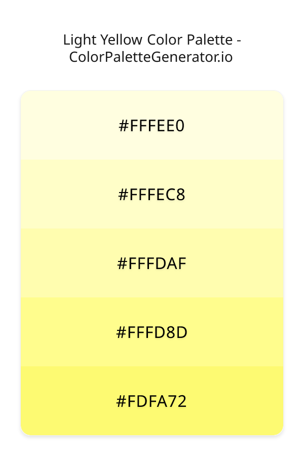
HEX: #FFFEE0
RGB: 255, 254, 224
HEX: #FFFEC8
RGB: 255, 254, 200
HEX: #FFFDAF
RGB: 255, 253, 175
HEX: #FFFD8D
RGB: 255, 253, 141
HEX: #FDFA72
RGB: 253, 250, 114
Text on White/Black Backgrounds
Color Pair Combinations (10 total)
WCAG Contrast Standards:
- AAA (7:1): Enhanced contrast for maximum readability
- AA (4.5:1): Minimum for normal text (under 18pt)
- AA Large (3:1): Acceptable for large text (18pt+ or 14pt+ bold)
- Fail: Below WCAG standards, not recommended for text
Recommended Text Colors
Horizontal (Left to Right)
background: linear-gradient(to right, #FFFEE0 0%, #FFFEC8 25%, #FFFDAF 50%, #FFFD8D 75%, #FDFA72 100%);Vertical (Top to Bottom)
background: linear-gradient(to bottom, #FFFEE0 0%, #FFFEC8 25%, #FFFDAF 50%, #FFFD8D 75%, #FDFA72 100%);Diagonal (Top Left to Bottom Right)
background: linear-gradient(to bottom right, #FFFEE0 0%, #FFFEC8 25%, #FFFDAF 50%, #FFFD8D 75%, #FDFA72 100%);Usage Tips:
- Copy the CSS code and paste directly into your stylesheets
- Linear gradients work great for backgrounds and hero sections
- Radial gradients are perfect for spotlights and focus effects
- Conic gradients create eye-catching loading spinners and progress indicators
- Smooth transitions ensure seamless color blending
Normal Vision
No color vision deficiency
Color Swatches
#FFFEE0
#FFFEC8
#FFFDAF
#FFFD8D
#FDFA72
Full Palette View
How people with Normal Vision see it:
Overall Mood & Feel
Energetic, warm, and inviting, with an airy and optimistic feel
Emotional Impact
Stimulating and energetic, evoking feelings of excitement, warmth, and action. The light tones create an uplifting, optimistic atmosphere perfect for approachable brands
Psychological Effect
This 5-color palette creates a energetic, warm, and inviting, with an airy and optimistic feel. The combination works together to create memorable visual experiences that influence consumer perception, decision-making, and brand recall. The rich variety provides versatility while maintaining cohesive emotional messaging across touchpoints.
Brand Personality Traits
Perfect For These Industries
Target Audience
Young, trend-conscious consumers (18-35) who value creativity and self-expression. Appeals to those seeking approachable, positive, and optimistic brands
Individual Color Psychology
#FFFEE0
Bright and cheerful
Emotions Evoked
Personality Traits
Brand Traits
Ideal Industries
Marketing Use
Grabs attention quickly, stimulates mental activity, and generates optimism. Great for highlighting products and encouraging impulse decisions.
Cultural Meanings
Color Harmony Analysis
Palette Mood
Temperature
This palette combines light & airy moods with warm tones, making it versatile for various design applications.
Professional Implementation Guide
This monochromatic light yellow palette features 5 carefully selected warm tones that create a energetic and passionate aesthetic. With low contrast levels and vibrant saturation, this palette is optimized for marketing materials and youth brands.
Web Design & Development
For web development, implement this palette with CSS variables for easy theme switching. Consider adding darker variants for better text readability.
- Apply the 60-30-10 rule for visual hierarchy
- Use accent colors for CTAs and hover states
- Maintain consistent color usage across all pages
- Test responsive behavior on multiple devices
Mobile App Interfaces
In mobile applications, these warm tones provide excellent readability in bright conditions. Use the subtle color variations to define clear touch targets.
- Design both light and dark mode variants
- Consider thumb-reach zones for color placement
- Test under direct sunlight and low light
- Use color to indicate interactive elements
Brand Identity Systems
Build a cohesive brand identity by designating specific colors for specific purposes. Establish your primary brand color from the most distinctive shade and create comprehensive brand guidelines specifying exact usage scenarios.
- Define primary, secondary, and accent colors
- Create usage rules for marketing materials
- Specify minimum sizes and clear space
- Document do's and don'ts for consistency
Frontend Development
Developers can integrate this palette efficiently using modern CSS techniques. Export as CSS variables for maximum flexibility, allowing theme switching and dynamic color updates without rewriting stylesheets.
- Use CSS custom properties for theming
- Implement semantic color naming conventions
- Create utility classes for rapid prototyping
- Consider CSS-in-JS for component-scoped colors
Print Design
For print materials, convert to CMYK using #FFFEE0 as the dominant color for headers and #FDFA72 for accents. These vibrant colors may appear slightly muted in print; request color proofs.
- Add to your design software color library
- Create swatches for quick color access
- Use CMYK values for print production
- Request color proofs before final print
Marketing Campaigns
Marketing materials benefit from consistent color usage that reinforces brand recognition. Apply this palette across email campaigns, landing pages, advertisements, and social media for maximum impact and memorability.
- Maintain color consistency across channels
- A/B test color variations for conversion
- Consider cultural color associations
- Align colors with campaign messaging
Strategic Color Distribution
Professional designers follow the 60-30-10 rule for balanced color distribution. Here's how to apply this principle with the Light Yellow:
Dominant Color
#FFFEE0Use #FFFEE0 as your primary color for backgrounds, main content areas. This yellow tone should occupy about 60% of your design space.
Secondary Color
#FFFDAFApply #FFFDAF as your secondary color for subtle backgrounds and card components. Allocate approximately 30% of your layout to this color.
Accent Color
#FDFA72Reserve #FDFA72 for accent elements like buttons, links, and important highlights. This yellow accent should be used sparingly (10% of design) to draw attention to key actions.
Professional Best Practices
✓ Smart Usage Tips
- •Add white or black text overlays to improve readability on colored backgrounds
- •Use desaturated versions (reduce saturation by 20-30%) for large background areas to prevent visual fatigue
- •Balance warm tones with neutral whites or grays to create visual breathing room
- •Test your palette across different devices and lighting conditions before finalizing
✗ Common Mistakes to Avoid
- •Don't use all colors equally—establish clear visual hierarchy through color weight
- •Avoid low-contrast text combinations that strain readability
- •Don't rely solely on color to convey meaning (use icons, text, and patterns too)
- •Avoid inconsistent color usage across different pages or screens
- •Don't assume screen colors match print output—always request physical proofs
Palette Overview & Statistics
5
Total Colors
1
Associated Tags
6
Categories
2262
Community Likes
Color Analysis & Technical Guide
Detailed breakdown of each color's role, characteristics, and optimal applications. This monochromatic palette creates a energetic and passionate aesthetic perfect for marketing materials and youth brands.
Individual Color Breakdown
Each color in this warm palette has been analyzed for its properties and ideal usage scenarios. The low contrast and vibrant saturation ensure harmonious visual relationships.
#FFFEE0
YELLOW
#FFFEE0 serves as the primary/dominant color in this palette. This light yellow (highly saturated) brings optimism and cheerfulness Use it for backgrounds, containers, and large surface areas.
Light toneH: 58°S: 100%L: 94%#FFFEC8
YELLOW
#FFFEC8 serves as the secondary/supporting color in this palette. This light yellow (highly saturated) brings optimism and cheerfulness Use it for cards, borders, section dividers, and supporting UI components.
Light toneH: 59°S: 100%L: 89%#FFFDAF
YELLOW
#FFFDAF serves as the secondary/supporting color in this palette. This light yellow (highly saturated) brings optimism and cheerfulness Use it for cards, borders, section dividers, and supporting UI components.
Light toneH: 59°S: 100%L: 84%#FFFD8D
YELLOW
#FFFD8D serves as the secondary/supporting color in this palette. This light yellow (highly saturated) brings optimism and cheerfulness Use it for cards, borders, section dividers, and supporting UI components.
Light toneH: 59°S: 100%L: 78%#FDFA72
YELLOW
#FDFA72 serves as the accent/highlight color in this palette. This light yellow (highly saturated) brings optimism and cheerfulness Use it for call-to-action buttons, links, important notifications, and interactive elements.
Light toneH: 59°S: 97%L: 72%
Palette Characteristics
This palette exhibits distinct characteristics that make it particularly suitable for specific design applications and industries.
Warm colors create energy, excitement, and approachability. Perfect for brands targeting emotional connection.
Low contrast creates subtle, sophisticated aesthetics but requires careful attention to text legibility.
Vibrant saturation creates bold, attention-grabbing designs perfect for youth brands and creative projects.
Light palette creates airy, open designs with excellent readability for dark text overlays.
💡 Pro Tips for This Palette
- Perfect for: marketing materials, youth brands, minimalist designs, health & wellness. The monochromatic color relationship creates natural visual flow.
- Mood & Psychology: This palette evokes a energetic and passionate feeling, making it ideal for brands seeking to convey those qualities.
- Accessibility: Test text combinations carefully with contrast checkers to ensure accessibility compliance.
- Extensions: Create tints (add white) and shades (add black) to expand this 5-color palette into a comprehensive design system.
- Cultural Context: Warm colors may have different meanings across cultures—verify associations with your target market.
Export Formats
Explore Light Yellow Palette
The Light Yellow color palette is a masterful blend of soft, sunny hues that evoke feelings of warmth, optimism, and joy. This carefully curated selection of colors, ranging from the pale cream of FFFEE0 to the vibrant, golden yellow of FDFA72, is sure to bring a sense of brightness and energy to any design project. The palette's monochromatic approach creates a sense of cohesion and harmony, making it perfect for designers looking to create a consistent visual identity.
At the heart of the Light Yellow palette is a range of delicate, pastel shades that work together in perfect harmony. The palest shade, FFFEE0, provides a soft, creamy background that sets the tone for the rest of the palette. As we move through the palette, we find FFFFEC8, a slightly deeper, more saturated yellow that adds a touch of warmth and depth to the design. The next shade, FFFDAF, introduces a hint of brightness and vibrancy, while FFFD8D brings a sense of excitement and playfulness to the table. Finally, the boldest shade, FDFA72, adds a burst of energy and vitality, drawing the viewer's eye and commanding attention.
The Light Yellow palette is incredibly versatile, making it suitable for a wide range of design applications, from websites and apps to branding and marketing materials. Designers can use this palette to create a bright, welcoming atmosphere that puts users at ease, or to add a touch of warmth and personality to a brand's visual identity. For example, a website focused on wellness or self-care might use the softer shades, such as FFFEE0 and FFFFEC8, to create a calming and soothing atmosphere, while a more energetic and vibrant brand might opt for the bolder shades, such as FFFD8D and FDFA72.
The colors in the Light Yellow palette also have a profound impact on viewer perception and behavior. Yellow is often associated with feelings of happiness, optimism, and creativity, making it an ideal choice for designs that aim to inspire and motivate. The softer shades in the palette can help to reduce stress and anxiety, while the bolder shades can stimulate the senses and encourage action. By carefully selecting the right shade for the job, designers can use the Light Yellow palette to influence viewer emotions and behavior, creating a more engaging and effective design.
To get the most out of the Light Yellow palette, designers should consider pairing these colors with complementary shades that enhance their natural warmth and energy. For example, pairing FFFEE0 with a deep, rich blue can create a stunning contrast that draws the viewer's eye, while combining FDFA72 with a bright, poppy pink can add a fun and playful touch to the design. By following best practices, such as using the 60-30-10 rule to balance the palette, and experimenting with different combinations and pairings, designers can unlock the full potential of the Light Yellow palette and create designs that are both beautiful and effective.
Palette Image
Below is the generated palette image showing all colors in a vertical layout. Perfect for sharing on social media or using as a reference.
Frequently Asked Questions
Everything you need to know about using and implementing the light yellow palette effectively in your projects.