Neon Purple Color Palette – HEX, RGB & Design Inspiration
Color Details
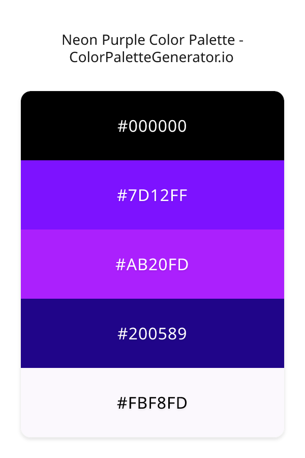
HEX: #000000
RGB: 0, 0, 0
HEX: #7D12FF
RGB: 125, 18, 255
HEX: #AB20FD
RGB: 171, 32, 253
HEX: #200589
RGB: 32, 5, 137
HEX: #FBF8FD
RGB: 251, 248, 253
Text on White/Black Backgrounds
Color Pair Combinations (10 total)
WCAG Contrast Standards:
- AAA (7:1): Enhanced contrast for maximum readability
- AA (4.5:1): Minimum for normal text (under 18pt)
- AA Large (3:1): Acceptable for large text (18pt+ or 14pt+ bold)
- Fail: Below WCAG standards, not recommended for text
Recommended Text Colors
Horizontal (Left to Right)
background: linear-gradient(to right, #000000 0%, #7D12FF 25%, #AB20FD 50%, #200589 75%, #FBF8FD 100%);Vertical (Top to Bottom)
background: linear-gradient(to bottom, #000000 0%, #7D12FF 25%, #AB20FD 50%, #200589 75%, #FBF8FD 100%);Diagonal (Top Left to Bottom Right)
background: linear-gradient(to bottom right, #000000 0%, #7D12FF 25%, #AB20FD 50%, #200589 75%, #FBF8FD 100%);Usage Tips:
- Copy the CSS code and paste directly into your stylesheets
- Linear gradients work great for backgrounds and hero sections
- Radial gradients are perfect for spotlights and focus effects
- Conic gradients create eye-catching loading spinners and progress indicators
- Smooth transitions ensure seamless color blending
Normal Vision
No color vision deficiency
Color Swatches
#000000
#7D12FF
#AB20FD
#200589
#FBF8FD
Full Palette View
How people with Normal Vision see it:
Overall Mood & Feel
Calm, professional, and trustworthy
Emotional Impact
Calming and contemplative, promoting feelings of trust, stability, and peace. The balanced lightness creates versatility across different contexts
Psychological Effect
This 5-color palette creates a calm, professional, and trustworthy. The combination works together to create memorable visual experiences that influence consumer perception, decision-making, and brand recall. The rich variety provides versatility while maintaining cohesive emotional messaging across touchpoints.
Brand Personality Traits
Perfect For These Industries
Target Audience
Affluent consumers seeking premium, high-quality products and experiences
Individual Color Psychology
#000000
Sophisticated and powerful
Emotions Evoked
Personality Traits
Brand Traits
Ideal Industries
Marketing Use
Conveys luxury, power, and sophistication. Makes colors stand out when used as background. Popular in high-end fashion and technology. Can be overwhelming if overused.
Cultural Meanings
Color Harmony Analysis
Palette Mood
Temperature
This palette combines dark & bold and balanced and light & airy moods with neutral and cool tones, making it versatile for various design applications.
Professional Implementation Guide
This complementary neon purple palette features 5 carefully selected cool tones that create a balanced and versatile aesthetic. With high contrast levels and vibrant saturation, this palette is optimized for web interfaces and mobile apps.
Web Design & Development
For web development, implement this palette with CSS variables for easy theme switching. The high contrast makes it ideal for accessible interfaces meeting WCAG AA standards.
- Apply the 60-30-10 rule for visual hierarchy
- Use accent colors for CTAs and hover states
- Maintain consistent color usage across all pages
- Test responsive behavior on multiple devices
Mobile App Interfaces
In mobile applications, these cool tones provide excellent battery efficiency on OLED screens. Use the strong color contrast to define clear touch targets.
- Design both light and dark mode variants
- Consider thumb-reach zones for color placement
- Test under direct sunlight and low light
- Use color to indicate interactive elements
Brand Identity Systems
Build a cohesive brand identity by designating specific colors for specific purposes. Establish your primary brand color from the most distinctive shade and create comprehensive brand guidelines specifying exact usage scenarios.
- Define primary, secondary, and accent colors
- Create usage rules for marketing materials
- Specify minimum sizes and clear space
- Document do's and don'ts for consistency
Frontend Development
Developers can integrate this palette efficiently using modern CSS techniques. Export as CSS variables for maximum flexibility, allowing theme switching and dynamic color updates without rewriting stylesheets.
- Use CSS custom properties for theming
- Implement semantic color naming conventions
- Create utility classes for rapid prototyping
- Consider CSS-in-JS for component-scoped colors
Print Design
For print materials, convert to CMYK using #000000 as the dominant color for headers and #FBF8FD for accents. These vibrant colors may appear slightly muted in print; request color proofs.
- Add to your design software color library
- Create swatches for quick color access
- Use CMYK values for print production
- Request color proofs before final print
Marketing Campaigns
Marketing materials benefit from consistent color usage that reinforces brand recognition. Apply this palette across email campaigns, landing pages, advertisements, and social media for maximum impact and memorability.
- Maintain color consistency across channels
- A/B test color variations for conversion
- Consider cultural color associations
- Align colors with campaign messaging
Strategic Color Distribution
Professional designers follow the 60-30-10 rule for balanced color distribution. Here's how to apply this principle with the Neon Purple:
Dominant Color
#000000Use #000000 as your primary color for backgrounds, main content areas. This black tone should occupy about 60% of your design space.
Secondary Color
#AB20FDApply #AB20FD as your secondary color for supporting elements and section dividers. Allocate approximately 30% of your layout to this color.
Accent Color
#FBF8FDReserve #FBF8FD for accent elements like buttons, links, and important highlights. This purple accent should be used sparingly (10% of design) to draw attention to key actions.
Professional Best Practices
✓ Smart Usage Tips
- •Use desaturated versions (reduce saturation by 20-30%) for large background areas to prevent visual fatigue
- •Add warm accent colors to create focal points and prevent designs from feeling too cold
- •Test your palette across different devices and lighting conditions before finalizing
✗ Common Mistakes to Avoid
- •Don't use all colors equally—establish clear visual hierarchy through color weight
- •Avoid low-contrast text combinations that strain readability
- •Don't rely solely on color to convey meaning (use icons, text, and patterns too)
- •Avoid inconsistent color usage across different pages or screens
- •Don't assume screen colors match print output—always request physical proofs
Palette Overview & Statistics
5
Total Colors
3
Associated Tags
5
Categories
4304
Community Likes
Color Analysis & Technical Guide
Detailed breakdown of each color's role, characteristics, and optimal applications. This complementary palette creates a balanced and versatile aesthetic perfect for web interfaces and mobile apps.
Individual Color Breakdown
Each color in this cool palette has been analyzed for its properties and ideal usage scenarios. The high contrast and vibrant saturation ensure excellent readability and accessibility.
#000000
BLACK
#000000 serves as the primary/dominant color in this palette. This dark black (muted) brings elegance and authority Use it for headers, navigation bars, and brand elements.
Dark toneH: 0°S: 0%L: 0%#7D12FF
PURPLE
#7D12FF serves as the secondary/supporting color in this palette. This medium purple (highly saturated) brings creative and luxurious Use it for cards, borders, section dividers, and supporting UI components.
Light toneH: 267°S: 100%L: 54%#AB20FD
PURPLE
#AB20FD serves as the secondary/supporting color in this palette. This medium purple (highly saturated) brings creative and luxurious Use it for cards, borders, section dividers, and supporting UI components.
Light toneH: 278°S: 98%L: 56%#200589
BLUE
#200589 serves as the secondary/supporting color in this palette. This dark blue (highly saturated) brings professionalism and depth Use it for cards, borders, section dividers, and supporting UI components.
Dark toneH: 252°S: 93%L: 28%#FBF8FD
PURPLE
#FBF8FD serves as the accent/highlight color in this palette. This light purple (moderately saturated) brings creative and luxurious Use it for call-to-action buttons, links, important notifications, and interactive elements.
Light toneH: 276°S: 56%L: 98%
Palette Characteristics
This palette exhibits distinct characteristics that make it particularly suitable for specific design applications and industries.
Cool tones convey professionalism, trust, and calmness. Ideal for corporate and tech applications.
High contrast ensures excellent readability and meets WCAG accessibility standards for most text combinations.
Vibrant saturation creates bold, attention-grabbing designs perfect for youth brands and creative projects.
Balanced brightness provides flexibility for both light and dark design elements.
💡 Pro Tips for This Palette
- Perfect for: web interfaces, mobile apps. The complementary color relationship creates natural visual flow.
- Mood & Psychology: This palette evokes a balanced and versatile feeling, making it ideal for brands seeking to convey those qualities.
- Accessibility: Excellent contrast makes this palette naturally accessible. Most color combinations will meet WCAG AA standards.
- Extensions: Create tints (add white) and shades (add black) to expand this 5-color palette into a comprehensive design system.
- Cultural Context: Cool tones are generally perceived as professional worldwide but always research cultural color meanings.
Export Formats
Explore Neon Purple Palette
The Neon Purple color palette is a mesmerizing blend of rich, bold hues that evoke a sense of luxury and sophistication, while also exuding a playful, modern vibe. At its core, this palette is all about making a statement, and its carefully curated colors work together in perfect harmony to create a truly show-stopping visual effect. The palette's darkest shade, a deep, mysterious black, provides a dramatic backdrop for the other colors to shine, and is often used as a foundation or accent color to add depth and contrast to a design. This black, with its hex code, is the perfect starting point for building a design that is both elegant and edgy.
As we delve deeper into the Neon Purple palette, we find a range of purple shades that are both bold and beautiful. The first of these, a vibrant, electric purple with a hex code of 7D12FF, is a true showstopper, and is often used as a primary color to grab the viewer's attention. This shade is perfectly balanced by a slightly lighter, more pastel purple with a hex code of AB20FD, which adds a touch of warmth and sophistication to the palette. Meanwhile, a deep, rich navy blue with a hex code of 200089 provides a sense of stability and grounding, and helps to balance out the brighter, more playful shades. Finally, a soft, creamy white with a hex code of FBF8FD adds a touch of elegance and refinement, and helps to create a sense of contrast and visual interest. Each of these colors plays a vital role in the palette, and together they create a truly unique and captivating visual effect.
The Neon Purple palette is incredibly versatile, and can be used in a wide range of design applications, from websites and apps to branding and marketing materials. Its bold, modern colors make it perfect for designs that need to stand out and grab the viewer's attention, while its elegant, sophisticated shades make it ideal for designs that require a touch of luxury and refinement. For example, a website or app that wants to convey a sense of fun and playfulness might use the brighter, more vibrant shades in the palette, such as the electric purple with a hex code of 7D12FF, as a primary color, while a more formal or corporate design might opt for the deeper, richer shades, such as the navy blue with a hex code of 200089. Whatever the application, the Neon Purple palette is sure to add a touch of excitement and energy to any design.
The colors in the Neon Purple palette also have a profound influence on the viewer's perception and behavior, and can be used to evoke a range of emotions and responses. For example, the bold, vibrant purples in the palette can stimulate creativity and enthusiasm, while the deeper, richer shades can promote feelings of trust and loyalty. The palette's use of contrast and visual interest can also help to capture the viewer's attention and draw them in, making it perfect for designs that need to communicate a message or tell a story. By understanding the psychological impact of the colors in the Neon Purple palette, designers can use them to create designs that are not only visually stunning, but also highly effective and engaging.
To get the most out of the Neon Purple palette, designers should consider pairing its bold, vibrant colors with complementary shades that enhance and balance their effects. For example, the electric purple with a hex code of 7D12FF pairs perfectly with a deep, rich green, which helps to bring out its bright, vibrant tones, while the navy blue with a hex code of 200089 is beautifully complemented by a warm, golden yellow, which adds a touch of sophistication and elegance. By experimenting with different pairings and combinations, designers can unlock the full potential of the Neon Purple palette and create designs that are truly unique and captivating. Additionally, designers should be mindful of the 60-30-10 rule, which suggests that a design should be composed of a dominant color, a secondary color, and an accent color, to create a balanced and harmonious visual effect. By following this rule and using the Neon Purple palette in a thoughtful and intentional way, designers can create designs that are both beautiful and effective.
Palette Image
Below is the generated palette image showing all colors in a vertical layout. Perfect for sharing on social media or using as a reference.
Categories & Tags
Frequently Asked Questions
Everything you need to know about using and implementing the neon purple palette effectively in your projects.