Pan-African Colours - Flags Of Ethiopia And Unia Color Palette – HEX, RGB & Design Inspiration
Color Details
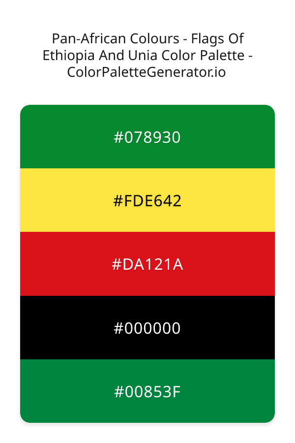
HEX: #078930
RGB: 7, 137, 48
HEX: #FDE642
RGB: 253, 230, 66
HEX: #DA121A
RGB: 218, 18, 26
HEX: #000000
RGB: 0, 0, 0
HEX: #00853F
RGB: 0, 133, 63
Text on White/Black Backgrounds
Color Pair Combinations (10 total)
WCAG Contrast Standards:
- AAA (7:1): Enhanced contrast for maximum readability
- AA (4.5:1): Minimum for normal text (under 18pt)
- AA Large (3:1): Acceptable for large text (18pt+ or 14pt+ bold)
- Fail: Below WCAG standards, not recommended for text
Recommended Text Colors
Horizontal (Left to Right)
background: linear-gradient(to right, #078930 0%, #FDE642 25%, #DA121A 50%, #000000 75%, #00853F 100%);Vertical (Top to Bottom)
background: linear-gradient(to bottom, #078930 0%, #FDE642 25%, #DA121A 50%, #000000 75%, #00853F 100%);Diagonal (Top Left to Bottom Right)
background: linear-gradient(to bottom right, #078930 0%, #FDE642 25%, #DA121A 50%, #000000 75%, #00853F 100%);Usage Tips:
- Copy the CSS code and paste directly into your stylesheets
- Linear gradients work great for backgrounds and hero sections
- Radial gradients are perfect for spotlights and focus effects
- Conic gradients create eye-catching loading spinners and progress indicators
- Smooth transitions ensure seamless color blending
Normal Vision
No color vision deficiency
Color Swatches
#078930
#FDE642
#DA121A
#000000
#00853F
Full Palette View
How people with Normal Vision see it:
Overall Mood & Feel
Energetic, warm, and inviting
Emotional Impact
Stimulating and energetic, evoking feelings of excitement, warmth, and action. The balanced lightness creates versatility across different contexts
Psychological Effect
This 5-color palette creates a energetic, warm, and inviting. It reduces stress and promotes relaxation, lowering heart rate and encouraging contemplation. The combination works together to create memorable visual experiences that influence consumer perception, decision-making, and brand recall. The rich variety provides versatility while maintaining cohesive emotional messaging across touchpoints.
Brand Personality Traits
Perfect For These Industries
Target Audience
Business professionals and decision-makers seeking reliability and competence
Individual Color Psychology
#078930
Calming and balanced
Emotions Evoked
Personality Traits
Brand Traits
Ideal Industries
Marketing Use
Suggests environmental friendliness and health. Easiest color for eyes to process. Perfect for wellness brands and eco-friendly products.
Cultural Meanings
Color Harmony Analysis
Palette Mood
Temperature
This palette combines balanced and light & airy and dark & bold moods with neutral and warm tones, making it versatile for various design applications.
Professional Implementation Guide
This complementary pan-african colours - flags of ethiopia and unia palette features 5 carefully selected warm tones that create a energetic and passionate aesthetic. With low contrast levels and vibrant saturation, this palette is optimized for marketing materials and youth brands.
Web Design & Development
For web development, implement this palette with CSS variables for easy theme switching. Consider adding darker variants for better text readability.
- Apply the 60-30-10 rule for visual hierarchy
- Use accent colors for CTAs and hover states
- Maintain consistent color usage across all pages
- Test responsive behavior on multiple devices
Mobile App Interfaces
In mobile applications, these warm tones provide excellent battery efficiency on OLED screens. Use the subtle color variations to define clear touch targets.
- Design both light and dark mode variants
- Consider thumb-reach zones for color placement
- Test under direct sunlight and low light
- Use color to indicate interactive elements
Brand Identity Systems
Build a cohesive brand identity by designating specific colors for specific purposes. Establish your primary brand color from the most distinctive shade and create comprehensive brand guidelines specifying exact usage scenarios.
- Define primary, secondary, and accent colors
- Create usage rules for marketing materials
- Specify minimum sizes and clear space
- Document do's and don'ts for consistency
Frontend Development
Developers can integrate this palette efficiently using modern CSS techniques. Export as CSS variables for maximum flexibility, allowing theme switching and dynamic color updates without rewriting stylesheets.
- Use CSS custom properties for theming
- Implement semantic color naming conventions
- Create utility classes for rapid prototyping
- Consider CSS-in-JS for component-scoped colors
Print Design
For print materials, convert to CMYK using #078930 as the dominant color for headers and #00853F for accents. These vibrant colors may appear slightly muted in print; request color proofs.
- Add to your design software color library
- Create swatches for quick color access
- Use CMYK values for print production
- Request color proofs before final print
Marketing Campaigns
Marketing materials benefit from consistent color usage that reinforces brand recognition. Apply this palette across email campaigns, landing pages, advertisements, and social media for maximum impact and memorability.
- Maintain color consistency across channels
- A/B test color variations for conversion
- Consider cultural color associations
- Align colors with campaign messaging
Strategic Color Distribution
Professional designers follow the 60-30-10 rule for balanced color distribution. Here's how to apply this principle with the Pan-African Colours - Flags Of Ethiopia And Unia:
Dominant Color
#078930Use #078930 as your primary color for backgrounds, main content areas. This green tone should occupy about 60% of your design space.
Secondary Color
#DA121AApply #DA121A as your secondary color for subtle backgrounds and card components. Allocate approximately 30% of your layout to this color.
Accent Color
#00853FReserve #00853F for accent elements like buttons, links, and important highlights. This green accent should be used sparingly (10% of design) to draw attention to key actions.
Professional Best Practices
✓ Smart Usage Tips
- •Add white or black text overlays to improve readability on colored backgrounds
- •Use desaturated versions (reduce saturation by 20-30%) for large background areas to prevent visual fatigue
- •Balance warm tones with neutral whites or grays to create visual breathing room
- •Test your palette across different devices and lighting conditions before finalizing
✗ Common Mistakes to Avoid
- •Don't use all colors equally—establish clear visual hierarchy through color weight
- •Avoid low-contrast text combinations that strain readability
- •Don't rely solely on color to convey meaning (use icons, text, and patterns too)
- •Avoid inconsistent color usage across different pages or screens
- •Don't assume screen colors match print output—always request physical proofs
Palette Overview & Statistics
5
Total Colors
5
Associated Tags
4
Categories
1639
Community Likes
Color Analysis & Technical Guide
Detailed breakdown of each color's role, characteristics, and optimal applications. This complementary palette creates a energetic and passionate aesthetic perfect for marketing materials and youth brands.
Individual Color Breakdown
Each color in this warm palette has been analyzed for its properties and ideal usage scenarios. The low contrast and vibrant saturation ensure harmonious visual relationships.
#078930
GREEN
#078930 serves as the primary/dominant color in this palette. This dark green (highly saturated) brings stability and prosperity Use it for headers, navigation bars, and brand elements.
Dark toneH: 139°S: 90%L: 28%#FDE642
YELLOW
#FDE642 serves as the secondary/supporting color in this palette. This medium yellow (highly saturated) brings optimism and cheerfulness Use it for cards, borders, section dividers, and supporting UI components.
Light toneH: 53°S: 98%L: 63%#DA121A
RED
#DA121A serves as the secondary/supporting color in this palette. This medium red (highly saturated) brings power and sophistication Use it for cards, borders, section dividers, and supporting UI components.
Dark toneH: 358°S: 85%L: 46%#000000
BLACK
#000000 serves as the secondary/supporting color in this palette. This dark black (muted) brings elegance and authority Use it for cards, borders, section dividers, and supporting UI components.
Dark toneH: 0°S: 0%L: 0%#00853F
GREEN
#00853F serves as the accent/highlight color in this palette. This dark green (highly saturated) brings stability and prosperity Use it for call-to-action buttons, links, important notifications, and interactive elements.
Dark toneH: 148°S: 100%L: 26%
Palette Characteristics
This palette exhibits distinct characteristics that make it particularly suitable for specific design applications and industries.
Warm colors create energy, excitement, and approachability. Perfect for brands targeting emotional connection.
Low contrast creates subtle, sophisticated aesthetics but requires careful attention to text legibility.
Vibrant saturation creates bold, attention-grabbing designs perfect for youth brands and creative projects.
Balanced brightness provides flexibility for both light and dark design elements.
💡 Pro Tips for This Palette
- Perfect for: marketing materials, youth brands. The complementary color relationship creates natural visual flow.
- Mood & Psychology: This palette evokes a energetic and passionate feeling, making it ideal for brands seeking to convey those qualities.
- Accessibility: Test text combinations carefully with contrast checkers to ensure accessibility compliance.
- Extensions: Create tints (add white) and shades (add black) to expand this 5-color palette into a comprehensive design system.
- Cultural Context: Warm colors may have different meanings across cultures—verify associations with your target market.
Export Formats
Explore Pan-African Colours - Flags Of Ethiopia And Unia Palette
The Pan-African Colours - Flags Of Ethiopia And Unia palette is a vibrant and emotive collection of colors that embodies the rich cultural heritage and resilience of the African continent. At its core, this palette is a celebration of unity, diversity, and the unwavering spirit of a people. The carefully curated selection of colors, including the deep teal of FDE642, the bold red of DA121A, the bright yellow of FDE642, the rich green of 078930, and the deep green of 00853F, work in harmony to evoke a sense of pride, hope, and empowerment.
Each color in the palette plays a unique role in creating a visually stunning and emotionally resonant experience. The 078930, a muted yet rich green, provides a sense of balance and stability, while the FDE642, a vibrant and energetic yellow, adds a touch of warmth and optimism. The DA121A, a bold and fiery red, injects a sense of passion and energy, drawing the viewer's attention and inspiring action. The 000000, a deep and dramatic black, adds depth and contrast, grounding the palette and preventing it from feeling too bright or overwhelming. Meanwhile, the 00853F, a deep and rich green, adds a sense of growth and harmony, bringing the palette full circle and creating a sense of unity and cohesion.
This palette is perfect for designers looking to create a bold and eye-catching visual identity for their brand, website, or application. The vintage, bold, playful, and elegant style categories make it an ideal choice for a wide range of design applications, from cultural and social justice organizations to lifestyle and entertainment brands. Whether you're designing a website, creating a marketing campaign, or developing a mobile app, the Pan-African Colours - Flags Of Ethiopia And Unia palette is sure to make a lasting impression and leave a lasting impact on your audience. The red, teal, yellow, coral, and green color themes also make it an excellent choice for designs that require a sense of energy, playfulness, and creativity.
The psychology behind this palette is just as fascinating as the colors themselves. The combination of red, yellow, and green creates a sense of excitement and energy, stimulating the viewer's senses and inspiring action. The teal and coral undertones add a sense of calmness and serenity, balancing out the boldness of the red and yellow and creating a sense of harmony and unity. The black and deep green accents add a sense of sophistication and elegance, making the palette feel more refined and polished. Overall, the Pan-African Colours - Flags Of Ethiopia And Unia palette has the power to evoke strong emotions and inspire meaningful connections with its audience.
For designers looking to get the most out of this palette, it's essential to consider the complementary colors and pairing suggestions that will enhance its impact. The FDE642 yellow, for example, pairs perfectly with the 078930 green, creating a beautiful and harmonious contrast that draws the viewer's eye. The DA121A red, on the other hand, is best paired with the 000000 black, creating a bold and dramatic visual statement that's sure to grab attention. When using this palette, it's also essential to consider the design best practices that will bring out its full potential, such as balancing bold colors with neutral accents, using contrast to create visual interest, and experimenting with different textures and typography to add depth and dimension to your design. By following these tips and tricks, designers can unlock the full creative potential of the Pan-African Colours - Flags Of Ethiopia And Unia palette and create designs that are truly unforgettable.
Palette Image
Below is the generated palette image showing all colors in a vertical layout. Perfect for sharing on social media or using as a reference.
Frequently Asked Questions
Everything you need to know about using and implementing the pan-african colours - flags of ethiopia and unia palette effectively in your projects.