Pearlescent Color Palette – HEX, RGB & Design Inspiration
Color Details
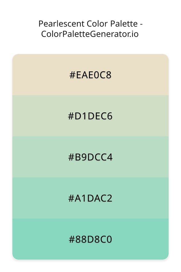
HEX: #EAE0C8
RGB: 234, 224, 200
HEX: #D1DEC6
RGB: 209, 222, 198
HEX: #B9DCC4
RGB: 185, 220, 196
HEX: #A1DAC2
RGB: 161, 218, 194
HEX: #88D8C0
RGB: 136, 216, 192
Text on White/Black Backgrounds
Color Pair Combinations (10 total)
WCAG Contrast Standards:
- AAA (7:1): Enhanced contrast for maximum readability
- AA (4.5:1): Minimum for normal text (under 18pt)
- AA Large (3:1): Acceptable for large text (18pt+ or 14pt+ bold)
- Fail: Below WCAG standards, not recommended for text
Recommended Text Colors
Horizontal (Left to Right)
background: linear-gradient(to right, #EAE0C8 0%, #D1DEC6 25%, #B9DCC4 50%, #A1DAC2 75%, #88D8C0 100%);Vertical (Top to Bottom)
background: linear-gradient(to bottom, #EAE0C8 0%, #D1DEC6 25%, #B9DCC4 50%, #A1DAC2 75%, #88D8C0 100%);Diagonal (Top Left to Bottom Right)
background: linear-gradient(to bottom right, #EAE0C8 0%, #D1DEC6 25%, #B9DCC4 50%, #A1DAC2 75%, #88D8C0 100%);Usage Tips:
- Copy the CSS code and paste directly into your stylesheets
- Linear gradients work great for backgrounds and hero sections
- Radial gradients are perfect for spotlights and focus effects
- Conic gradients create eye-catching loading spinners and progress indicators
- Smooth transitions ensure seamless color blending
Normal Vision
No color vision deficiency
Color Swatches
#EAE0C8
#D1DEC6
#B9DCC4
#A1DAC2
#88D8C0
Full Palette View
How people with Normal Vision see it:
Overall Mood & Feel
Balanced and versatile, with an airy and optimistic feel
Emotional Impact
Calming and contemplative, promoting feelings of trust, stability, and peace. The light tones create an uplifting, optimistic atmosphere perfect for approachable brands
Psychological Effect
This 5-color palette creates a balanced and versatile, with an airy and optimistic feel. It reduces stress and promotes relaxation, lowering heart rate and encouraging contemplation. The combination works together to create memorable visual experiences that influence consumer perception, decision-making, and brand recall. The rich variety provides versatility while maintaining cohesive emotional messaging across touchpoints.
Brand Personality Traits
Perfect For These Industries
Target Audience
Business professionals and decision-makers seeking reliability and competence. Appeals to those seeking approachable, positive, and optimistic brands
Individual Color Psychology
#EAE0C8
Cheerful and inviting
Emotions Evoked
Personality Traits
Brand Traits
Ideal Industries
Marketing Use
Stimulates activity and socialization, creates a sense of fun and affordability. Excellent for CTAs, impulse purchases, and youth marketing.
Cultural Meanings
Color Harmony Analysis
Palette Mood
Temperature
This palette combines light & airy and balanced moods with warm and neutral tones, making it versatile for various design applications.
Professional Implementation Guide
This triadic pearlescent palette features 5 carefully selected warm tones that create a light and airy aesthetic. With low contrast levels and moderate saturation, this palette is optimized for minimalist designs and health & wellness.
Web Design & Development
For web development, implement this palette with CSS variables for easy theme switching. Consider adding darker variants for better text readability.
- Apply the 60-30-10 rule for visual hierarchy
- Use accent colors for CTAs and hover states
- Maintain consistent color usage across all pages
- Test responsive behavior on multiple devices
Mobile App Interfaces
In mobile applications, these warm tones provide excellent readability in bright conditions. Use the subtle color variations to define clear touch targets.
- Design both light and dark mode variants
- Consider thumb-reach zones for color placement
- Test under direct sunlight and low light
- Use color to indicate interactive elements
Brand Identity Systems
Build a cohesive brand identity by designating specific colors for specific purposes. Establish your primary brand color from the most distinctive shade and create comprehensive brand guidelines specifying exact usage scenarios.
- Define primary, secondary, and accent colors
- Create usage rules for marketing materials
- Specify minimum sizes and clear space
- Document do's and don'ts for consistency
Frontend Development
Developers can integrate this palette efficiently using modern CSS techniques. Export as CSS variables for maximum flexibility, allowing theme switching and dynamic color updates without rewriting stylesheets.
- Use CSS custom properties for theming
- Implement semantic color naming conventions
- Create utility classes for rapid prototyping
- Consider CSS-in-JS for component-scoped colors
Print Design
For print materials, convert to CMYK using #EAE0C8 as the dominant color for headers and #88D8C0 for accents. These colors translate well to print with minimal adjustment.
- Add to your design software color library
- Create swatches for quick color access
- Use CMYK values for print production
- Request color proofs before final print
Marketing Campaigns
Marketing materials benefit from consistent color usage that reinforces brand recognition. Apply this palette across email campaigns, landing pages, advertisements, and social media for maximum impact and memorability.
- Maintain color consistency across channels
- A/B test color variations for conversion
- Consider cultural color associations
- Align colors with campaign messaging
Strategic Color Distribution
Professional designers follow the 60-30-10 rule for balanced color distribution. Here's how to apply this principle with the Pearlescent:
Dominant Color
#EAE0C8Use #EAE0C8 as your primary color for backgrounds, main content areas. This orange tone should occupy about 60% of your design space.
Secondary Color
#B9DCC4Apply #B9DCC4 as your secondary color for subtle backgrounds and card components. Allocate approximately 30% of your layout to this color.
Accent Color
#88D8C0Reserve #88D8C0 for accent elements like buttons, links, and important highlights. This cyan accent should be used sparingly (10% of design) to draw attention to key actions.
Professional Best Practices
✓ Smart Usage Tips
- •Add white or black text overlays to improve readability on colored backgrounds
- •Balance warm tones with neutral whites or grays to create visual breathing room
- •Test your palette across different devices and lighting conditions before finalizing
✗ Common Mistakes to Avoid
- •Don't use all colors equally—establish clear visual hierarchy through color weight
- •Avoid low-contrast text combinations that strain readability
- •Don't rely solely on color to convey meaning (use icons, text, and patterns too)
- •Avoid inconsistent color usage across different pages or screens
- •Don't assume screen colors match print output—always request physical proofs
Palette Overview & Statistics
5
Total Colors
3
Associated Tags
3
Categories
2606
Community Likes
Color Analysis & Technical Guide
Detailed breakdown of each color's role, characteristics, and optimal applications. This triadic palette creates a light and airy aesthetic perfect for minimalist designs and health & wellness.
Individual Color Breakdown
Each color in this warm palette has been analyzed for its properties and ideal usage scenarios. The low contrast and moderate saturation ensure harmonious visual relationships.
#EAE0C8
ORANGE
#EAE0C8 serves as the primary/dominant color in this palette. This light orange (moderately saturated) brings creativity and enthusiasm Use it for backgrounds, containers, and large surface areas.
Light toneH: 42°S: 45%L: 85%#D1DEC6
GREEN
#D1DEC6 serves as the secondary/supporting color in this palette. This light green (muted) brings freshness and growth Use it for cards, borders, section dividers, and supporting UI components.
Light toneH: 93°S: 27%L: 82%#B9DCC4
GREEN
#B9DCC4 serves as the secondary/supporting color in this palette. This light green (moderately saturated) brings freshness and growth Use it for cards, borders, section dividers, and supporting UI components.
Light toneH: 139°S: 33%L: 79%#A1DAC2
GREEN
#A1DAC2 serves as the secondary/supporting color in this palette. This light green (moderately saturated) brings freshness and growth Use it for cards, borders, section dividers, and supporting UI components.
Light toneH: 155°S: 44%L: 74%#88D8C0
CYAN
#88D8C0 serves as the accent/highlight color in this palette. This medium cyan (moderately saturated) brings clarity and innovation Use it for call-to-action buttons, links, important notifications, and interactive elements.
Light toneH: 162°S: 51%L: 69%
Palette Characteristics
This palette exhibits distinct characteristics that make it particularly suitable for specific design applications and industries.
Warm colors create energy, excitement, and approachability. Perfect for brands targeting emotional connection.
Low contrast creates subtle, sophisticated aesthetics but requires careful attention to text legibility.
Moderate saturation balances visual interest with professional restraint.
Light palette creates airy, open designs with excellent readability for dark text overlays.
💡 Pro Tips for This Palette
- Perfect for: minimalist designs, health & wellness. The triadic color relationship creates natural visual flow.
- Mood & Psychology: This palette evokes a light and airy feeling, making it ideal for brands seeking to convey those qualities.
- Accessibility: Test text combinations carefully with contrast checkers to ensure accessibility compliance.
- Extensions: Create tints (add white) and shades (add black) to expand this 5-color palette into a comprehensive design system.
- Cultural Context: Warm colors may have different meanings across cultures—verify associations with your target market.
Export Formats
Explore Pearlescent Palette
The Pearlescent color palette exudes a sense of serenity and tranquility, evoking feelings of calmness and peacefulness in those who experience it. This exquisite combination of hues is reminiscent of the soft sheen of a pearl, with each color blending seamlessly into the next to create a truly mesmerizing visual effect. At the heart of this palette lies a delicate balance of light, pastel shades that are perfectly suited to the warmth and vibrancy of spring. As we delve deeper into the individual colors that make up the Pearlescent palette, it becomes clear that each one plays a vital role in crafting this captivating aesthetic.
The palette begins with a warm, creamy shade, eae0c8, which provides a subtle foundation for the other colors to build upon. This gentle hue is followed by d1dec6, a soft, muted green that adds a touch of freshness and vitality to the palette. As we move further into the palette, we find b9dcc4, a pale, serene blue-green that brings a sense of calmness and tranquility to the overall effect. The next shade, a1dac2, introduces a hint of minty freshness, while the final color, 88d8c0, adds a pop of bright, teal-inspired vibrancy to the palette. Each of these colors works in harmony with the others to create a truly unique and captivating visual experience.
The Pearlescent color palette is incredibly versatile, lending itself to a wide range of practical applications in the world of design. It would be perfectly suited to websites and apps that require a clean, calming aesthetic, such as those focused on wellness, self-care, or environmental issues. This palette would also be an excellent choice for branding and marketing initiatives that aim to convey a sense of serenity, tranquility, and natural beauty. Whether used in its entirety or as a starting point for further experimentation, the Pearlescent palette is sure to inspire designers and developers to create something truly special.
The colors that make up the Pearlescent palette have a profound influence on viewer perception and behavior, with each one contributing to a unique psychological impact. The soft, pastel shades of the palette are often associated with feelings of calmness, serenity, and peacefulness, making them perfect for designs that aim to promote relaxation and reduce stress. The mint and teal-inspired colors in the palette also have a refreshing, invigorating effect, which can help to stimulate creativity and inspire new ideas. By carefully balancing these colors, designers can create a visual experience that not only captivates the eye but also resonates deeply with the viewer on an emotional level.
For designers looking to make the most of the Pearlescent palette, it is worth considering the ways in which these colors can be paired with complementary shades to create an even more striking visual effect. By introducing a deep, rich color such as a charcoal grey or navy blue, designers can create a beautiful contrast that highlights the soft, pastel hues of the palette. Additionally, the Pearlescent palette can be paired with a range of neutral shades, such as beige or cream, to create a sense of balance and harmony. By following these design best practices and experimenting with different combinations of colors, designers can unlock the full potential of the Pearlescent palette and create something truly breathtaking.
Palette Image
Below is the generated palette image showing all colors in a vertical layout. Perfect for sharing on social media or using as a reference.
Frequently Asked Questions
Everything you need to know about using and implementing the pearlescent palette effectively in your projects.