Pink Peach Color Palette – HEX, RGB & Design Inspiration
Color Details
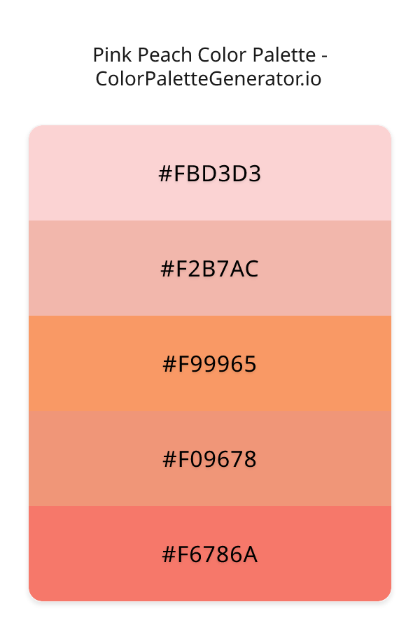
HEX: #FBD3D3
RGB: 251, 211, 211
HEX: #F2B7AC
RGB: 242, 183, 172
HEX: #F99965
RGB: 249, 153, 101
HEX: #F09678
RGB: 240, 150, 120
HEX: #F6786A
RGB: 246, 120, 106
Text on White/Black Backgrounds
Color Pair Combinations (10 total)
WCAG Contrast Standards:
- AAA (7:1): Enhanced contrast for maximum readability
- AA (4.5:1): Minimum for normal text (under 18pt)
- AA Large (3:1): Acceptable for large text (18pt+ or 14pt+ bold)
- Fail: Below WCAG standards, not recommended for text
Recommended Text Colors
Horizontal (Left to Right)
background: linear-gradient(to right, #FBD3D3 0%, #F2B7AC 25%, #F99965 50%, #F09678 75%, #F6786A 100%);Vertical (Top to Bottom)
background: linear-gradient(to bottom, #FBD3D3 0%, #F2B7AC 25%, #F99965 50%, #F09678 75%, #F6786A 100%);Diagonal (Top Left to Bottom Right)
background: linear-gradient(to bottom right, #FBD3D3 0%, #F2B7AC 25%, #F99965 50%, #F09678 75%, #F6786A 100%);Usage Tips:
- Copy the CSS code and paste directly into your stylesheets
- Linear gradients work great for backgrounds and hero sections
- Radial gradients are perfect for spotlights and focus effects
- Conic gradients create eye-catching loading spinners and progress indicators
- Smooth transitions ensure seamless color blending
Normal Vision
No color vision deficiency
Color Swatches
#FBD3D3
#F2B7AC
#F99965
#F09678
#F6786A
Full Palette View
How people with Normal Vision see it:
Overall Mood & Feel
Energetic, warm, and inviting, with an airy and optimistic feel
Emotional Impact
Stimulating and energetic, evoking feelings of excitement, warmth, and action. The light tones create an uplifting, optimistic atmosphere perfect for approachable brands
Psychological Effect
This 5-color palette creates a energetic, warm, and inviting, with an airy and optimistic feel. It stimulates activity and engagement, increasing heart rate and mental alertness. The combination works together to create memorable visual experiences that influence consumer perception, decision-making, and brand recall. The rich variety provides versatility while maintaining cohesive emotional messaging across touchpoints.
Brand Personality Traits
Perfect For These Industries
Target Audience
Active, outgoing individuals who respond to energy and enthusiasm. Appeals to those seeking approachable, positive, and optimistic brands
Individual Color Psychology
#FBD3D3
Warm and romantic
Emotions Evoked
Personality Traits
Brand Traits
Ideal Industries
Marketing Use
Creates urgency, stimulates appetite, increases heart rate, and grabs attention. Perfect for clearance sales, food brands, and call-to-action buttons.
Cultural Meanings
Color Harmony Analysis
Palette Mood
Temperature
This palette combines light & airy and balanced moods with warm tones, making it versatile for various design applications.
Professional Implementation Guide
This monochromatic pink peach palette features 5 carefully selected warm tones that create a energetic and passionate aesthetic. With low contrast levels and vibrant saturation, this palette is optimized for marketing materials and youth brands.
Web Design & Development
For web development, implement this palette with CSS variables for easy theme switching. Consider adding darker variants for better text readability.
- Apply the 60-30-10 rule for visual hierarchy
- Use accent colors for CTAs and hover states
- Maintain consistent color usage across all pages
- Test responsive behavior on multiple devices
Mobile App Interfaces
In mobile applications, these warm tones provide excellent readability in bright conditions. Use the subtle color variations to define clear touch targets.
- Design both light and dark mode variants
- Consider thumb-reach zones for color placement
- Test under direct sunlight and low light
- Use color to indicate interactive elements
Brand Identity Systems
Build a cohesive brand identity by designating specific colors for specific purposes. Establish your primary brand color from the most distinctive shade and create comprehensive brand guidelines specifying exact usage scenarios.
- Define primary, secondary, and accent colors
- Create usage rules for marketing materials
- Specify minimum sizes and clear space
- Document do's and don'ts for consistency
Frontend Development
Developers can integrate this palette efficiently using modern CSS techniques. Export as CSS variables for maximum flexibility, allowing theme switching and dynamic color updates without rewriting stylesheets.
- Use CSS custom properties for theming
- Implement semantic color naming conventions
- Create utility classes for rapid prototyping
- Consider CSS-in-JS for component-scoped colors
Print Design
For print materials, convert to CMYK using #FBD3D3 as the dominant color for headers and #F6786A for accents. These vibrant colors may appear slightly muted in print; request color proofs.
- Add to your design software color library
- Create swatches for quick color access
- Use CMYK values for print production
- Request color proofs before final print
Marketing Campaigns
Marketing materials benefit from consistent color usage that reinforces brand recognition. Apply this palette across email campaigns, landing pages, advertisements, and social media for maximum impact and memorability.
- Maintain color consistency across channels
- A/B test color variations for conversion
- Consider cultural color associations
- Align colors with campaign messaging
Strategic Color Distribution
Professional designers follow the 60-30-10 rule for balanced color distribution. Here's how to apply this principle with the Pink Peach:
Dominant Color
#FBD3D3Use #FBD3D3 as your primary color for backgrounds, main content areas. This red tone should occupy about 60% of your design space.
Secondary Color
#F99965Apply #F99965 as your secondary color for subtle backgrounds and card components. Allocate approximately 30% of your layout to this color.
Accent Color
#F6786AReserve #F6786A for accent elements like buttons, links, and important highlights. This red accent should be used sparingly (10% of design) to draw attention to key actions.
Professional Best Practices
✓ Smart Usage Tips
- •Add white or black text overlays to improve readability on colored backgrounds
- •Use desaturated versions (reduce saturation by 20-30%) for large background areas to prevent visual fatigue
- •Balance warm tones with neutral whites or grays to create visual breathing room
- •Test your palette across different devices and lighting conditions before finalizing
✗ Common Mistakes to Avoid
- •Don't use all colors equally—establish clear visual hierarchy through color weight
- •Avoid low-contrast text combinations that strain readability
- •Don't rely solely on color to convey meaning (use icons, text, and patterns too)
- •Avoid inconsistent color usage across different pages or screens
- •Don't assume screen colors match print output—always request physical proofs
Palette Overview & Statistics
5
Total Colors
1
Associated Tags
6
Categories
2354
Community Likes
Color Analysis & Technical Guide
Detailed breakdown of each color's role, characteristics, and optimal applications. This monochromatic palette creates a energetic and passionate aesthetic perfect for marketing materials and youth brands.
Individual Color Breakdown
Each color in this warm palette has been analyzed for its properties and ideal usage scenarios. The low contrast and vibrant saturation ensure harmonious visual relationships.
#FBD3D3
RED
#FBD3D3 serves as the primary/dominant color in this palette. This light red (highly saturated) brings energy and warmth Use it for backgrounds, containers, and large surface areas.
Light toneH: 0°S: 83%L: 91%#F2B7AC
RED
#F2B7AC serves as the secondary/supporting color in this palette. This light red (highly saturated) brings energy and warmth Use it for cards, borders, section dividers, and supporting UI components.
Light toneH: 9°S: 73%L: 81%#F99965
ORANGE
#F99965 serves as the secondary/supporting color in this palette. This medium orange (highly saturated) brings creativity and enthusiasm Use it for cards, borders, section dividers, and supporting UI components.
Light toneH: 21°S: 93%L: 69%#F09678
ORANGE
#F09678 serves as the secondary/supporting color in this palette. This light orange (highly saturated) brings creativity and enthusiasm Use it for cards, borders, section dividers, and supporting UI components.
Light toneH: 15°S: 80%L: 71%#F6786A
RED
#F6786A serves as the accent/highlight color in this palette. This medium red (highly saturated) brings energy and warmth Use it for call-to-action buttons, links, important notifications, and interactive elements.
Light toneH: 6°S: 89%L: 69%
Palette Characteristics
This palette exhibits distinct characteristics that make it particularly suitable for specific design applications and industries.
Warm colors create energy, excitement, and approachability. Perfect for brands targeting emotional connection.
Low contrast creates subtle, sophisticated aesthetics but requires careful attention to text legibility.
Vibrant saturation creates bold, attention-grabbing designs perfect for youth brands and creative projects.
Light palette creates airy, open designs with excellent readability for dark text overlays.
💡 Pro Tips for This Palette
- Perfect for: marketing materials, youth brands, minimalist designs, health & wellness. The monochromatic color relationship creates natural visual flow.
- Mood & Psychology: This palette evokes a energetic and passionate feeling, making it ideal for brands seeking to convey those qualities.
- Accessibility: Test text combinations carefully with contrast checkers to ensure accessibility compliance.
- Extensions: Create tints (add white) and shades (add black) to expand this 5-color palette into a comprehensive design system.
- Cultural Context: Warm colors may have different meanings across cultures—verify associations with your target market.
Export Formats
Explore Pink Peach Palette
The Pink Peach color palette is a breathtakingly beautiful combination of soft, warm hues that evoke feelings of serenity and joy, perfect for designs that aim to uplift and inspire. At its core, this palette is a masterful blend of monochromatic shades that flow seamlessly into one another, creating a sense of continuity and harmony. The palette's light, pastel quality is reminiscent of spring mornings, filled with vibrant energy and endless possibilities. As the colors graduate from the pale FBD3D3 to the more saturated F6786A, a sense of depth and dimensionality emerges, drawing the viewer in and inviting them to explore.
Each color in the Pink Peach palette plays a unique role in creating this captivating visual experience. The soft FBD3D3 provides a gentle foundation, setting the tone for the rest of the palette. As the eye moves through the palette, it encounters the slightly warmer F2B7AC, which adds a touch of sophistication and elegance. The F99965 introduces a hint of vibrancy, injecting a sense of playfulness and energy into the design. The F09678 and F6786A, with their increasing saturation and depth, create a sense of progression and movement, guiding the viewer through the composition. Together, these colors create a cohesive and engaging visual narrative that is both soothing and stimulating.
The Pink Peach color palette is incredibly versatile, lending itself to a wide range of design applications, from websites and apps to branding and marketing materials. Its warm, light quality makes it an ideal choice for designs that aim to evoke feelings of approachability and friendliness, such as e-commerce sites, social media platforms, or children's entertainment brands. The palette's vibrant, spring-inspired colors also make it a great fit for seasonal promotions, limited-edition products, or events that celebrate renewal and growth. Whether used in its entirety or as a starting point for further exploration, the Pink Peach palette is sure to bring a sense of freshness and excitement to any design project.
The colors in the Pink Peach palette have a profound impact on viewer perception and behavior, influencing emotions and moods in subtle yet powerful ways. The dominant red undertones in colors like F99965 and F6786A stimulate the senses, increasing energy and enthusiasm, while the softer FBD3D3 and F2B7AC provide a calming balance, soothing the eye and promoting relaxation. This interplay of warm, vibrant colors can inspire feelings of creativity, playfulness, and joy, making the Pink Peach palette an excellent choice for designs that aim to engage and delight their audience. By leveraging the psychological effects of these colors, designers can create experiences that resonate with their viewers on a deep, emotional level.
To get the most out of the Pink Peach color palette, designers can experiment with complementary colors like deep blues or rich greens, which create striking contrasts and add depth to the design. Pairing the palette's lighter shades with neutral backgrounds or textures can also help to enhance their soft, pastel quality, while combining the more saturated colors with bold typography or graphics can amplify their vibrant energy. By following best practices like balancing warm and cool colors, using color gradients to create subtle transitions, and considering the emotional resonance of each hue, designers can unlock the full potential of the Pink Peach palette and create designs that are both visually stunning and emotionally resonant.
Palette Image
Below is the generated palette image showing all colors in a vertical layout. Perfect for sharing on social media or using as a reference.
Categories & Tags
Frequently Asked Questions
Everything you need to know about using and implementing the pink peach palette effectively in your projects.