Pure White Color Palette – HEX, RGB & Design Inspiration
Color Details
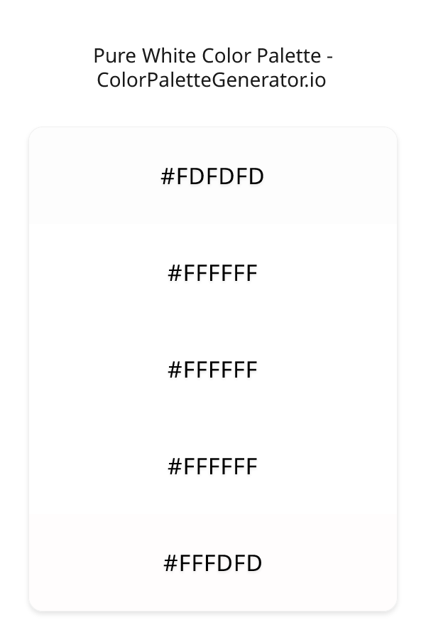
HEX: #FDFDFD
RGB: 253, 253, 253
HEX: #FFFFFF
RGB: 255, 255, 255
HEX: #FFFFFF
RGB: 255, 255, 255
HEX: #FFFFFF
RGB: 255, 255, 255
HEX: #FFFDFD
RGB: 255, 253, 253
Text on White/Black Backgrounds
Color Pair Combinations (10 total)
WCAG Contrast Standards:
- AAA (7:1): Enhanced contrast for maximum readability
- AA (4.5:1): Minimum for normal text (under 18pt)
- AA Large (3:1): Acceptable for large text (18pt+ or 14pt+ bold)
- Fail: Below WCAG standards, not recommended for text
Recommended Text Colors
Horizontal (Left to Right)
background: linear-gradient(to right, #FDFDFD 0%, #FFFFFF 25%, #FFFFFF 50%, #FFFFFF 75%, #FFFDFD 100%);Vertical (Top to Bottom)
background: linear-gradient(to bottom, #FDFDFD 0%, #FFFFFF 25%, #FFFFFF 50%, #FFFFFF 75%, #FFFDFD 100%);Diagonal (Top Left to Bottom Right)
background: linear-gradient(to bottom right, #FDFDFD 0%, #FFFFFF 25%, #FFFFFF 50%, #FFFFFF 75%, #FFFDFD 100%);Usage Tips:
- Copy the CSS code and paste directly into your stylesheets
- Linear gradients work great for backgrounds and hero sections
- Radial gradients are perfect for spotlights and focus effects
- Conic gradients create eye-catching loading spinners and progress indicators
- Smooth transitions ensure seamless color blending
Normal Vision
No color vision deficiency
Color Swatches
#FDFDFD
#FFFFFF
#FFFFFF
#FFFFFF
#FFFDFD
Full Palette View
How people with Normal Vision see it:
Overall Mood & Feel
Energetic, warm, and inviting, with an airy and optimistic feel
Emotional Impact
Stimulating and energetic, evoking feelings of excitement, warmth, and action. The light tones create an uplifting, optimistic atmosphere perfect for approachable brands
Psychological Effect
This 5-color palette creates a energetic, warm, and inviting, with an airy and optimistic feel. The combination works together to create memorable visual experiences that influence consumer perception, decision-making, and brand recall. The rich variety provides versatility while maintaining cohesive emotional messaging across touchpoints.
Brand Personality Traits
Perfect For These Industries
Target Audience
Active, outgoing individuals who respond to energy and enthusiasm. Appeals to those seeking approachable, positive, and optimistic brands
Individual Color Psychology
#FDFDFD
Clean and minimal
Emotions Evoked
Personality Traits
Brand Traits
Ideal Industries
Marketing Use
Creates sense of space and simplicity. Used in minimalist designs, medical fields, and luxury brands. Provides contrast and breathing room.
Cultural Meanings
Color Harmony Analysis
Palette Mood
Temperature
This palette combines light & airy moods with neutral and warm tones, making it versatile for various design applications.
Professional Implementation Guide
This monochromatic pure white palette features 5 carefully selected warm tones that create a light and airy aesthetic. With low contrast levels and muted saturation, this palette is optimized for minimalist designs and health & wellness.
Web Design & Development
For web development, implement this palette with CSS variables for easy theme switching. Consider adding darker variants for better text readability.
- Apply the 60-30-10 rule for visual hierarchy
- Use accent colors for CTAs and hover states
- Maintain consistent color usage across all pages
- Test responsive behavior on multiple devices
Mobile App Interfaces
In mobile applications, these warm tones provide excellent readability in bright conditions. Use the subtle color variations to define clear touch targets.
- Design both light and dark mode variants
- Consider thumb-reach zones for color placement
- Test under direct sunlight and low light
- Use color to indicate interactive elements
Brand Identity Systems
Build a cohesive brand identity by designating specific colors for specific purposes. Establish your primary brand color from the most distinctive shade and create comprehensive brand guidelines specifying exact usage scenarios.
- Define primary, secondary, and accent colors
- Create usage rules for marketing materials
- Specify minimum sizes and clear space
- Document do's and don'ts for consistency
Frontend Development
Developers can integrate this palette efficiently using modern CSS techniques. Export as CSS variables for maximum flexibility, allowing theme switching and dynamic color updates without rewriting stylesheets.
- Use CSS custom properties for theming
- Implement semantic color naming conventions
- Create utility classes for rapid prototyping
- Consider CSS-in-JS for component-scoped colors
Print Design
For print materials, convert to CMYK using #FDFDFD as the dominant color for headers and #FFFDFD for accents. These colors translate well to print with minimal adjustment.
- Add to your design software color library
- Create swatches for quick color access
- Use CMYK values for print production
- Request color proofs before final print
Marketing Campaigns
Marketing materials benefit from consistent color usage that reinforces brand recognition. Apply this palette across email campaigns, landing pages, advertisements, and social media for maximum impact and memorability.
- Maintain color consistency across channels
- A/B test color variations for conversion
- Consider cultural color associations
- Align colors with campaign messaging
Strategic Color Distribution
Professional designers follow the 60-30-10 rule for balanced color distribution. Here's how to apply this principle with the Pure White:
Dominant Color
#FDFDFDUse #FDFDFD as your primary color for backgrounds, main content areas. This white tone should occupy about 60% of your design space.
Secondary Color
#FFFFFFApply #FFFFFF as your secondary color for subtle backgrounds and card components. Allocate approximately 30% of your layout to this color.
Accent Color
#FFFDFDReserve #FFFDFD for accent elements like buttons, links, and important highlights. This red accent should be used sparingly (10% of design) to draw attention to key actions.
Professional Best Practices
✓ Smart Usage Tips
- •Add white or black text overlays to improve readability on colored backgrounds
- •Balance warm tones with neutral whites or grays to create visual breathing room
- •Test your palette across different devices and lighting conditions before finalizing
✗ Common Mistakes to Avoid
- •Don't use all colors equally—establish clear visual hierarchy through color weight
- •Avoid low-contrast text combinations that strain readability
- •Don't rely solely on color to convey meaning (use icons, text, and patterns too)
- •Avoid inconsistent color usage across different pages or screens
- •Don't assume screen colors match print output—always request physical proofs
Palette Overview & Statistics
5
Total Colors
2
Associated Tags
6
Categories
2521
Community Likes
Color Analysis & Technical Guide
Detailed breakdown of each color's role, characteristics, and optimal applications. This monochromatic palette creates a light and airy aesthetic perfect for minimalist designs and health & wellness.
Individual Color Breakdown
Each color in this warm palette has been analyzed for its properties and ideal usage scenarios. The low contrast and muted saturation ensure harmonious visual relationships.
#FDFDFD
WHITE
#FDFDFD serves as the primary/dominant color in this palette. This light white (muted) brings cleanliness and simplicity Use it for backgrounds, containers, and large surface areas.
Light toneH: 0°S: 0%L: 99%#FFFFFF
WHITE
#FFFFFF serves as the secondary/supporting color in this palette. This light white (muted) brings cleanliness and simplicity Use it for cards, borders, section dividers, and supporting UI components.
Light toneH: 0°S: 0%L: 100%#FFFFFF
WHITE
#FFFFFF serves as the secondary/supporting color in this palette. This light white (muted) brings cleanliness and simplicity Use it for cards, borders, section dividers, and supporting UI components.
Light toneH: 0°S: 0%L: 100%#FFFFFF
WHITE
#FFFFFF serves as the secondary/supporting color in this palette. This light white (muted) brings cleanliness and simplicity Use it for cards, borders, section dividers, and supporting UI components.
Light toneH: 0°S: 0%L: 100%#FFFDFD
RED
#FFFDFD serves as the accent/highlight color in this palette. This light red (highly saturated) brings energy and warmth Use it for call-to-action buttons, links, important notifications, and interactive elements.
Light toneH: 0°S: 100%L: 100%
Palette Characteristics
This palette exhibits distinct characteristics that make it particularly suitable for specific design applications and industries.
Warm colors create energy, excitement, and approachability. Perfect for brands targeting emotional connection.
Low contrast creates subtle, sophisticated aesthetics but requires careful attention to text legibility.
Muted saturation offers sophistication and reduces visual fatigue, ideal for content-heavy applications.
Light palette creates airy, open designs with excellent readability for dark text overlays.
💡 Pro Tips for This Palette
- Perfect for: minimalist designs, health & wellness. The monochromatic color relationship creates natural visual flow.
- Mood & Psychology: This palette evokes a light and airy feeling, making it ideal for brands seeking to convey those qualities.
- Accessibility: Test text combinations carefully with contrast checkers to ensure accessibility compliance.
- Extensions: Create tints (add white) and shades (add black) to expand this 5-color palette into a comprehensive design system.
- Cultural Context: Warm colors may have different meanings across cultures—verify associations with your target market.
Export Formats
Explore Pure White Palette
The Pure White color palette is a masterful creation that embodies the essence of serenity and elegance, evoking feelings of calmness and tranquility in all who experience it. At its core, this palette is a thoughtful blend of various shades of white, carefully curated to work in harmony and create a sense of visual balance. The dominant color, FDFDFD, sets the tone for the palette, providing a subtle warmth that is both soothing and inviting. As the eye moves through the palette, it is drawn to the pristine cleanliness of the multiple iterations of FFFFFF, each one a perfect representation of purity and simplicity. The final touch is added by the gentle warmth of FFFDFD, which brings a sense of softness and approachability to the overall design.
As we delve deeper into the individual colors that comprise the Pure White palette, it becomes clear that each shade plays a vital role in creating the overall aesthetic. The initial FDFDFD provides a subtle foundation, its gentle warmth a perfect foil to the colder, more sterile feel that can sometimes be associated with the color white. The multiple iterations of FFFFFF that follow serve to amplify this sense of purity, their pristine cleanliness creating a sense of visual clarity that is both calming and uplifting. The final color, FFFDFD, adds a touch of softness to the palette, its gentle warmth bringing a sense of approachability and humanity to the design. While the palette may seem simple at first glance, the subtle variations in shade and tone create a sense of depth and visual interest that is both captivating and engaging.
The Pure White color palette is incredibly versatile, lending itself to a wide range of practical applications in the world of design. It is particularly well-suited to website and app design, where its clean lines and minimalist aesthetic can help to create a sense of clarity and focus. In the realm of branding and marketing, the palette's association with purity and simplicity makes it an excellent choice for companies looking to convey a sense of elegance and sophistication. Additionally, the palette's subtle warmth and approachability make it an excellent choice for designs that require a sense of humanity and emotional connection, such as those found in the healthcare or non-profit sectors.
The colors used in the Pure White palette also have a profound impact on the psychology of the viewer, influencing their perception and behavior in subtle yet powerful ways. The dominant white tones create a sense of cleanliness and purity, which can help to build trust and credibility with the viewer. The subtle warmth of the FDFDFD and FFFDFD shades adds a sense of approachability and humanity to the design, creating a sense of emotional connection with the viewer. While the palette may not be directly associated with the color themes of red and pink, its subtle warmth and gentle tones create a sense of softness and approachability that is reminiscent of these colors. Furthermore, the palette's association with the style categories of monochromatic, warm, light, pastel, spring, and muted creates a sense of visual balance and harmony, which can help to create a sense of calmness and tranquility in the viewer.
For designers looking to get the most out of the Pure White color palette, there are a number of pro tips and pairing suggestions that can help to elevate their design. One approach is to use the palette in conjunction with complementary colors, such as soft pastels or muted earth tones, to create a sense of visual contrast and interest. Another approach is to pair the palette with bold, vibrant colors, such as those found in the red and pink color themes, to create a sense of drama and visual tension. In terms of design best practices, it is generally recommended to use the Pure White palette in a subtle and restrained manner, allowing its clean lines and minimalist aesthetic to create a sense of clarity and focus. By following these tips and suggestions, designers can unlock the full potential of the Pure White color palette, creating designs that are both beautiful and effective.
Palette Image
Below is the generated palette image showing all colors in a vertical layout. Perfect for sharing on social media or using as a reference.
Frequently Asked Questions
Everything you need to know about using and implementing the pure white palette effectively in your projects.