Red-Orange Color Palette – HEX, RGB & Design Inspiration
Color Details
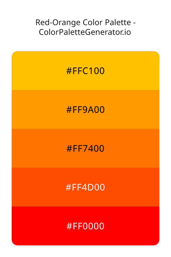
HEX: #FFC100
RGB: 255, 193, 0
HEX: #FF9A00
RGB: 255, 154, 0
HEX: #FF7400
RGB: 255, 116, 0
HEX: #FF4D00
RGB: 255, 77, 0
HEX: #FF0000
RGB: 255, 0, 0
Text on White/Black Backgrounds
Color Pair Combinations (10 total)
WCAG Contrast Standards:
- AAA (7:1): Enhanced contrast for maximum readability
- AA (4.5:1): Minimum for normal text (under 18pt)
- AA Large (3:1): Acceptable for large text (18pt+ or 14pt+ bold)
- Fail: Below WCAG standards, not recommended for text
Recommended Text Colors
Horizontal (Left to Right)
background: linear-gradient(to right, #FFC100 0%, #FF9A00 25%, #FF7400 50%, #FF4D00 75%, #FF0000 100%);Vertical (Top to Bottom)
background: linear-gradient(to bottom, #FFC100 0%, #FF9A00 25%, #FF7400 50%, #FF4D00 75%, #FF0000 100%);Diagonal (Top Left to Bottom Right)
background: linear-gradient(to bottom right, #FFC100 0%, #FF9A00 25%, #FF7400 50%, #FF4D00 75%, #FF0000 100%);Usage Tips:
- Copy the CSS code and paste directly into your stylesheets
- Linear gradients work great for backgrounds and hero sections
- Radial gradients are perfect for spotlights and focus effects
- Conic gradients create eye-catching loading spinners and progress indicators
- Smooth transitions ensure seamless color blending
Normal Vision
No color vision deficiency
Color Swatches
#FFC100
#FF9A00
#FF7400
#FF4D00
#FF0000
Full Palette View
How people with Normal Vision see it:
Overall Mood & Feel
Energetic, warm, and inviting
Emotional Impact
Stimulating and energetic, evoking feelings of excitement, warmth, and action. The balanced lightness creates versatility across different contexts
Psychological Effect
This 5-color palette creates a energetic, warm, and inviting. It stimulates activity and engagement, increasing heart rate and mental alertness. The combination works together to create memorable visual experiences that influence consumer perception, decision-making, and brand recall. The rich variety provides versatility while maintaining cohesive emotional messaging across touchpoints.
Brand Personality Traits
Perfect For These Industries
Target Audience
Young, trend-conscious consumers (18-35) who value creativity and self-expression
Individual Color Psychology
#FFC100
Luxurious and prestigious
Emotions Evoked
Personality Traits
Brand Traits
Ideal Industries
Marketing Use
Grabs attention quickly, stimulates mental activity, and generates optimism. Great for highlighting products and encouraging impulse decisions.
Cultural Meanings
Color Harmony Analysis
Palette Mood
Temperature
This palette combines balanced moods with warm tones, making it versatile for various design applications.
Professional Implementation Guide
This analogous red-orange palette features 5 carefully selected warm tones that create a energetic and passionate aesthetic. With low contrast levels and vibrant saturation, this palette is optimized for marketing materials and youth brands.
Web Design & Development
For web development, implement this palette with CSS variables for easy theme switching. Consider adding darker variants for better text readability.
- Apply the 60-30-10 rule for visual hierarchy
- Use accent colors for CTAs and hover states
- Maintain consistent color usage across all pages
- Test responsive behavior on multiple devices
Mobile App Interfaces
In mobile applications, these warm tones provide excellent battery efficiency on OLED screens. Use the subtle color variations to define clear touch targets.
- Design both light and dark mode variants
- Consider thumb-reach zones for color placement
- Test under direct sunlight and low light
- Use color to indicate interactive elements
Brand Identity Systems
Build a cohesive brand identity by designating specific colors for specific purposes. Establish your primary brand color from the most distinctive shade and create comprehensive brand guidelines specifying exact usage scenarios.
- Define primary, secondary, and accent colors
- Create usage rules for marketing materials
- Specify minimum sizes and clear space
- Document do's and don'ts for consistency
Frontend Development
Developers can integrate this palette efficiently using modern CSS techniques. Export as CSS variables for maximum flexibility, allowing theme switching and dynamic color updates without rewriting stylesheets.
- Use CSS custom properties for theming
- Implement semantic color naming conventions
- Create utility classes for rapid prototyping
- Consider CSS-in-JS for component-scoped colors
Print Design
For print materials, convert to CMYK using #FFC100 as the dominant color for headers and #FF0000 for accents. These vibrant colors may appear slightly muted in print; request color proofs.
- Add to your design software color library
- Create swatches for quick color access
- Use CMYK values for print production
- Request color proofs before final print
Marketing Campaigns
Marketing materials benefit from consistent color usage that reinforces brand recognition. Apply this palette across email campaigns, landing pages, advertisements, and social media for maximum impact and memorability.
- Maintain color consistency across channels
- A/B test color variations for conversion
- Consider cultural color associations
- Align colors with campaign messaging
Strategic Color Distribution
Professional designers follow the 60-30-10 rule for balanced color distribution. Here's how to apply this principle with the Red-Orange:
Dominant Color
#FFC100Use #FFC100 as your primary color for backgrounds, main content areas. This yellow tone should occupy about 60% of your design space.
Secondary Color
#FF7400Apply #FF7400 as your secondary color for subtle backgrounds and card components. Allocate approximately 30% of your layout to this color.
Accent Color
#FF0000Reserve #FF0000 for accent elements like buttons, links, and important highlights. This red accent should be used sparingly (10% of design) to draw attention to key actions.
Professional Best Practices
✓ Smart Usage Tips
- •Add white or black text overlays to improve readability on colored backgrounds
- •Use desaturated versions (reduce saturation by 20-30%) for large background areas to prevent visual fatigue
- •Balance warm tones with neutral whites or grays to create visual breathing room
- •Test your palette across different devices and lighting conditions before finalizing
✗ Common Mistakes to Avoid
- •Don't use all colors equally—establish clear visual hierarchy through color weight
- •Avoid low-contrast text combinations that strain readability
- •Don't rely solely on color to convey meaning (use icons, text, and patterns too)
- •Avoid inconsistent color usage across different pages or screens
- •Don't assume screen colors match print output—always request physical proofs
Palette Overview & Statistics
5
Total Colors
2
Associated Tags
6
Categories
2956
Community Likes
Color Analysis & Technical Guide
Detailed breakdown of each color's role, characteristics, and optimal applications. This analogous palette creates a energetic and passionate aesthetic perfect for marketing materials and youth brands.
Individual Color Breakdown
Each color in this warm palette has been analyzed for its properties and ideal usage scenarios. The low contrast and vibrant saturation ensure harmonious visual relationships.
#FFC100
YELLOW
#FFC100 serves as the primary/dominant color in this palette. This medium yellow (highly saturated) brings richness and prestige Use it for headers, navigation bars, and brand elements.
Dark toneH: 45°S: 100%L: 50%#FF9A00
ORANGE
#FF9A00 serves as the secondary/supporting color in this palette. This medium orange (highly saturated) brings creativity and enthusiasm Use it for cards, borders, section dividers, and supporting UI components.
Dark toneH: 36°S: 100%L: 50%#FF7400
ORANGE
#FF7400 serves as the secondary/supporting color in this palette. This medium orange (highly saturated) brings creativity and enthusiasm Use it for cards, borders, section dividers, and supporting UI components.
Dark toneH: 27°S: 100%L: 50%#FF4D00
ORANGE
#FF4D00 serves as the secondary/supporting color in this palette. This medium orange (highly saturated) brings creativity and enthusiasm Use it for cards, borders, section dividers, and supporting UI components.
Dark toneH: 18°S: 100%L: 50%#FF0000
RED
#FF0000 serves as the accent/highlight color in this palette. This medium red (highly saturated) brings power and sophistication Use it for call-to-action buttons, links, important notifications, and interactive elements.
Dark toneH: 0°S: 100%L: 50%
Palette Characteristics
This palette exhibits distinct characteristics that make it particularly suitable for specific design applications and industries.
Warm colors create energy, excitement, and approachability. Perfect for brands targeting emotional connection.
Low contrast creates subtle, sophisticated aesthetics but requires careful attention to text legibility.
Vibrant saturation creates bold, attention-grabbing designs perfect for youth brands and creative projects.
Balanced brightness provides flexibility for both light and dark design elements.
💡 Pro Tips for This Palette
- Perfect for: marketing materials, youth brands. The analogous color relationship creates natural visual flow.
- Mood & Psychology: This palette evokes a energetic and passionate feeling, making it ideal for brands seeking to convey those qualities.
- Accessibility: Test text combinations carefully with contrast checkers to ensure accessibility compliance.
- Extensions: Create tints (add white) and shades (add black) to expand this 5-color palette into a comprehensive design system.
- Cultural Context: Warm colors may have different meanings across cultures—verify associations with your target market.
Export Formats
Explore Red-Orange Palette
The Red-Orange color palette is a dynamic and captivating combination of hues that evoke feelings of energy, excitement, and warmth. At its core, this palette is all about creating a sense of vibrancy and playfulness, making it perfect for designs that need to grab attention and leave a lasting impression. The palette's monochromatic scheme, which ranges from the soft and inviting FFC100 to the deep and bold FF0000, creates a sense of continuity and cohesion, while the varying shades of red and orange add a touch of complexity and visual interest.
Delving deeper into the palette, we find that each color plays a unique role in creating the overall aesthetic. The lightest shade, FFC100, is a beautiful blend of red and orange that adds a touch of warmth and sophistication to any design. As we move through the palette, we encounter FF9A00, a slightly deeper and more saturated shade that begins to take on a more orange-like quality. This is followed by FF7400, a rich and inviting color that is reminiscent of a sunset on a summer evening. The two deepest shades, FF4D00 and FF0000, are bold and attention-grabbing, adding a sense of drama and intensity to the palette. Each of these colors can be used as an accent or background color, depending on the desired effect, and the fact that they are all part of the same monochromatic scheme makes it easy to create a sense of harmony and balance in a design.
In terms of practical applications, the Red-Orange color palette is incredibly versatile and can be used in a wide range of design contexts. It would be perfect for creating eye-catching websites and apps, particularly those that are focused on entertainment, lifestyle, or youth culture. It could also be used in branding and marketing materials, such as logos, advertisements, and social media graphics, to add a sense of energy and excitement. Additionally, the palette's warm and inviting colors make it well-suited for designs that need to create a sense of comfort and approachability, such as e-commerce websites or food and beverage branding.
The Red-Orange color palette also has a profound impact on viewer perception and behavior. The colors in this palette are known to stimulate feelings of excitement and enthusiasm, which can be particularly useful in designs that are meant to motivate or inspire. The bold and vibrant colors can also help to grab attention and create a sense of urgency, making them perfect for calls-to-action or promotional materials. Furthermore, the warm and inviting nature of the colors can help to create a sense of trust and approachability, which is essential for building strong relationships with customers or users.
When working with the Red-Orange color palette, it's essential to consider the colors that will complement and enhance the overall aesthetic. Neutral colors such as beige, gray, or white can help to balance out the boldness of the palette, while deeper, richer colors like navy blue or dark gray can add a sense of sophistication and depth. In terms of pairing suggestions, the palette works particularly well with earthy tones like green or brown, which can help to create a sense of naturalness and harmony. To get the most out of this palette, designers should also consider the 60-30-10 rule, where the dominant color takes up 60 percent of the design, the secondary color takes up 30 percent, and the accent color takes up 10 percent. By following this rule and using the colors in the Red-Orange palette thoughtfully and intentionally, designers can create stunning and effective designs that capture the imagination and inspire the senses.
Palette Image
Below is the generated palette image showing all colors in a vertical layout. Perfect for sharing on social media or using as a reference.
Frequently Asked Questions
Everything you need to know about using and implementing the red-orange palette effectively in your projects.