Rouge Color Palette – HEX, RGB & Design Inspiration
Color Details
HEX: #763E3E
RGB: 118, 62, 62
HEX: #B82B2B
RGB: 184, 43, 43
HEX: #E12929
RGB: 225, 41, 41
HEX: #9C0909
RGB: 156, 9, 9
HEX: #F60303
RGB: 246, 3, 3
Text on White/Black Backgrounds
Color Pair Combinations (10 total)
WCAG Contrast Standards:
- AAA (7:1): Enhanced contrast for maximum readability
- AA (4.5:1): Minimum for normal text (under 18pt)
- AA Large (3:1): Acceptable for large text (18pt+ or 14pt+ bold)
- Fail: Below WCAG standards, not recommended for text
Recommended Text Colors
Horizontal (Left to Right)
background: linear-gradient(to right, #763E3E 0%, #B82B2B 25%, #E12929 50%, #9C0909 75%, #F60303 100%);Vertical (Top to Bottom)
background: linear-gradient(to bottom, #763E3E 0%, #B82B2B 25%, #E12929 50%, #9C0909 75%, #F60303 100%);Diagonal (Top Left to Bottom Right)
background: linear-gradient(to bottom right, #763E3E 0%, #B82B2B 25%, #E12929 50%, #9C0909 75%, #F60303 100%);Usage Tips:
- Copy the CSS code and paste directly into your stylesheets
- Linear gradients work great for backgrounds and hero sections
- Radial gradients are perfect for spotlights and focus effects
- Conic gradients create eye-catching loading spinners and progress indicators
- Smooth transitions ensure seamless color blending
Normal Vision
No color vision deficiency
Color Swatches
#763E3E
#B82B2B
#E12929
#9C0909
#F60303
Full Palette View
How people with Normal Vision see it:
Overall Mood & Feel
Energetic, warm, and inviting
Emotional Impact
Stimulating and energetic, evoking feelings of excitement, warmth, and action. The balanced lightness creates versatility across different contexts
Psychological Effect
This 5-color palette creates a energetic, warm, and inviting. It stimulates activity and engagement, increasing heart rate and mental alertness. The combination works together to create memorable visual experiences that influence consumer perception, decision-making, and brand recall. The rich variety provides versatility while maintaining cohesive emotional messaging across touchpoints.
Brand Personality Traits
Perfect For These Industries
Target Audience
Active, outgoing individuals who respond to energy and enthusiasm
Individual Color Psychology
#763E3E
Powerful and sophisticated
Emotions Evoked
Personality Traits
Brand Traits
Ideal Industries
Marketing Use
Creates urgency, stimulates appetite, increases heart rate, and grabs attention. Perfect for clearance sales, food brands, and call-to-action buttons.
Cultural Meanings
Color Harmony Analysis
Palette Mood
Temperature
This palette combines balanced moods with warm tones, making it versatile for various design applications.
Professional Implementation Guide
This monochromatic rouge palette features 5 carefully selected warm tones that create a energetic and passionate aesthetic. With low contrast levels and vibrant saturation, this palette is optimized for marketing materials and youth brands.
Web Design & Development
For web development, implement this palette with CSS variables for easy theme switching. Consider adding darker variants for better text readability.
- Apply the 60-30-10 rule for visual hierarchy
- Use accent colors for CTAs and hover states
- Maintain consistent color usage across all pages
- Test responsive behavior on multiple devices
Mobile App Interfaces
In mobile applications, these warm tones provide excellent battery efficiency on OLED screens. Use the subtle color variations to define clear touch targets.
- Design both light and dark mode variants
- Consider thumb-reach zones for color placement
- Test under direct sunlight and low light
- Use color to indicate interactive elements
Brand Identity Systems
Build a cohesive brand identity by designating specific colors for specific purposes. Establish your primary brand color from the most distinctive shade and create comprehensive brand guidelines specifying exact usage scenarios.
- Define primary, secondary, and accent colors
- Create usage rules for marketing materials
- Specify minimum sizes and clear space
- Document do's and don'ts for consistency
Frontend Development
Developers can integrate this palette efficiently using modern CSS techniques. Export as CSS variables for maximum flexibility, allowing theme switching and dynamic color updates without rewriting stylesheets.
- Use CSS custom properties for theming
- Implement semantic color naming conventions
- Create utility classes for rapid prototyping
- Consider CSS-in-JS for component-scoped colors
Print Design
For print materials, convert to CMYK using #763E3E as the dominant color for headers and #F60303 for accents. These vibrant colors may appear slightly muted in print; request color proofs.
- Add to your design software color library
- Create swatches for quick color access
- Use CMYK values for print production
- Request color proofs before final print
Marketing Campaigns
Marketing materials benefit from consistent color usage that reinforces brand recognition. Apply this palette across email campaigns, landing pages, advertisements, and social media for maximum impact and memorability.
- Maintain color consistency across channels
- A/B test color variations for conversion
- Consider cultural color associations
- Align colors with campaign messaging
Strategic Color Distribution
Professional designers follow the 60-30-10 rule for balanced color distribution. Here's how to apply this principle with the Rouge:
Dominant Color
#763E3EUse #763E3E as your primary color for backgrounds, main content areas. This red tone should occupy about 60% of your design space.
Secondary Color
#E12929Apply #E12929 as your secondary color for subtle backgrounds and card components. Allocate approximately 30% of your layout to this color.
Accent Color
#F60303Reserve #F60303 for accent elements like buttons, links, and important highlights. This red accent should be used sparingly (10% of design) to draw attention to key actions.
Professional Best Practices
✓ Smart Usage Tips
- •Add white or black text overlays to improve readability on colored backgrounds
- •Use desaturated versions (reduce saturation by 20-30%) for large background areas to prevent visual fatigue
- •Balance warm tones with neutral whites or grays to create visual breathing room
- •Test your palette across different devices and lighting conditions before finalizing
✗ Common Mistakes to Avoid
- •Don't use all colors equally—establish clear visual hierarchy through color weight
- •Avoid low-contrast text combinations that strain readability
- •Don't rely solely on color to convey meaning (use icons, text, and patterns too)
- •Avoid inconsistent color usage across different pages or screens
- •Don't assume screen colors match print output—always request physical proofs
Palette Overview & Statistics
5
Total Colors
4
Associated Tags
4
Categories
2878
Community Likes
Color Analysis & Technical Guide
Detailed breakdown of each color's role, characteristics, and optimal applications. This monochromatic palette creates a energetic and passionate aesthetic perfect for marketing materials and youth brands.
Individual Color Breakdown
Each color in this warm palette has been analyzed for its properties and ideal usage scenarios. The low contrast and vibrant saturation ensure harmonious visual relationships.
#763E3E
RED
#763E3E serves as the primary/dominant color in this palette. This medium red (moderately saturated) brings power and sophistication Use it for headers, navigation bars, and brand elements.
Dark toneH: 0°S: 31%L: 35%#B82B2B
RED
#B82B2B serves as the secondary/supporting color in this palette. This medium red (highly saturated) brings power and sophistication Use it for cards, borders, section dividers, and supporting UI components.
Dark toneH: 0°S: 62%L: 45%#E12929
RED
#E12929 serves as the secondary/supporting color in this palette. This medium red (highly saturated) brings energy and warmth Use it for cards, borders, section dividers, and supporting UI components.
Light toneH: 0°S: 75%L: 52%#9C0909
RED
#9C0909 serves as the secondary/supporting color in this palette. This medium red (highly saturated) brings power and sophistication Use it for cards, borders, section dividers, and supporting UI components.
Dark toneH: 0°S: 89%L: 32%#F60303
RED
#F60303 serves as the accent/highlight color in this palette. This medium red (highly saturated) brings power and sophistication Use it for call-to-action buttons, links, important notifications, and interactive elements.
Dark toneH: 0°S: 98%L: 49%
Palette Characteristics
This palette exhibits distinct characteristics that make it particularly suitable for specific design applications and industries.
Warm colors create energy, excitement, and approachability. Perfect for brands targeting emotional connection.
Low contrast creates subtle, sophisticated aesthetics but requires careful attention to text legibility.
Vibrant saturation creates bold, attention-grabbing designs perfect for youth brands and creative projects.
Balanced brightness provides flexibility for both light and dark design elements.
💡 Pro Tips for This Palette
- Perfect for: marketing materials, youth brands. The monochromatic color relationship creates natural visual flow.
- Mood & Psychology: This palette evokes a energetic and passionate feeling, making it ideal for brands seeking to convey those qualities.
- Accessibility: Test text combinations carefully with contrast checkers to ensure accessibility compliance.
- Extensions: Create tints (add white) and shades (add black) to expand this 5-color palette into a comprehensive design system.
- Cultural Context: Warm colors may have different meanings across cultures—verify associations with your target market.
Export Formats
Explore Rouge Palette
The Rouge color palette is a vibrant and captivating collection of hues that evoke the warmth and intensity of a sunset. At its core, this palette is all about passion, energy, and creativity, making it perfect for designers looking to add a bold and modern touch to their work. The palette's monochromatic scheme, which features a range of red shades from deep maroon to bright coral, creates a sense of continuity and flow, while its warm and modern style categories make it ideal for projects that require a sense of excitement and dynamism.
Delving deeper into the palette, we find a range of unique and captivating colors, each with its own distinct character and role to play. The darkest shade, a rich and muted red with the hex code 763E3E, provides a sense of depth and sophistication, while the brighter, more saturated shade with the hex code B82B2B adds a sense of vibrancy and playfulness. The palette's two most intense colors, with hex codes E12929 and 9C0909, bring a sense of urgency and excitement, drawing the viewer's eye and commanding attention. Finally, the lightest shade, with the hex code F60303, adds a touch of warmth and energy, balancing out the palette and creating a sense of harmony.
In terms of practical applications, the Rouge palette is incredibly versatile, lending itself to a wide range of design projects, from websites and apps to branding and marketing campaigns. Its warm and modern style makes it particularly well-suited to projects that require a sense of innovation and creativity, such as tech startups or artistic ventures. The palette's bold and vibrant colors also make it ideal for projects that require a sense of excitement and energy, such as entertainment or lifestyle brands. Whether used in its entirety or in combination with other colors, the Rouge palette is sure to add a sense of passion and intensity to any design project.
The colors in the Rouge palette also have a profound impact on viewer perception and behavior, influencing everything from mood and attitude to decision-making and action. The palette's dominant red shades, for example, are known to stimulate the senses, increase heart rate, and boost energy levels, making them perfect for projects that require a sense of urgency or excitement. At the same time, the palette's darker, more muted shades can create a sense of sophistication and luxury, making them ideal for projects that require a sense of elegance and refinement. By carefully balancing these different colors and shades, designers can create a visual language that resonates with their target audience and drives desired behaviors.
For designers looking to get the most out of the Rouge palette, there are a few key tips and tricks to keep in mind. When pairing these colors with others, it's often helpful to balance them out with neutral shades, such as grays or whites, to create a sense of contrast and visual interest. The palette's bright, saturated colors can also be paired with complementary colors, such as blues or greens, to create a sense of tension and excitement. In terms of design best practices, it's often helpful to use the palette's darker shades as backgrounds or accents, while reserving the lighter shades for highlights and emphasis. By following these guidelines and experimenting with different combinations and permutations, designers can unlock the full creative potential of the Rouge palette and create truly stunning visual effects.
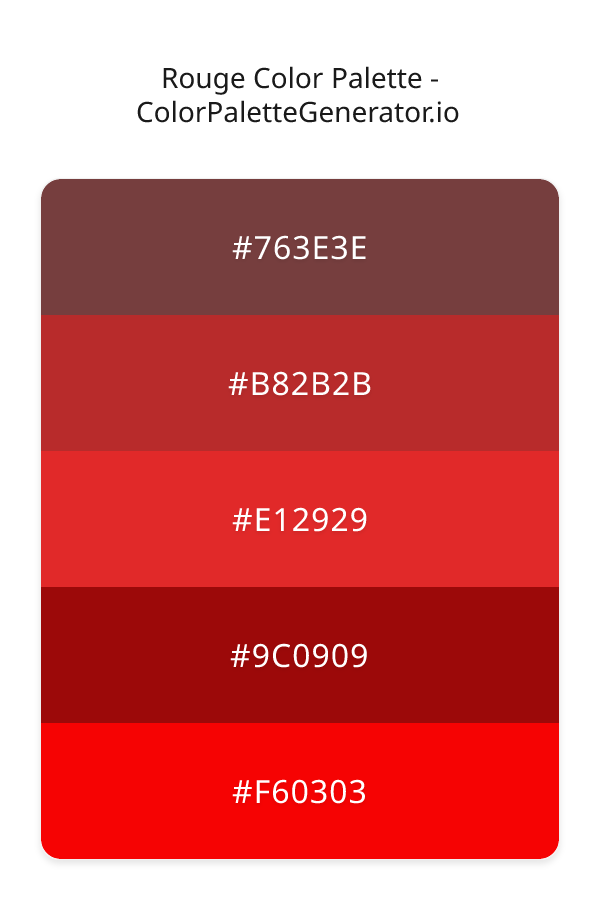
Palette Image
Below is the generated palette image showing all colors in a vertical layout. Perfect for sharing on social media or using as a reference.
Frequently Asked Questions
Everything you need to know about using and implementing the rouge palette effectively in your projects.