Royal Purple Color Palette – HEX, RGB & Design Inspiration
Color Details
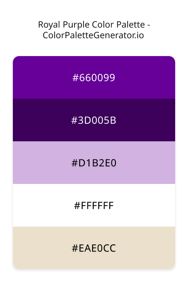
HEX: #660099
RGB: 102, 0, 153
HEX: #3D005B
RGB: 61, 0, 91
HEX: #D1B2E0
RGB: 209, 178, 224
HEX: #FFFFFF
RGB: 255, 255, 255
HEX: #EAE0CC
RGB: 234, 224, 204
Text on White/Black Backgrounds
Color Pair Combinations (10 total)
WCAG Contrast Standards:
- AAA (7:1): Enhanced contrast for maximum readability
- AA (4.5:1): Minimum for normal text (under 18pt)
- AA Large (3:1): Acceptable for large text (18pt+ or 14pt+ bold)
- Fail: Below WCAG standards, not recommended for text
Recommended Text Colors
Horizontal (Left to Right)
background: linear-gradient(to right, #660099 0%, #3D005B 25%, #D1B2E0 50%, #FFFFFF 75%, #EAE0CC 100%);Vertical (Top to Bottom)
background: linear-gradient(to bottom, #660099 0%, #3D005B 25%, #D1B2E0 50%, #FFFFFF 75%, #EAE0CC 100%);Diagonal (Top Left to Bottom Right)
background: linear-gradient(to bottom right, #660099 0%, #3D005B 25%, #D1B2E0 50%, #FFFFFF 75%, #EAE0CC 100%);Usage Tips:
- Copy the CSS code and paste directly into your stylesheets
- Linear gradients work great for backgrounds and hero sections
- Radial gradients are perfect for spotlights and focus effects
- Conic gradients create eye-catching loading spinners and progress indicators
- Smooth transitions ensure seamless color blending
Normal Vision
No color vision deficiency
Color Swatches
#660099
#3D005B
#D1B2E0
#FFFFFF
#EAE0CC
Full Palette View
How people with Normal Vision see it:
Overall Mood & Feel
Calm, professional, and trustworthy
Emotional Impact
Calming and contemplative, promoting feelings of trust, stability, and peace. The balanced lightness creates versatility across different contexts
Psychological Effect
This 5-color palette creates a calm, professional, and trustworthy. The combination works together to create memorable visual experiences that influence consumer perception, decision-making, and brand recall. The rich variety provides versatility while maintaining cohesive emotional messaging across touchpoints.
Brand Personality Traits
Perfect For These Industries
Target Audience
Affluent consumers seeking premium, high-quality products and experiences
Individual Color Psychology
#660099
Creative and mysterious
Emotions Evoked
Personality Traits
Brand Traits
Ideal Industries
Marketing Use
Evokes sophistication and luxury. Appeals to creative audiences. Used by premium brands to suggest quality and exclusivity. Rare in nature makes it feel special.
Cultural Meanings
Color Harmony Analysis
Palette Mood
Temperature
This palette combines dark & bold and balanced and light & airy moods with cool and neutral and warm tones, making it versatile for various design applications.
Professional Implementation Guide
This complementary royal purple palette features 5 carefully selected cool tones that create a balanced and versatile aesthetic. With high contrast levels and moderate saturation, this palette is optimized for web interfaces and mobile apps.
Web Design & Development
For web development, implement this palette with CSS variables for easy theme switching. The high contrast makes it ideal for accessible interfaces meeting WCAG AA standards.
- Apply the 60-30-10 rule for visual hierarchy
- Use accent colors for CTAs and hover states
- Maintain consistent color usage across all pages
- Test responsive behavior on multiple devices
Mobile App Interfaces
In mobile applications, these cool tones provide excellent battery efficiency on OLED screens. Use the strong color contrast to define clear touch targets.
- Design both light and dark mode variants
- Consider thumb-reach zones for color placement
- Test under direct sunlight and low light
- Use color to indicate interactive elements
Brand Identity Systems
Build a cohesive brand identity by designating specific colors for specific purposes. Establish your primary brand color from the most distinctive shade and create comprehensive brand guidelines specifying exact usage scenarios.
- Define primary, secondary, and accent colors
- Create usage rules for marketing materials
- Specify minimum sizes and clear space
- Document do's and don'ts for consistency
Frontend Development
Developers can integrate this palette efficiently using modern CSS techniques. Export as CSS variables for maximum flexibility, allowing theme switching and dynamic color updates without rewriting stylesheets.
- Use CSS custom properties for theming
- Implement semantic color naming conventions
- Create utility classes for rapid prototyping
- Consider CSS-in-JS for component-scoped colors
Print Design
For print materials, convert to CMYK using #660099 as the dominant color for headers and #EAE0CC for accents. These colors translate well to print with minimal adjustment.
- Add to your design software color library
- Create swatches for quick color access
- Use CMYK values for print production
- Request color proofs before final print
Marketing Campaigns
Marketing materials benefit from consistent color usage that reinforces brand recognition. Apply this palette across email campaigns, landing pages, advertisements, and social media for maximum impact and memorability.
- Maintain color consistency across channels
- A/B test color variations for conversion
- Consider cultural color associations
- Align colors with campaign messaging
Strategic Color Distribution
Professional designers follow the 60-30-10 rule for balanced color distribution. Here's how to apply this principle with the Royal Purple:
Dominant Color
#660099Use #660099 as your primary color for backgrounds, main content areas. This purple tone should occupy about 60% of your design space.
Secondary Color
#D1B2E0Apply #D1B2E0 as your secondary color for supporting elements and section dividers. Allocate approximately 30% of your layout to this color.
Accent Color
#EAE0CCReserve #EAE0CC for accent elements like buttons, links, and important highlights. This orange accent should be used sparingly (10% of design) to draw attention to key actions.
Professional Best Practices
✓ Smart Usage Tips
- •Add warm accent colors to create focal points and prevent designs from feeling too cold
- •Test your palette across different devices and lighting conditions before finalizing
✗ Common Mistakes to Avoid
- •Don't use all colors equally—establish clear visual hierarchy through color weight
- •Avoid low-contrast text combinations that strain readability
- •Don't rely solely on color to convey meaning (use icons, text, and patterns too)
- •Avoid inconsistent color usage across different pages or screens
- •Don't assume screen colors match print output—always request physical proofs
Palette Overview & Statistics
5
Total Colors
5
Associated Tags
5
Categories
2803
Community Likes
Color Analysis & Technical Guide
Detailed breakdown of each color's role, characteristics, and optimal applications. This complementary palette creates a balanced and versatile aesthetic perfect for web interfaces and mobile apps.
Individual Color Breakdown
Each color in this cool palette has been analyzed for its properties and ideal usage scenarios. The high contrast and moderate saturation ensure excellent readability and accessibility.
#660099
PURPLE
#660099 serves as the primary/dominant color in this palette. This medium purple (highly saturated) brings luxury and mystery Use it for headers, navigation bars, and brand elements.
Dark toneH: 280°S: 100%L: 30%#3D005B
PURPLE
#3D005B serves as the secondary/supporting color in this palette. This dark purple (highly saturated) brings luxury and mystery Use it for cards, borders, section dividers, and supporting UI components.
Dark toneH: 280°S: 100%L: 18%#D1B2E0
PURPLE
#D1B2E0 serves as the secondary/supporting color in this palette. This light purple (moderately saturated) brings creative and luxurious Use it for cards, borders, section dividers, and supporting UI components.
Light toneH: 280°S: 43%L: 79%#FFFFFF
WHITE
#FFFFFF serves as the secondary/supporting color in this palette. This light white (muted) brings cleanliness and simplicity Use it for cards, borders, section dividers, and supporting UI components.
Light toneH: 0°S: 0%L: 100%#EAE0CC
ORANGE
#EAE0CC serves as the accent/highlight color in this palette. This light orange (moderately saturated) brings creativity and enthusiasm Use it for call-to-action buttons, links, important notifications, and interactive elements.
Light toneH: 40°S: 42%L: 86%
Palette Characteristics
This palette exhibits distinct characteristics that make it particularly suitable for specific design applications and industries.
Cool tones convey professionalism, trust, and calmness. Ideal for corporate and tech applications.
High contrast ensures excellent readability and meets WCAG accessibility standards for most text combinations.
Moderate saturation balances visual interest with professional restraint.
Balanced brightness provides flexibility for both light and dark design elements.
💡 Pro Tips for This Palette
- Perfect for: web interfaces, mobile apps. The complementary color relationship creates natural visual flow.
- Mood & Psychology: This palette evokes a balanced and versatile feeling, making it ideal for brands seeking to convey those qualities.
- Accessibility: Excellent contrast makes this palette naturally accessible. Most color combinations will meet WCAG AA standards.
- Extensions: Create tints (add white) and shades (add black) to expand this 5-color palette into a comprehensive design system.
- Cultural Context: Cool tones are generally perceived as professional worldwide but always research cultural color meanings.
Export Formats
Explore Royal Purple Palette
The Royal Purple color palette is a masterful blend of rich, jewel-toned hues that evoke feelings of luxury, creativity, and wisdom. This carefully crafted palette is designed to make a statement, with its bold and modern aesthetic tempered by feminine elegance. At its core, the palette features a deep, rich purple shade, reminiscent of lavender and violet, which sets the tone for a sophisticated and refined visual identity. The colors work together in perfect harmony, creating a balanced and visually stunning effect that is sure to captivate audiences.
Delving deeper into the palette, we find a range of nuanced shades that add depth and complexity to the overall design. The darkest shade, a rich plum color, is represented by the code 3D005B, and serves as a dramatic anchor for the palette, providing a sense of stability and grounding. In contrast, the lightest shade, a soft white represented by the code FFFFFF, adds a touch of airiness and sophistication, while the code EAE0CC, a warm beige, brings a sense of warmth and approachability to the design. The code D1B2E0, a pale lavender, adds a touch of whimsy and romance, while the code 660099, a deep, rich purple, is the true star of the show, drawing the eye and commanding attention.
The Royal Purple palette is incredibly versatile, lending itself to a wide range of practical applications, from website design and app development to branding and marketing materials. Designers can use this palette to create a bold and eye-catching visual identity for a fashion or beauty brand, or to add a touch of elegance and sophistication to a luxury goods or services website. The palette's modern and feminine aesthetic also makes it well-suited to social media and influencer marketing campaigns, where a strong visual identity is essential for standing out in a crowded and competitive landscape.
The colors in the Royal Purple palette have a profound impact on viewer perception and behavior, with the deep purple shade evoking feelings of creativity, wisdom, and luxury. The pale lavender and soft white shades add a touch of femininity and elegance, while the warm beige and rich plum shades bring a sense of warmth and sophistication. When used together, these colors can create a powerful emotional connection with the viewer, drawing them in and inspiring them to engage with the brand or product. By leveraging the psychological power of color, designers can use the Royal Purple palette to create a lasting impression and drive meaningful results.
For designers looking to get the most out of the Royal Purple palette, there are a few pro tips to keep in mind. To add depth and contrast to the design, try pairing the deep purple shade with a complementary color like golden yellow or bright green. The pale lavender and soft white shades can also be used to create a beautiful ombre effect, adding a touch of romance and whimsy to the design. When it comes to typography and graphics, a clean and modern sans-serif font is often the best choice, as it allows the colors to take center stage and creates a sense of balance and harmony in the design. By following these tips and experimenting with different combinations and applications, designers can unlock the full potential of the Royal Purple palette and create truly stunning visual identities that inspire and delight.
Palette Image
Below is the generated palette image showing all colors in a vertical layout. Perfect for sharing on social media or using as a reference.
Frequently Asked Questions
Everything you need to know about using and implementing the royal purple palette effectively in your projects.