Say The Name! Seventeen Color Palette – HEX, RGB & Design Inspiration
Color Details
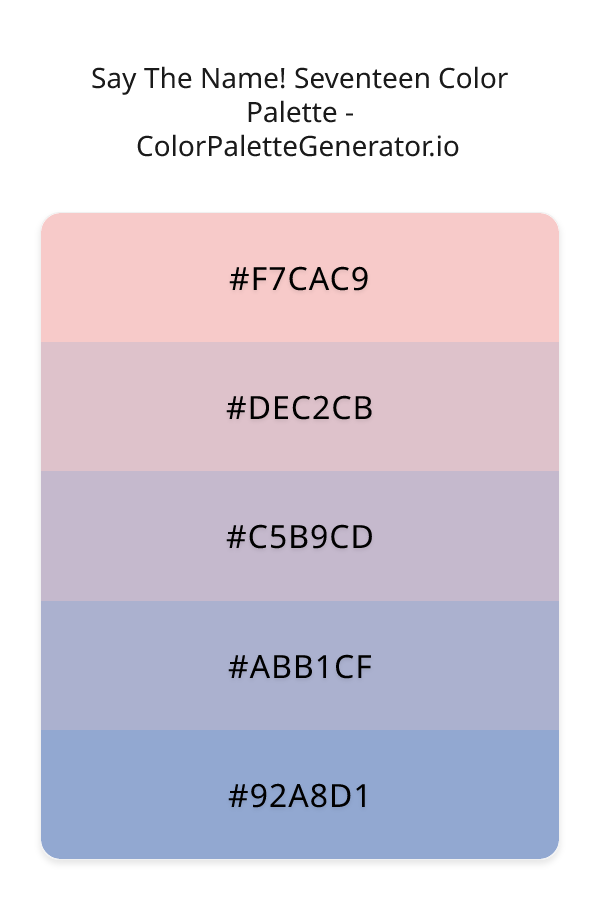
HEX: #F7CAC9
RGB: 247, 202, 201
HEX: #DEC2CB
RGB: 222, 194, 203
HEX: #C5B9CD
RGB: 197, 185, 205
HEX: #ABB1CF
RGB: 171, 177, 207
HEX: #92A8D1
RGB: 146, 168, 209
Text on White/Black Backgrounds
Color Pair Combinations (10 total)
WCAG Contrast Standards:
- AAA (7:1): Enhanced contrast for maximum readability
- AA (4.5:1): Minimum for normal text (under 18pt)
- AA Large (3:1): Acceptable for large text (18pt+ or 14pt+ bold)
- Fail: Below WCAG standards, not recommended for text
Recommended Text Colors
Horizontal (Left to Right)
background: linear-gradient(to right, #F7CAC9 0%, #DEC2CB 25%, #C5B9CD 50%, #ABB1CF 75%, #92A8D1 100%);Vertical (Top to Bottom)
background: linear-gradient(to bottom, #F7CAC9 0%, #DEC2CB 25%, #C5B9CD 50%, #ABB1CF 75%, #92A8D1 100%);Diagonal (Top Left to Bottom Right)
background: linear-gradient(to bottom right, #F7CAC9 0%, #DEC2CB 25%, #C5B9CD 50%, #ABB1CF 75%, #92A8D1 100%);Usage Tips:
- Copy the CSS code and paste directly into your stylesheets
- Linear gradients work great for backgrounds and hero sections
- Radial gradients are perfect for spotlights and focus effects
- Conic gradients create eye-catching loading spinners and progress indicators
- Smooth transitions ensure seamless color blending
Normal Vision
No color vision deficiency
Color Swatches
#F7CAC9
#DEC2CB
#C5B9CD
#ABB1CF
#92A8D1
Full Palette View
How people with Normal Vision see it:
Overall Mood & Feel
Calm, professional, and trustworthy, with an airy and optimistic feel
Emotional Impact
Calming and contemplative, promoting feelings of trust, stability, and peace. The light tones create an uplifting, optimistic atmosphere perfect for approachable brands
Psychological Effect
This 5-color palette creates a calm, professional, and trustworthy, with an airy and optimistic feel. The combination works together to create memorable visual experiences that influence consumer perception, decision-making, and brand recall. The rich variety provides versatility while maintaining cohesive emotional messaging across touchpoints.
Brand Personality Traits
Perfect For These Industries
Target Audience
Business professionals and decision-makers seeking reliability and competence. Appeals to those seeking approachable, positive, and optimistic brands
Individual Color Psychology
#F7CAC9
Warm and romantic
Emotions Evoked
Personality Traits
Brand Traits
Ideal Industries
Marketing Use
Creates urgency, stimulates appetite, increases heart rate, and grabs attention. Perfect for clearance sales, food brands, and call-to-action buttons.
Cultural Meanings
Color Harmony Analysis
Palette Mood
Temperature
This palette combines light & airy and balanced moods with warm and cool tones, making it versatile for various design applications.
Professional Implementation Guide
This complementary say the name! seventeen palette features 5 carefully selected cool tones that create a calm and professional aesthetic. With low contrast levels and moderate saturation, this palette is optimized for corporate branding and business websites.
Web Design & Development
For web development, implement this palette with CSS variables for easy theme switching. Consider adding darker variants for better text readability.
- Apply the 60-30-10 rule for visual hierarchy
- Use accent colors for CTAs and hover states
- Maintain consistent color usage across all pages
- Test responsive behavior on multiple devices
Mobile App Interfaces
In mobile applications, these cool tones provide excellent readability in bright conditions. Use the subtle color variations to define clear touch targets.
- Design both light and dark mode variants
- Consider thumb-reach zones for color placement
- Test under direct sunlight and low light
- Use color to indicate interactive elements
Brand Identity Systems
Build a cohesive brand identity by designating specific colors for specific purposes. Establish your primary brand color from the most distinctive shade and create comprehensive brand guidelines specifying exact usage scenarios.
- Define primary, secondary, and accent colors
- Create usage rules for marketing materials
- Specify minimum sizes and clear space
- Document do's and don'ts for consistency
Frontend Development
Developers can integrate this palette efficiently using modern CSS techniques. Export as CSS variables for maximum flexibility, allowing theme switching and dynamic color updates without rewriting stylesheets.
- Use CSS custom properties for theming
- Implement semantic color naming conventions
- Create utility classes for rapid prototyping
- Consider CSS-in-JS for component-scoped colors
Print Design
For print materials, convert to CMYK using #F7CAC9 as the dominant color for headers and #92A8D1 for accents. These colors translate well to print with minimal adjustment.
- Add to your design software color library
- Create swatches for quick color access
- Use CMYK values for print production
- Request color proofs before final print
Marketing Campaigns
Marketing materials benefit from consistent color usage that reinforces brand recognition. Apply this palette across email campaigns, landing pages, advertisements, and social media for maximum impact and memorability.
- Maintain color consistency across channels
- A/B test color variations for conversion
- Consider cultural color associations
- Align colors with campaign messaging
Strategic Color Distribution
Professional designers follow the 60-30-10 rule for balanced color distribution. Here's how to apply this principle with the Say The Name! Seventeen:
Dominant Color
#F7CAC9Use #F7CAC9 as your primary color for backgrounds, main content areas. This red tone should occupy about 60% of your design space.
Secondary Color
#C5B9CDApply #C5B9CD as your secondary color for subtle backgrounds and card components. Allocate approximately 30% of your layout to this color.
Accent Color
#92A8D1Reserve #92A8D1 for accent elements like buttons, links, and important highlights. This blue accent should be used sparingly (10% of design) to draw attention to key actions.
Professional Best Practices
✓ Smart Usage Tips
- •Add white or black text overlays to improve readability on colored backgrounds
- •Add warm accent colors to create focal points and prevent designs from feeling too cold
- •Test your palette across different devices and lighting conditions before finalizing
✗ Common Mistakes to Avoid
- •Don't use all colors equally—establish clear visual hierarchy through color weight
- •Avoid low-contrast text combinations that strain readability
- •Don't rely solely on color to convey meaning (use icons, text, and patterns too)
- •Avoid inconsistent color usage across different pages or screens
- •Don't assume screen colors match print output—always request physical proofs
Palette Overview & Statistics
5
Total Colors
5
Associated Tags
3
Categories
4010
Community Likes
Color Analysis & Technical Guide
Detailed breakdown of each color's role, characteristics, and optimal applications. This complementary palette creates a calm and professional aesthetic perfect for corporate branding and business websites.
Individual Color Breakdown
Each color in this cool palette has been analyzed for its properties and ideal usage scenarios. The low contrast and moderate saturation ensure harmonious visual relationships.
#F7CAC9
RED
#F7CAC9 serves as the primary/dominant color in this palette. This light red (highly saturated) brings energy and warmth Use it for backgrounds, containers, and large surface areas.
Light toneH: 1°S: 74%L: 88%#DEC2CB
PINK
#DEC2CB serves as the secondary/supporting color in this palette. This light pink (moderately saturated) brings playfulness and compassion Use it for cards, borders, section dividers, and supporting UI components.
Light toneH: 341°S: 30%L: 82%#C5B9CD
PURPLE
#C5B9CD serves as the secondary/supporting color in this palette. This light purple (muted) brings creative and luxurious Use it for cards, borders, section dividers, and supporting UI components.
Light toneH: 276°S: 17%L: 76%#ABB1CF
BLUE
#ABB1CF serves as the secondary/supporting color in this palette. This light blue (muted) brings trust and tranquility Use it for cards, borders, section dividers, and supporting UI components.
Light toneH: 230°S: 27%L: 74%#92A8D1
BLUE
#92A8D1 serves as the accent/highlight color in this palette. This medium blue (moderately saturated) brings trust and tranquility Use it for call-to-action buttons, links, important notifications, and interactive elements.
Light toneH: 219°S: 41%L: 70%
Palette Characteristics
This palette exhibits distinct characteristics that make it particularly suitable for specific design applications and industries.
Cool tones convey professionalism, trust, and calmness. Ideal for corporate and tech applications.
Low contrast creates subtle, sophisticated aesthetics but requires careful attention to text legibility.
Moderate saturation balances visual interest with professional restraint.
Light palette creates airy, open designs with excellent readability for dark text overlays.
💡 Pro Tips for This Palette
- Perfect for: corporate branding, business websites, minimalist designs, health & wellness. The complementary color relationship creates natural visual flow.
- Mood & Psychology: This palette evokes a calm and professional feeling, making it ideal for brands seeking to convey those qualities.
- Accessibility: Test text combinations carefully with contrast checkers to ensure accessibility compliance.
- Extensions: Create tints (add white) and shades (add black) to expand this 5-color palette into a comprehensive design system.
- Cultural Context: Cool tones are generally perceived as professional worldwide but always research cultural color meanings.
Export Formats
Explore Say The Name! Seventeen Palette
The Say The Name Seventeen color palette is a delicate and enchanting blend of hues that evoke a sense of whimsy and romance, perfect for designs that require a touch of elegance and sophistication. At its core, this palette is a masterful combination of soft reds, pinks, light blues, lavenders, and blues, each working in harmony to create a visual experience that is both soothing and uplifting. The palette's gentle, pastel quality makes it an ideal choice for wedding and light-themed designs, where a sense of airiness and joy is essential.
Delving deeper into the palette, we find that the warm, blush-like tone of F7CAC9 sets the stage for a romantic and feminine aesthetic, while DEC2CB introduces a softer, more muted quality that adds depth and nuance to the overall design. The introduction of C5B9CD brings a subtle lavender hue into the mix, which not only adds a touch of sophistication but also serves as a beautiful bridge between the warmer and cooler tones. ABB1CF and 92A8D1, with their light blue and blue undertones, respectively, bring a sense of calmness and serenity to the palette, rounding out the color scheme and creating a sense of balance and harmony.
In practical terms, the Say The Name Seventeen palette is a versatile and inspiring choice for a wide range of design applications, from websites and apps to branding and marketing materials. For wedding designs, this palette is a natural fit, as it evokes the soft, romantic qualities of the occasion. In other contexts, such as e-commerce websites or social media platforms, this palette can be used to create a sense of approachability and friendliness, making it an excellent choice for brands that want to connect with their audience on a more personal level. Whether used in its entirety or as a starting point for further experimentation, this palette is sure to bring a touch of elegance and sophistication to any design project.
From a psychological perspective, the colors in the Say The Name Seventeen palette have a profound impact on viewer perception and behavior. The soft pinks and lavenders are known to evoke feelings of warmth and nurturing, while the light blues and blues are often associated with trust and loyalty. By combining these colors in a single palette, designers can create a visual experience that is both soothing and uplifting, making it an excellent choice for designs that require a sense of calmness and serenity. Furthermore, the palette's pastel quality can help to create a sense of distance or subtlety, making it an excellent choice for designs where a more understated approach is desired.
For designers looking to get the most out of the Say The Name Seventeen palette, there are several pro tips to keep in mind. To create a sense of contrast and visual interest, consider pairing F7CAC9 with a deeper, richer blue, such as a navy or indigo. For a more subtle look, try combining DEC2CB with a muted green or beige, which can help to bring out the palette's softer, more muted qualities. Additionally, designers can experiment with different shades and tints of the palette's core colors, such as ABB1CF and 92A8D1, to create a sense of depth and dimensionality in their designs. By following these tips and experimenting with the palette's many possibilities, designers can unlock the full potential of the Say The Name Seventeen color palette and create designs that are both beautiful and effective.
Palette Image
Below is the generated palette image showing all colors in a vertical layout. Perfect for sharing on social media or using as a reference.
Frequently Asked Questions
Everything you need to know about using and implementing the say the name! seventeen palette effectively in your projects.