Shades Of Black To Blue Color Palette – HEX, RGB & Design Inspiration
Color Details
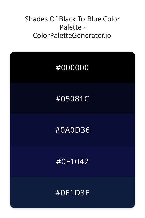
HEX: #000000
RGB: 0, 0, 0
HEX: #05081C
RGB: 5, 8, 28
HEX: #0A0D36
RGB: 10, 13, 54
HEX: #0F1042
RGB: 15, 16, 66
HEX: #0E1D3E
RGB: 14, 29, 62
Text on White/Black Backgrounds
Color Pair Combinations (10 total)
WCAG Contrast Standards:
- AAA (7:1): Enhanced contrast for maximum readability
- AA (4.5:1): Minimum for normal text (under 18pt)
- AA Large (3:1): Acceptable for large text (18pt+ or 14pt+ bold)
- Fail: Below WCAG standards, not recommended for text
Recommended Text Colors
Horizontal (Left to Right)
background: linear-gradient(to right, #000000 0%, #05081C 25%, #0A0D36 50%, #0F1042 75%, #0E1D3E 100%);Vertical (Top to Bottom)
background: linear-gradient(to bottom, #000000 0%, #05081C 25%, #0A0D36 50%, #0F1042 75%, #0E1D3E 100%);Diagonal (Top Left to Bottom Right)
background: linear-gradient(to bottom right, #000000 0%, #05081C 25%, #0A0D36 50%, #0F1042 75%, #0E1D3E 100%);Usage Tips:
- Copy the CSS code and paste directly into your stylesheets
- Linear gradients work great for backgrounds and hero sections
- Radial gradients are perfect for spotlights and focus effects
- Conic gradients create eye-catching loading spinners and progress indicators
- Smooth transitions ensure seamless color blending
Normal Vision
No color vision deficiency
Color Swatches
#000000
#05081C
#0A0D36
#0F1042
#0E1D3E
Full Palette View
How people with Normal Vision see it:
Overall Mood & Feel
Calm, professional, and trustworthy, with a sophisticated and dramatic atmosphere
Emotional Impact
Calming and contemplative, promoting feelings of trust, stability, and peace. The dark tones establish a premium, sophisticated feel ideal for luxury positioning
Psychological Effect
This 5-color palette creates a calm, professional, and trustworthy, with a sophisticated and dramatic atmosphere. The combination works together to create memorable visual experiences that influence consumer perception, decision-making, and brand recall. The rich variety provides versatility while maintaining cohesive emotional messaging across touchpoints.
Brand Personality Traits
Perfect For These Industries
Target Audience
Business professionals and decision-makers seeking reliability and competence
Individual Color Psychology
#000000
Sophisticated and powerful
Emotions Evoked
Personality Traits
Brand Traits
Ideal Industries
Marketing Use
Conveys luxury, power, and sophistication. Makes colors stand out when used as background. Popular in high-end fashion and technology. Can be overwhelming if overused.
Cultural Meanings
Color Harmony Analysis
Palette Mood
Temperature
This palette combines dark & bold moods with neutral and cool tones, making it versatile for various design applications.
Professional Implementation Guide
This complementary shades of black to blue palette features 5 carefully selected cool tones that create a dramatic and sophisticated aesthetic. With low contrast levels and moderate saturation, this palette is optimized for .
Web Design & Development
For web development, implement this palette with CSS variables for easy theme switching. Consider adding darker variants for better text readability.
- Apply the 60-30-10 rule for visual hierarchy
- Use accent colors for CTAs and hover states
- Maintain consistent color usage across all pages
- Test responsive behavior on multiple devices
Mobile App Interfaces
In mobile applications, these cool tones provide excellent battery efficiency on OLED screens. Use the subtle color variations to define clear touch targets.
- Design both light and dark mode variants
- Consider thumb-reach zones for color placement
- Test under direct sunlight and low light
- Use color to indicate interactive elements
Brand Identity Systems
Build a cohesive brand identity by designating specific colors for specific purposes. Establish your primary brand color from the most distinctive shade and create comprehensive brand guidelines specifying exact usage scenarios.
- Define primary, secondary, and accent colors
- Create usage rules for marketing materials
- Specify minimum sizes and clear space
- Document do's and don'ts for consistency
Frontend Development
Developers can integrate this palette efficiently using modern CSS techniques. Export as CSS variables for maximum flexibility, allowing theme switching and dynamic color updates without rewriting stylesheets.
- Use CSS custom properties for theming
- Implement semantic color naming conventions
- Create utility classes for rapid prototyping
- Consider CSS-in-JS for component-scoped colors
Print Design
For print materials, convert to CMYK using #000000 as the dominant color for headers and #0E1D3E for accents. These colors translate well to print with minimal adjustment.
- Add to your design software color library
- Create swatches for quick color access
- Use CMYK values for print production
- Request color proofs before final print
Marketing Campaigns
Marketing materials benefit from consistent color usage that reinforces brand recognition. Apply this palette across email campaigns, landing pages, advertisements, and social media for maximum impact and memorability.
- Maintain color consistency across channels
- A/B test color variations for conversion
- Consider cultural color associations
- Align colors with campaign messaging
Strategic Color Distribution
Professional designers follow the 60-30-10 rule for balanced color distribution. Here's how to apply this principle with the Shades Of Black To Blue:
Dominant Color
#000000Use #000000 as your primary color for headers, hero sections, and primary CTAs. This black tone should occupy about 60% of your design space.
Secondary Color
#0A0D36Apply #0A0D36 as your secondary color for subtle backgrounds and card components. Allocate approximately 30% of your layout to this color.
Accent Color
#0E1D3EReserve #0E1D3E for accent elements like buttons, links, and important highlights. This blue accent should be used sparingly (10% of design) to draw attention to key actions.
Professional Best Practices
✓ Smart Usage Tips
- •Add white or black text overlays to improve readability on colored backgrounds
- •Add warm accent colors to create focal points and prevent designs from feeling too cold
- •Ensure sufficient lighting contrast for text elements—use light text on dark backgrounds
- •Test your palette across different devices and lighting conditions before finalizing
✗ Common Mistakes to Avoid
- •Don't use all colors equally—establish clear visual hierarchy through color weight
- •Avoid low-contrast text combinations that strain readability
- •Don't rely solely on color to convey meaning (use icons, text, and patterns too)
- •Avoid inconsistent color usage across different pages or screens
- •Don't assume screen colors match print output—always request physical proofs
Palette Overview & Statistics
5
Total Colors
2
Associated Tags
6
Categories
2450
Community Likes
Color Analysis & Technical Guide
Detailed breakdown of each color's role, characteristics, and optimal applications. This complementary palette creates a dramatic and sophisticated aesthetic perfect for .
Individual Color Breakdown
Each color in this cool palette has been analyzed for its properties and ideal usage scenarios. The low contrast and moderate saturation ensure harmonious visual relationships.
#000000
BLACK
#000000 serves as the primary/dominant color in this palette. This dark black (muted) brings elegance and authority Use it for headers, navigation bars, and brand elements.
Dark toneH: 0°S: 0%L: 0%#05081C
BLUE
#05081C serves as the secondary/supporting color in this palette. This dark blue (highly saturated) brings professionalism and depth Use it for cards, borders, section dividers, and supporting UI components.
Dark toneH: 232°S: 70%L: 6%#0A0D36
BLUE
#0A0D36 serves as the secondary/supporting color in this palette. This dark blue (highly saturated) brings professionalism and depth Use it for cards, borders, section dividers, and supporting UI components.
Dark toneH: 236°S: 69%L: 13%#0F1042
BLUE
#0F1042 serves as the secondary/supporting color in this palette. This dark blue (highly saturated) brings professionalism and depth Use it for cards, borders, section dividers, and supporting UI components.
Dark toneH: 239°S: 63%L: 16%#0E1D3E
BLUE
#0E1D3E serves as the accent/highlight color in this palette. This dark blue (highly saturated) brings professionalism and depth Use it for call-to-action buttons, links, important notifications, and interactive elements.
Dark toneH: 221°S: 63%L: 15%
Palette Characteristics
This palette exhibits distinct characteristics that make it particularly suitable for specific design applications and industries.
Cool tones convey professionalism, trust, and calmness. Ideal for corporate and tech applications.
Low contrast creates subtle, sophisticated aesthetics but requires careful attention to text legibility.
Moderate saturation balances visual interest with professional restraint.
Dark tones create dramatic, sophisticated aesthetics and save battery on OLED displays.
💡 Pro Tips for This Palette
- Perfect for: . The complementary color relationship creates natural visual flow.
- Mood & Psychology: This palette evokes a dramatic and sophisticated feeling, making it ideal for brands seeking to convey those qualities.
- Accessibility: Test text combinations carefully with contrast checkers to ensure accessibility compliance.
- Extensions: Create tints (add white) and shades (add black) to expand this 5-color palette into a comprehensive design system.
- Cultural Context: Cool tones are generally perceived as professional worldwide but always research cultural color meanings.
Export Formats
Explore Shades Of Black To Blue Palette
The Shades Of Black To Blue color palette is a masterful blend of deep, rich hues that evoke a sense of mystery, sophistication, and limitless possibility. This palette is perfect for designers seeking to create a dramatic and captivating visual experience that draws the viewer in and refuses to let go. As the name suggests, the palette seamlessly transitions from the darkest depths of black, represented by the hex code 000000, to the profound blues that evoke the night sky, with 05081C, 0A0D36, 0F1042, and 0E1D3E each playing a unique role in the overall aesthetic.
Each color in the Shades Of Black To Blue palette has been carefully selected to contribute to the overall narrative, with 05081C serving as a deep, foreboding blue that sets the tone for the rest of the palette. As we progress to 0A0D36, the blue becomes slightly more vibrant, yet still retains a sense of darkness and intensity. The 0F1042 shade introduces a hint of nuance, with a slightly purplish undertone that adds depth and complexity to the overall design. Finally, 0E1D3E brings a sense of balance and harmony, with a blue that is both soothing and professional. While the palette may seem dark and muted at first glance, it is actually a thoughtful and deliberate combination of colors that work together to create a sense of cohesion and visual interest.
The Shades Of Black To Blue palette is incredibly versatile, and can be applied to a wide range of design contexts, from websites and apps to branding and marketing materials. For example, a website for a financial services company might use this palette to convey a sense of professionalism and stability, while a mobile app for a nighttime entertainment venue might use it to evoke the excitement and energy of the night. Regardless of the specific application, the palette is sure to make a lasting impression on the viewer, and can be used to create a wide range of visual effects, from subtle and understated to bold and dramatic. The navy and coral color themes that underlie the palette also offer a wealth of creative possibilities, and can be used to add a pop of color and visual interest to an otherwise dark and muted design.
The psychology of the Shades Of Black To Blue palette is also worth considering, as the colors used have a profound impact on the viewer's perception and behavior. The dark blues and blacks used in the palette can create a sense of trust and reliability, while also evoking feelings of creativity and intuition. The palette can also be used to create a sense of luxury and sophistication, making it perfect for high-end brands and designer products. By carefully considering the emotional and psychological impact of the colors used, designers can create a visual experience that resonates with the viewer on a deep and profound level.
For designers looking to get the most out of the Shades Of Black To Blue palette, there are a number of pro tips and best practices to keep in mind. For example, the palette can be paired with a range of complementary colors, from bright and vibrant hues like coral to more muted and subtle shades like gray and beige. The key is to find a balance between contrast and harmony, and to use the colors in a way that creates a sense of visual interest and tension. By experimenting with different combinations and permutations, designers can unlock the full potential of the Shades Of Black To Blue palette, and create a visual experience that is both captivating and unforgettable.
Palette Image
Below is the generated palette image showing all colors in a vertical layout. Perfect for sharing on social media or using as a reference.
Frequently Asked Questions
Everything you need to know about using and implementing the shades of black to blue palette effectively in your projects.