Soft Pink And Brown Color Palette – HEX, RGB & Design Inspiration
Color Details
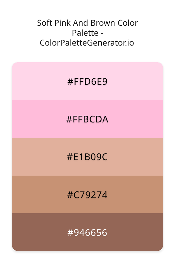
HEX: #FFD6E9
RGB: 255, 214, 233
HEX: #FFBCDA
RGB: 255, 188, 218
HEX: #E1B09C
RGB: 225, 176, 156
HEX: #C79274
RGB: 199, 146, 116
HEX: #946656
RGB: 148, 102, 86
Text on White/Black Backgrounds
Color Pair Combinations (10 total)
WCAG Contrast Standards:
- AAA (7:1): Enhanced contrast for maximum readability
- AA (4.5:1): Minimum for normal text (under 18pt)
- AA Large (3:1): Acceptable for large text (18pt+ or 14pt+ bold)
- Fail: Below WCAG standards, not recommended for text
Recommended Text Colors
Horizontal (Left to Right)
background: linear-gradient(to right, #FFD6E9 0%, #FFBCDA 25%, #E1B09C 50%, #C79274 75%, #946656 100%);Vertical (Top to Bottom)
background: linear-gradient(to bottom, #FFD6E9 0%, #FFBCDA 25%, #E1B09C 50%, #C79274 75%, #946656 100%);Diagonal (Top Left to Bottom Right)
background: linear-gradient(to bottom right, #FFD6E9 0%, #FFBCDA 25%, #E1B09C 50%, #C79274 75%, #946656 100%);Usage Tips:
- Copy the CSS code and paste directly into your stylesheets
- Linear gradients work great for backgrounds and hero sections
- Radial gradients are perfect for spotlights and focus effects
- Conic gradients create eye-catching loading spinners and progress indicators
- Smooth transitions ensure seamless color blending
Normal Vision
No color vision deficiency
Color Swatches
#FFD6E9
#FFBCDA
#E1B09C
#C79274
#946656
Full Palette View
How people with Normal Vision see it:
Overall Mood & Feel
Energetic, warm, and inviting, with an airy and optimistic feel
Emotional Impact
Stimulating and energetic, evoking feelings of excitement, warmth, and action. The light tones create an uplifting, optimistic atmosphere perfect for approachable brands
Psychological Effect
This 5-color palette creates a energetic, warm, and inviting, with an airy and optimistic feel. It stimulates activity and engagement, increasing heart rate and mental alertness. The combination works together to create memorable visual experiences that influence consumer perception, decision-making, and brand recall. The rich variety provides versatility while maintaining cohesive emotional messaging across touchpoints.
Brand Personality Traits
Perfect For These Industries
Target Audience
Young, trend-conscious consumers (18-35) who value creativity and self-expression. Appeals to those seeking approachable, positive, and optimistic brands
Individual Color Psychology
#FFD6E9
Warm and caring
Emotions Evoked
Personality Traits
Brand Traits
Ideal Industries
Marketing Use
Appeals to feminine markets, evokes compassion and care. Used in healthcare and beauty. Hot pink captures attention and conveys energy and fun.
Cultural Meanings
Color Harmony Analysis
Palette Mood
Temperature
This palette combines light & airy and balanced moods with warm tones, making it versatile for various design applications.
Professional Implementation Guide
This complementary soft pink and brown palette features 5 carefully selected warm tones that create a energetic and passionate aesthetic. With medium contrast levels and vibrant saturation, this palette is optimized for marketing materials and youth brands.
Web Design & Development
For web development, implement this palette with CSS variables for easy theme switching. Consider adding darker variants for better text readability.
- Apply the 60-30-10 rule for visual hierarchy
- Use accent colors for CTAs and hover states
- Maintain consistent color usage across all pages
- Test responsive behavior on multiple devices
Mobile App Interfaces
In mobile applications, these warm tones provide excellent readability in bright conditions. Use the subtle color variations to define clear touch targets.
- Design both light and dark mode variants
- Consider thumb-reach zones for color placement
- Test under direct sunlight and low light
- Use color to indicate interactive elements
Brand Identity Systems
Build a cohesive brand identity by designating specific colors for specific purposes. Establish your primary brand color from the most distinctive shade and create comprehensive brand guidelines specifying exact usage scenarios.
- Define primary, secondary, and accent colors
- Create usage rules for marketing materials
- Specify minimum sizes and clear space
- Document do's and don'ts for consistency
Frontend Development
Developers can integrate this palette efficiently using modern CSS techniques. Export as CSS variables for maximum flexibility, allowing theme switching and dynamic color updates without rewriting stylesheets.
- Use CSS custom properties for theming
- Implement semantic color naming conventions
- Create utility classes for rapid prototyping
- Consider CSS-in-JS for component-scoped colors
Print Design
For print materials, convert to CMYK using #FFD6E9 as the dominant color for headers and #946656 for accents. These vibrant colors may appear slightly muted in print; request color proofs.
- Add to your design software color library
- Create swatches for quick color access
- Use CMYK values for print production
- Request color proofs before final print
Marketing Campaigns
Marketing materials benefit from consistent color usage that reinforces brand recognition. Apply this palette across email campaigns, landing pages, advertisements, and social media for maximum impact and memorability.
- Maintain color consistency across channels
- A/B test color variations for conversion
- Consider cultural color associations
- Align colors with campaign messaging
Strategic Color Distribution
Professional designers follow the 60-30-10 rule for balanced color distribution. Here's how to apply this principle with the Soft Pink And Brown:
Dominant Color
#FFD6E9Use #FFD6E9 as your primary color for backgrounds, main content areas. This pink tone should occupy about 60% of your design space.
Secondary Color
#E1B09CApply #E1B09C as your secondary color for subtle backgrounds and card components. Allocate approximately 30% of your layout to this color.
Accent Color
#946656Reserve #946656 for accent elements like buttons, links, and important highlights. This orange accent should be used sparingly (10% of design) to draw attention to key actions.
Professional Best Practices
✓ Smart Usage Tips
- •Use desaturated versions (reduce saturation by 20-30%) for large background areas to prevent visual fatigue
- •Balance warm tones with neutral whites or grays to create visual breathing room
- •Test your palette across different devices and lighting conditions before finalizing
✗ Common Mistakes to Avoid
- •Don't use all colors equally—establish clear visual hierarchy through color weight
- •Avoid low-contrast text combinations that strain readability
- •Don't rely solely on color to convey meaning (use icons, text, and patterns too)
- •Avoid inconsistent color usage across different pages or screens
- •Don't assume screen colors match print output—always request physical proofs
Palette Overview & Statistics
5
Total Colors
4
Associated Tags
5
Categories
1695
Community Likes
Color Analysis & Technical Guide
Detailed breakdown of each color's role, characteristics, and optimal applications. This complementary palette creates a energetic and passionate aesthetic perfect for marketing materials and youth brands.
Individual Color Breakdown
Each color in this warm palette has been analyzed for its properties and ideal usage scenarios. The medium contrast and vibrant saturation ensure harmonious visual relationships.
#FFD6E9
PINK
#FFD6E9 serves as the primary/dominant color in this palette. This light pink (highly saturated) brings playfulness and compassion Use it for backgrounds, containers, and large surface areas.
Light toneH: 332°S: 100%L: 92%#FFBCDA
PINK
#FFBCDA serves as the secondary/supporting color in this palette. This light pink (highly saturated) brings playfulness and compassion Use it for cards, borders, section dividers, and supporting UI components.
Light toneH: 333°S: 100%L: 87%#E1B09C
ORANGE
#E1B09C serves as the secondary/supporting color in this palette. This light orange (moderately saturated) brings creativity and enthusiasm Use it for cards, borders, section dividers, and supporting UI components.
Light toneH: 17°S: 53%L: 75%#C79274
ORANGE
#C79274 serves as the secondary/supporting color in this palette. This medium orange (moderately saturated) brings creativity and enthusiasm Use it for cards, borders, section dividers, and supporting UI components.
Light toneH: 22°S: 43%L: 62%#946656
ORANGE
#946656 serves as the accent/highlight color in this palette. This medium orange (muted) brings creativity and enthusiasm Use it for call-to-action buttons, links, important notifications, and interactive elements.
Dark toneH: 15°S: 26%L: 46%
Palette Characteristics
This palette exhibits distinct characteristics that make it particularly suitable for specific design applications and industries.
Warm colors create energy, excitement, and approachability. Perfect for brands targeting emotional connection.
Medium contrast provides visual interest while maintaining readability with proper text color choices.
Vibrant saturation creates bold, attention-grabbing designs perfect for youth brands and creative projects.
Light palette creates airy, open designs with excellent readability for dark text overlays.
💡 Pro Tips for This Palette
- Perfect for: marketing materials, youth brands, minimalist designs, health & wellness. The complementary color relationship creates natural visual flow.
- Mood & Psychology: This palette evokes a energetic and passionate feeling, making it ideal for brands seeking to convey those qualities.
- Accessibility: Test text combinations carefully with contrast checkers to ensure accessibility compliance.
- Extensions: Create tints (add white) and shades (add black) to expand this 5-color palette into a comprehensive design system.
- Cultural Context: Warm colors may have different meanings across cultures—verify associations with your target market.
Export Formats
Explore Soft Pink And Brown Palette
The Soft Pink And Brown color palette is a symphony of warm, inviting hues that evoke feelings of playfulness and femininity, making it perfect for designs that aim to convey a sense of approachability and creativity. At the heart of this palette lies a range of pink shades, from the soft and subtle FFD6E9 to the more vibrant and energetic FFBCDA, which serve as the foundation for a monochromatic scheme that exudes warmth and coziness. These pink tones are beautifully complemented by a selection of brown shades, including E1B09C, C79274, and 946656, which add depth and sophistication to the palette, grounding the brighter pink hues and creating a sense of balance and harmony.
Each color in the Soft Pink And Brown palette plays a distinct role in creating its unique aesthetic. The lightest shade, FFD6E9, is a gentle and soothing pink that provides a clean and airy feel, perfect for backgrounds and accents. In contrast, FFBCDA is a more saturated and lively pink that demands attention and adds a touch of playfulness to the design. The brown shades, starting with E1B09C, introduce a sense of warmth and comfort, while C79274 adds a slightly darker and richer tone that deepens the palette. Finally, 946656 serves as the darkest and coolest shade, providing a sense of stability and structure to the design. By combining these colors, designers can create a wide range of visual effects, from soft and romantic to bold and eye-catching.
The Soft Pink And Brown color palette is incredibly versatile and can be applied to a variety of design contexts, including websites, apps, branding, and marketing materials. Its warm and feminine tones make it particularly well-suited for designs targeting a female audience or aimed at conveying a sense of approachability and creativity. For example, a fashion or beauty brand might use this palette to create a visually appealing and engaging website or social media campaign. Similarly, a lifestyle or wellness app could leverage these colors to create a soothing and inviting user interface. By incorporating the Soft Pink And Brown palette into their design, developers and creative professionals can create a consistent visual identity that resonates with their target audience and sets their brand apart.
The colors in the Soft Pink And Brown palette have a profound impact on viewer perception and behavior, influencing emotions and moods in subtle yet powerful ways. The pink shades, for instance, are known to evoke feelings of joy, playfulness, and creativity, making them perfect for designs that aim to inspire and engage. The brown tones, on the other hand, convey a sense of warmth, comfort, and stability, which can help to build trust and credibility with the audience. By carefully balancing these colors, designers can create a visual narrative that resonates with their target audience and elicits the desired emotional response. Furthermore, the palette's monochromatic scheme creates a sense of cohesion and harmony, which can help to simplify complex designs and guide the viewer's attention.
To get the most out of the Soft Pink And Brown color palette, designers should consider pairing these colors with complementary shades that enhance their natural beauty. For example, adding a touch of coral or red can add a pop of color and create a sense of energy and excitement. Similarly, introducing a neutral gray tone can help to balance out the warmer shades and create a sense of contrast. When working with this palette, it's also essential to consider the 60-30-10 rule, where the dominant color occupies 60 percent of the design, the secondary color occupies 30 percent, and the accent color occupies 10 percent. By following this guideline and experimenting with different combinations, designers can unlock the full potential of the Soft Pink And Brown color palette and create stunning, effective designs that captivate and inspire their audience.
Palette Image
Below is the generated palette image showing all colors in a vertical layout. Perfect for sharing on social media or using as a reference.
Frequently Asked Questions
Everything you need to know about using and implementing the soft pink and brown palette effectively in your projects.