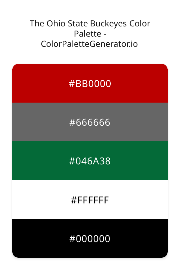
The Ohio State Buckeyes Color Palette – HEX, RGB & Design Inspiration
Color Details
HEX: #BB0000
RGB: 187, 0, 0
HEX: #666666
RGB: 102, 102, 102
HEX: #046A38
RGB: 4, 106, 56
HEX: #FFFFFF
RGB: 255, 255, 255
HEX: #000000
RGB: 0, 0, 0
Text on White/Black Backgrounds
Color Pair Combinations (10 total)
WCAG Contrast Standards:
- AAA (7:1): Enhanced contrast for maximum readability
- AA (4.5:1): Minimum for normal text (under 18pt)
- AA Large (3:1): Acceptable for large text (18pt+ or 14pt+ bold)
- Fail: Below WCAG standards, not recommended for text
Recommended Text Colors
Horizontal (Left to Right)
background: linear-gradient(to right, #BB0000 0%, #666666 25%, #046A38 50%, #FFFFFF 75%, #000000 100%);Vertical (Top to Bottom)
background: linear-gradient(to bottom, #BB0000 0%, #666666 25%, #046A38 50%, #FFFFFF 75%, #000000 100%);Diagonal (Top Left to Bottom Right)
background: linear-gradient(to bottom right, #BB0000 0%, #666666 25%, #046A38 50%, #FFFFFF 75%, #000000 100%);Usage Tips:
- Copy the CSS code and paste directly into your stylesheets
- Linear gradients work great for backgrounds and hero sections
- Radial gradients are perfect for spotlights and focus effects
- Conic gradients create eye-catching loading spinners and progress indicators
- Smooth transitions ensure seamless color blending
Normal Vision
No color vision deficiency
Color Swatches
#BB0000
#666666
#046A38
#FFFFFF
#000000
Full Palette View
How people with Normal Vision see it:
Overall Mood & Feel
Energetic, warm, and inviting
Emotional Impact
Stimulating and energetic, evoking feelings of excitement, warmth, and action. The balanced lightness creates versatility across different contexts
Psychological Effect
This 5-color palette creates a energetic, warm, and inviting. It stimulates activity and engagement, increasing heart rate and mental alertness. The combination works together to create memorable visual experiences that influence consumer perception, decision-making, and brand recall. The rich variety provides versatility while maintaining cohesive emotional messaging across touchpoints.
Brand Personality Traits
Perfect For These Industries
Target Audience
Affluent consumers seeking premium, high-quality products and experiences
Individual Color Psychology
#BB0000
Powerful and sophisticated
Emotions Evoked
Personality Traits
Brand Traits
Ideal Industries
Marketing Use
Creates urgency, stimulates appetite, increases heart rate, and grabs attention. Perfect for clearance sales, food brands, and call-to-action buttons.
Cultural Meanings
Color Harmony Analysis
Palette Mood
Temperature
This palette combines balanced and light & airy and dark & bold moods with warm and neutral tones, making it versatile for various design applications.
Professional Implementation Guide
This complementary the ohio state buckeyes palette features 5 carefully selected warm tones that create a balanced and versatile aesthetic. With medium contrast levels and moderate saturation, this palette is optimized for .
Web Design & Development
For web development, implement this palette with CSS variables for easy theme switching. Consider adding darker variants for better text readability.
- Apply the 60-30-10 rule for visual hierarchy
- Use accent colors for CTAs and hover states
- Maintain consistent color usage across all pages
- Test responsive behavior on multiple devices
Mobile App Interfaces
In mobile applications, these warm tones provide excellent battery efficiency on OLED screens. Use the subtle color variations to define clear touch targets.
- Design both light and dark mode variants
- Consider thumb-reach zones for color placement
- Test under direct sunlight and low light
- Use color to indicate interactive elements
Brand Identity Systems
Build a cohesive brand identity by designating specific colors for specific purposes. Establish your primary brand color from the most distinctive shade and create comprehensive brand guidelines specifying exact usage scenarios.
- Define primary, secondary, and accent colors
- Create usage rules for marketing materials
- Specify minimum sizes and clear space
- Document do's and don'ts for consistency
Frontend Development
Developers can integrate this palette efficiently using modern CSS techniques. Export as CSS variables for maximum flexibility, allowing theme switching and dynamic color updates without rewriting stylesheets.
- Use CSS custom properties for theming
- Implement semantic color naming conventions
- Create utility classes for rapid prototyping
- Consider CSS-in-JS for component-scoped colors
Print Design
For print materials, convert to CMYK using #BB0000 as the dominant color for headers and #000000 for accents. These colors translate well to print with minimal adjustment.
- Add to your design software color library
- Create swatches for quick color access
- Use CMYK values for print production
- Request color proofs before final print
Marketing Campaigns
Marketing materials benefit from consistent color usage that reinforces brand recognition. Apply this palette across email campaigns, landing pages, advertisements, and social media for maximum impact and memorability.
- Maintain color consistency across channels
- A/B test color variations for conversion
- Consider cultural color associations
- Align colors with campaign messaging
Strategic Color Distribution
Professional designers follow the 60-30-10 rule for balanced color distribution. Here's how to apply this principle with the The Ohio State Buckeyes:
Dominant Color
#BB0000Use #BB0000 as your primary color for backgrounds, main content areas. This red tone should occupy about 60% of your design space.
Secondary Color
#046A38Apply #046A38 as your secondary color for subtle backgrounds and card components. Allocate approximately 30% of your layout to this color.
Accent Color
#000000Reserve #000000 for accent elements like buttons, links, and important highlights. This black accent should be used sparingly (10% of design) to draw attention to key actions.
Professional Best Practices
✓ Smart Usage Tips
- •Balance warm tones with neutral whites or grays to create visual breathing room
- •Test your palette across different devices and lighting conditions before finalizing
✗ Common Mistakes to Avoid
- •Don't use all colors equally—establish clear visual hierarchy through color weight
- •Avoid low-contrast text combinations that strain readability
- •Don't rely solely on color to convey meaning (use icons, text, and patterns too)
- •Avoid inconsistent color usage across different pages or screens
- •Don't assume screen colors match print output—always request physical proofs
Palette Overview & Statistics
5
Total Colors
4
Associated Tags
4
Categories
3942
Community Likes
Color Analysis & Technical Guide
Detailed breakdown of each color's role, characteristics, and optimal applications. This complementary palette creates a balanced and versatile aesthetic perfect for .
Individual Color Breakdown
Each color in this warm palette has been analyzed for its properties and ideal usage scenarios. The medium contrast and moderate saturation ensure harmonious visual relationships.
#BB0000
RED
#BB0000 serves as the primary/dominant color in this palette. This medium red (highly saturated) brings power and sophistication Use it for headers, navigation bars, and brand elements.
Dark toneH: 0°S: 100%L: 37%#666666
GRAY
#666666 serves as the secondary/supporting color in this palette. This medium gray (muted) brings neutrality and balance Use it for cards, borders, section dividers, and supporting UI components.
Dark toneH: 0°S: 0%L: 40%#046A38
GREEN
#046A38 serves as the secondary/supporting color in this palette. This dark green (highly saturated) brings stability and prosperity Use it for cards, borders, section dividers, and supporting UI components.
Dark toneH: 151°S: 93%L: 22%#FFFFFF
WHITE
#FFFFFF serves as the secondary/supporting color in this palette. This light white (muted) brings cleanliness and simplicity Use it for cards, borders, section dividers, and supporting UI components.
Light toneH: 0°S: 0%L: 100%#000000
BLACK
#000000 serves as the accent/highlight color in this palette. This dark black (muted) brings elegance and authority Use it for call-to-action buttons, links, important notifications, and interactive elements.
Dark toneH: 0°S: 0%L: 0%
Palette Characteristics
This palette exhibits distinct characteristics that make it particularly suitable for specific design applications and industries.
Warm colors create energy, excitement, and approachability. Perfect for brands targeting emotional connection.
Medium contrast provides visual interest while maintaining readability with proper text color choices.
Moderate saturation balances visual interest with professional restraint.
Balanced brightness provides flexibility for both light and dark design elements.
💡 Pro Tips for This Palette
- Perfect for: . The complementary color relationship creates natural visual flow.
- Mood & Psychology: This palette evokes a balanced and versatile feeling, making it ideal for brands seeking to convey those qualities.
- Accessibility: Test text combinations carefully with contrast checkers to ensure accessibility compliance.
- Extensions: Create tints (add white) and shades (add black) to expand this 5-color palette into a comprehensive design system.
- Cultural Context: Warm colors may have different meanings across cultures—verify associations with your target market.
Export Formats
Explore The Ohio State Buckeyes Palette
The Ohio State Buckeyes color palette is a rich and vibrant collection of hues that evoke a sense of passion, energy, and nostalgia, reminiscent of a classic American football team. This palette is designed to capture the essence of a bygone era, with a unique blend of warm, vintage, bold, and elegant shades that work together in perfect harmony. At its core, the palette features a deep, bold red, often represented by the hex code BB0000, which serves as the primary anchor color, evoking feelings of excitement and dynamism.
As we delve deeper into the palette, we find a range of complementary shades that add depth and nuance to the overall aesthetic. The dark gray tone, represented by the hex code 666666, provides a sophisticated and balanced counterpoint to the bold red, while the deep teal green, represented by the hex code 046A38, adds a touch of elegance and refinement. The palette is rounded out by the inclusion of pure white, represented by the hex code FFFFFF, and deep black, represented by the hex code 000000, which serve as versatile background and accent colors, respectively. While the palette may not feature traditional teal, pink, maroon, or coral hues, it does draw inspiration from these color themes, incorporating subtle nods to these shades through its bold, vintage aesthetic.
The Ohio State Buckeyes color palette is incredibly versatile and can be applied to a wide range of design contexts, from websites and apps to branding and marketing materials. Designers can use this palette to create bold, eye-catching visuals that evoke a sense of excitement and energy, making it particularly well-suited for sports teams, universities, and other organizations that want to convey a sense of passion and dedication. The palette's vintage feel also makes it a great fit for retro-themed designs, or for projects that require a touch of classic nostalgia. Whether used in digital or print applications, the Ohio State Buckeyes color palette is sure to make a lasting impression on viewers.
The colors in this palette have a profound impact on viewer perception and behavior, with each shade playing a specific role in shaping the overall emotional response. The bold red tone, for example, is known to stimulate feelings of excitement and energy, while the dark gray tone provides a sense of balance and sophistication. The deep teal green, meanwhile, is often associated with feelings of growth and harmony, making it a great choice for designs that require a sense of natural balance. By carefully combining these colors, designers can create a visual language that resonates with their target audience and leaves a lasting impression.
For designers looking to get the most out of the Ohio State Buckeyes color palette, it's essential to consider the ways in which each color interacts with the others. To create a sense of visual harmony, try pairing the bold red tone with the deep teal green, or use the dark gray tone as a background color to add depth and sophistication. The pure white and deep black shades can be used as accent colors to add contrast and visual interest, while the bold red tone can be used to draw attention to specific design elements. By following these pro tips and experimenting with different color combinations, designers can unlock the full potential of the Ohio State Buckeyes color palette and create stunning visuals that leave a lasting impression.
Palette Image
Below is the generated palette image showing all colors in a vertical layout. Perfect for sharing on social media or using as a reference.
Frequently Asked Questions
Everything you need to know about using and implementing the the ohio state buckeyes palette effectively in your projects.