The Twilight Palette Color Palette – HEX, RGB & Design Inspiration
Color Details
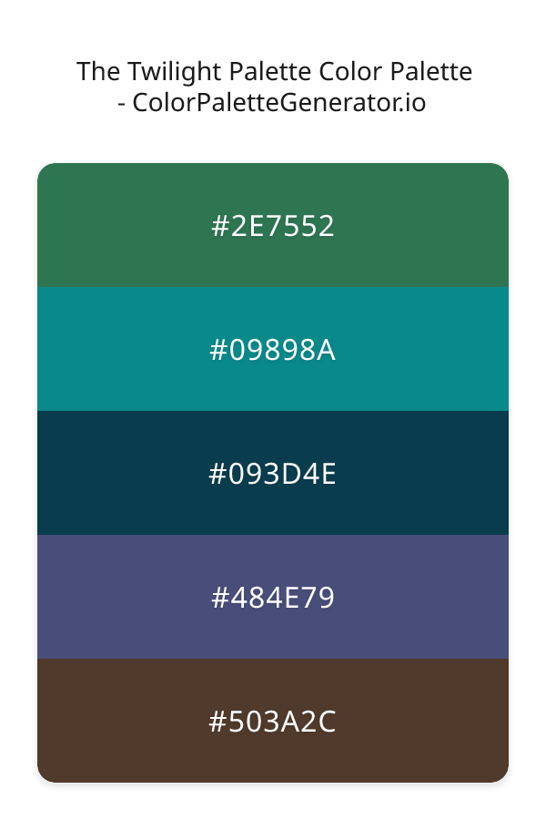
HEX: #2E7552
RGB: 46, 117, 82
HEX: #09898A
RGB: 9, 137, 138
HEX: #093D4E
RGB: 9, 61, 78
HEX: #484E79
RGB: 72, 78, 121
HEX: #503A2C
RGB: 80, 58, 44
Text on White/Black Backgrounds
Color Pair Combinations (10 total)
WCAG Contrast Standards:
- AAA (7:1): Enhanced contrast for maximum readability
- AA (4.5:1): Minimum for normal text (under 18pt)
- AA Large (3:1): Acceptable for large text (18pt+ or 14pt+ bold)
- Fail: Below WCAG standards, not recommended for text
Recommended Text Colors
Horizontal (Left to Right)
background: linear-gradient(to right, #2E7552 0%, #09898A 25%, #093D4E 50%, #484E79 75%, #503A2C 100%);Vertical (Top to Bottom)
background: linear-gradient(to bottom, #2E7552 0%, #09898A 25%, #093D4E 50%, #484E79 75%, #503A2C 100%);Diagonal (Top Left to Bottom Right)
background: linear-gradient(to bottom right, #2E7552 0%, #09898A 25%, #093D4E 50%, #484E79 75%, #503A2C 100%);Usage Tips:
- Copy the CSS code and paste directly into your stylesheets
- Linear gradients work great for backgrounds and hero sections
- Radial gradients are perfect for spotlights and focus effects
- Conic gradients create eye-catching loading spinners and progress indicators
- Smooth transitions ensure seamless color blending
Normal Vision
No color vision deficiency
Color Swatches
#2E7552
#09898A
#093D4E
#484E79
#503A2C
Full Palette View
How people with Normal Vision see it:
Overall Mood & Feel
Calm, professional, and trustworthy, with a sophisticated and dramatic atmosphere
Emotional Impact
Calming and contemplative, promoting feelings of trust, stability, and peace. The dark tones establish a premium, sophisticated feel ideal for luxury positioning
Psychological Effect
This 5-color palette creates a calm, professional, and trustworthy, with a sophisticated and dramatic atmosphere. The combination works together to create memorable visual experiences that influence consumer perception, decision-making, and brand recall. The rich variety provides versatility while maintaining cohesive emotional messaging across touchpoints.
Brand Personality Traits
Perfect For These Industries
Target Audience
Business professionals and decision-makers seeking reliability and competence
Individual Color Psychology
#2E7552
Calming and balanced
Emotions Evoked
Personality Traits
Brand Traits
Ideal Industries
Marketing Use
Suggests environmental friendliness and health. Easiest color for eyes to process. Perfect for wellness brands and eco-friendly products.
Cultural Meanings
Color Harmony Analysis
Palette Mood
Temperature
This palette combines balanced and dark & bold moods with neutral and cool and warm tones, making it versatile for various design applications.
Professional Implementation Guide
This complementary the twilight palette palette features 5 carefully selected cool tones that create a dramatic and sophisticated aesthetic. With low contrast levels and moderate saturation, this palette is optimized for .
Web Design & Development
For web development, implement this palette with CSS variables for easy theme switching. Consider adding darker variants for better text readability.
- Apply the 60-30-10 rule for visual hierarchy
- Use accent colors for CTAs and hover states
- Maintain consistent color usage across all pages
- Test responsive behavior on multiple devices
Mobile App Interfaces
In mobile applications, these cool tones provide excellent battery efficiency on OLED screens. Use the subtle color variations to define clear touch targets.
- Design both light and dark mode variants
- Consider thumb-reach zones for color placement
- Test under direct sunlight and low light
- Use color to indicate interactive elements
Brand Identity Systems
Build a cohesive brand identity by designating specific colors for specific purposes. Establish your primary brand color from the most distinctive shade and create comprehensive brand guidelines specifying exact usage scenarios.
- Define primary, secondary, and accent colors
- Create usage rules for marketing materials
- Specify minimum sizes and clear space
- Document do's and don'ts for consistency
Frontend Development
Developers can integrate this palette efficiently using modern CSS techniques. Export as CSS variables for maximum flexibility, allowing theme switching and dynamic color updates without rewriting stylesheets.
- Use CSS custom properties for theming
- Implement semantic color naming conventions
- Create utility classes for rapid prototyping
- Consider CSS-in-JS for component-scoped colors
Print Design
For print materials, convert to CMYK using #2E7552 as the dominant color for headers and #503A2C for accents. These colors translate well to print with minimal adjustment.
- Add to your design software color library
- Create swatches for quick color access
- Use CMYK values for print production
- Request color proofs before final print
Marketing Campaigns
Marketing materials benefit from consistent color usage that reinforces brand recognition. Apply this palette across email campaigns, landing pages, advertisements, and social media for maximum impact and memorability.
- Maintain color consistency across channels
- A/B test color variations for conversion
- Consider cultural color associations
- Align colors with campaign messaging
Strategic Color Distribution
Professional designers follow the 60-30-10 rule for balanced color distribution. Here's how to apply this principle with the The Twilight Palette:
Dominant Color
#2E7552Use #2E7552 as your primary color for headers, hero sections, and primary CTAs. This green tone should occupy about 60% of your design space.
Secondary Color
#093D4EApply #093D4E as your secondary color for subtle backgrounds and card components. Allocate approximately 30% of your layout to this color.
Accent Color
#503A2CReserve #503A2C for accent elements like buttons, links, and important highlights. This orange accent should be used sparingly (10% of design) to draw attention to key actions.
Professional Best Practices
✓ Smart Usage Tips
- •Add white or black text overlays to improve readability on colored backgrounds
- •Add warm accent colors to create focal points and prevent designs from feeling too cold
- •Ensure sufficient lighting contrast for text elements—use light text on dark backgrounds
- •Test your palette across different devices and lighting conditions before finalizing
✗ Common Mistakes to Avoid
- •Don't use all colors equally—establish clear visual hierarchy through color weight
- •Avoid low-contrast text combinations that strain readability
- •Don't rely solely on color to convey meaning (use icons, text, and patterns too)
- •Avoid inconsistent color usage across different pages or screens
- •Don't assume screen colors match print output—always request physical proofs
Palette Overview & Statistics
5
Total Colors
3
Associated Tags
6
Categories
3381
Community Likes
Color Analysis & Technical Guide
Detailed breakdown of each color's role, characteristics, and optimal applications. This complementary palette creates a dramatic and sophisticated aesthetic perfect for .
Individual Color Breakdown
Each color in this cool palette has been analyzed for its properties and ideal usage scenarios. The low contrast and moderate saturation ensure harmonious visual relationships.
#2E7552
GREEN
#2E7552 serves as the primary/dominant color in this palette. This medium green (moderately saturated) brings stability and prosperity Use it for headers, navigation bars, and brand elements.
Dark toneH: 150°S: 44%L: 32%#09898A
CYAN
#09898A serves as the secondary/supporting color in this palette. This dark cyan (highly saturated) brings clarity and innovation Use it for cards, borders, section dividers, and supporting UI components.
Dark toneH: 180°S: 88%L: 29%#093D4E
CYAN
#093D4E serves as the secondary/supporting color in this palette. This dark cyan (highly saturated) brings clarity and innovation Use it for cards, borders, section dividers, and supporting UI components.
Dark toneH: 195°S: 79%L: 17%#484E79
BLUE
#484E79 serves as the secondary/supporting color in this palette. This medium blue (muted) brings professionalism and depth Use it for cards, borders, section dividers, and supporting UI components.
Dark toneH: 233°S: 25%L: 38%#503A2C
ORANGE
#503A2C serves as the accent/highlight color in this palette. This dark orange (muted) brings creativity and enthusiasm Use it for call-to-action buttons, links, important notifications, and interactive elements.
Dark toneH: 23°S: 29%L: 24%
Palette Characteristics
This palette exhibits distinct characteristics that make it particularly suitable for specific design applications and industries.
Cool tones convey professionalism, trust, and calmness. Ideal for corporate and tech applications.
Low contrast creates subtle, sophisticated aesthetics but requires careful attention to text legibility.
Moderate saturation balances visual interest with professional restraint.
Dark tones create dramatic, sophisticated aesthetics and save battery on OLED displays.
💡 Pro Tips for This Palette
- Perfect for: . The complementary color relationship creates natural visual flow.
- Mood & Psychology: This palette evokes a dramatic and sophisticated feeling, making it ideal for brands seeking to convey those qualities.
- Accessibility: Test text combinations carefully with contrast checkers to ensure accessibility compliance.
- Extensions: Create tints (add white) and shades (add black) to expand this 5-color palette into a comprehensive design system.
- Cultural Context: Cool tones are generally perceived as professional worldwide but always research cultural color meanings.
Export Formats
Explore The Twilight Palette Palette
The Twilight Palette evokes a sense of serenity and mystique, transporting viewers to a world of breathtaking skies and coastal landscapes at dusk. This enchanting color scheme has a profound emotional impact, perfect for designers seeking to create a sense of balance and harmony in their work. With its unique blend of vintage and modern elements, The Twilight Palette is an elegant and sophisticated choice for a wide range of design applications.
At the heart of The Twilight Palette lies a rich array of colors, each with its own distinct character and role to play in the overall aesthetic. The deep, mossy green of 2E7552 adds a sense of earthiness and grounding, while the soft, blue-green hue of 09898A brings a touch of freshness and vitality. In contrast, the dark, cool tone of 093D4E provides a sense of depth and sophistication, perfectly balanced by the warm, weathered quality of 503A2C. Meanwhile, the soft, blue-grey shade of 484E79 serves as a bridge between the other colors, tying the entire palette together with its calm, soothing presence. As the colors work together, they create a sense of indigo, teal, and coral that is both captivating and nuanced.
The Twilight Palette is incredibly versatile, lending itself to a wide range of design applications, from websites and apps to branding and marketing materials. Its balanced, elegant quality makes it an ideal choice for luxury brands, high-end products, and premium services. At the same time, its vintage and coastal elements also make it suitable for more laid-back, casual designs, such as those found in the travel, hospitality, or outdoor industries. Whether used in digital or print design, The Twilight Palette is sure to create a lasting impression on viewers, drawing them in with its unique blend of style and sophistication.
The colors in The Twilight Palette also have a profound psychological impact on viewers, influencing their perception and behavior in subtle yet powerful ways. The deep, cool tones of 093D4E and 484E79, for example, can create a sense of trust and authority, while the soft, warm quality of 503A2C can evoke feelings of comfort and relaxation. The blue-green hue of 09898A, meanwhile, can stimulate creativity and inspiration, making it an ideal choice for designs that require a sense of innovation and forward thinking. By carefully considering the psychological impact of each color, designers can use The Twilight Palette to create designs that not only look beautiful but also resonate with their target audience on a deeper level.
To get the most out of The Twilight Palette, designers can experiment with complementary colors and pairing suggestions to create a wide range of different looks and feels. For example, pairing 2E7552 with a bright, sunny yellow can create a stunning contrast that is perfect for summer-themed designs. Alternatively, combining 09898A with a deep, rich brown can add a sense of warmth and coziness to a design, making it ideal for autumn or winter-themed projects. By following best practices such as using a limited color palette, selecting colors that complement each other, and considering the psychological impact of each color, designers can unlock the full potential of The Twilight Palette and create designs that are truly unforgettable.
Palette Image
Below is the generated palette image showing all colors in a vertical layout. Perfect for sharing on social media or using as a reference.
Frequently Asked Questions
Everything you need to know about using and implementing the the twilight palette palette effectively in your projects.