Typical Galaxy Color Palette – HEX, RGB & Design Inspiration
Color Details
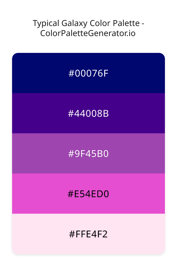
HEX: #00076F
RGB: 0, 7, 111
HEX: #44008B
RGB: 68, 0, 139
HEX: #9F45B0
RGB: 159, 69, 176
HEX: #E54ED0
RGB: 229, 78, 208
HEX: #FFE4F2
RGB: 255, 228, 242
Text on White/Black Backgrounds
Color Pair Combinations (10 total)
WCAG Contrast Standards:
- AAA (7:1): Enhanced contrast for maximum readability
- AA (4.5:1): Minimum for normal text (under 18pt)
- AA Large (3:1): Acceptable for large text (18pt+ or 14pt+ bold)
- Fail: Below WCAG standards, not recommended for text
Recommended Text Colors
Horizontal (Left to Right)
background: linear-gradient(to right, #00076F 0%, #44008B 25%, #9F45B0 50%, #E54ED0 75%, #FFE4F2 100%);Vertical (Top to Bottom)
background: linear-gradient(to bottom, #00076F 0%, #44008B 25%, #9F45B0 50%, #E54ED0 75%, #FFE4F2 100%);Diagonal (Top Left to Bottom Right)
background: linear-gradient(to bottom right, #00076F 0%, #44008B 25%, #9F45B0 50%, #E54ED0 75%, #FFE4F2 100%);Usage Tips:
- Copy the CSS code and paste directly into your stylesheets
- Linear gradients work great for backgrounds and hero sections
- Radial gradients are perfect for spotlights and focus effects
- Conic gradients create eye-catching loading spinners and progress indicators
- Smooth transitions ensure seamless color blending
Normal Vision
No color vision deficiency
Color Swatches
#00076F
#44008B
#9F45B0
#E54ED0
#FFE4F2
Full Palette View
How people with Normal Vision see it:
Overall Mood & Feel
Energetic, warm, and inviting
Emotional Impact
Stimulating and energetic, evoking feelings of excitement, warmth, and action. The balanced lightness creates versatility across different contexts
Psychological Effect
This 5-color palette creates a energetic, warm, and inviting. The combination works together to create memorable visual experiences that influence consumer perception, decision-making, and brand recall. The rich variety provides versatility while maintaining cohesive emotional messaging across touchpoints.
Brand Personality Traits
Perfect For These Industries
Target Audience
Active, outgoing individuals who respond to energy and enthusiasm
Individual Color Psychology
#00076F
Professional and authoritative
Emotions Evoked
Personality Traits
Brand Traits
Ideal Industries
Marketing Use
Most popular color globally. Builds trust and reduces stress. Ideal for corporate brands, financial services, and healthcare. Can suppress appetite.
Cultural Meanings
Color Harmony Analysis
Palette Mood
Temperature
This palette combines dark & bold and balanced and light & airy moods with cool and warm tones, making it versatile for various design applications.
Professional Implementation Guide
This triadic typical galaxy palette features 5 carefully selected cool tones that create a balanced and versatile aesthetic. With high contrast levels and vibrant saturation, this palette is optimized for web interfaces and mobile apps.
Web Design & Development
For web development, implement this palette with CSS variables for easy theme switching. The high contrast makes it ideal for accessible interfaces meeting WCAG AA standards.
- Apply the 60-30-10 rule for visual hierarchy
- Use accent colors for CTAs and hover states
- Maintain consistent color usage across all pages
- Test responsive behavior on multiple devices
Mobile App Interfaces
In mobile applications, these cool tones provide excellent battery efficiency on OLED screens. Use the strong color contrast to define clear touch targets.
- Design both light and dark mode variants
- Consider thumb-reach zones for color placement
- Test under direct sunlight and low light
- Use color to indicate interactive elements
Brand Identity Systems
Build a cohesive brand identity by designating specific colors for specific purposes. Establish your primary brand color from the most distinctive shade and create comprehensive brand guidelines specifying exact usage scenarios.
- Define primary, secondary, and accent colors
- Create usage rules for marketing materials
- Specify minimum sizes and clear space
- Document do's and don'ts for consistency
Frontend Development
Developers can integrate this palette efficiently using modern CSS techniques. Export as CSS variables for maximum flexibility, allowing theme switching and dynamic color updates without rewriting stylesheets.
- Use CSS custom properties for theming
- Implement semantic color naming conventions
- Create utility classes for rapid prototyping
- Consider CSS-in-JS for component-scoped colors
Print Design
For print materials, convert to CMYK using #00076F as the dominant color for headers and #FFE4F2 for accents. These vibrant colors may appear slightly muted in print; request color proofs.
- Add to your design software color library
- Create swatches for quick color access
- Use CMYK values for print production
- Request color proofs before final print
Marketing Campaigns
Marketing materials benefit from consistent color usage that reinforces brand recognition. Apply this palette across email campaigns, landing pages, advertisements, and social media for maximum impact and memorability.
- Maintain color consistency across channels
- A/B test color variations for conversion
- Consider cultural color associations
- Align colors with campaign messaging
Strategic Color Distribution
Professional designers follow the 60-30-10 rule for balanced color distribution. Here's how to apply this principle with the Typical Galaxy:
Dominant Color
#00076FUse #00076F as your primary color for backgrounds, main content areas. This blue tone should occupy about 60% of your design space.
Secondary Color
#9F45B0Apply #9F45B0 as your secondary color for supporting elements and section dividers. Allocate approximately 30% of your layout to this color.
Accent Color
#FFE4F2Reserve #FFE4F2 for accent elements like buttons, links, and important highlights. This pink accent should be used sparingly (10% of design) to draw attention to key actions.
Professional Best Practices
✓ Smart Usage Tips
- •Use desaturated versions (reduce saturation by 20-30%) for large background areas to prevent visual fatigue
- •Add warm accent colors to create focal points and prevent designs from feeling too cold
- •Test your palette across different devices and lighting conditions before finalizing
✗ Common Mistakes to Avoid
- •Don't use all colors equally—establish clear visual hierarchy through color weight
- •Avoid low-contrast text combinations that strain readability
- •Don't rely solely on color to convey meaning (use icons, text, and patterns too)
- •Avoid inconsistent color usage across different pages or screens
- •Don't assume screen colors match print output—always request physical proofs
Palette Overview & Statistics
5
Total Colors
5
Associated Tags
6
Categories
1629
Community Likes
Color Analysis & Technical Guide
Detailed breakdown of each color's role, characteristics, and optimal applications. This triadic palette creates a balanced and versatile aesthetic perfect for web interfaces and mobile apps.
Individual Color Breakdown
Each color in this cool palette has been analyzed for its properties and ideal usage scenarios. The high contrast and vibrant saturation ensure excellent readability and accessibility.
#00076F
BLUE
#00076F serves as the primary/dominant color in this palette. This dark blue (highly saturated) brings professionalism and depth Use it for headers, navigation bars, and brand elements.
Dark toneH: 236°S: 100%L: 22%#44008B
PURPLE
#44008B serves as the secondary/supporting color in this palette. This dark purple (highly saturated) brings luxury and mystery Use it for cards, borders, section dividers, and supporting UI components.
Dark toneH: 269°S: 100%L: 27%#9F45B0
PINK
#9F45B0 serves as the secondary/supporting color in this palette. This medium pink (moderately saturated) brings playfulness and compassion Use it for cards, borders, section dividers, and supporting UI components.
Dark toneH: 290°S: 44%L: 48%#E54ED0
PINK
#E54ED0 serves as the secondary/supporting color in this palette. This medium pink (highly saturated) brings playfulness and compassion Use it for cards, borders, section dividers, and supporting UI components.
Light toneH: 308°S: 74%L: 60%#FFE4F2
PINK
#FFE4F2 serves as the accent/highlight color in this palette. This light pink (highly saturated) brings playfulness and compassion Use it for call-to-action buttons, links, important notifications, and interactive elements.
Light toneH: 329°S: 100%L: 95%
Palette Characteristics
This palette exhibits distinct characteristics that make it particularly suitable for specific design applications and industries.
Cool tones convey professionalism, trust, and calmness. Ideal for corporate and tech applications.
High contrast ensures excellent readability and meets WCAG accessibility standards for most text combinations.
Vibrant saturation creates bold, attention-grabbing designs perfect for youth brands and creative projects.
Balanced brightness provides flexibility for both light and dark design elements.
💡 Pro Tips for This Palette
- Perfect for: web interfaces, mobile apps. The triadic color relationship creates natural visual flow.
- Mood & Psychology: This palette evokes a balanced and versatile feeling, making it ideal for brands seeking to convey those qualities.
- Accessibility: Excellent contrast makes this palette naturally accessible. Most color combinations will meet WCAG AA standards.
- Extensions: Create tints (add white) and shades (add black) to expand this 5-color palette into a comprehensive design system.
- Cultural Context: Cool tones are generally perceived as professional worldwide but always research cultural color meanings.
Export Formats
Explore Typical Galaxy Palette
The Typical Galaxy color palette is an enchanting blend of cosmic hues that evoke a sense of wonder and excitement, drawing the viewer into a world of vibrant energy and modern sophistication. As the eye travels through the palette, it is greeted by a dramatic range of shades, from the darkest, richest tones to the lightest, most ethereal whispers of color. This palette is perfect for designers seeking to create a bold, feminine, and playful aesthetic that is both mesmerizing and thought-provoking.
At the heart of the Typical Galaxy palette lies a profound indigo, represented by the code 00076F, a mysterious and intense shade that serves as the foundation for the entire color scheme. As the palette evolves, it introduces a deeper, more saturated purple, coded as 44008B, which adds a sense of luxury and creativity to the mix. The introduction of 9F45B0 brings a touch of magenta-infused purple, injecting a sense of vibrancy and playfulness into the palette, while E54ED0, a bright and bold magenta, elevates the energy to new heights. Finally, the soft, pastel hue of FFE4F2 brings a sense of airiness and lightness, balancing out the darker, richer shades and preventing the palette from feeling overwhelming.
The Typical Galaxy palette is incredibly versatile, lending itself to a wide range of practical applications, from website design and mobile app development to branding and marketing campaigns. Designers can use this palette to create bold, eye-catching visuals that demand attention and inspire engagement, making it perfect for projects that require a modern, energetic, and feminine touch. Whether used in its entirety or in select combinations, the Typical Galaxy palette is sure to add a touch of excitement and sophistication to any design project, drawing the viewer in and refusing to let go.
The colors that comprise the Typical Galaxy palette have a profound impact on viewer perception and behavior, influencing emotions and moods in subtle yet powerful ways. The darker, richer shades, such as 00076F and 44008B, tend to evoke feelings of luxury, creativity, and wisdom, while the brighter, more vibrant shades, like E54ED0 and FFE4F2, inspire energy, playfulness, and a sense of spontaneity. By carefully balancing these contrasting shades, designers can create a visual experience that is both captivating and thought-provoking, drawing the viewer in and inviting them to explore and engage with the content.
To get the most out of the Typical Galaxy palette, designers should consider pairing these colors with complementary shades that enhance their natural beauty and energy. For example, combining 9F45B0 with a deep, rich gray can create a stunning visual contrast that adds depth and sophistication to the design. Similarly, pairing E54ED0 with a lighter, more muted shade of purple can help to balance out the brightness and create a sense of harmony. By following these pro tips and best practices, designers can unlock the full potential of the Typical Galaxy palette, creating designs that are both visually stunning and emotionally resonant.
Palette Image
Below is the generated palette image showing all colors in a vertical layout. Perfect for sharing on social media or using as a reference.
Categories & Tags
Frequently Asked Questions
Everything you need to know about using and implementing the typical galaxy palette effectively in your projects.