Unc Color Palette – HEX, RGB & Design Inspiration
Color Details
HEX: #D8E9F7
RGB: 216, 233, 247
HEX: #4B9CD3
RGB: 75, 156, 211
HEX: #13294B
RGB: 19, 41, 75
HEX: #73B4DC
RGB: 115, 180, 220
HEX: #E7F6FA
RGB: 231, 246, 250
Text on White/Black Backgrounds
Color Pair Combinations (10 total)
WCAG Contrast Standards:
- AAA (7:1): Enhanced contrast for maximum readability
- AA (4.5:1): Minimum for normal text (under 18pt)
- AA Large (3:1): Acceptable for large text (18pt+ or 14pt+ bold)
- Fail: Below WCAG standards, not recommended for text
Recommended Text Colors
Horizontal (Left to Right)
background: linear-gradient(to right, #D8E9F7 0%, #4B9CD3 25%, #13294B 50%, #73B4DC 75%, #E7F6FA 100%);Vertical (Top to Bottom)
background: linear-gradient(to bottom, #D8E9F7 0%, #4B9CD3 25%, #13294B 50%, #73B4DC 75%, #E7F6FA 100%);Diagonal (Top Left to Bottom Right)
background: linear-gradient(to bottom right, #D8E9F7 0%, #4B9CD3 25%, #13294B 50%, #73B4DC 75%, #E7F6FA 100%);Usage Tips:
- Copy the CSS code and paste directly into your stylesheets
- Linear gradients work great for backgrounds and hero sections
- Radial gradients are perfect for spotlights and focus effects
- Conic gradients create eye-catching loading spinners and progress indicators
- Smooth transitions ensure seamless color blending
Normal Vision
No color vision deficiency
Color Swatches
#D8E9F7
#4B9CD3
#13294B
#73B4DC
#E7F6FA
Full Palette View
How people with Normal Vision see it:
Overall Mood & Feel
Calm, professional, and trustworthy
Emotional Impact
Calming and contemplative, promoting feelings of trust, stability, and peace. The balanced lightness creates versatility across different contexts
Psychological Effect
This 5-color palette creates a calm, professional, and trustworthy. The combination works together to create memorable visual experiences that influence consumer perception, decision-making, and brand recall. The rich variety provides versatility while maintaining cohesive emotional messaging across touchpoints.
Brand Personality Traits
Perfect For These Industries
Target Audience
Business professionals and decision-makers seeking reliability and competence
Individual Color Psychology
#D8E9F7
Peaceful and airy
Emotions Evoked
Personality Traits
Brand Traits
Ideal Industries
Marketing Use
Most popular color globally. Builds trust and reduces stress. Ideal for corporate brands, financial services, and healthcare. Can suppress appetite.
Cultural Meanings
Color Harmony Analysis
Palette Mood
Temperature
This palette combines light & airy and balanced and dark & bold moods with cool tones, making it versatile for various design applications.
Professional Implementation Guide
This monochromatic unc palette features 5 carefully selected cool tones that create a balanced and versatile aesthetic. With low contrast levels and vibrant saturation, this palette is optimized for .
Web Design & Development
For web development, implement this palette with CSS variables for easy theme switching. Consider adding darker variants for better text readability.
- Apply the 60-30-10 rule for visual hierarchy
- Use accent colors for CTAs and hover states
- Maintain consistent color usage across all pages
- Test responsive behavior on multiple devices
Mobile App Interfaces
In mobile applications, these cool tones provide excellent battery efficiency on OLED screens. Use the subtle color variations to define clear touch targets.
- Design both light and dark mode variants
- Consider thumb-reach zones for color placement
- Test under direct sunlight and low light
- Use color to indicate interactive elements
Brand Identity Systems
Build a cohesive brand identity by designating specific colors for specific purposes. Establish your primary brand color from the most distinctive shade and create comprehensive brand guidelines specifying exact usage scenarios.
- Define primary, secondary, and accent colors
- Create usage rules for marketing materials
- Specify minimum sizes and clear space
- Document do's and don'ts for consistency
Frontend Development
Developers can integrate this palette efficiently using modern CSS techniques. Export as CSS variables for maximum flexibility, allowing theme switching and dynamic color updates without rewriting stylesheets.
- Use CSS custom properties for theming
- Implement semantic color naming conventions
- Create utility classes for rapid prototyping
- Consider CSS-in-JS for component-scoped colors
Print Design
For print materials, convert to CMYK using #D8E9F7 as the dominant color for headers and #E7F6FA for accents. These vibrant colors may appear slightly muted in print; request color proofs.
- Add to your design software color library
- Create swatches for quick color access
- Use CMYK values for print production
- Request color proofs before final print
Marketing Campaigns
Marketing materials benefit from consistent color usage that reinforces brand recognition. Apply this palette across email campaigns, landing pages, advertisements, and social media for maximum impact and memorability.
- Maintain color consistency across channels
- A/B test color variations for conversion
- Consider cultural color associations
- Align colors with campaign messaging
Strategic Color Distribution
Professional designers follow the 60-30-10 rule for balanced color distribution. Here's how to apply this principle with the Unc:
Dominant Color
#D8E9F7Use #D8E9F7 as your primary color for backgrounds, main content areas. This blue tone should occupy about 60% of your design space.
Secondary Color
#13294BApply #13294B as your secondary color for subtle backgrounds and card components. Allocate approximately 30% of your layout to this color.
Accent Color
#E7F6FAReserve #E7F6FA for accent elements like buttons, links, and important highlights. This cyan accent should be used sparingly (10% of design) to draw attention to key actions.
Professional Best Practices
✓ Smart Usage Tips
- •Add white or black text overlays to improve readability on colored backgrounds
- •Use desaturated versions (reduce saturation by 20-30%) for large background areas to prevent visual fatigue
- •Add warm accent colors to create focal points and prevent designs from feeling too cold
- •Test your palette across different devices and lighting conditions before finalizing
✗ Common Mistakes to Avoid
- •Don't use all colors equally—establish clear visual hierarchy through color weight
- •Avoid low-contrast text combinations that strain readability
- •Don't rely solely on color to convey meaning (use icons, text, and patterns too)
- •Avoid inconsistent color usage across different pages or screens
- •Don't assume screen colors match print output—always request physical proofs
Palette Overview & Statistics
5
Total Colors
3
Associated Tags
6
Categories
2414
Community Likes
Color Analysis & Technical Guide
Detailed breakdown of each color's role, characteristics, and optimal applications. This monochromatic palette creates a balanced and versatile aesthetic perfect for .
Individual Color Breakdown
Each color in this cool palette has been analyzed for its properties and ideal usage scenarios. The low contrast and vibrant saturation ensure harmonious visual relationships.
#D8E9F7
BLUE
#D8E9F7 serves as the primary/dominant color in this palette. This light blue (highly saturated) brings trust and tranquility Use it for backgrounds, containers, and large surface areas.
Light toneH: 207°S: 66%L: 91%#4B9CD3
BLUE
#4B9CD3 serves as the secondary/supporting color in this palette. This medium blue (highly saturated) brings trust and tranquility Use it for cards, borders, section dividers, and supporting UI components.
Light toneH: 204°S: 61%L: 56%#13294B
BLUE
#13294B serves as the secondary/supporting color in this palette. This dark blue (moderately saturated) brings professionalism and depth Use it for cards, borders, section dividers, and supporting UI components.
Dark toneH: 216°S: 60%L: 18%#73B4DC
BLUE
#73B4DC serves as the secondary/supporting color in this palette. This medium blue (moderately saturated) brings trust and tranquility Use it for cards, borders, section dividers, and supporting UI components.
Light toneH: 203°S: 60%L: 66%#E7F6FA
CYAN
#E7F6FA serves as the accent/highlight color in this palette. This light cyan (highly saturated) brings clarity and innovation Use it for call-to-action buttons, links, important notifications, and interactive elements.
Light toneH: 193°S: 66%L: 94%
Palette Characteristics
This palette exhibits distinct characteristics that make it particularly suitable for specific design applications and industries.
Cool tones convey professionalism, trust, and calmness. Ideal for corporate and tech applications.
Low contrast creates subtle, sophisticated aesthetics but requires careful attention to text legibility.
Vibrant saturation creates bold, attention-grabbing designs perfect for youth brands and creative projects.
Balanced brightness provides flexibility for both light and dark design elements.
💡 Pro Tips for This Palette
- Perfect for: . The monochromatic color relationship creates natural visual flow.
- Mood & Psychology: This palette evokes a balanced and versatile feeling, making it ideal for brands seeking to convey those qualities.
- Accessibility: Test text combinations carefully with contrast checkers to ensure accessibility compliance.
- Extensions: Create tints (add white) and shades (add black) to expand this 5-color palette into a comprehensive design system.
- Cultural Context: Cool tones are generally perceived as professional worldwide but always research cultural color meanings.
Export Formats
Explore Unc Palette
The Unc color palette is a thoughtfully curated collection of hues that evoke the serenity of a clear sky on a warm summer day, while also exuding a sense of professionalism and sophistication. At its core, this palette is designed to inspire feelings of trust, reliability, and calmness, making it an excellent choice for designers seeking to create a lasting impression on their audience. With a range of blues and cyans, from the soft D8E9F7 to the deep 13294B, Unc is a versatile palette that can be used to convey a sense of confidence and expertise.
Delving deeper into the palette, we find that each color plays a unique role in creating a harmonious visual experience. The lightest shade, D8E9F7, serves as a gentle background that provides a clean and airy feel, while the 4B9CD3 and 73B4DC mid-tones add a sense of depth and nuance, drawing the viewer's eye through their subtle contrast. The darkest shade, 13294B, provides a sense of stability and grounding, anchoring the palette and preventing it from feeling too ephemeral. Meanwhile, the E7F6FA shade adds a touch of warmth and subtlety, rounding out the palette and preventing it from feeling too cool or detached. By combining these colors, designers can create a visual narrative that is both engaging and easy to follow.
In terms of practical applications, the Unc palette is well-suited for a wide range of design projects, from websites and apps to branding and marketing materials. Its professional and calming vibe makes it an excellent choice for corporate websites, financial institutions, or healthcare organizations, where trust and reliability are paramount. At the same time, its bold and cool tones also lend themselves well to more creative fields, such as design studios, tech startups, or innovative product launches. Whether used as a primary color scheme or as an accent palette, Unc is sure to add a touch of sophistication and elegance to any design project.
The psychology behind the Unc palette is also worth exploring, as the colors used have a profound impact on viewer perception and behavior. Blues and cyans are often associated with feelings of trust, loyalty, and wisdom, which can help to establish a strong emotional connection with the audience. The cool tones can also help to reduce stress and anxiety, creating a sense of calmness and serenity that is essential for effective communication. Furthermore, the contrast between light and dark shades can help to create a sense of visual interest and engagement, drawing the viewer's eye through the design and encouraging them to explore further.
For designers looking to get the most out of the Unc palette, there are several pro tips to keep in mind. To add some warmth and contrast to the design, consider pairing the cool blues and cyans with complementary colors like orange or yellow, which can help to create a sense of balance and harmony. Alternatively, try pairing the palette with neutral shades like gray or beige, which can help to ground the design and prevent it from feeling too overwhelming. In terms of design best practices, it's essential to use the palette consistently throughout the design project, using the different shades to create a clear visual hierarchy and guide the viewer's eye through the content. By following these tips and leveraging the full potential of the Unc palette, designers can create stunning visual experiences that engage, inspire, and leave a lasting impression on their audience.
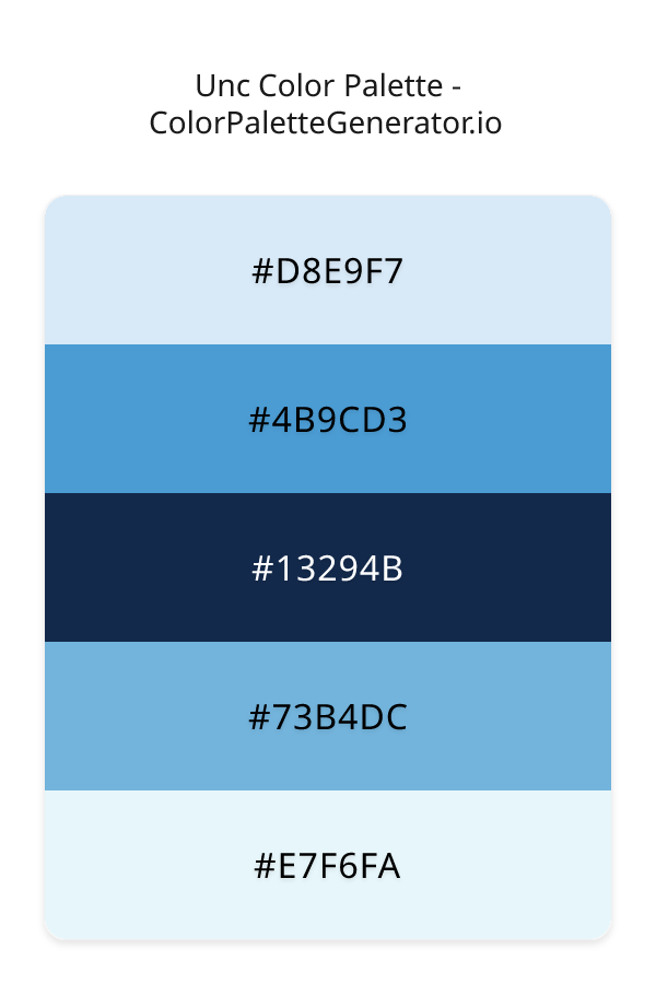
Palette Image
Below is the generated palette image showing all colors in a vertical layout. Perfect for sharing on social media or using as a reference.
Categories & Tags
Frequently Asked Questions
Everything you need to know about using and implementing the unc palette effectively in your projects.