Usa Flag Color Palette – HEX, RGB & Design Inspiration
Color Details
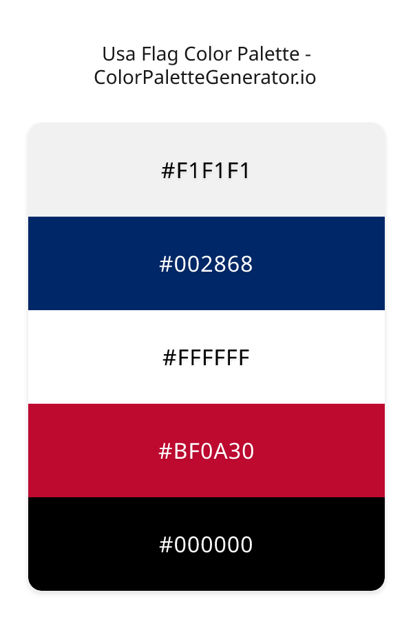
HEX: #F1F1F1
RGB: 241, 241, 241
HEX: #002868
RGB: 0, 40, 104
HEX: #FFFFFF
RGB: 255, 255, 255
HEX: #BF0A30
RGB: 191, 10, 48
HEX: #000000
RGB: 0, 0, 0
Text on White/Black Backgrounds
Color Pair Combinations (10 total)
WCAG Contrast Standards:
- AAA (7:1): Enhanced contrast for maximum readability
- AA (4.5:1): Minimum for normal text (under 18pt)
- AA Large (3:1): Acceptable for large text (18pt+ or 14pt+ bold)
- Fail: Below WCAG standards, not recommended for text
Recommended Text Colors
Horizontal (Left to Right)
background: linear-gradient(to right, #F1F1F1 0%, #002868 25%, #FFFFFF 50%, #BF0A30 75%, #000000 100%);Vertical (Top to Bottom)
background: linear-gradient(to bottom, #F1F1F1 0%, #002868 25%, #FFFFFF 50%, #BF0A30 75%, #000000 100%);Diagonal (Top Left to Bottom Right)
background: linear-gradient(to bottom right, #F1F1F1 0%, #002868 25%, #FFFFFF 50%, #BF0A30 75%, #000000 100%);Usage Tips:
- Copy the CSS code and paste directly into your stylesheets
- Linear gradients work great for backgrounds and hero sections
- Radial gradients are perfect for spotlights and focus effects
- Conic gradients create eye-catching loading spinners and progress indicators
- Smooth transitions ensure seamless color blending
Normal Vision
No color vision deficiency
Color Swatches
#F1F1F1
#002868
#FFFFFF
#BF0A30
#000000
Full Palette View
How people with Normal Vision see it:
Overall Mood & Feel
Energetic, warm, and inviting
Emotional Impact
Stimulating and energetic, evoking feelings of excitement, warmth, and action. The balanced lightness creates versatility across different contexts
Psychological Effect
This 5-color palette creates a energetic, warm, and inviting. The combination works together to create memorable visual experiences that influence consumer perception, decision-making, and brand recall. The rich variety provides versatility while maintaining cohesive emotional messaging across touchpoints.
Brand Personality Traits
Perfect For These Industries
Target Audience
Active, outgoing individuals who respond to energy and enthusiasm
Individual Color Psychology
#F1F1F1
Clean and minimal
Emotions Evoked
Personality Traits
Brand Traits
Ideal Industries
Marketing Use
Creates sense of space and simplicity. Used in minimalist designs, medical fields, and luxury brands. Provides contrast and breathing room.
Cultural Meanings
Color Harmony Analysis
Palette Mood
Temperature
This palette combines light & airy and dark & bold and balanced moods with neutral and cool and warm tones, making it versatile for various design applications.
Professional Implementation Guide
This complementary usa flag palette features 5 carefully selected warm tones that create a balanced and versatile aesthetic. With high contrast levels and moderate saturation, this palette is optimized for web interfaces and mobile apps.
Web Design & Development
For web development, implement this palette with CSS variables for easy theme switching. The high contrast makes it ideal for accessible interfaces meeting WCAG AA standards.
- Apply the 60-30-10 rule for visual hierarchy
- Use accent colors for CTAs and hover states
- Maintain consistent color usage across all pages
- Test responsive behavior on multiple devices
Mobile App Interfaces
In mobile applications, these warm tones provide excellent battery efficiency on OLED screens. Use the strong color contrast to define clear touch targets.
- Design both light and dark mode variants
- Consider thumb-reach zones for color placement
- Test under direct sunlight and low light
- Use color to indicate interactive elements
Brand Identity Systems
Build a cohesive brand identity by designating specific colors for specific purposes. Establish your primary brand color from the most distinctive shade and create comprehensive brand guidelines specifying exact usage scenarios.
- Define primary, secondary, and accent colors
- Create usage rules for marketing materials
- Specify minimum sizes and clear space
- Document do's and don'ts for consistency
Frontend Development
Developers can integrate this palette efficiently using modern CSS techniques. Export as CSS variables for maximum flexibility, allowing theme switching and dynamic color updates without rewriting stylesheets.
- Use CSS custom properties for theming
- Implement semantic color naming conventions
- Create utility classes for rapid prototyping
- Consider CSS-in-JS for component-scoped colors
Print Design
For print materials, convert to CMYK using #F1F1F1 as the dominant color for headers and #000000 for accents. These colors translate well to print with minimal adjustment.
- Add to your design software color library
- Create swatches for quick color access
- Use CMYK values for print production
- Request color proofs before final print
Marketing Campaigns
Marketing materials benefit from consistent color usage that reinforces brand recognition. Apply this palette across email campaigns, landing pages, advertisements, and social media for maximum impact and memorability.
- Maintain color consistency across channels
- A/B test color variations for conversion
- Consider cultural color associations
- Align colors with campaign messaging
Strategic Color Distribution
Professional designers follow the 60-30-10 rule for balanced color distribution. Here's how to apply this principle with the Usa Flag:
Dominant Color
#F1F1F1Use #F1F1F1 as your primary color for backgrounds, main content areas. This white tone should occupy about 60% of your design space.
Secondary Color
#FFFFFFApply #FFFFFF as your secondary color for supporting elements and section dividers. Allocate approximately 30% of your layout to this color.
Accent Color
#000000Reserve #000000 for accent elements like buttons, links, and important highlights. This black accent should be used sparingly (10% of design) to draw attention to key actions.
Professional Best Practices
✓ Smart Usage Tips
- •Balance warm tones with neutral whites or grays to create visual breathing room
- •Test your palette across different devices and lighting conditions before finalizing
✗ Common Mistakes to Avoid
- •Don't use all colors equally—establish clear visual hierarchy through color weight
- •Avoid low-contrast text combinations that strain readability
- •Don't rely solely on color to convey meaning (use icons, text, and patterns too)
- •Avoid inconsistent color usage across different pages or screens
- •Don't assume screen colors match print output—always request physical proofs
Palette Overview & Statistics
5
Total Colors
4
Associated Tags
3
Categories
3730
Community Likes
Color Analysis & Technical Guide
Detailed breakdown of each color's role, characteristics, and optimal applications. This complementary palette creates a balanced and versatile aesthetic perfect for web interfaces and mobile apps.
Individual Color Breakdown
Each color in this warm palette has been analyzed for its properties and ideal usage scenarios. The high contrast and moderate saturation ensure excellent readability and accessibility.
#F1F1F1
WHITE
#F1F1F1 serves as the primary/dominant color in this palette. This light white (muted) brings cleanliness and simplicity Use it for backgrounds, containers, and large surface areas.
Light toneH: 0°S: 0%L: 95%#002868
BLUE
#002868 serves as the secondary/supporting color in this palette. This dark blue (highly saturated) brings professionalism and depth Use it for cards, borders, section dividers, and supporting UI components.
Dark toneH: 217°S: 100%L: 20%#FFFFFF
WHITE
#FFFFFF serves as the secondary/supporting color in this palette. This light white (muted) brings cleanliness and simplicity Use it for cards, borders, section dividers, and supporting UI components.
Light toneH: 0°S: 0%L: 100%#BF0A30
RED
#BF0A30 serves as the secondary/supporting color in this palette. This medium red (highly saturated) brings power and sophistication Use it for cards, borders, section dividers, and supporting UI components.
Dark toneH: 347°S: 90%L: 39%#000000
BLACK
#000000 serves as the accent/highlight color in this palette. This dark black (muted) brings elegance and authority Use it for call-to-action buttons, links, important notifications, and interactive elements.
Dark toneH: 0°S: 0%L: 0%
Palette Characteristics
This palette exhibits distinct characteristics that make it particularly suitable for specific design applications and industries.
Warm colors create energy, excitement, and approachability. Perfect for brands targeting emotional connection.
High contrast ensures excellent readability and meets WCAG accessibility standards for most text combinations.
Moderate saturation balances visual interest with professional restraint.
Balanced brightness provides flexibility for both light and dark design elements.
💡 Pro Tips for This Palette
- Perfect for: web interfaces, mobile apps. The complementary color relationship creates natural visual flow.
- Mood & Psychology: This palette evokes a balanced and versatile feeling, making it ideal for brands seeking to convey those qualities.
- Accessibility: Excellent contrast makes this palette naturally accessible. Most color combinations will meet WCAG AA standards.
- Extensions: Create tints (add white) and shades (add black) to expand this 5-color palette into a comprehensive design system.
- Cultural Context: Warm colors may have different meanings across cultures—verify associations with your target market.
Export Formats
Explore Usa Flag Palette
The Usa Flag color palette is a powerful and evocative combination of colors that instantly evokes a sense of patriotism and elegance, stirring emotions and inspiring creativity in all who lay eyes on it. At its core, this palette is a masterful blend of warm and bold hues, tempered by subtle neutral tones, resulting in a visual identity that is both sophisticated and attention-grabbing. The palette's foundation is built upon a soft, creamy white, represented by the hex code F1F1F1, which provides a clean and serene backdrop for the other colors to shine.
As we delve deeper into the palette, we find a rich, dark navy blue, embodied by the hex code 002868, which adds a sense of depth and luxury to the overall aesthetic. This dramatic shade is perfectly balanced by the pure, snowy white of the hex code FFFFFFF, which injects a touch of crispness and modernity into the design. The palette's bold and vibrant elements are courtesy of the deep, fiery red of the hex code BF0A30, which bursts with energy and passion, while the hex code 000000 provides a sleek and dramatic black accent that grounds the entire color scheme. Although the palette does not literally feature pink, maroon, or coral, the hex code BF0A30 has a reddish tone that can be seen as a variation of maroon, and its combination with the other colors creates a sense of warmth reminiscent of coral.
The Usa Flag color palette is an incredibly versatile and practical choice for designers, lending itself beautifully to a wide range of applications, from website design and app development to branding and marketing campaigns. Its unique blend of warm and cool tones makes it an excellent fit for projects that require a sense of balance and harmony, such as corporate identities, packaging design, and digital advertising. Whether you're aiming to create a striking visual identity, craft a compelling user experience, or simply add a touch of sophistication to your design, this palette is sure to inspire and delight.
The colors in the Usa Flag palette have a profound impact on viewer perception and behavior, with each hue playing a distinct role in shaping the emotional response to the design. The navy blue and black tones convey a sense of trust, stability, and professionalism, while the red accent adds a burst of excitement and energy, stimulating the viewer's senses and encouraging engagement. The creamy white and pure white tones, meanwhile, provide a sense of calmness and clarity, helping to balance out the more dramatic elements of the palette. By harnessing the psychological power of these colors, designers can create a visual identity that resonates deeply with their target audience, fostering a sense of connection and loyalty.
To get the most out of the Usa Flag color palette, designers can experiment with complementary colors and pairing suggestions to create a unique and captivating visual identity. For example, the navy blue and red tones can be paired with earthy, natural hues to create a sense of warmth and coziness, while the black and white accents can be used to add a touch of modernity and sophistication. When working with this palette, it's essential to remember the principles of color harmony and balance, using the 60-30-10 rule to ensure that the dominant color is balanced by secondary and accent hues. By following these design best practices and embracing the creative possibilities of the Usa Flag color palette, designers can unlock a world of inspiration and creativity, crafting designs that are both beautiful and effective.
Palette Image
Below is the generated palette image showing all colors in a vertical layout. Perfect for sharing on social media or using as a reference.
Categories & Tags
Frequently Asked Questions
Everything you need to know about using and implementing the usa flag palette effectively in your projects.